Not a typical request? No problem.
Get in touch

UX reviewed, UI redesigned, interfaces refreshed — all to make things easier for users and better for business.
Need to test an idea fast, without going all in?
Expect a streamlined, functional UX/UI in no time.
Visitors getting lost and dropping off?
Time to adjust user navigation logic.
Afraid a redesign could do more harm than good?
The update will be careful — what works stays untouched.
No one to take care of UX/UI design?
From UX research to clean UI mockups — we’ve got it covered.
Menus and sidebars work well until a person knows exactly what they want. Nobody wants to click through three levels to reach it. A command palette solves that case. A single keyboard shortcut opens a small search box over whatever screen is open. A person types a few letters instead of hunting through a menu tree.
The shortcut has to be consistent everywhere, on every screen, at every scroll position. Nothing kills trust faster than a shortcut that sometimes opens a browser search bar instead, because a page swallowed the key combination. Reserve the combination fully. Offer a plain visible button too, as a fallback for anyone who does not know the shortcut exists yet.
What goes inside the palette matters more than how it looks. Pages and screens belong there. So do actions: creating a record, changing a setting, switching a workspace. Mix navigation and action in one list. A small icon next to each result should mark which kind it is. That keeps a person from needing two separate tools for two related jobs.
Matching should tolerate typos and partial words, not demand an exact title. Someone searching for billing settings should find that screen even typing bill set with no space. Rank recent and frequent picks above the rest when the box first opens empty. That saves the most common trip through the palette down to zero keystrokes.
An empty query should never show a truly empty box. Show the last few visited screens. Or the most used actions across the product. That gives a person something useful the instant the palette opens, before they type a single character. The default view earns its keep on its own.
A no-results state needs care too. Rather than a blank space, a short line suggesting a broader term keeps a dead end from feeling like a bug. Offer to search everything, titles and content both. Some products let a person file the missed search as a suggestion for later. A failure becomes useful signal.
The palette should teach shortcuts, not replace them. Show the keyboard shortcut for an action next to its label in the results list, the way a desktop menu shows one beside a menu item. Over time, a person graduates from searching for an action to triggering it straight from memory.
None of this should ever become a requirement. A person who never opens the palette, who clicks through menus for every task, needs the full product to work exactly as well as before. A command palette is an accelerator for people who want speed. It is never the only road to any screen or action.
A setup wizard, a bulk import, or a long form all share the same risk. The person has no idea how much is left. Uncertainty is what makes people quit halfway through. A progress indicator turns an open chore into a task with a visible end. That alone changes how patient a person will be.
The simplest version is a bar that fills left to right as steps complete. It works when the steps are fixed and known ahead of time. Pair the bar with a plain count, such as step three of six. That gives a second read of the same fact. It helps anyone who finds a bar hard to judge alone.
Some tasks have no fixed step count. An import running on a server is one example. A bar that fills at a knowable rate beats one that guesses. If true progress cannot be measured, use an indeterminate animation instead. Avoid a bar that stalls near the end. A stalled bar reads as broken, even while the work continues.
Checklists deserve their own version of this idea. A short list of setup tasks, each with a box that fills once finished, gives momentum a single bar cannot match. Each completed line is its own small reward. Put an easy task first. Starting is the hardest part.
Time estimates are tempting and easy to get wrong. A label saying about a minute remaining, then stuck there for five minutes, damages trust fast. If a rough estimate appears, it should update as conditions change. Round toward a longer estimate. A broken promise costs more than no number at all.
Interruption is normal. A person fills out half a form, takes a call, and returns an hour later. Progress that survives a closed tab respects the effort already spent. It should pick up exactly where the person left off. Losing it to a timeout or a cleared field loses that person for good.
Momentum can work against a person too. Used to pressure rather than inform, it backfires. A bar that fills fast at first and crawls near the end, built to make a task look shorter than it is, gets noticed. And remembered unkindly. Describe the real state of a task. Do not manage a feeling.
Near the end of a long process, a short summary screen helps. Show what was completed, what was skipped, and what needs attention. That beats a plain redirect to the next screen. It gives finishing its own weight. It is also the place to surface anything that failed quietly along the way.
We focus on what matters: user behavior, thoughtful structure, and data-driven improvements. Design that is measured, then proven to work.
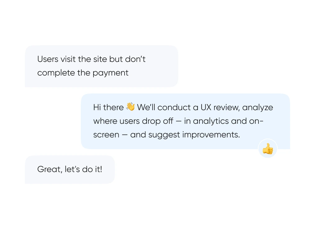
We start with real behavior: run UX reviews, analyze the full funnel, and identify exactly where and when users drop off.
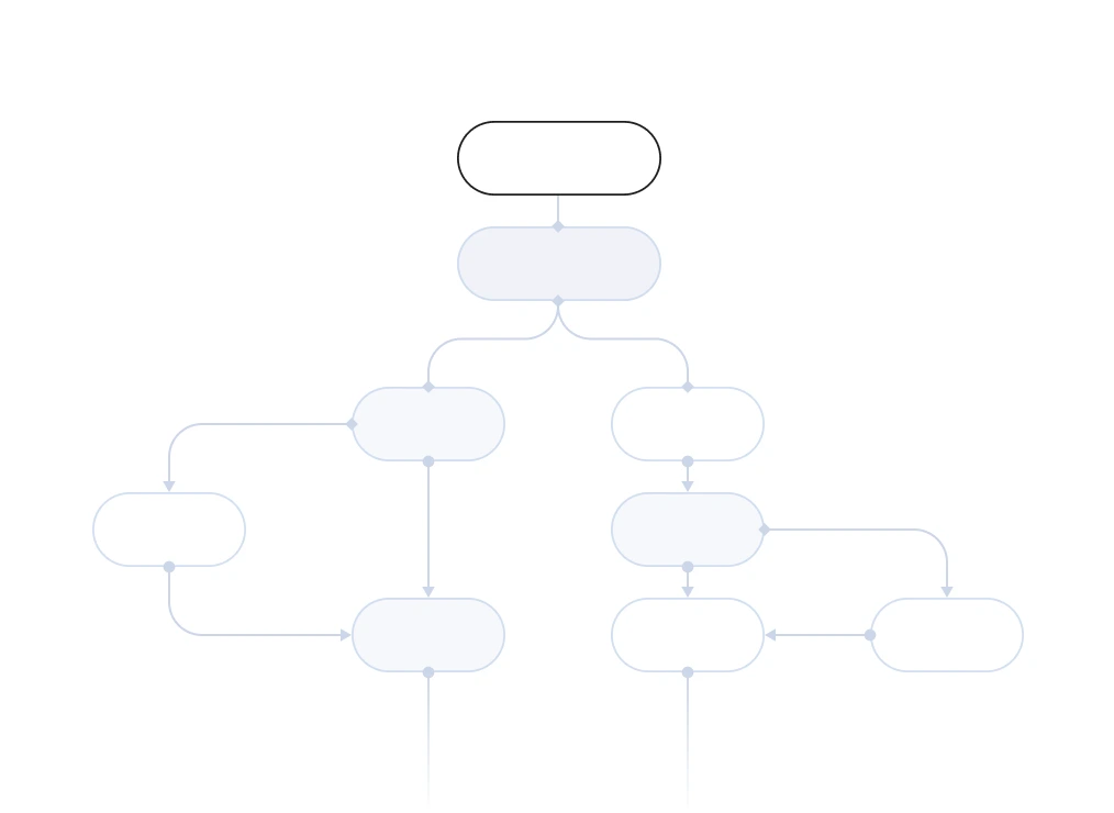
We build out logic and structure — from user flows and prototypes to final layouts. Everything gets tested before it ever reaches code.
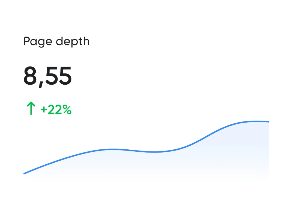
Looking good is the easy half. The work is working well. We track the numbers: time to complete key actions, scroll depth, conversion rate. All measurable.
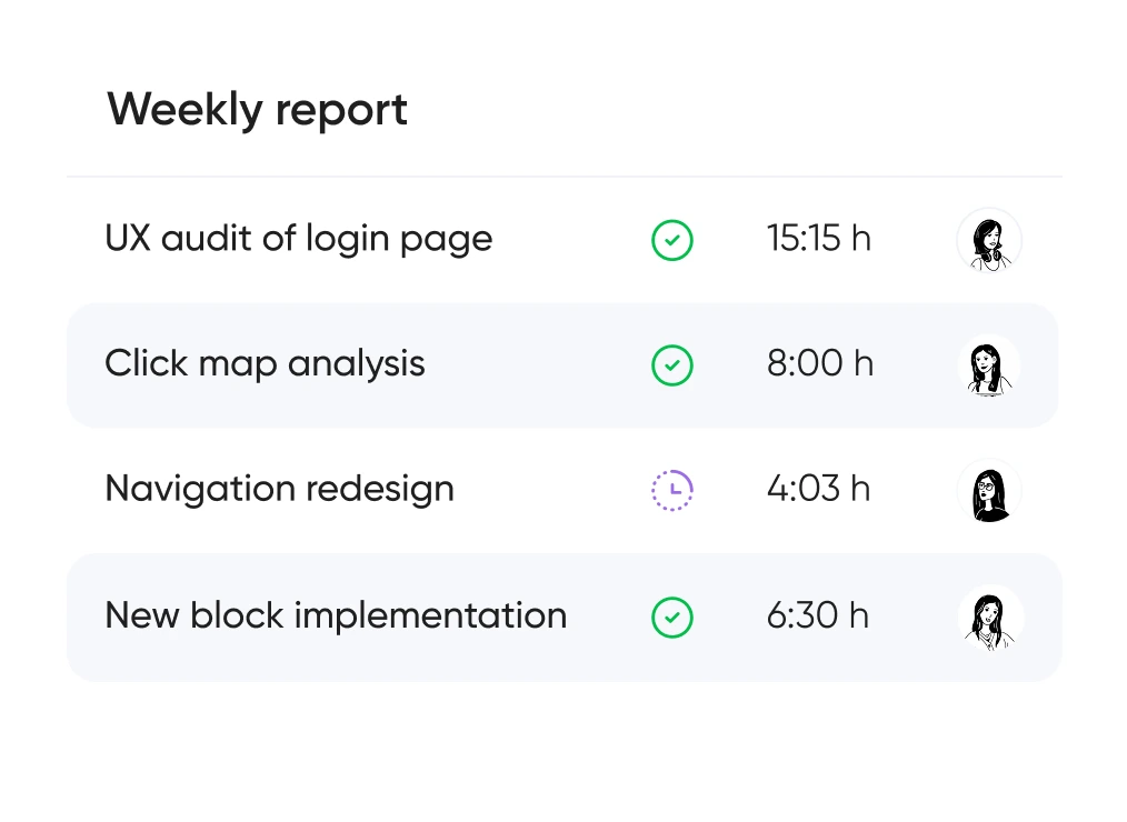
You always know which hypotheses we’re testing, what we’re improving — and why. No design for design’s sake — only what brings real business value.


Support for launching, refreshing, or rethinking an interface — at the right pace
and tailored to your product and business goals.
Pricing is tailored to each project — based on its stage, scope, and business objectives.
We use only the tools that help us create intuitive, responsive, and scalable interfaces.
UX/UI design for ecommerce, fintech, edtech, and more.
Didn’t find what you were looking for? Drop us a line at info@toimi.pro.
The cost depends on the number of pages, the complexity of user flows, and whether the project includes UX research and prototyping or moves directly into visual design. A focused redesign of a service site for a Seattle professional services firm differs significantly from a full UX/UI engagement for a SaaS product in the South Lake Union tech corridor — where complex user flows, multi-role dashboards, and onboarding sequences require extensive wireframing before visual design begins. For healthcare organizations, patient-facing interfaces must balance clarity, accessibility compliance, and clinical communication standards that add depth to the discovery and wireframing phases. We confirm exact pricing after reviewing your project brief. Most custom web design projects start from a few thousand dollars and scale with scope and flow complexity.
A standard custom web design project — covering discovery, wireframes, visual design, and developer-ready files — typically runs 4 to 8 weeks. For businesses with complex user flows, multiple audience segments, or stakeholder review requirements, the timeline extends to 10 to 14 weeks. We set a clear schedule at kickoff with defined review checkpoints at each phase so your team always knows where the project stands and what decisions are coming up, without last-minute approval pressure disrupting the development handoff.
Businesses where the website is the primary conversion tool — and where the audience evaluates design quality as a signal of product or service quality — benefit most from custom design over templates. In Seattle, this standard is particularly high: a city where Amazon, Microsoft, and Starbucks have set global benchmarks for digital design means that a template-based site signals underinvestment to an unusually design-literate local audience. Tech startups in the South Lake Union and Capitol Hill corridors competing for enterprise clients, life sciences companies presenting to pharmaceutical partners, aerospace suppliers in the Boeing supply chain bidding for procurement contracts, and Pacific Northwest consumer brands differentiating in retail categories where Patagonia and REI set visual standards all share the same need for design that communicates credibility on first impression.
We begin with a discovery phase — understanding your audience segments, business goals, and the specific actions each type of visitor needs to be able to take. This informs the information architecture and wireframes, which map out page structure and user flows before any visual design begins. Visual design follows wireframe approval, working through key page templates that define the full design language for the site. Seattle clients review and approve each phase before we proceed, and all final files are delivered in a format ready for development handoff or direct implementation by our team if the project continues into build.
Seattle's professional population — dense with product managers, engineers, and designers from Amazon, Microsoft, and their extended networks — evaluates interface design with professional-grade scrutiny. Patterns that would pass in a less technically informed market get noticed and judged here: inconsistent spacing, unclear information hierarchy, friction in form flows, and mobile layouts that prioritize desktop aesthetics over thumb-reach ergonomics all register as quality signals to this audience. We design for Seattle's user expectations by treating interface decisions as hypotheses that need justification — every layout choice, interaction pattern, and navigation structure is grounded in how your specific users think and behave, not in what looks good in a design portfolio screenshot.
Yes — for projects where research is scoped in, we conduct competitor interface analysis, user journey mapping, and where applicable, usability testing with representative users. For businesses in sectors with specific user behaviors — aerospace procurement managers accustomed to dense technical interfaces, patients navigating healthcare appointment booking under stress, or SaaS power users who spend eight hours a day in a product — UX research prevents design decisions based on assumptions that an internal team perspective cannot correct for. Research findings feed directly into wireframe decisions so every layout choice has a rationale grounded in how your actual users think and behave rather than how your team imagines they do.
Design reviews happen at three defined points — information architecture approval, wireframe sign-off, and visual design presentation. All design files are shared through a collaborative tool where your team can leave precise comments directly on the design rather than describing changes in writing. For companies with multiple internal stakeholders — product owners, marketing leads, technical co-founders, and executive reviewers — this format keeps feedback consolidated and prevents conflicting instructions reaching the design team between sessions. We document all approved decisions so late-stage change requests are easy to identify and scope separately, which protects both the project timeline and the design quality that approved decisions were building toward.
After final design approval, we deliver a complete set of developer-ready files along with a design system document covering components, spacing rules, typography hierarchy, color tokens, and interactive state specifications. For projects that continue with Toimi for development, the handoff is internal and seamless. For clients taking the design to their own development team or another vendor, the documentation is thorough enough that any competent developer can implement it without interpretation gaps or follow-up questions about design intent. Post-launch design support is available if refinements are needed after the site goes live with real traffic.


