Not a typical request? No problem.
Get in touch

UX reviewed, UI redesigned, interfaces refreshed — all to make things easier for users and better for business.
Need to test an idea fast, without going all in?
Expect a streamlined, functional UX/UI in no time.
Visitors getting lost and dropping off?
Time to adjust user navigation logic.
Afraid a redesign could do more harm than good?
The update will be careful — what works stays untouched.
No one to take care of UX/UI design?
From UX research to clean UI mockups — we’ve got it covered.
Search inside a product is different from search on a public website. People are looking for their own things. A contract signed last spring, a customer with an unusual surname, an invoice that bounced. They usually know the item exists. They want to reach it faster than by clicking through menus.
Start by reading real queries if you have them. Most products log search terms. The list shows what people expect the box to do. Partial names, reference numbers, email addresses, phrases like overdue or last week. Those patterns decide the design more than any competitor screenshot.
Decide what the search covers and show it. One box that searches everything sounds friendly, but results mixing people, files and settings are hard to scan. A scoped search inside each section is easier to trust. A global search can work if results are grouped by type, with each group labelled clearly.
Tolerance for typos matters more than cleverness. People mistype names, forget whether a code uses dashes and paste text with extra spaces. Matching should forgive these. It should also match the start of words, since many users type only the first few letters and expect an answer.
Results need enough context to choose. Show the matched term highlighted, the item type, a date and the owner where relevant. Two customers named Martin need something that tells them apart. A company name, a city or an account number often does it.
Filters narrow what search finds. Put the most used filters in view and move the rest under a single control. Show active filters as removable chips above the results. People forget which filters they applied, then decide that their item does not exist.
Zero results is a moment to help. Repeat the query so people can spot a typo. Suggest removing filters if any are active. Offer a way to create the item if that makes sense. A blank area with the words no results leaves them stranded.
Speed shapes perception. If results take more than a moment, show that something is happening. Keep the typed query intact while loading. Avoid results that jump around as more arrive, since people click the wrong row.
Finally, remember keyboards. Heavy users open search with a shortcut, type, move through results with arrow keys and press enter. Designing for that flow costs little and saves them minutes every day.
Recent items deserve a place beside the box. Many searches are really attempts to return to something opened an hour ago, and a short list of the last few records viewed answers those without typing. The list should be personal, private to the user, and easy to clear for anyone who shares a screen during meetings.
Products with paid tiers need to tell people when a feature costs more. How and when they say it affects both revenue and trust. A prompt that interrupts a task at the wrong moment feels like a trap. One that appears at the right moment feels like advice.
The worst moment is in the middle of work. A person has filled in half a form, uploaded a file or built a report, and a modal blocks the save button with a pricing table. Whatever they made should be kept. Let them finish, save a draft and then explain what the paid tier would allow.
The best moment is when the person reaches for something they need. They click an option that is locked, or approach a limit such as the number of projects. Explain in one line what the feature does and which plan includes it. Offer a way to try it if possible. Avoid vague labels like premium feature with no explanation.
Show limits before they are reached. A small counter that says eight of ten projects used lets people plan. Hitting a hard wall with no warning, especially during a deadline, creates the kind of anger that ends up in support tickets and reviews.
Locked features need a visual language. A small icon and a muted label work in most interfaces. Hiding locked features completely makes the product look smaller than it is. Showing them fully, then blocking on click, feels like bait. Something between the two is usually right.
Consider who can pay. In team products, the person who hits a limit is often not the person holding the budget. The prompt should let them request an upgrade from the account owner with one click, and tell them that the request was sent.
Downgrades deserve the same care. When a plan ends or a trial expires, explain clearly what happens to the data created with paid features. Is it read only? Hidden? Deleted after a period? People should never learn this by losing something.
Frequency needs a limit. If a person dismisses a prompt, do not show it again on the next screen. Wait for a new trigger. Repeated nudges train users to close anything that looks like a panel, including useful messages.
Test the wording with people who fit the free tier. Ask what they think each plan includes. Confusion there costs more than any colour choice on the pricing table.
Keep the language of prompts free of pressure. Countdown timers, warnings about missing out and exaggerated discounts may lift a number for a week, but they teach users to distrust every panel in the product. Plain facts about what the plan adds, what it costs and how to cancel later make a stronger case over the long life of an account.
Products gain features easily and lose them with difficulty. A feature that seemed useful at launch may now serve a handful of accounts, add work to every release and confuse new users. Taking it out is a design job as much as an engineering one.
Start with evidence. Find out who uses the feature, how often and for what. Usage logs give the numbers. A few conversations give the reasons. Sometimes a rarely used feature holds up a monthly task that nothing else covers. That discovery changes the plan.
Decide what replaces it, if anything. The cleanest removals point to a better way of doing the same job. Export to spreadsheet might give way to a built-in report. When there is no replacement, say so plainly. People respect honesty more than a vague promise of something better later.
Tell people early. A notice inside the product, close to the feature itself, reaches the right users. A general email reaches everyone and alarms people who never used the feature. Give a date, explain why, and link to guidance on what to do instead.
Give time proportional to the effort of switching. A button that moves needs a few days. A workflow that people built their process around needs months. Let them export their data in a usable format before the feature disappears.
Consider a staged removal. First hide the feature from new accounts. Then mark it as retiring for existing users. Then make it read only. Finally remove it. Each stage gives feedback and a chance to reverse course if something unexpected breaks.
Watch support channels closely during the change. Prepare the support team with a short explanation and the recommended alternative. Complaints in the first days are normal. Complaints that keep coming describe a need you missed.
Remove it completely when the time comes. Old menu items, help articles, onboarding screens and marketing pages all need updating. A half removed feature that still appears in a tooltip causes more confusion than keeping it would have.
Afterwards, check whether the product got simpler. Fewer settings, shorter menus, faster releases. If nothing improved, the decision to remove may have been the wrong one to spend effort on.
Internal users need attention too. Sales staff may have promised the feature to a prospect, and account managers may know which large customers rely on it in ways the logs do not show. Brief them before any public notice goes out, give them the date and the reasoning, and ask them to flag any account that would be seriously affected so the team can speak to it directly.
Keep a short record of each removal once it is finished, with the reasons, the dates, the feedback received and anything that went wrong along the way. The next time somebody proposes retiring a feature, that record turns a nervous debate into a plan the team has already rehearsed, and it shows which warnings users actually read.
The moment a design leaves the design tool is where many products lose quality. Spacing drifts, states go missing, edge cases get improvised. The fix is to treat handoff as a conversation that starts early, rather than a file delivered at the end.
Invite a developer into design reviews from the first sketches. They will spot what is expensive, what the existing code already supports and which interactions the platform handles poorly. An early question saves a week of rework. Late questions lead to compromises nobody chose.
Organise the file for the person reading it. Name frames by screen and state. Keep explorations in a separate page. Mark what is final and what is still under discussion. A developer should never have to guess which of four similar buttons is the approved one.
Every screen needs its states. Loading, empty, partial, error, success, disabled. Also long text, missing images and very large numbers. Designs often show only the perfect case. Developers then invent the rest, each in a slightly different way.
Describe behaviour as well as appearance. What happens when the user presses back? When the network drops? When two people edit the same item? Short written notes next to the frames answer these. A prototype can help, but notes are easier to search later.
Use shared names. If the design calls something a card and the code calls it a tile, conversations will go wrong. Agree on terms for components and use them in both places. A design system makes this easier, but even a short glossary helps.
Measurements should come from rules, not pixels. Spacing in steps of four or eight, a fixed type scale, a small set of colours. When the developer knows the rule, they can handle a screen the designer never drew.
Stay available during the build. Review work in progress weekly in the browser or on a real device rather than in screenshots. Small corrections early cost minutes. The same corrections after release need a new ticket, a new test and a new deploy.
Close the loop after launch. Compare the live product with the design and note differences. Some are mistakes to fix. Others are improvements the developer made, which should flow back into the design file so the next handoff starts from reality.
Assets need a predictable home as well. Icons exported in the right formats, images at the sizes the code expects, fonts with licences that cover the web and the apps. Collect them in one place with clear names, and note which ones are final. A developer hunting through a file for the correct version of an icon is a developer who is not building the feature, and the hunt tends to end with the wrong icon in production.
Motion and interaction details are the easiest part of a handoff to lose, because a static frame cannot show them. Describe the duration, the easing and what triggers each animation, or record a short video of the prototype and attach it to the relevant frame. Without that information, developers either skip the motion or invent their own, and the finished product feels slightly different from the one everyone approved in the review.
We focus on what matters: user behavior, thoughtful structure, and data-driven improvements. Design that is measured, then proven to work.
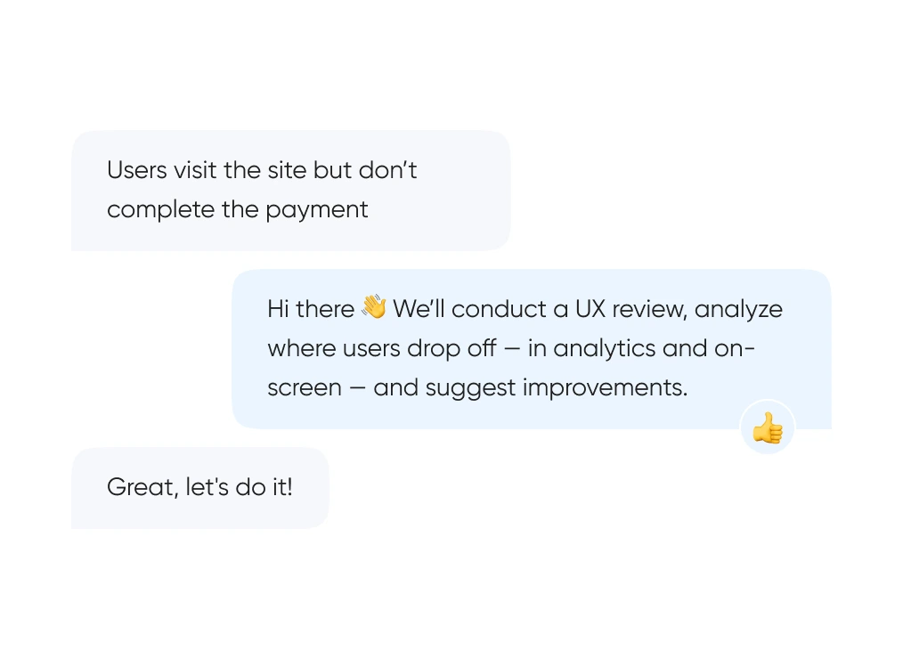
We start with real behavior: run UX reviews, analyze the full funnel, and identify exactly where and when users drop off.
We build out logic and structure — from user flows and prototypes to final layouts. Everything gets tested before it ever reaches code.
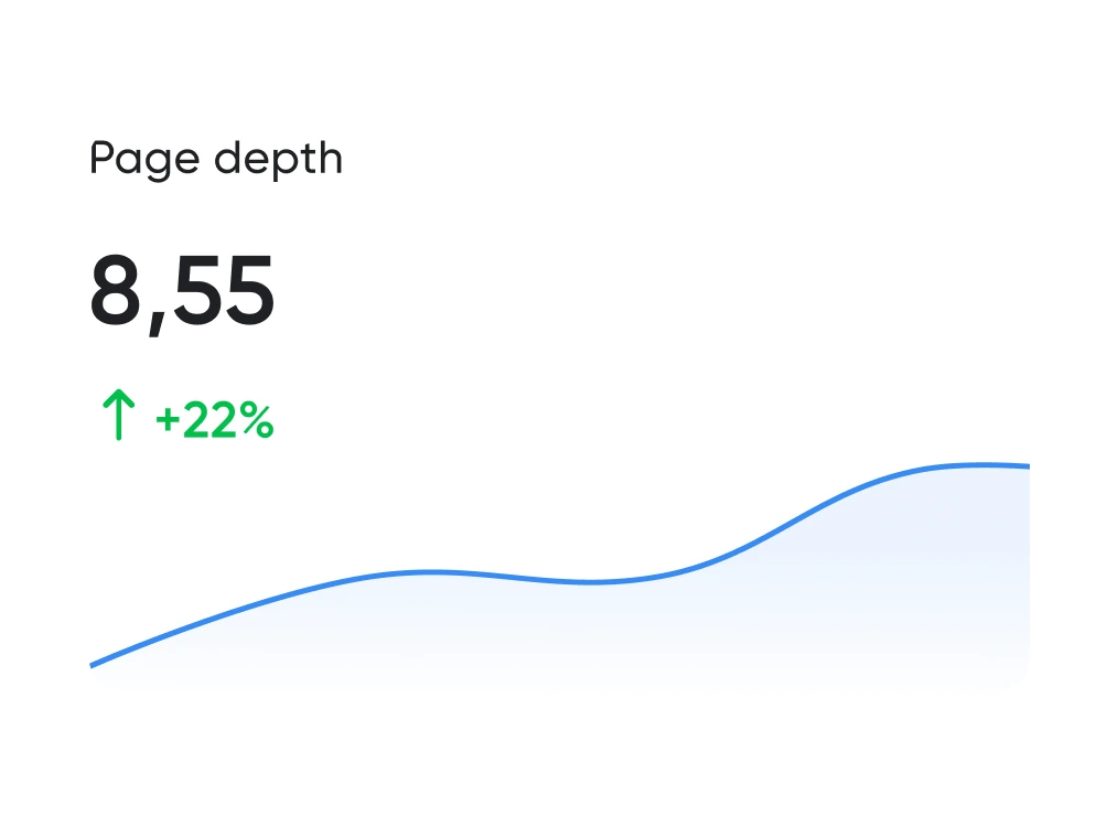
Looking good is the easy half. The work is working well. We track the numbers: time to complete key actions, scroll depth, conversion rate. All measurable.
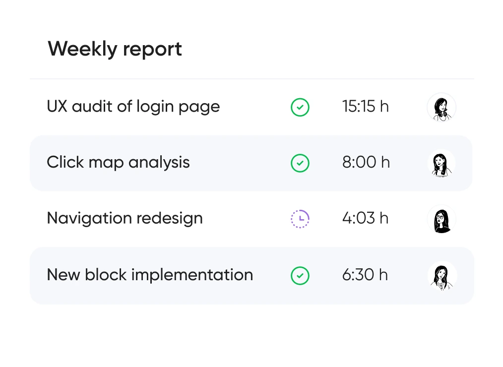
You always know which hypotheses we’re testing, what we’re improving — and why. No design for design’s sake — only what brings real business value.


Support for launching, refreshing, or rethinking an interface — at the right pace
and tailored to your product and business goals.
Pricing is tailored to each project — based on its stage, scope, and business objectives.
We use only the tools that help us create intuitive, responsive, and scalable interfaces.
UX/UI design for ecommerce, fintech, edtech, and more.
Didn’t find what you were looking for? Drop us a line at info@toimi.pro.
Bethesda design audiences combine sophisticated corporate professionals (Lockheed Martin, Marriott, federal contractors), federal employees and contractors with substantial professional sophistication, NIH researchers and biomedical professionals, healthcare professionals at Walter Reed and Suburban Hospital, and one of the most affluent and educated consumer audiences in the United States. Design serving these audiences must balance corporate professional polish with consumer accessibility, accommodate federal accessibility (Section 508) requirements, and meet engineering audience expectations. Generic DC-area design fails consistently.
Our process includes user research with Bethesda audience representatives, information architecture defining content and functionality structure, low-fidelity wireframes establishing interaction patterns, prototype development supporting evaluation, usability testing with appropriate user representatives, high-fidelity visual design with design system development, design system documentation supporting ongoing development, and design implementation support during engineering. For Bethesda federal contracting projects, additional Section 508 accessibility design throughout.
Design timelines depend on project scope. Focused MVP product design runs 8-14 weeks. Mid-complexity product design with substantial information architecture and design system development requires 12-22 weeks. Enterprise product design for Lockheed Martin-scale defense, Marriott-scale hospitality, NIH-adjacent biomedical, and federal contracting runs 18-32 weeks. Federal contracting projects with substantial Section 508 design requirements add appropriate timeline.
User research approaches include qualitative interviews with Bethesda audience representatives, usability testing identifying interface effectiveness, ethnographic research for complex audience contexts, quantitative testing where statistical confidence matters, competitive UX analysis examining Bethesda audience experience with competitive products, and synthesis of research findings into actionable design direction. For Bethesda corporate audiences, research often requires substantial coordination with defense industry, federal contracting, biomedical, or hospitality organizations.
Design systems support consistent design across product growth. We develop design systems including comprehensive component libraries, color and typography systems, iconography and illustration systems, motion and animation specifications, and component usage documentation. For Bethesda enterprises with multiple products or web-mobile parity requirements, unified design systems enable consistent experience across digital touchpoints. For Bethesda federal contracting design systems, USWDS (US Web Design System) integration where applicable.
Accessibility includes proper screen reader support for visually impaired users, sufficient color contrast meeting WCAG standards, keyboard navigation supporting users without precise pointing devices, motion sensitivity accommodation, sufficient touch target sizing, and proper semantic structure for assistive technology. For Bethesda federal contracting products particularly, Section 508 compliance is regulatory requirement. For healthcare products at Walter Reed-area and Suburban Hospital networks, accessibility implementation is regulatory requirement rather than optional consideration.
Premium consumer design for Bethesda affluent audiences (downtown Bethesda, Westbard, Friendship Heights consumers, federal executive professionals) requires sophisticated polish matching the premium lifestyle these audiences expect. We accommodate premium typography, sophisticated motion and animation, high-quality image handling, and premium customer experience patterns matching premium retail and lifestyle context.
Product design evolves continuously based on usage data and changing requirements. We provide ongoing design partnership including analytics review identifying user behavior patterns, A/B testing for interface variations, additional research as new audience segments emerge, design system evolution as products grow, and ongoing design support across product development. For Bethesda federal contracting products, ongoing accessibility maintenance supporting Section 508 compliance.


