Not a typical request? No problem.
Get in touch

UX reviewed, UI redesigned, interfaces refreshed — all to make things easier for users and better for business.
Need to test an idea fast, without going all in?
Expect a streamlined, functional UX/UI in no time.
Visitors getting lost and dropping off?
Time to adjust user navigation logic.
Afraid a redesign could do more harm than good?
The update will be careful — what works stays untouched.
No one to take care of UX/UI design?
From UX research to clean UI mockups — we’ve got it covered.
An interface bought by a Swiss public body is judged against written rules, and the designer should know them before the first wireframe. The legal base is the disability equality act, the Behindertengleichstellungsgesetz, usually shortened to BehiG. It binds the authorities of the Confederation. Among other duties, it requires that the services they offer over the internet can be used by people with disabilities. That covers people who cannot see a screen, people who cannot hold a mouse and people who read slowly.
The working yardstick is eCH-0059, the accessibility standard published by eCH, the association that sets e-government standards in Switzerland. It builds on WCAG, the international guidelines of the W3C, and asks for conformance at level AA. Offices of the Confederation apply it. Cantons, cities and publicly funded organisations often name it in their tenders as well. A private company can adopt it too, and some do so because their own customers are public bodies.
For a design team this turns a vague wish into a checklist. Each rule has a success criterion. Each criterion can be tested. That helps planning. It also means shortcuts will be found.
Contrast comes first because it touches the visual identity. Body text needs a contrast ratio of at least 4.5 to 1 against its background, and large text needs 3 to 1. Icons, input borders and focus rings need 3 to 1 as well. Pale grey hints and thin light buttons, so common in polished product mockups, tend to fail. Fixing the palette once in the design system costs far less than arguing about each screen later.
Keyboard use is the second test. A tester puts the mouse aside and presses Tab through the page. Focus has to be visible at every stop. It should move in the order a reader expects, from the heading into the form and on to the button, and never disappear into a hidden menu. A modal dialog keeps focus inside while it is open and returns it to the trigger when it closes. Most of this is decided in the wireframe, where the designer fixes the reading order and draws a focus state for every control.
Forms are where public services most often let people down. Every field needs a visible label, since a placeholder vanishes as soon as someone types. Required fields are marked in words as well as colour. An error message names the field, says what is wrong and is announced to screen readers. Session time limits need a way to extend them. A permit or subsidy form can run across many screens, so the layout should also show where the person is and what remains.
Documents are the part teams forget. Public bodies publish decisions, forms and reports as PDFs, and the standard covers those files too. An accessible PDF carries tags, a logical reading order, real headings, alternative text for images and a declared language. When the product generates files of its own, such as a confirmation or a certificate, the template must produce tagged output. A handsome export from a design tool rarely does. If a document cannot be made accessible, an equivalent HTML page is often the better answer.
Testing should mix tools and people. Automated checkers catch missing labels and weak contrast. They miss a confusing focus order and an error text that helps nobody. A manual review against each criterion, done with a screen reader and a keyboard alone, finds most of the rest. Sessions with disabled users find what no criterion describes. Specialised organisations in Switzerland run audits against the standard, and a buyer may ask to see the report before acceptance.
When a tender names eCH-0059, write the version and the level into the design brief and into the acceptance criteria. Agree who tests, at which milestones and what counts as a blocker. Conformance then becomes part of each sprint. It stops being a surprise in the final week.
Every product has a few places where people hesitate. A field whose meaning is unclear, a setting with side effects, a status that could mean two things. The usual response is to add a small question mark icon with a tooltip. Sometimes that is right. Often it hides a design problem under a layer of text.
Start by asking why the help is needed. If the label is vague, rewrite the label. If a choice has consequences that nobody can guess, show those consequences next to the choice. A tooltip is a fair answer only when the screen is already clear for most people and a minority needs one more sentence.
Different kinds of help suit different moments. A short hint under a field, always visible, works for format rules such as how a reference number is written. A tooltip suits a definition that experienced users no longer need. A side panel or a linked article fits a concept that takes a paragraph to explain. A guided tour fits almost nothing. People skip it, then forget it.
Tooltips carry practical traps. They appear on hover, which does not exist on a touch screen. They can cover the very field someone is typing into. Keyboard users need to reach them with Tab, and screen readers need them tied to the control they describe. If the text matters for completing the task, it belongs on the page, not behind an icon.
Write help as the answer to a real question. What happens if I change this? Who will see it? Can I undo it? One or two sentences, in the words users use, with an example where the idea is abstract. Avoid repeating the label in longer form. That tells nobody anything new.
Place matters as much as wording. Help should sit next to the thing it explains and appear at the moment of doubt. A help centre three clicks away is useful for reference. It rarely rescues someone halfway through a task.
Empty and first-use states are a special case. A new account has no data, so the screen can afford a few lines of guidance that would be clutter later. Let that guidance fade once the person has done the thing it describes, instead of staying forever in the corner.
Treat help texts as part of the design system. Give them a component, a tone and an owner. Otherwise every team writes its own, and the product ends up with five styles of explanation on one screen.
Help is also a source of evidence. Track which tooltips are opened most and which articles people reach from inside the product. A hint that gets opened by nearly everyone signals that the screen needs work. Support tickets about the same field say the same thing louder.
Review the list every few releases. Remove help that nobody reads. Redesign the screens that need too much of it. Over time, a product should need fewer explanations, not more.
Most business products meet their first real data through an import. A new customer arrives with a spreadsheet of contacts, products or projects and wants it inside the tool on day one. If that import fails, the trial often ends there. It deserves design attention equal to any main screen.
The flow usually has four stages. Upload the file. Match its columns to the fields of the product. Review what will happen. Confirm and watch the result. Each stage has its own ways to go wrong.
Upload should accept the formats people actually have. That means the common spreadsheet format as well as CSV, with sensible handling of separators and character encodings. Accented names turning into symbols is a classic failure. Offer a template to download, with example rows, for people who start from scratch.
Column matching is the heart of the screen. Guess matches from the headers, show the guess with a sample of real values from the file, and let people correct it with a simple dropdown. Columns that match nothing should be easy to skip or to keep as a custom field. Dates and numbers need a visible choice of format, since the same string can mean two different days.
Before anything is written, show a preview. How many rows will be created, how many will update existing records, how many will be skipped. Duplicates need a rule that the person picks, such as matching on email or on an ID. Surprises at this stage are cheap. After the import they are expensive.
Errors should be specific and fixable. This row has a date that cannot be read, in the column called Start. That row is missing a required name. Each message points to the row number in the original file, so people can find it. Let people download the failed rows as a file, correct them in their spreadsheet and upload just those. Blocking the whole import because of a few bad rows punishes the people who did most of the work right.
Large files take time. Run the import in the background, show progress, and let the person keep using the product meanwhile. Send a short summary when it finishes, with a link to the new records and to any rows that failed. If the same person imports every month, remember their column matches so the second import takes a minute.
Finally, make it reversible. An undo for the last import, available for a while afterwards, turns a risky step into a safe one. People are far more willing to try when they know a mistake will not leave a mess of half-correct records.
When scoping the design, ask for three or four real customer files. They reveal the merged cells, the stray header rows and the odd formats that a clean sample never shows.
We focus on what matters: user behavior, thoughtful structure, and data-driven improvements. Design that is measured, then proven to work.
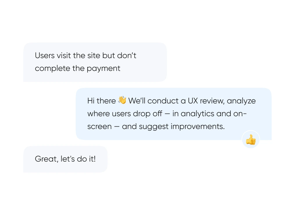
We start with real behavior: run UX reviews, analyze the full funnel, and identify exactly where and when users drop off.
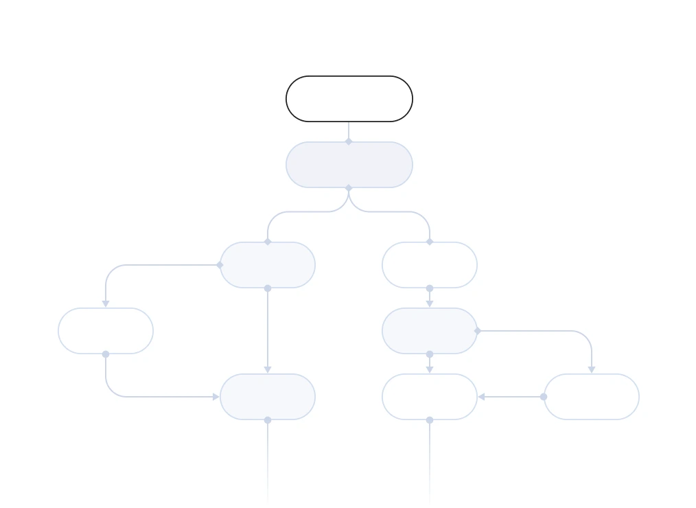
We build out logic and structure — from user flows and prototypes to final layouts. Everything gets tested before it ever reaches code.
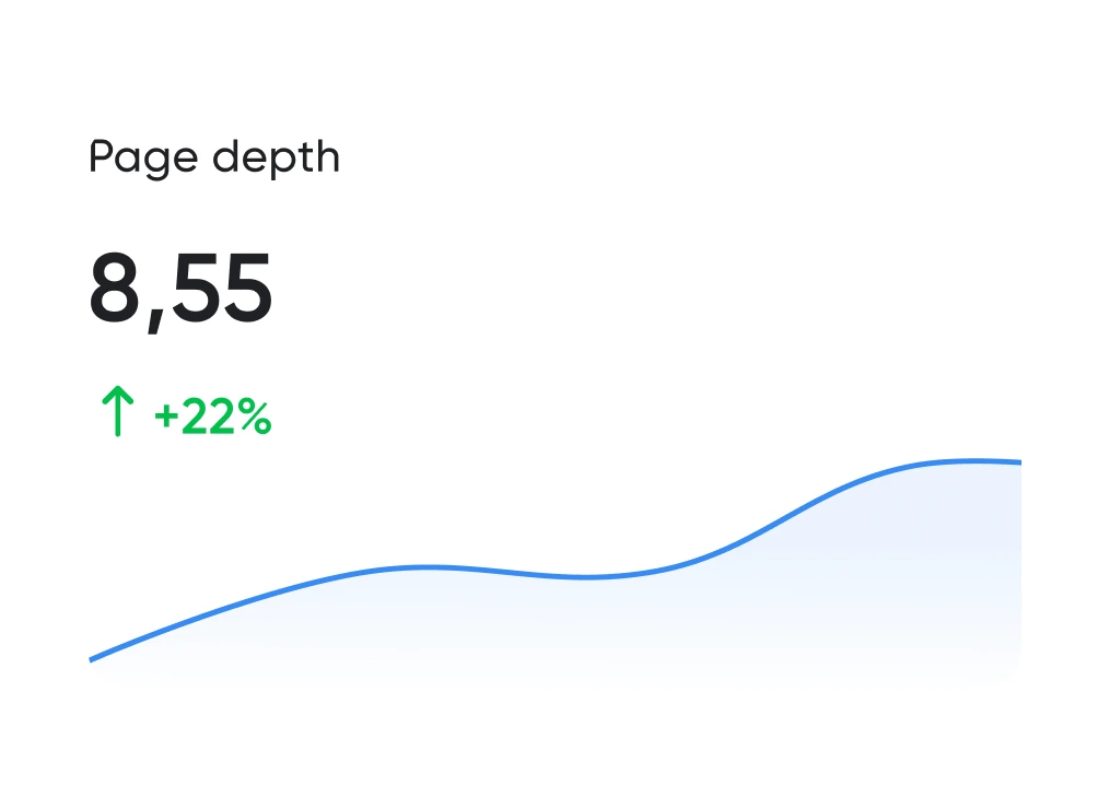
Looking good is the easy half. The work is working well. We track the numbers: time to complete key actions, scroll depth, conversion rate. All measurable.
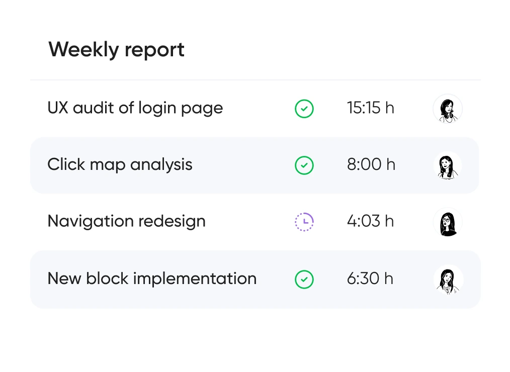
You always know which hypotheses we’re testing, what we’re improving — and why. No design for design’s sake — only what brings real business value.


Support for launching, refreshing, or rethinking an interface — at the right pace
and tailored to your product and business goals.
Pricing is tailored to each project — based on its stage, scope, and business objectives.
We use only the tools that help us create intuitive, responsive, and scalable interfaces.
UX/UI design for ecommerce, fintech, edtech, and more.
Didn’t find what you were looking for? Drop us a line at info@toimi.pro.
We research user behavior, design interface logic, create clear visual layouts, and provide support after launch.
Final cost depends on the number of screens, level of detail, and whether research is included.
We can join at any stage — from UX analysis to full handoff to development. Happy to work with your team or handle the project end-to-end.
That's totally fine. We often step in to redesign specific blocks, audit funnels, or add new flows to an existing interface.
Both. We design personal accounts, services, marketplaces, CRMs, and corporate portals — and make complex products feel simple and intuitive.


