Not a typical request? No problem.
Get in touch

UX reviewed, UI redesigned, interfaces refreshed — all to make things easier for users and better for business.
Need to test an idea fast, without going all in?
Expect a streamlined, functional UX/UI in no time.
Visitors getting lost and dropping off?
Time to adjust user navigation logic.
Afraid a redesign could do more harm than good?
The update will be careful — what works stays untouched.
No one to take care of UX/UI design?
From UX research to clean UI mockups — we’ve got it covered.
A billing screen gets opened for one reason more than any other: something looks wrong. A customer sees a charge they do not recognize, or a total that changed since last month. They go looking for an explanation. If the screen answers in seconds, the support inbox stays quiet. If not, a ticket follows. The tone is rarely calm.
The core pattern is simple: a reverse-chronological list. Each row needs a date, a short description, an amount, and a status. Status deserves real visual treatment. Paid, pending, and failed should be distinguishable at a glance, by color and icon together, since color alone fails for some users.
Descriptions matter more than most teams assume. An internal product code means nothing to the person paying the bill. Translate it. Show the plan name and the period it covers, such as a subscription tier and the month it applies to. Anyone reading the row should understand the charge without asking.
Payment method deserves its own card near the top: the card brand, the last digits, an expiry date. When a card is close to expiring, say so before the renewal fails, not after. A quiet reminder days ahead avoids a support conversation that starts with a declined payment.
A failed payment needs a banner that states the situation plainly and offers one clear action: update the card. Avoid alarming color across the whole page. Reserve strong color for the banner and its button. Everything else can stay calm. Panic does not help anyone finish a task faster.
Every paid invoice should produce a downloadable file, with a filename sortable by date. A receipt viewed inline is convenient for a quick check. The download link matters more for anyone filing expenses or reconciling accounts.
Larger accounts want to filter by date range. If more than one currency is involved, state it on every row rather than assume it. Tax lines should be broken out separately from the base charge, since a finance team often needs that split, not a combined total alone.
Who can see this screen is a permission question worth deciding early. An owner usually needs full access, including payment changes. A team member added later might only need to view past invoices. Get this wrong either way and friction follows: too open, and card data spreads; too closed, and nobody can reconcile.
New accounts on a trial have nothing to show yet. An empty table with no explanation reads as broken. A short line explaining that invoices appear after the first cycle prevents confusion. On a narrow screen, collapse each row into a card: date and amount on top, status as a small badge, so nothing cuts off mid-word.
Most products start with two access levels: an administrator and everyone else. That works for a while. It fails once a business grows past a handful of people. One person edits content, not billing. Another approves expenses, not accounts. The usual fix is a permission matrix, and the fix itself usually becomes a wall of checkboxes nobody wants to open.
The pattern is sound: rows for permissions, columns for roles, a toggle where they meet. The failure mode is scale without structure. Past sixty or so permissions listed alphabetically, the grid turns into a search problem before it becomes a decision. Group permissions by feature area instead. Add a heading per group. Make each group collapsible when it is not needed that day.
Role templates solve the cold-start problem. Offer a small set of presets, such as owner, editor, and viewer, each already filled in. Most administrators pick a template and move on. Only a minority ever customize one permission at a time, and the matrix should stay available for exactly that minority.
Inheritance needs a visual answer, not a written rule buried in documentation. If an editor role includes every viewer permission automatically, gray out or lock those boxes in the editor column. Nobody should waste a click trying to uncheck something that cannot be removed alone. A locked box with a short hover note beats a support ticket.
One case deserves a dedicated warning: a user about to remove their own administrative access. A distracted click can lock an account out of its own settings, sometimes with nobody left able to reverse it. A short, specific confirmation dialog is worth the small friction it adds.
Changes to this screen should leave a trace. Log who changed which permission, for which role, and when. That gives an administrator somewhere to look when access behaves oddly weeks later. This needs no elaborate interface. A plain list under an activity tab is usually enough.
Enterprise accounts often define more roles than a small team ever will, and the matrix can outgrow a single screen width. Keep the role headers fixed while permission rows scroll. A person should never lose track of which column they are editing. A search box above the grid turns a long scroll into a short lookup.
None of this replaces plain language. Every permission name should describe an action a person recognizes: manage payment methods, invite members, export reports. A label copied straight from a database column reads as a foreign tongue to whoever is deciding if a colleague should have that access.
A drag-and-drop zone looks modern. It feels effortless to someone who already knows how to use one. It also excludes anyone on a screen reader, anyone on a touch device where dragging between apps is awkward, and anyone who just prefers clicking. Every drop zone needs a visible button that opens the native file picker instead. Same job, different door.
The zone needs at least three states beyond idle. A hover state while a file is dragged over it. An uploading state. A completed one. The hover state should shift border and background together. A subtle border change alone is easy to miss while dragging.
Validate file type and size before the upload begins, not after it fails. If a product only accepts images under a certain size, say so near the zone. Reject an oversized file at once, with a specific message: too large, or wrong format. A flat error leaves someone guessing which rule they broke.
For multiple files at once, each needs its own row. Its own progress indicator. Its own cancel control. A single combined bar hides which file is stuck. A person watching it cannot tell whether one upload needs a retry or the whole batch has stalled.
Previews earn their keep immediately. An image gets a thumbnail. A document gets a recognizable icon plus a truncated filename that still shows the extension. A name cut off with no extension leaves a user unsure what they picked. A short pause to build a thumbnail is worth it. A blank gray box is not reassuring.
Large files change the interaction. A short upload can use a simple spinner. Anything longer needs a real progress indicator and, ideally, a resumable transfer that survives a dropped connection without forcing a restart from nothing. Say plainly what is happening, uploading or processing, so a slow step does not read as a frozen page.
When something fails partway, name the problem. Skip the generic apology. A dropped connection, a server rejection, and an unsupported format each need their own message and, where possible, their own fix: retry, pick a different file, or convert first. A retry button attached to a clear cause helps more than a vague line of regret.
After a file lands successfully, give the person an obvious next step: remove it, replace it, or move on. A completed upload with no visible action beyond a checkmark leaves people wondering if more is required. An uncertain user is more likely to abandon a form near the end than anywhere earlier.
We focus on what matters: user behavior, thoughtful structure, and data-driven improvements. Design that is measured, then proven to work.
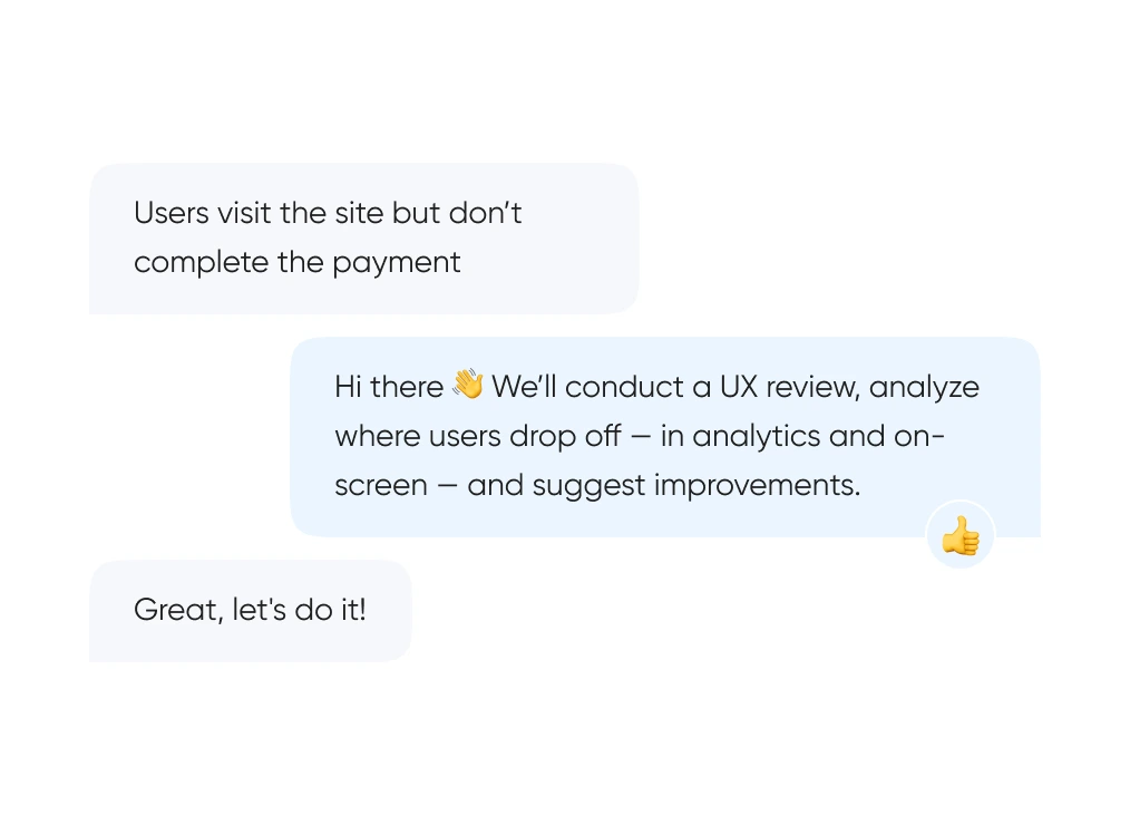
We start with real behavior: run UX reviews, analyze the full funnel, and identify exactly where and when users drop off.
We build out logic and structure — from user flows and prototypes to final layouts. Everything gets tested before it ever reaches code.
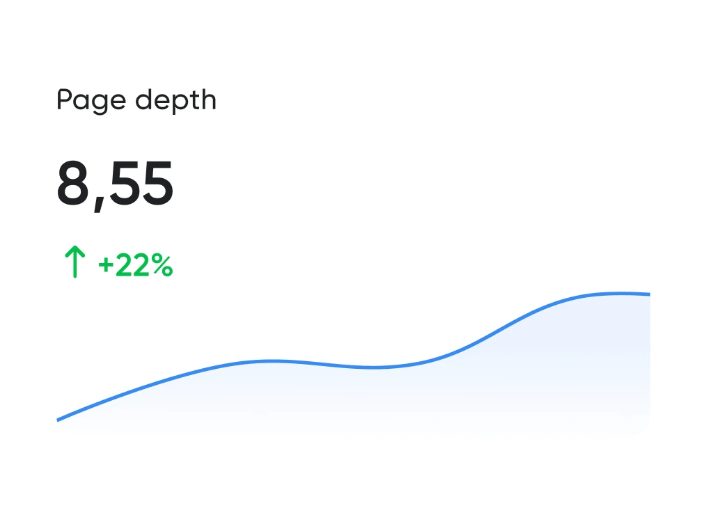
Looking good is the easy half. The work is working well. We track the numbers: time to complete key actions, scroll depth, conversion rate. All measurable.
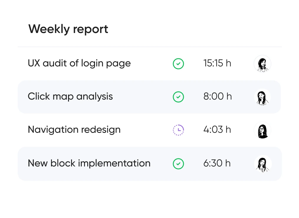
You always know which hypotheses we’re testing, what we’re improving — and why. No design for design’s sake — only what brings real business value.


Support for launching, refreshing, or rethinking an interface — at the right pace
and tailored to your product and business goals.
Pricing is tailored to each project — based on its stage, scope, and business objectives.
We use only the tools that help us create intuitive, responsive, and scalable interfaces.
UX/UI design for ecommerce, fintech, edtech, and more.
Didn’t find what you were looking for? Drop us a line at info@toimi.pro.
Brookline audiences combine substantial design sophistication with substantial functional sophistication expectations. Brookline professionals, LMA-affiliated medical community, affluent consumers, and Brookline's substantial professional demographic experience the world's best digital products daily and expect comparable quality. Aesthetic refinement matters, but functional clarity, information density, and substantive capability matter equally.
Product design covers comprehensive UX/UI design from research through implementation. We bring particular Brookline-relevant capability — professional services product design accommodating professional standards, healthcare product design accommodating clinical environments and HIPAA compliance, educational product design suited to Brookline educational quality expectations, premium consumer product design suited to Brookline's affluent audience, and enterprise product design.
Product design timelines depend on scope. Focused product design for MVP scope runs 8-14 weeks. Standard product design with comprehensive scope runs 12-20 weeks. Comprehensive product design with substantial feature scope, design system development, accessibility design, and internationalization design runs 5-9 months. Healthcare product design with HIPAA considerations and clinical UX patterns runs 6-12 months.
User research substantially strengthens product design. We conduct research including primary user interviews capturing authentic user perspectives, contextual inquiry observing users in actual work environments, usability testing measuring design effectiveness, secondary research synthesizing existing user research, and proper research synthesis informing design decisions.
Brookline accessibility expectations exceed national norms substantially. We design with WCAG 2.1 AA minimum with frequent WCAG 2.1 AAA targets, screen reader compatibility (VoiceOver, JAWS, NVDA, TalkBack), keyboard navigation supporting users who cannot use mouse, color contrast meeting accessibility standards, motor accessibility considerations (substantial for Brookline senior population), cognitive accessibility for diverse populations, and proper accessibility testing.
Design systems support quality and consistency at scale. We build comprehensive design systems with component libraries, design tokens for systematic style management, documentation supporting design team collaboration, integration with engineering implementation (Storybook, design system documentation, Figma libraries), and proper governance supporting evolution.
Multilingual design is a layout and typography task. We accommodate text expansion (Russian often runs noticeably longer than English — substantial for Brookline Russian community), right-to-left layout for Hebrew (substantial for Brookline's Jewish community), language-specific typography (Hebrew, Cyrillic, Chinese, Korean requiring specific font handling), cultural design conventions varying across cultures, and proper internationalization workflow integration.
Product design requires continuous evolution. iOS and Android design language updates following Apple's annual WWDC and Google's I/O announcements, design system evolution supporting product expansion, accessibility design updates following accessibility standard evolution, user research and usability testing informing design improvement, A/B testing supporting systematic design optimization, and feature design supporting product roadmap.


