Not a typical request? No problem.
Get in touch

UX reviewed, UI redesigned, interfaces refreshed — all to make things easier for users and better for business.
Need to test an idea fast, without going all in?
Expect a streamlined, functional UX/UI in no time.
Visitors getting lost and dropping off?
Time to adjust user navigation logic.
Afraid a redesign could do more harm than good?
The update will be careful — what works stays untouched.
No one to take care of UX/UI design?
From UX research to clean UI mockups — we’ve got it covered.
A screen that shows every option at once teaches a new user nothing. It only adds noise. Noise is what people abandon fastest. The opposite mistake is just as common: hiding so much that the product feels thin, so a returning user cannot find the control they used yesterday. Progressive disclosure is the practical middle path. A screen shows the choice most people make first. The rest waits one step away, reachable but not staring back at anyone.
The method starts with sorting, not hiding. Every field, toggle and menu item gets placed into one of three groups: seen by everyone, one click away, or rarely needed. That third group still belongs in the product. It just does not belong on the first view a person opens. Sorting this way forces a real conversation about what a task requires, rather than what an internal team wanted to display simply because it exists.
Usage data settles most arguments that opinion cannot. A feature touched by a small share of accounts, on a rare occasion, is a strong candidate for the second tier. That holds true no matter how proud a team is of building it. A setting used during nearly every session belongs on the main screen, even if it looks unglamorous next to something newer. Frequency decides visibility, not development effort.
Signposting matters as much as the sorting itself. A link labeled more options, a small arrow, or a clearly named advanced section tells a curious user where to look. No search required. Disclosure without a signal reads as a missing feature rather than a folded one, and support requests follow soon after launch. A well placed label costs almost nothing. It prevents most of that confusion before it starts.
Progressive disclosure differs from a one time onboarding tour, and the two get confused often. A tour teaches through repetition, then disappears, leaving the full interface exposed whether a person is ready or not. Disclosure is structural. The interface itself stays layered for as long as the product exists. A first day user and a three year veteran can look at the identical screen and see a different amount of it, based on what each one actually opens.
Depth has a real cost past two levels. Once a person clicks through three menus to reach a setting used weekly, the design has traded clarity for tidiness. Tidiness was never the goal. Hold onto one rule: anything touched weekly earns a spot no more than one click from the main view, no matter how the earlier sorting classified it.
For a founder or product lead commissioning this kind of work, the request to bring to a design session stays simple. Ask for a tiered map of every screen, built from real usage rather than internal preference, with a stated rule for how many clicks separate any hidden control from the surface. That map becomes a working reference long after launch. It keeps future additions from creeping back onto a crowded first screen.
A map like this also settles a common argument between design and engineering: whether a new feature deserves a spot on the main screen at all. Instead of a debate driven by whoever raises their voice first, the tiered list gives a shared, revisable answer. Revisit it every few months. Usage shifts. A feature that once mattered daily can fade, and a rarely used one can suddenly become central after a change elsewhere in the product.
A dashboard built for the operations team and a screen built for a paying customer often get designed by the same rules. That habit produces a worse result for both. A customer facing product earns trust through restraint: white space, few choices per screen, copy that reassures as much as it instructs. An internal tool serves a different goal. The person using it already understands the domain, works in it for hours at a stretch, and would rather see forty dense rows than five cards with generous padding.
Density is not sloppiness here. It is efficiency. An operator scanning a queue of orders, tickets or shipments wants a compact table, sortable columns, and status shown through color or a short label rather than a paragraph. Scrolling a screen of records in a few seconds beats paging through friendly cards one at a time. Cards look nice. They also waste a scroll. The visual restraint that makes a checkout feel calm would slow an internal user down.
Keyboard support earns its cost fast on a tool used all day. A support agent, warehouse coordinator or finance clerk repeats the same actions across hundreds of records. That person benefits far more from a shortcut key, a fast search field, and bulk selection than from an animated button. A single key beats three clicks. Mouse heavy interfaces feel fine for a task done once a week. They become a real source of fatigue for a task done constantly, hour after hour, five days a week.
Error tolerance shifts too. A customer facing screen usually needs soft guardrails and gentle wording, since a mistake there could mean a lost sale. An internal tool can afford a sharper, faster style, because the person on the other side already has context and training. A confirmation step that would feel patronizing to a customer can be skipped for a trained operator moving through routine work.
Onboarding looks different as well. A customer discovers a product cold, and needs the interface itself to explain what is happening. An employee usually gets a walkthrough from a colleague, or a short internal document. The screen does not have to carry the entire teaching burden alone. That frees a designer to favor density and speed over the explanatory copy a public product still needs.
None of this argues for a careless interface. Consistency, clear states and readable typography still matter inside an operations tool. A badly built internal screen still costs real time across a team living inside it every day. The difference is priority. A public product optimizes for a first impression from a stranger. An internal tool optimizes for the two hundredth session from someone who already knows exactly what they want.
Teams that skip this distinction usually end up with one of two failures. Either an internal tool turns so decorative that a trained user fights the whitespace to finish routine work, or a customer product turns so dense that a first time visitor gives up before finding the one thing they came for. Naming the audience honestly, before a single screen gets drawn, avoids both outcomes.
A quick test separates the two audiences before any design work starts: would this person tolerate a training session to use the screen well. An employee usually says yes, since training already happens for the job as a whole. A paying customer almost never says yes, and expects the interface to teach itself within the first few minutes. That single question shapes density, wording and error handling for everything that follows.
Shrinking a desktop layout down to a phone is rarely just a matter of stacking the same blocks in one column. A screen that wide invites a different kind of attention than one held in a hand on a train platform. A feature list built for the bigger canvas needs an honest edit, not a simple shrink. Some parts survive untouched. Some need a simpler version. A few belong on desktop only, at least for a first release.
The first question worth asking about any feature: how often does it get used away from a desk. A comparison tool that a shopper studies for ten minutes, weighing several options, is a poor fit for a small screen and a thumb. Forcing it there produces a cramped, frustrating version of something that worked well before. Keep the full comparison on desktop. Simplify it to a short summary on mobile. That respects both contexts instead of compromising each one equally.
Bulk actions are another common casualty, for good reason. Selecting forty rows, applying a filter, reviewing the result: this is a task built for a mouse, a keyboard and a wide table. On a phone, it turns into a long scroll with a small tap target repeated forty times. Forty taps. Nobody wants that. A mobile version usually narrows the scope instead. One item at a time. Or a handful of the most common bulk actions, rather than the full set.
Some features earn a genuinely different design on mobile, not a smaller copy of the desktop one. A rich text editor with a dozen formatting buttons becomes, on a phone, a short list of the three or four options someone reaches for during a quick edit on a train or in a waiting room. That is not a lesser version of the same tool. It is a separate tool, built for a separate set of circumstances, and it lets a thumb actually use it.
A short list of features can wait for a later release rather than ship in a weaker form on day one. Advanced reporting, detailed configuration screens, anything built around a large amount of side by side data: these usually belong to a desktop first plan. Save the effort. A mobile version can arrive once real usage shows whether anyone wants it away from a desk. Shipping a weak mobile version of a rarely needed feature spends effort better spent on the screens people open constantly, day after day.
Deciding what to keep, trim or drop works best as a written list, agreed before the first mobile mockup exists. Each feature gets one of three labels: full parity, simplified version, or desktop only for now. That list keeps a project from drifting toward either extreme. One is a bloated mobile build trying to match the desktop feature for feature. The other is a stripped down build that quietly drops something a customer actually relies on.
The same list is worth revisiting after launch, once real mobile usage numbers exist rather than guesses made before a single person used the product on a phone. A feature marked desktop only sometimes turns out to matter on mobile after all, and a simplified version sometimes needs its full desktop scope restored. Treat the first version of the list as a plan, not a permanent verdict.
A modal window, a dropdown menu and a tooltip share one job before they explain anything else. They tell a person that this piece of the screen sits above the rest. The rest is temporarily out of reach. Flat design trends pushed shadow and depth out of fashion for years. Plenty of interfaces still read as visually calm without them. But once several layers can appear at once, some signal for order becomes necessary. Shadow remains the clearest one available.
A shadow does two jobs at once. It separates an element from the background behind it. It also tells a person roughly how far that element has lifted off the surface. A small, tight shadow under a card reads as barely raised, useful for something still part of the page flow. A large, soft shadow under a modal reads as clearly detached. It signals something that has interrupted the page and wants a direct response first.
Consistency across shadow depth matters more than the exact values chosen. Pick three or four fixed levels. Nothing more. Each one should read as a clear step further off the page than the last. That gives a person a reliable way to judge what they can dismiss casually and what needs a real decision. A product that improvises shadow screen by screen loses that signal. A person then treats every overlay with the same caution, and everyone slows down as a result.
Order needs a rule too, for moments when two layered elements compete for the same space. A tooltip opening from a button inside an already open dropdown should never end up hidden behind it. A notification banner should never sit beneath a modal it is meant to warn about. Work out this order once, as a numbered list from lowest to highest. Write it down. That single exercise saves a team from finding the conflict live, on a real screen, well after launch.
Motion earns a brief mention alongside shadow. The two usually travel together. An element that rises into view with a short animation reinforces the same message a shadow sends alone: this thing sits above everything else now, and it arrived on purpose. Skipping the motion will not break the pattern. But pairing a sudden shadow with a small entrance movement makes the layering easier to read at a glance, especially for someone moving fast through a task.
None of this is decoration for its own sake. On a crowded interface with several possible overlays, a missing depth cue leaves a person guessing. Will a click land on the visible menu, or on the thing sitting quietly underneath it? A short, consistent set of shadow and motion rules removes that guesswork. It costs a design system very little to define once, then reuse across every screen that needs it.
Documenting this once, inside the same file that already holds color and type rules, saves the question from being reopened on every new screen a team designs afterward. A junior designer picking up the file six months later should be able to answer, without asking anyone, exactly which shadow level a new panel deserves and where it should sit in the stacking order relative to everything else already on screen.
We focus on what matters: user behavior, thoughtful structure, and data-driven improvements. Design that is measured, then proven to work.
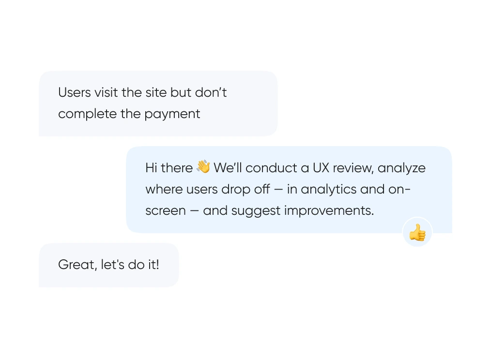
We start with real behavior: run UX reviews, analyze the full funnel, and identify exactly where and when users drop off.
We build out logic and structure — from user flows and prototypes to final layouts. Everything gets tested before it ever reaches code.
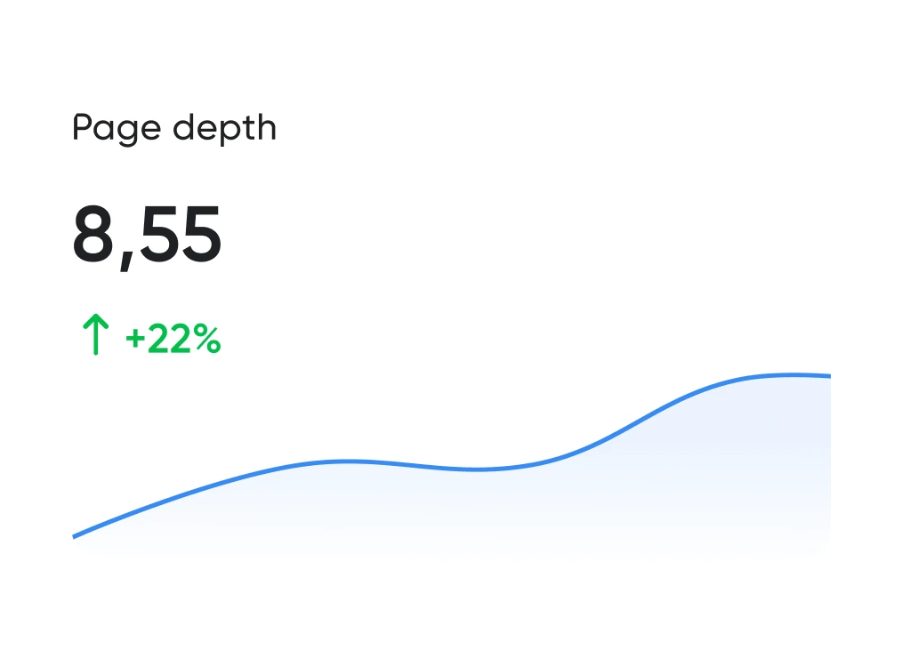
Looking good is the easy half. The work is working well. We track the numbers: time to complete key actions, scroll depth, conversion rate. All measurable.
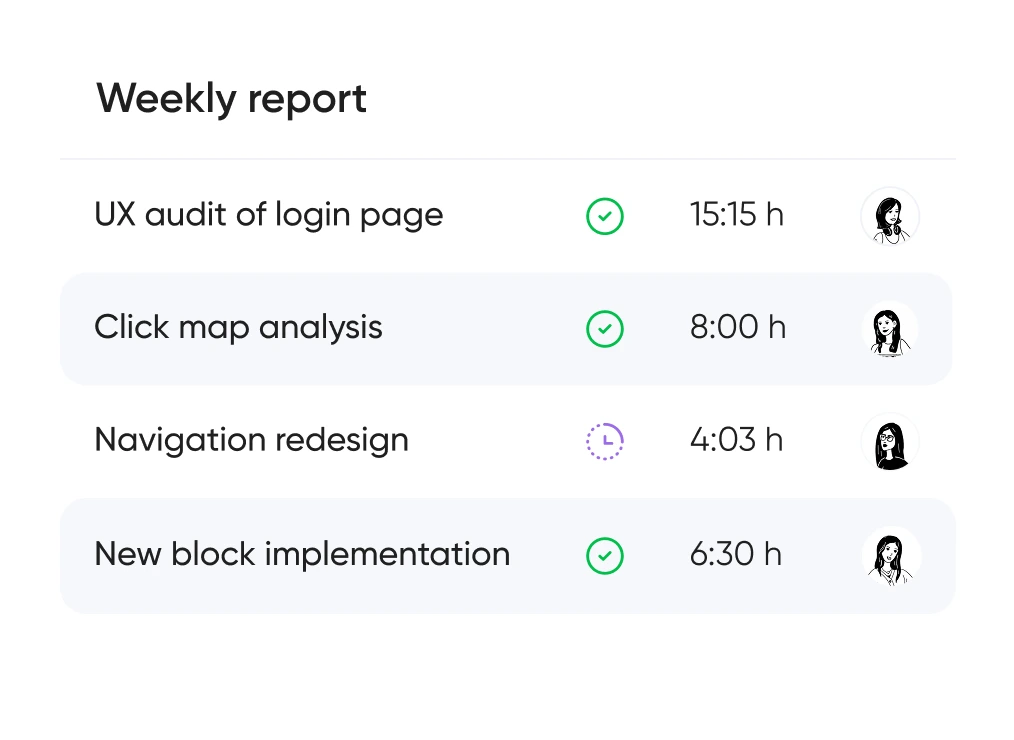
You always know which hypotheses we’re testing, what we’re improving — and why. No design for design’s sake — only what brings real business value.


Support for launching, refreshing, or rethinking an interface — at the right pace
and tailored to your product and business goals.
Pricing is tailored to each project — based on its stage, scope, and business objectives.
We use only the tools that help us create intuitive, responsive, and scalable interfaces.
UX/UI design for ecommerce, fintech, edtech, and more.
Didn’t find what you were looking for? Drop us a line at info@toimi.pro.
Long Beach design audiences combine sophisticated corporate professionals (Molina Healthcare, modern aerospace, port logistics decision-makers), affluent Belmont Shore and Naples consumers, the substantial Cambodian-American and Latino communities with specific cultural design expectations, and engineering decision-makers with high standards. Design serving these audiences must balance corporate professional polish with consumer accessibility, accommodate multicultural design conventions, and meet engineering audience expectations for usability and technical precision. Generic Hollywood-style design fails consistently in Long Beach contexts.
Our process includes user research with Long Beach audience representatives, information architecture defining content and functionality structure, low-fidelity wireframes establishing interaction patterns, prototype development supporting evaluation, usability testing with appropriate user representatives, high-fidelity visual design with design system development, design system documentation supporting ongoing development, and design implementation support during engineering. The depth respects Long Beach audience sophistication.
Design timelines depend on project scope. Focused MVP product design runs 8-14 weeks. Mid-complexity product design with substantial information architecture and design system development requires 12-22 weeks. Enterprise product design for Molina-scale operations, modern aerospace systems, port logistics platforms, and healthcare networks runs 18-32 weeks. Multilingual design accommodating Long Beach diverse audiences adds appropriate timeline for cultural design accommodation.
User research approaches include qualitative interviews with Long Beach audience representatives, usability testing identifying interface effectiveness, ethnographic research for complex audience contexts, quantitative testing where statistical confidence matters, competitive UX analysis examining Long Beach audience experience with competitive products, and synthesis of research findings into actionable design direction. For Long Beach corporate audiences, research often requires substantial coordination with Molina-scale, modern aerospace, or healthcare organizations.
Design systems support consistent design across product growth. We develop design systems including comprehensive component libraries, color and typography systems, iconography and illustration systems, motion and animation specifications, and component usage documentation. For Long Beach enterprises with multiple products or web-mobile parity requirements, unified design systems enable consistent experience across digital touchpoints. Design systems substantially affect long-term product development efficiency and consistency.
Multicultural design extends substantially beyond translation — information density preferences, color usage patterns, typography conventions, hierarchy preferences, and interaction pattern preferences differ across audiences. For Long Beach products serving Cambodian-American audiences, Latino-market audiences, Filipino-American audiences, and broader diverse Long Beach community, cultural design accommodation substantially affects product effectiveness across audience segments.
Accessibility includes proper screen reader support for visually impaired users, sufficient color contrast meeting WCAG standards, keyboard navigation supporting users without precise pointing devices, motion sensitivity accommodation, sufficient touch target sizing, and proper semantic structure for assistive technology. For Long Beach healthcare products particularly (Long Beach Memorial-affiliated, MemorialCare network, Molina Healthcare member portals, VA Medical Center adjacent), accessibility implementation is regulatory requirement rather than optional consideration.
Product design evolves continuously based on usage data and changing requirements. We provide ongoing design partnership including analytics review identifying user behavior patterns, A/B testing for interface variations, additional research as new audience segments emerge, design system evolution as products grow, and ongoing design support across product development. For Long Beach products with long-term operation, design partnership ensures products remain modern across years of evolution.


