Not a typical request? No problem.
Get in touch

UX reviewed, UI redesigned, interfaces refreshed — all to make things easier for users and better for business.
Need to test an idea fast, without going all in?
Expect a streamlined, functional UX/UI in no time.
Visitors getting lost and dropping off?
Time to adjust user navigation logic.
Afraid a redesign could do more harm than good?
The update will be careful — what works stays untouched.
No one to take care of UX/UI design?
From UX research to clean UI mockups — we’ve got it covered.
A digital product sold to consumers in the Netherlands now sits under two pressures that land directly on the design team. The first is legal. The European Accessibility Act applies to a wide group of consumer products and services across the EU, including online shops, banking services, e-books, ticketing and transport information. The second is linguistic. Many people use Dutch and English interchangeably, and a product that handles only one of them feels unfinished.
Start with the law, because it changes the definition of done. The Act describes outcomes: an interface that can be perceived, operated and understood by people with different abilities. The practical reference for meeting it is EN 301 549, the European harmonised standard for accessibility of digital products. Its web requirements are built on WCAG success criteria. So a team already designing to WCAG level AA is close. A team that treats accessibility as a final audit is not.
What does that mean inside the design file? Colour pairs get checked for contrast when the palette is set, before any screen exists. Focus states are drawn as deliberately as hover states. Every icon button gets a written name. Forms get visible labels, since placeholder text disappears the moment someone types. Error messages point at the field and say how to fix it.
There is a second effect that buyers often miss. The Act also asks for accessibility information about the service itself. That usually means a statement explaining how the product meets the requirements and where it still falls short. The designer can help write it honestly, because the designer knows which components were tested and which were assumed.
Now the language question. Dutch words are often longer than their English counterparts, and compound nouns do not break politely. A navigation label that fits comfortably in English can wrap onto two lines in Dutch. Buttons grow. Table headers collide. Truncating with an ellipsis is a poor fix, because it hides exactly the word the user needed.
The safer habit is to design every key screen in the longer language first. Components get flexible widths, labels are allowed to wrap, and the layout is reviewed with real Dutch copy instead of lorem ipsum. Date formats, decimal commas and address fields follow Dutch conventions when the interface is in Dutch. Postcodes have their own pattern, and the form should accept it without complaint.
Switching language needs its own small piece of design. Put the switcher where people look for it, usually the header, and label each option in its own language. Keep the user on the same page after the switch. Remember the choice. Never use flags, since a flag names a country and several countries share these languages.
Accessibility and language also meet. Screen readers pronounce text according to the declared language of the page. If a Dutch screen carries an English product name or a quoted phrase, that fragment should be marked, or the voice will mangle it. Small detail. It decides whether a blind user hears a sentence or noise.
None of this requires a separate project. It requires writing these rules into the component library at the start, so every new screen inherits them.
Most interface designs show two moments: the empty screen and the finished result. The seconds in between get almost no attention. Yet that interval is where users decide whether the product is working, broken or simply slow. A report that takes twenty seconds to build feels very different depending on what the screen does meanwhile.
Begin by sorting waits by length. Under a second, show nothing special. A spinner that flashes for a fraction of a second only makes the product feel jumpy. Between one and a few seconds, a light indicator in place of the content is enough. Beyond that, people need information.
Skeleton screens suit the middle range. They draw grey shapes where the text and images will appear, so the page has a structure before the data arrives. The trick is honesty. The skeleton must match the real layout closely, otherwise the content jumps when it loads and the user loses the line they were reading.
Longer operations need a real progress indicator. A determinate bar works when the system knows how much is done, such as an upload measured in bytes or an import measured in rows. When the system cannot know, a bar that crawls and then stalls near the end does more harm than a plain message. Tell the user what is happening instead. Checking the file. Matching customers. Building charts.
Very long work should leave the foreground entirely. Exports, bulk imports and video processing can run in the background while the person carries on. The design then needs three extra parts: a clear confirmation that the task started, a place to see its status later, and a notification when it finishes or fails. Without these, users start the same job twice.
Failure deserves as much design as success. A task that fails after two minutes should say which step broke and whether any part was saved. Can the user retry from where it stopped? Does the retry button keep their settings? These answers belong in the mockup, not in a developer guess.
Cancellation is often forgotten. If a user can start something slow, they should be able to stop it. The cancel control must be visible during the wait, and the product should explain what state it returns to afterwards.
There is also a writing task here. Messages during a wait are read by anxious people. Short, specific text works better than cheerful filler. Nobody wants a joke while their payroll file is uploading.
Optimistic updates are a related tool. When an action almost always succeeds, such as starring an item or renaming a folder, the interface can show the result immediately and confirm with the server in the background. If the server later refuses, the change is reversed with a clear notice. Used on the right actions, this removes many waits altogether without hiding real errors from the person who caused them.
A useful test is to throttle the network in the browser and walk through the main flows at a slow speed. Every blank area, every frozen button, every sudden layout jump becomes obvious within minutes. The designer then has a list of states to draw, and the developers have a specification instead of an assumption.
Finally, agree on thresholds with the engineering team. Which delay triggers a skeleton, which one triggers a message, and when does a task move to the background? Written down once, those rules keep the product consistent as new features arrive.
We focus on what matters: user behavior, thoughtful structure, and data-driven improvements. Design that is measured, then proven to work.
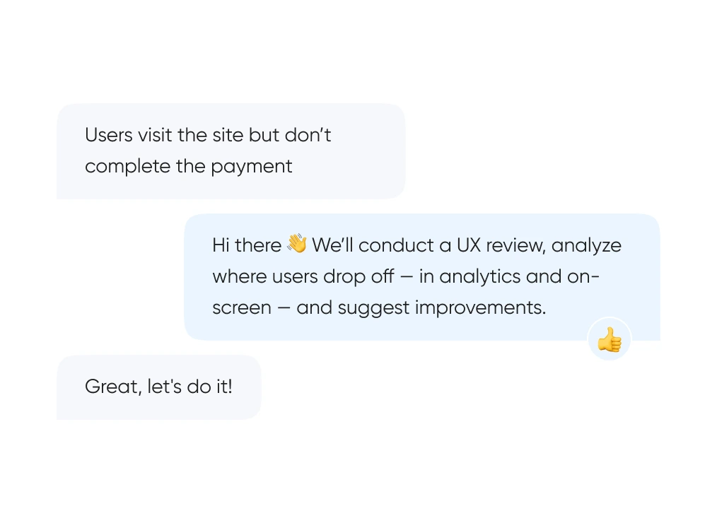
We start with real behavior: run UX reviews, analyze the full funnel, and identify exactly where and when users drop off.
We build out logic and structure — from user flows and prototypes to final layouts. Everything gets tested before it ever reaches code.
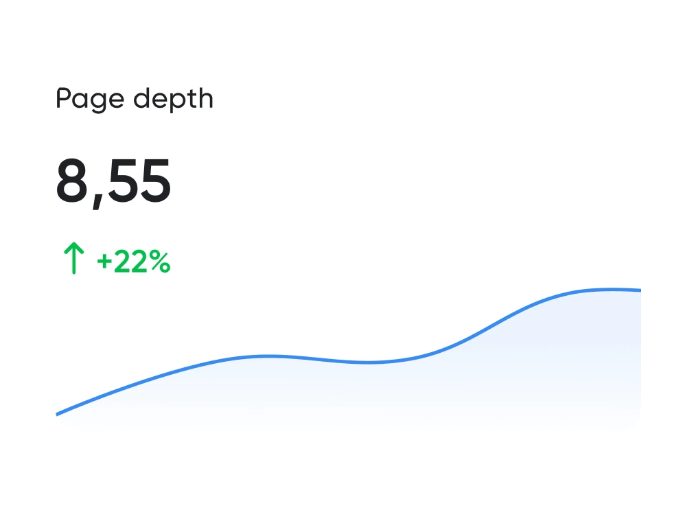
Looking good is the easy half. The work is working well. We track the numbers: time to complete key actions, scroll depth, conversion rate. All measurable.
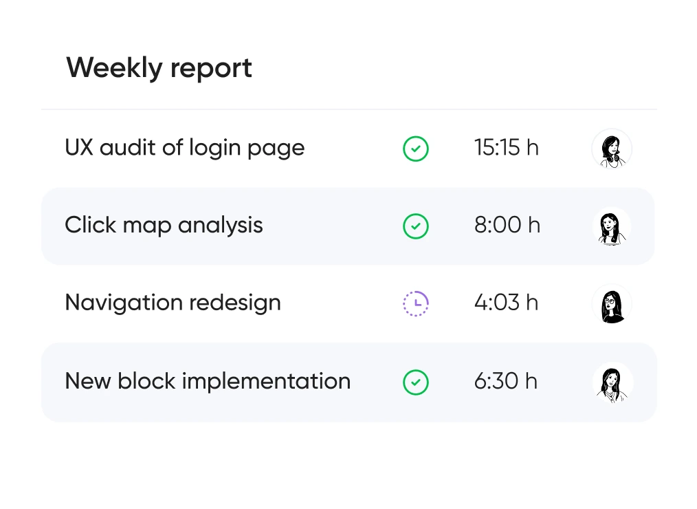
You always know which hypotheses we’re testing, what we’re improving — and why. No design for design’s sake — only what brings real business value.


Support for launching, refreshing, or rethinking an interface — at the right pace
and tailored to your product and business goals.
Pricing is tailored to each project — based on its stage, scope, and business objectives.
We use only the tools that help us create intuitive, responsive, and scalable interfaces.
UX/UI design for ecommerce, fintech, edtech, and more.
Didn’t find what you were looking for? Drop us a line at info@toimi.pro.
We research user behavior, design interface logic, create clear visual layouts, and provide support after launch.
Final cost depends on the number of screens, level of detail, and whether research is included.
We can join at any stage — from UX analysis to full handoff to development. Happy to work with your team or handle the project end-to-end.
That's totally fine. We often step in to redesign specific blocks, audit funnels, or add new flows to an existing interface.
Both. We design personal accounts, services, marketplaces, CRMs, and corporate portals — and make complex products feel simple and intuitive.


