Not a typical request? No problem.
Get in touch

UX reviewed, UI redesigned, interfaces refreshed — all to make things easier for users and better for business.
Need to test an idea fast, without going all in?
Expect a streamlined, functional UX/UI in no time.
Visitors getting lost and dropping off?
Time to adjust user navigation logic.
Afraid a redesign could do more harm than good?
The update will be careful — what works stays untouched.
No one to take care of UX/UI design?
From UX research to clean UI mockups — we’ve got it covered.
Some products are used one item at a time. Others are used by someone who has to archive two hundred tickets, reassign a batch of leads or change the price of an entire product category before lunch. For that person, bulk actions are the product. If they are missing or awkward, the user falls back on repetitive clicking, or on asking a developer to run a script.
Selection comes first. A checkbox on each row is the familiar pattern, with a master checkbox in the header. The master checkbox raises an immediate question. Does it select the rows visible on this page, or every row that matches the current filter? Both are valid. The interface must say which one happened, and offer the other as a follow-up link.
Range selection saves a lot of effort. Holding Shift to select everything between two clicked rows is a habit people bring from file managers and email. Supporting it costs little. Keeping the selection while the user scrolls or changes pages costs more, but it prevents a painful surprise.
Once rows are selected, the available actions should appear close to the selection. A toolbar that replaces the table header while items are chosen works well. It shows the count, the actions and a way to clear the selection. Actions that do not apply to every selected item should be disabled with a reason, not hidden.
Mixed states need thought. Suppose five selected records have different owners and the user opens the owner field. Showing one of the five names would be misleading. The field should read as mixed, and changing it should apply one value to all five. The same logic holds for tags, statuses and dates.
Then there is risk. Deleting one record by mistake is irritating. Deleting three thousand is a support incident. Bulk operations that destroy or overwrite data should state the exact count before they run and ask for confirmation in plain words. For the largest ones, typing the number or a short word is a reasonable extra step.
Undo is better than confirmation where the system allows it. A short window after the action, with a clear undo button, lets people move fast without fear. Soft deletion on the back end makes this possible. This is a decision for engineering, so it should be raised during design rather than discovered afterwards.
Large batches take time. The interface should report progress, handle partial failure and list exactly which items did not change and why. A single message that says something went wrong leaves the user unable to fix anything.
Permissions add a final layer. A user may be allowed to edit some of the selected records and not others. The product should apply the change where it can and report the rest, instead of rejecting the whole batch.
Testing bulk flows needs realistic volume. A prototype with eight rows hides every problem worth finding. Load the test environment with thousands of items and watch someone try to clean them up.
Users now expect a dark option in many products, and operating systems let them request it by default. Adding one looks simple on a roadmap. Invert the background, lighten the text, ship it. In practice a dark theme is a second colour system, and it exposes every shortcut taken in the first one.
Pure black is rarely the right background. Very dark grey is easier on the eyes, reduces the harsh glow of white text and leaves room to show depth. On a light theme, depth comes from shadows. On a dark one, shadows barely register, so raised surfaces such as cards and menus are shown as slightly lighter tones instead.
Text needs its own care. Bright white on near black can shimmer for some readers, especially in long passages. Softer off-white for body text, with full white reserved for headings, tends to read better. Secondary text still has to pass contrast checks. Grey that looked fine on white often fails badly on charcoal.
Brand colours cause the most trouble. A saturated blue that works on a white page can vibrate against a dark one or lose contrast entirely. Most teams end up with adjusted versions of each accent colour for the dark theme. That is fine. The brand is recognised by hue and usage, and a small shift in lightness does not break it.
Status colours need the same treatment. Red for errors, amber for warnings and green for success all have to stay distinguishable and readable on the darker surfaces. Charts are a common casualty. A data palette tuned for white backgrounds can turn muddy, so charts deserve their own review.
Images and illustrations raise awkward questions. Product screenshots with white backgrounds glare out of a dark page. Logos supplied as dark artwork disappear. Sometimes the answer is a second version of the asset. Sometimes it is a subtle frame or a dimmed treatment. Someone has to decide for each type of image.
The cleanest way to build all this is with design tokens. Instead of hard-coding colours, each element refers to a role: page background, raised surface, primary text, border, accent. The light and dark themes then assign values to the same roles. A new component automatically works in both, provided it uses roles and not raw colour values.
Retrofitting a dark theme onto a product without tokens is slow. Every screen has to be inspected, and hard-coded colours hide in old components and third-party widgets. It is often worth doing the token work first, even if the dark theme ships later.
Finally, respect the preference. Follow the system setting by default, offer a manual override in settings, and remember the choice. Test both themes in every review, or one of them will quietly decay. Screenshots in documentation and marketing pages should show both, so nobody forgets the second one exists.
We focus on what matters: user behavior, thoughtful structure, and data-driven improvements. Design that is measured, then proven to work.
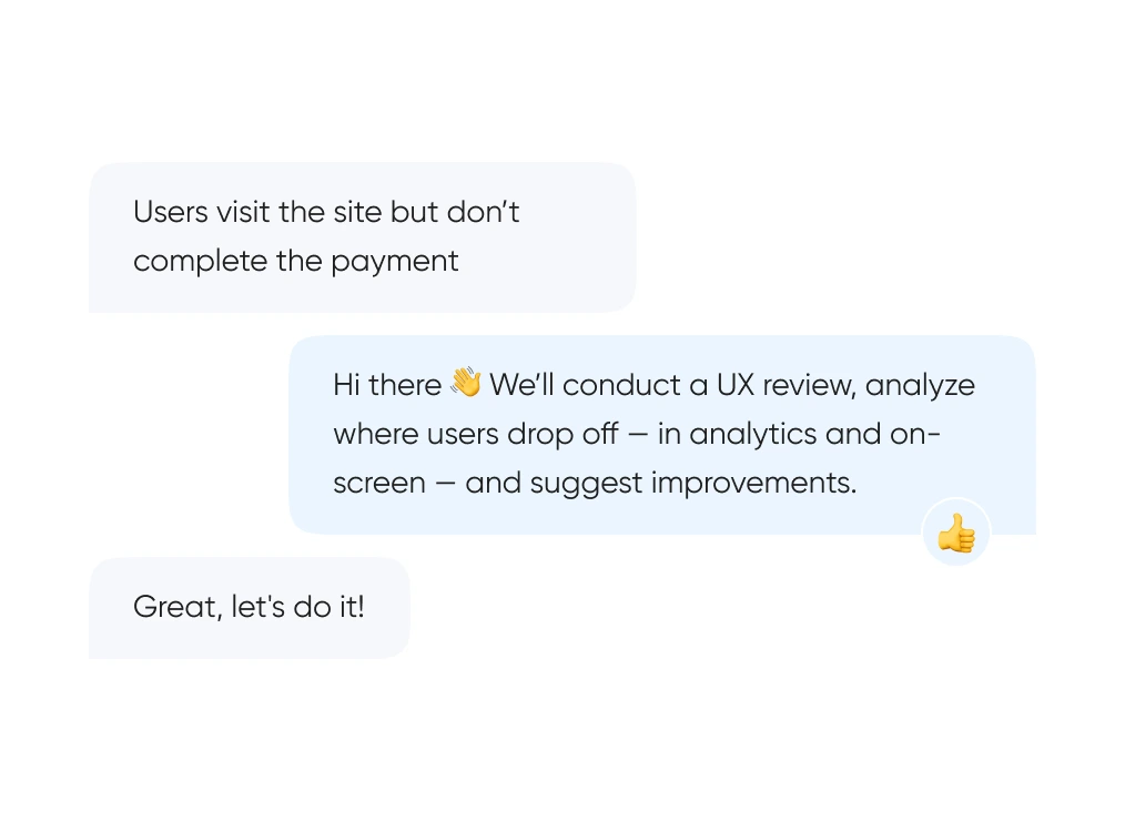
We start with real behavior: run UX reviews, analyze the full funnel, and identify exactly where and when users drop off.
We build out logic and structure — from user flows and prototypes to final layouts. Everything gets tested before it ever reaches code.
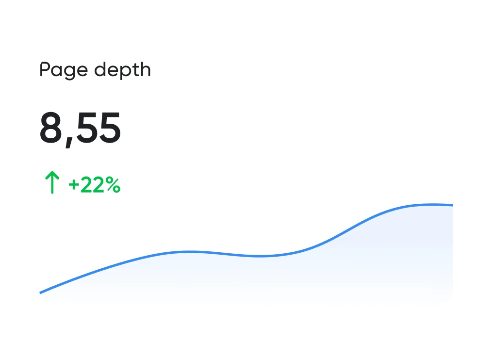
Looking good is the easy half. The work is working well. We track the numbers: time to complete key actions, scroll depth, conversion rate. All measurable.
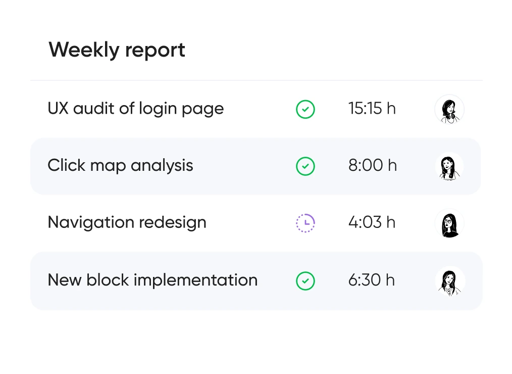
You always know which hypotheses we’re testing, what we’re improving — and why. No design for design’s sake — only what brings real business value.


Support for launching, refreshing, or rethinking an interface — at the right pace
and tailored to your product and business goals.
Pricing is tailored to each project — based on its stage, scope, and business objectives.
We use only the tools that help us create intuitive, responsive, and scalable interfaces.
UX/UI design for ecommerce, fintech, edtech, and more.
Didn’t find what you were looking for? Drop us a line at info@toimi.pro.
Berkeley sits in the Bay Area — users here interact with Apple, Google, and the best digital products daily. UC Berkeley's HCI program produces graduates who notice every design flaw. Poor UX means instant abandonment. For Berkeley's biotech companies, companion app UX directly impacts product perception and clinical adoption.
User research, information architecture, wireframing, visual design, prototyping, and usability testing. Berkeley businesses get designs validated with real users before code is written — eliminating expensive mid-development redesigns.
Focused design sprint for a key flow takes 2-3 weeks. Full product design for web or mobile takes 6-12 weeks. Berkeley biotech startups often run rapid sprints to validate research tool concepts before committing to full development.
Screen count, research depth, prototyping fidelity, and user flow count. A marketing site costs less than a complex SaaS dashboard with multiple researcher roles. We scope Berkeley projects based on journeys that most impact business outcomes.
Yes. User interviews and usability tests with participants matching your actual Berkeley demographics — UC students, researchers, biotech professionals, or local consumers. Research reveals how different user groups navigate interfaces, insights that homogeneous testing panels miss.
Absolutely. UX audit first — identifying friction, drop-offs, and accessibility issues. Redesign addresses validated problems. Berkeley SaaS and research tool companies see measurable metric improvements after research-driven redesigns.
Interactive Figma prototypes — click through real flows, not static mockups. Design rationale explaining each decision. Structured review sessions with annotation tools for Berkeley teams.
Yes. Organized Figma files with component libraries, spacing systems, and interaction specs. Berkeley development teams implement pixel-perfectly without constant designer back-and-forth.


