Not a typical request? No problem.
Get in touch

UX reviewed, UI redesigned, interfaces refreshed — all to make things easier for users and better for business.
Need to test an idea fast, without going all in?
Expect a streamlined, functional UX/UI in no time.
Visitors getting lost and dropping off?
Time to adjust user navigation logic.
Afraid a redesign could do more harm than good?
The update will be careful — what works stays untouched.
No one to take care of UX/UI design?
From UX research to clean UI mockups — we’ve got it covered.
A bank, a fintech, or a checkout page selling to customers in Germany answers to the second Payment Services Directive, usually shortened to PSD2. The directive sets a European standard. It governs how a payment or a login must be proven to truly belong to the customer making it. For a designer, that standard becomes a screen. It is the moment a customer stops browsing and has to confirm who they are before money moves.
The rule at the centre of PSD2 is strong customer authentication, or SCA. Two factors are required. They must come from two different categories out of three. Two items from the same category do not count. Knowledge is something only the customer knows, such as a PIN or a password. Possession is something only the customer holds, typically a registered phone or a hardware token. Inherence is something the customer is, read through a fingerprint or a face scan on the device. A password paired with a second password fails the test. A password paired with a phone the customer already owns passes it.
German banks and payment providers have largely settled on app based approval rather than a code sent by text message. A customer starts a payment online. A push notification opens the banking app on a paired phone. The customer reviews the request inside the app and approves it with a fingerprint or a face scan, supplying two of the three required factors in one motion. This sidesteps a known weakness of text message delivery, where a message can be intercepted, delayed, or redirected through a swapped SIM.
Designing for this pattern means designing across two screens that do not talk to each other in real time. The checkout or login screen has to wait, visibly, while the customer switches to a banking app. A clear waiting state matters here. A spinner alone explains nothing. It reads as a broken payment. A customer who closes the tab out of doubt has abandoned a transaction that was seconds from completing.
Some payments can skip full strong authentication under PSD2. The exemptions are worth knowing, even in general terms. A low value payment, small enough that the regulatory risk is limited, can sometimes go through without a full step. A trusted beneficiary works the same way. The customer marks a recipient as trusted, and future payments to that recipient can skip repeated checks. Neither exemption is automatic. The bank decides case by case. It weighs the risk each time. A design should never assume an exemption will apply.
One requirement shapes the approval screen itself: dynamic linking. The amount and the payee of a transaction must be generated at the moment of authentication and shown to the customer as part of the approval step. Nothing carries over from an earlier screen. Nothing gets reused. If either value changes after a customer authorises a payment, the authorisation no longer covers the new transaction. The approval screen must always render the live amount and the live payee name, pulled fresh from the transaction actually being confirmed.
Timeout and fallback only get attention after something goes wrong. A push approval request has to expire. Leaving it open indefinitely would let an old request linger and get approved by mistake later. A short window, closed with a clear expired state, keeps the customer oriented. Fallback matters just as much. A phone can be lost, switched off, or without signal at the exact moment approval is needed. That gap is easy to miss. A product built only around the app based path, with no secondary route such as a hardware token, leaves some customers stranded at the final step of a purchase.
None of this is a reason to make the flow feel like a security checkpoint. The categories, the dynamic linking, and the timeout behaviour are constraints a designer works inside. They are not a script to read aloud to the customer. The best flows explain this quickly. Then they step aside, and let the customer finish the job.
A form with thirty fields on one screen looks efficient to whoever built it. It looks exhausting to whoever has to fill it in. Splitting that same form into a sequence of shorter steps, sometimes called a wizard, trades one long decision for several small ones. Not every step earns its place, though. The trade only pays off when each one does. The customer also needs to always know how many steps remain.
The first design decision is how to group fields. Grouping matters more than it looks. Steps built around a single decision the customer already has in mind, such as shipping details, then payment details, then a final review, tend to feel natural. Steps built around how the database happens to be organised feel different. Fields get scattered by table rather than by task. That kind of step feels arbitrary, and it gets abandoned halfway through.
Progress indication is not decoration. A numbered sequence, a bar that fills in, or a simple label such as step two of four gives the customer a reason to keep going. There is an end point. It is visibly getting closer. Hiding that information, on the theory that a shorter looking form converts better, tends to backfire. The customer reaches step four with no warning there would be a step five.
Saving partial progress is the feature that turns a wizard from a gamble into a safe bet. A customer who starts a long application on a phone during a commute and finishes it later on a laptop should not have to start over. Save state after every step. Do not wait until the very end. That protects work already done from a dropped connection, a closed tab, or a phone that simply runs out of battery.
Validation timing deserves its own decision, separate from the layout of the steps. Checking a field the instant the customer leaves it catches small mistakes early. A malformed email address gets caught while the context is still fresh. Waiting until the very end is worse. It reveals five different problems at once, and forces the customer to scroll back through steps already considered finished.
Not every long form deserves to become a wizard. A short list of related fields, all part of one clear decision, can stay on a single screen without confusing anyone. The pattern earns its complexity only when the fields split into separate stages. Each stage should carry its own moment of doubt. That doubt takes real time to resolve.
Exiting and returning is the case most designs forget. A customer who abandons a wizard at step three and comes back a day later needs to land somewhere sensible. That might be the exact step they left, or a summary showing what has already been filled in. Dumping them back at step one, fields empty, undoes every argument in favour of breaking the form up in the first place.
The steps a customer sees rarely match the steps a developer builds behind them one to one. That is fine. What matters is that the visible sequence reflects how a person actually thinks through the task. It should not simply mirror how the underlying record happens to be structured.
Ask five designers on the same product to space a button away from its label. Without a shared rule, five different answers will show up in the shipped interface. A spacing scale is the fix. It is a short list of numbers, such as four, eight, sixteen, and thirty two pixels, that every gap and every margin in the product draws from.
The value of the scale is not any single number in it. It is that a developer who needs a gap does not invent one. A value gets picked from a list everyone already uses. Nothing gets improvised. Across dozens of screens, built by different people at different times, that discipline is what keeps a product from feeling stitched together from several smaller ones.
A layout grid does the same job at a larger scale. Columns, gutters, and margins define where content can sit on a page or a screen. A heading, a card, and a table row all line up. Nobody who built them ever compared notes. Breaking the grid on purpose, to make one element stand out, only works because the grid is visible everywhere else.
Vertical rhythm is the part of this system that gets noticed only when it is missing. Headings, paragraphs, and list items each carry their own space above and below. Those spaces need to relate to each other by simple ratios, not by whatever felt right at the time. A page where every block sits a slightly different distance from its neighbour reads as sloppy, even to someone who could not say exactly why.
Density is the setting that spacing scales quietly control. A marketing page can afford generous gaps, because it asks the visitor to read and absorb. A data heavy admin screen is different. Rows get scanned quickly, not read. It needs tighter spacing, so more information sits in view without forcing a scroll for every decision.
None of this needs to be invented from scratch for each project. A base unit, a small multiplier, and a short set of allowed values cover most layout decisions a product will ever need. The scale should be small enough to remember. It should also be large enough to cover a dense table, a spacious landing section, and everything in between.
Enforcing the scale is a separate problem from defining it. A written rule that nobody checks drifts within a few sprints, as one screen after another introduces a value that seemed close enough at the time. Building the scale into shared components closes that gap far more reliably. A spacing value then has to be chosen from a limited set, rather than typed in freehand.
A spacing system does not make a product beautiful on its own. It removes one category of small decisions. That category is inconsistency, screen after screen. Whatever attention is left over can then go toward the decisions that actually need a human judgement call.
We focus on what matters: user behavior, thoughtful structure, and data-driven improvements. Design that is measured, then proven to work.
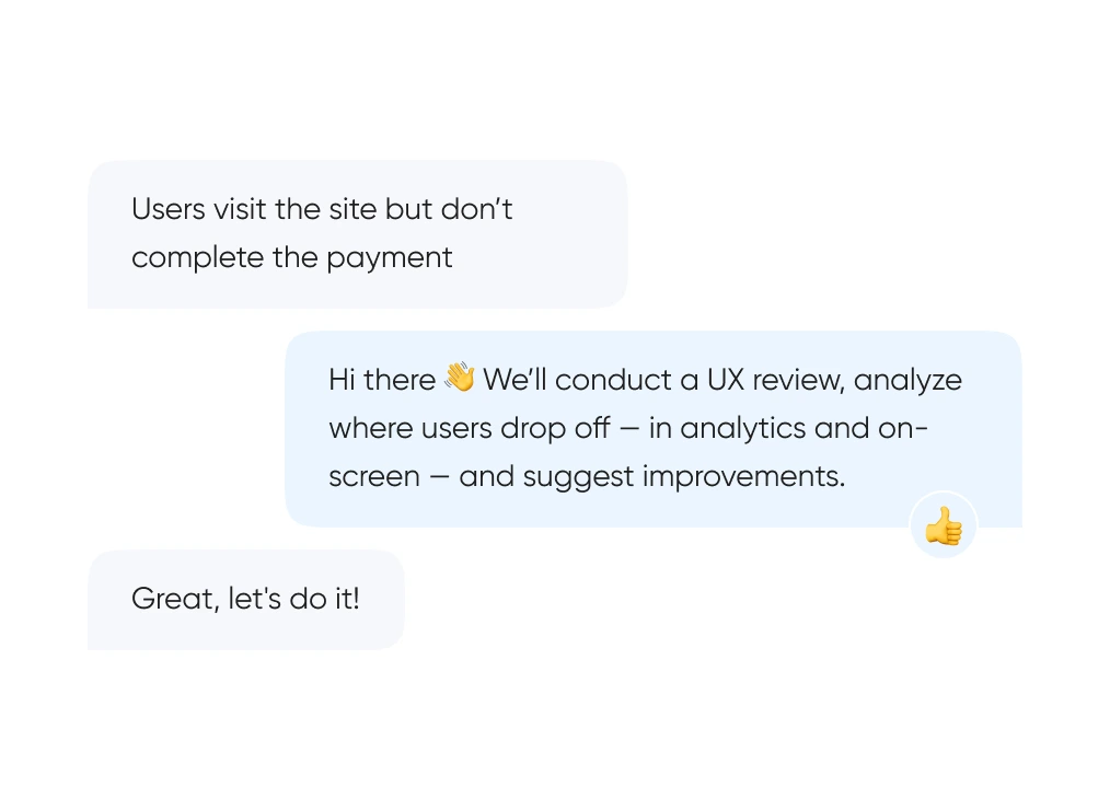
We start with real behavior: run UX reviews, analyze the full funnel, and identify exactly where and when users drop off.
We build out logic and structure — from user flows and prototypes to final layouts. Everything gets tested before it ever reaches code.
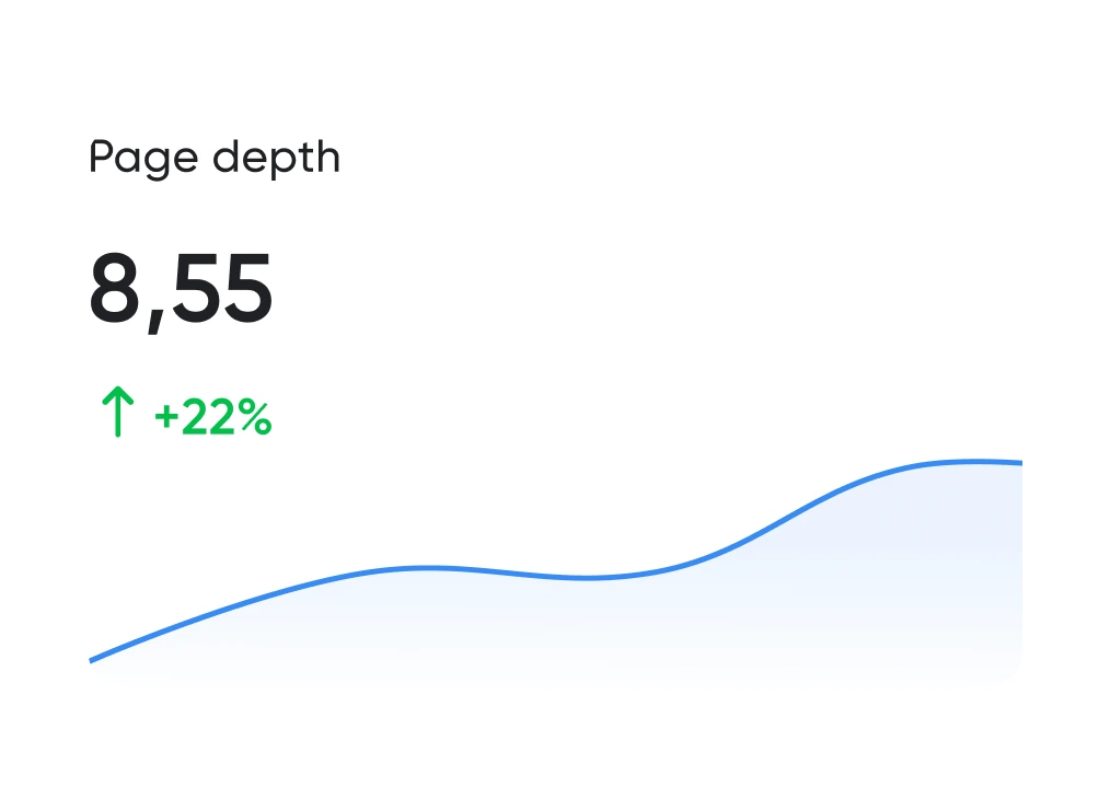
Looking good is the easy half. The work is working well. We track the numbers: time to complete key actions, scroll depth, conversion rate. All measurable.
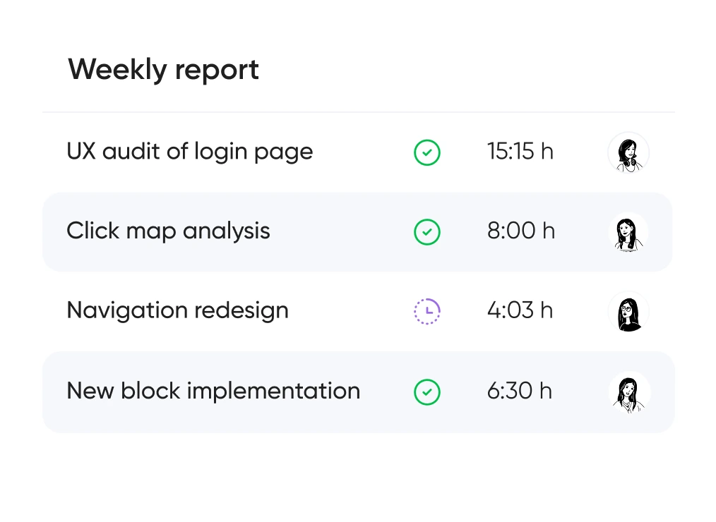
You always know which hypotheses we’re testing, what we’re improving — and why. No design for design’s sake — only what brings real business value.


Support for launching, refreshing, or rethinking an interface — at the right pace
and tailored to your product and business goals.
Pricing is tailored to each project — based on its stage, scope, and business objectives.
We use only the tools that help us create intuitive, responsive, and scalable interfaces.
UX/UI design for ecommerce, fintech, edtech, and more.
Didn’t find what you were looking for? Drop us a line at info@toimi.pro.
We research user behavior, design interface logic, create clear visual layouts, and provide support after launch.
Final cost depends on the number of screens, level of detail, and whether research is included.
We can join at any stage — from UX analysis to full handoff to development. Happy to work with your team or handle the project end-to-end.
That's totally fine. We often step in to redesign specific blocks, audit funnels, or add new flows to an existing interface.
Both. We design personal accounts, services, marketplaces, CRMs, and corporate portals — and make complex products feel simple and intuitive.


