Not a typical request? No problem.
Get in touch

UX reviewed, UI redesigned, interfaces refreshed — all to make things easier for users and better for business.
Need to test an idea fast, without going all in?
Expect a streamlined, functional UX/UI in no time.
Visitors getting lost and dropping off?
Time to adjust user navigation logic.
Afraid a redesign could do more harm than good?
The update will be careful — what works stays untouched.
No one to take care of UX/UI design?
From UX research to clean UI mockups — we’ve got it covered.
Design systems are sold as the mature choice and bought too early. On a single product with one designer and two developers, a system is overhead: it formalises decisions that have not been made yet and slows the loop where most of the learning happens.
The value arrives with repetition. Two products, several teams, or a long-lived product with staff turnover. At that point the same button is being invented weekly, and the cost of inconsistency has become real rather than theoretical.
So the honest starting point is smaller than a system. It is an inventory. Screenshot everything that exists. Every button, every input, every card, every empty state. The result is usually uncomfortable: nine greys, four border radii, six versions of the same dialogue. That inventory is evidence, and it also tells you which components are worth building first, because it shows what is used most.
Tokens come next, and they are the durable layer. Colour, spacing, type scale and radius held as named values rather than numbers repeated across files. Rename a value in one place and the change propagates. Skip this and a system is a collection of pictures.
Components are only half the deliverable. The other half is the rule for when to use each one. Two buttons that look different and mean the same thing are a documentation problem, not a design problem. Every component needs the sentence that says what it is for and what it is not for.
States are where systems earn their keep, because they are where individual screens are weakest. Loading. Empty. Error. Disabled. Too much content. A component defined with all of those saves every future designer from inventing them badly under time pressure.
A system also needs an owner and a way in. If nobody can add to it, teams will work around it, and a system that is worked around is worse than none: it costs maintenance and delivers no consistency. A short contribution path and a named maintainer are what keep it alive.
Adoption should be measured rather than assumed. Count where components are actually used against where the local copies still live. That number tells you whether the investment is landing.
The last piece is a way to leave. Products change and parts of a system will be retired. Marking a component deprecated with a stated replacement and a date lets teams migrate on their own schedule. Removing it quietly produces the opposite.
Prototyping gets treated as one activity. It is at least two, and confusing them wastes weeks.
A demonstration prototype exists to show a direction. It is polished, it follows one happy path, and it is built to be watched. A question prototype exists to find something out. It can be ugly. It only needs the part under investigation.
Trouble starts when a question is asked of a demonstration. Watching somebody admire a smooth walkthrough tells you almost nothing about whether the model makes sense. The empty states, the errors and the awkward data are exactly what got removed to make it smooth.
So write the question first, before choosing the tool. Can a person find the setting without help. Does the sorting rule match what they expect. Is the form completable with the information they actually have to hand. Each of these suggests a different, usually smaller, artefact.
Fidelity should follow the question rather than the calendar. Paper answers structural questions faster than any software. A clickable flow answers navigation questions. Only performance, motion and real latency require something close to working code.
Data realism matters more than visual fidelity in most tests. A rough screen with plausible names, lengths and edge cases surfaces problems that a beautiful screen with placeholder text conceals entirely.
And set a disposal rule. A question prototype has served its purpose once the answer is recorded, and keeping it alive invites somebody to ask for it to be shipped. Write down what was learned. Then let the artefact go.
The uncomfortable version of an accessibility audit happens late. The design is approved, the build is nearly done, and a report arrives listing problems that reach back into decisions taken months earlier.
Some of what comes back is cheap. Missing labels, contrast that needs a shade adjusting, a focus outline that was removed for looks. These are hours of work and should simply be fixed.
The expensive findings are structural. A colour system whose accent fails against its own background. A navigation pattern that cannot be operated from a keyboard. A layout built around hover. A custom control reimplementing something the platform provides, without the behaviour that made it usable.
Triage should be by user impact rather than by the order in the report. A blocker that prevents a task being completed outranks a dozen advisory items, and auditors do not always rank them that way.
The structural findings need an honest conversation about the remedy. A patch that satisfies the checker without fixing the experience is the worst outcome, because it removes the pressure and leaves the problem. Rebuilding the control properly is usually cheaper over two years than maintaining the patched version.
Prevention is mostly a matter of moving two checks earlier. Contrast is decidable when the palette is chosen, which is before any screen exists. Keyboard operation is decidable when the interaction pattern is picked, which is before any code. Those two account for a large share of late findings.
It is worth recording what the audit found and what was done, with dates. The next audit starts from that record, and the same conversation does not have to happen twice.
White-labelled products change the design problem in ways teams underestimate. The interface has to work under a brand chosen by somebody else. Its users may never learn your company exists.
The first decision is how much is actually variable. A logo slot and one accent colour stays manageable. Typography, spacing, iconography and component shapes are a different order of commitment. Each new variable multiplies the combinations somebody has to check.
Colour is the usual place this goes wrong. A partner supplies a brand colour that fails contrast against the surface it lands on. Or it collides with a colour that already carries meaning. Keep the state colours out of the themeable set. Error, warning, success. Otherwise a brand red quietly means two things at once.
Density and layout have to hold across partners with different amounts to say. A navigation built for six items breaks at fourteen. One partner will have fourteen. Design the extremes first. Discovering them during an onboarding costs more.
There is a question of voice that often goes unasked. Error messages, empty states and help text carry a tone. A partner may want their own. Deciding early whether copy is themeable determines whether the strings live in the code or in configuration.
Testing needs a fixture set, not one example. Build three synthetic partner themes. A conservative one, a loud one, an awkward one. Between them they catch most of what real partners do, and they can run automatically on every change.
Finally, document the constraints for the people selling it. A promise of full customisation made in a meeting becomes an engineering obligation, and the boundary is much easier to hold when it was written down before the contract.
We focus on what matters: user behavior, thoughtful structure, and data-driven improvements. Design that is measured, then proven to work.
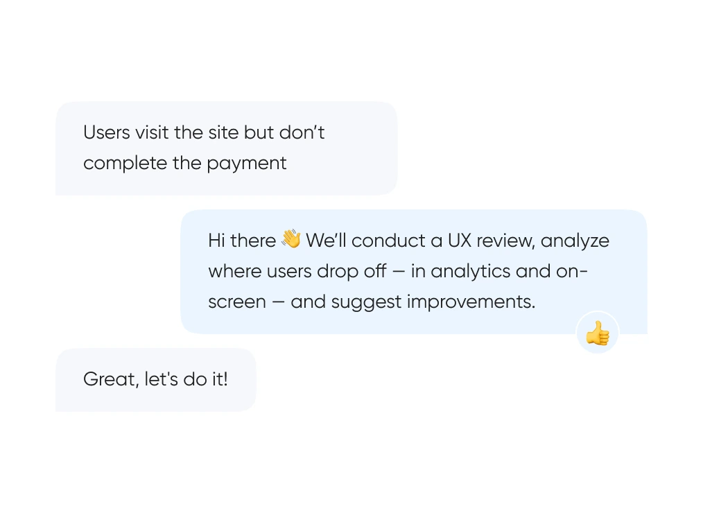
We start with real behavior: run UX reviews, analyze the full funnel, and identify exactly where and when users drop off.
We build out logic and structure — from user flows and prototypes to final layouts. Everything gets tested before it ever reaches code.
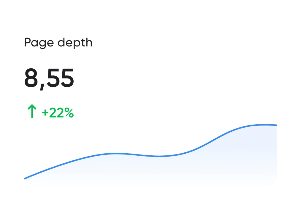
Looking good is the easy half. The work is working well. We track the numbers: time to complete key actions, scroll depth, conversion rate. All measurable.
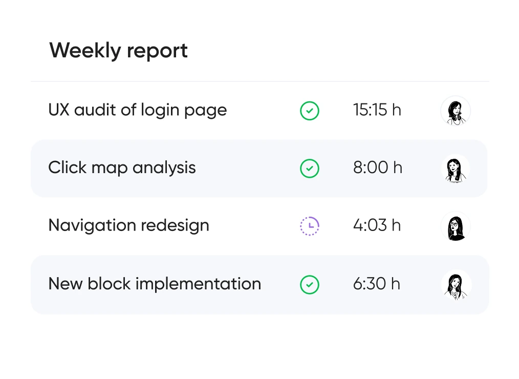
You always know which hypotheses we’re testing, what we’re improving — and why. No design for design’s sake — only what brings real business value.


Support for launching, refreshing, or rethinking an interface — at the right pace
and tailored to your product and business goals.
Pricing is tailored to each project — based on its stage, scope, and business objectives.
We use only the tools that help us create intuitive, responsive, and scalable interfaces.
UX/UI design for ecommerce, fintech, edtech, and more.
Didn’t find what you were looking for? Drop us a line at info@toimi.pro.
Mobile app development includes requirements analysis, UI/UX design, native or cross-platform coding, backend integration, testing, app store submission, and maintenance.
Yes. We develop iOS and Android applications for Philadelphia companies needing customer-facing apps, internal tools, or mobile-first solutions.
When mobile web limitations exist, offline functionality is required, device features are needed, or when app-based engagement improves customer experience.
Typically 14-26 weeks depending on platform choice, feature complexity, design requirements, and backend needs.
Native offers better performance and platform features; cross-platform reduces development cost and time. Choice depends on requirements and budget.
Yes. Apps share backends with web platforms, ensuring data consistency across all user touchpoints.
We manage submission process, ensure guideline compliance, address review feedback, and coordinate launch timing.
User authentication, data storage, API development, push notifications, analytics, and third-party integrations.
Yes. We provide ongoing updates for new OS versions, feature additions, bug fixes, and performance improvements.
Mobile apps create direct user channels, enable push engagement, support offline workflows, and differentiate from competitors.


