Not a typical request? No problem.
Get in touch

UX reviewed, UI redesigned, interfaces refreshed — all to make things easier for users and better for business.
Need to test an idea fast, without going all in?
Expect a streamlined, functional UX/UI in no time.
Visitors getting lost and dropping off?
Time to adjust user navigation logic.
Afraid a redesign could do more harm than good?
The update will be careful — what works stays untouched.
No one to take care of UX/UI design?
From UX research to clean UI mockups — we’ve got it covered.
Most dashboards start with a list of available data. Every metric the system can produce ends up on the screen: charts, counters, tables, trends. The result looks impressive in a demo and is almost useless in daily work. People open it, scan it, and still cannot tell whether something needs their attention.
A useful dashboard starts with a question. What does this person need to know when they open the screen? Whether sales are on track this week. Which orders are late. Which machines need a service. Each question suggests a small number of measures and a clear way to show them.
Different roles need different views. A manager wants trends and exceptions, while an operator wants the list of things to act on now. A single dashboard trying to serve both usually serves neither. Separate views, sharing the same data, work better.
Comparison gives numbers meaning. A figure on its own is hard to judge. The same figure next to last week, the target or the same period last year tells the reader immediately whether it is good or bad.
Exceptions deserve the most visual weight. Colour, position and size should draw the eye to what is wrong or unusual. If everything is highlighted, nothing stands out, and a calm screen with one red item is more useful than a screen full of green and amber.
Every number should lead somewhere. A reader who sees ten late orders will want to know which ones. Linking each figure to the list or record behind it turns the dashboard into a starting point for work rather than a report to read and close.
Definitions must be visible. Terms such as active customer, late order and conversion each hide a rule. A short explanation on hover or in a side panel prevents arguments about why two reports show different numbers.
Test with real users and real data. A layout that looks balanced with sample data may break when one figure is a hundred times larger than another, or when a list has three items one day and three hundred the next.
Review the dashboard after a few months. Usage data shows which parts people look at and which they ignore. Removing unused widgets makes the rest easier to read.
Mobile views need their own thinking. A dashboard designed for a wide monitor rarely survives on a phone. On a small screen, the most important question should come first, with a single figure and its comparison, and the detailed charts one tap away.
Empty and loading states count too. A dashboard that shows zero everywhere while data loads can cause alarm, so loading should look different from a real zero.
Many products are designed by people who spend all day on screens, for people who do the same. But a large share of real users are different. Older customers, people who use a computer only at work, people using a product in a second language, people who were pushed onto an app because the paper form disappeared. Designing for them is a skill of its own.
Low confidence is not the same as low ability. These users can complete complex tasks. What they lack is familiarity with conventions that designers take for granted: icons without labels, gestures without hints, menus hidden behind three lines. Each unexplained convention is a point where they may stop.
Plain labels help everyone. A button that says Save changes is clearer than a floppy disk icon. A link that says Show all orders is clearer than an arrow. Text costs a little space and saves a lot of hesitation.
One task per screen reduces anxiety. Long forms with many optional sections make people worry they have missed something. Breaking the task into short steps, with a clear sign of progress and a summary before the final action, gives them a sense of control.
Mistakes need a way back. Users with little confidence are often afraid of breaking something or losing data. Clear undo, confirmation before irreversible steps and a visible way to go back reduce that fear.
Size and contrast matter more than fashion. Small grey text on a white background may look elegant, but it fails many users. Larger tap targets, strong contrast and text that respects system font size settings make a product usable for far more people.
Help must be close to the problem. A help centre several clicks away is rarely used. A short explanation next to a difficult field, or a phone number on the screen where people get stuck, is far more effective.
Research with these users directly. Recruit through channels they actually use, such as community groups, libraries and customer service lines, as well as online panels. Watch them use the product in their own setting, on their own device. Their difficulties are often invisible to experienced testers.
Designing for these users usually improves the product for everyone. Clearer labels, fewer steps and forgiving flows help experts too, especially when they are tired or in a hurry.
Language matters beyond labels. Short sentences, common words and instructions written in the order people act help readers of any level. Legal and technical terms should be explained where they appear. Many teams test key screens with a readability checker and with people who read in a second language.
We focus on what matters: user behavior, thoughtful structure, and data-driven improvements. Design that is measured, then proven to work.
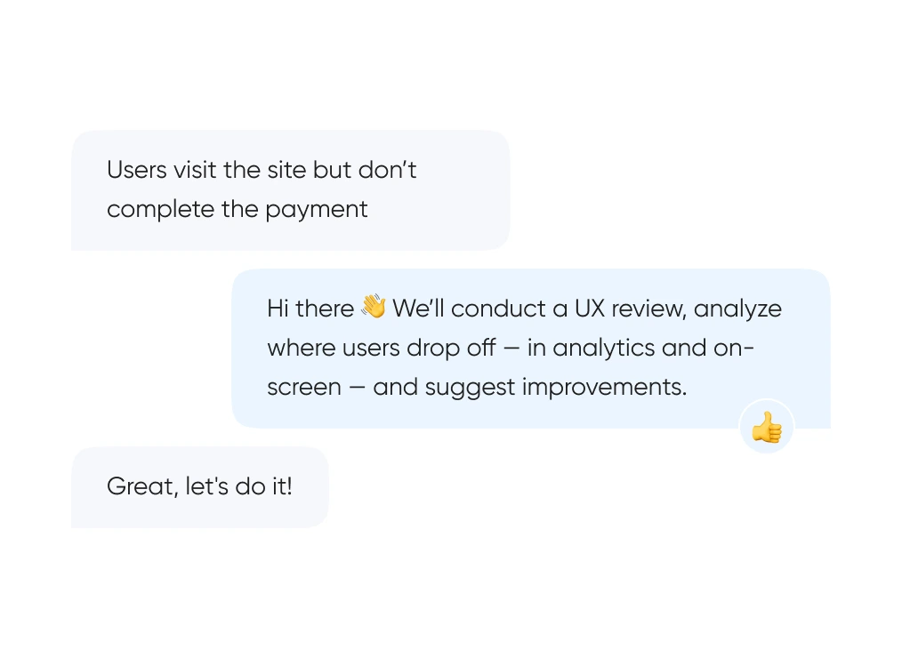
We start with real behavior: run UX reviews, analyze the full funnel, and identify exactly where and when users drop off.
We build out logic and structure — from user flows and prototypes to final layouts. Everything gets tested before it ever reaches code.
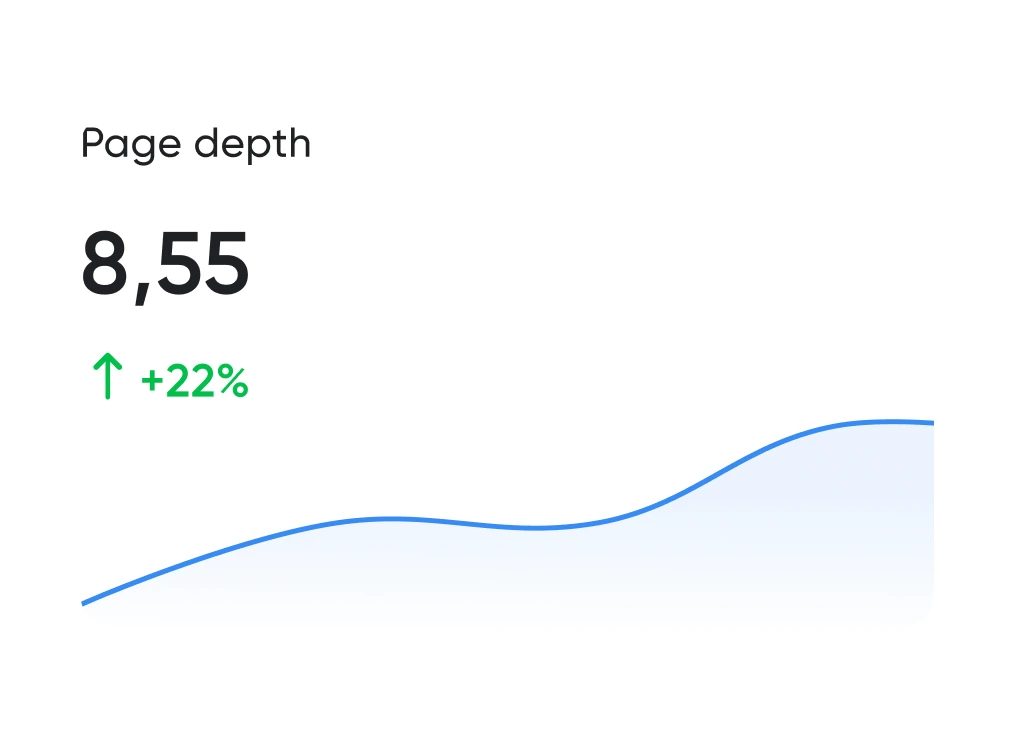
Looking good is the easy half. The work is working well. We track the numbers: time to complete key actions, scroll depth, conversion rate. All measurable.
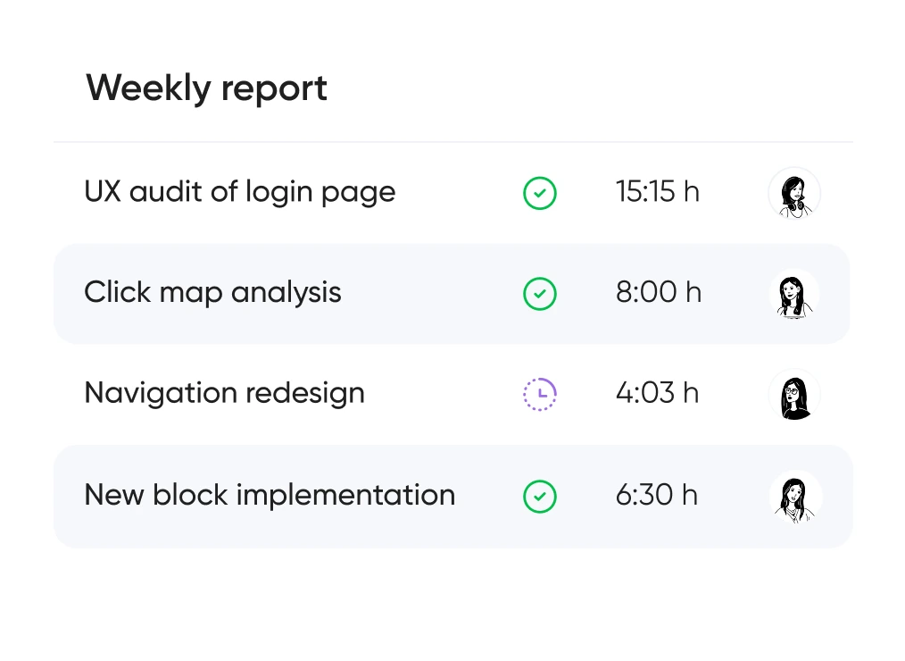
You always know which hypotheses we’re testing, what we’re improving — and why. No design for design’s sake — only what brings real business value.


Support for launching, refreshing, or rethinking an interface — at the right pace
and tailored to your product and business goals.
Pricing is tailored to each project — based on its stage, scope, and business objectives.
We use only the tools that help us create intuitive, responsive, and scalable interfaces.
UX/UI design for ecommerce, fintech, edtech, and more.
Didn’t find what you were looking for? Drop us a line at info@toimi.pro.
We design for healthcare platforms, educational institutions, fintech products, biotech companies, and professional services across Boston.
We analyze user behavior specific to Boston's industries — combining data insights with local usability testing, interviews, and feedback from target users.
Yes. Many Boston companies hire us to modernize legacy interfaces and improve usability while maintaining brand recognition and compliance.
Usually 4–8 weeks, depending on scope, complexity, and number of approval stages required by Boston organizations.
Absolutely. We collaborate with in-house teams and agencies, ensuring seamless design-to-dev handoff and consistent communication throughout Boston projects.
Yes. Every Boston project includes interactive Figma prototypes and detailed UI specifications for developers to implement accurately.
We follow WCAG guidelines and test interfaces for accessibility — critical for healthcare, education, and public-facing Boston organizations.
Yes. Most Boston projects require responsive web platforms, native mobile apps, and cross-platform consistency for diverse user needs.
Yes. We audit Boston-based products to identify friction points, improve retention, and optimize conversion through data-driven recommendations.
Because we understand local industry expectations — healthcare compliance, academic partnerships, and enterprise-grade design standards that Boston organizations require.


