How do you go about a situation where the customer and the contractor have different ideas of what a beautiful web design should look like? Who is right, the client or the technical team with a wealth of experience?
The correct answer is: both. Beauty is subjective: minimalism and functionality vs realism and 3D; pastel palettes vs vibrant colours; static images vs animation – it’s all a matter of preference and it’s impossible to say which is “better”.
That said, it’s entirely possible to assess the quality of web design. Not in terms of beauty, but in terms of its meaningfulness.
Questions to ask yourself
No website is built just for the sake of it – there’s always a specific goal in mind. And all website elements – including the web design – must be conducive to this goal and work together as a whole. To give you a simple example: CTA’s are designed to grab the user’s attention. If we run an A/B test with different CTA button placements, we’ll see that one version produces more clicks than the other. This means that we’re dealing with a perfectly measurable indicator of quality.
Some people think of design as an art form, but originally this word was used to describe the specifications of an object that allow it to solve specific problems. In this sense, the most logical first step in website design is to define your goals and objectives – although these tend to change over the course of the project, so you’ll need to constantly revisit them. That’s why it’s important to ask questions when designing web pages and developing the site’s functionality: What problem do we want to solve with these features? What do we want to say? What action do we want the user to take? By leveraging a meaningful approach, we ensure that the final design of the site will serve its original purpose.
Tailoring for purpose
The image below shows a product card we developed for Braer, a group of brick & concrete block manufacturers.
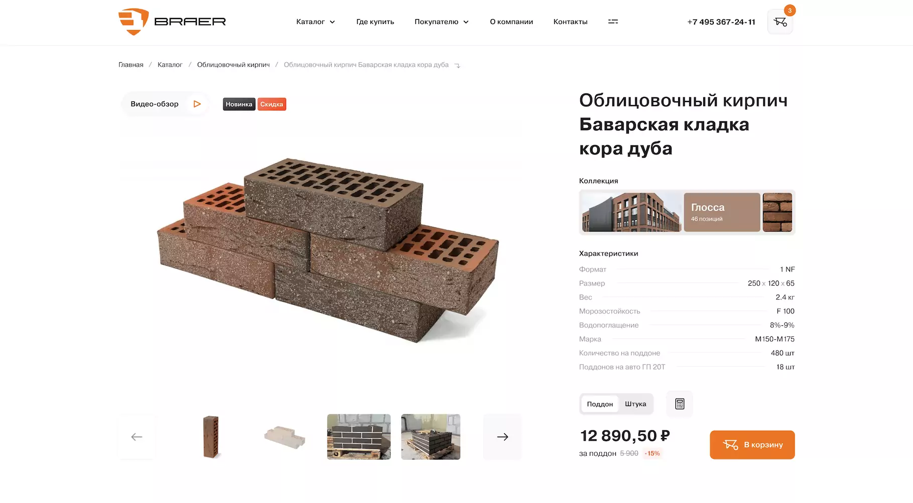
The first screen consists of standard elements: header, photos, specifications, price, and an Add to cart button. This was done intentionally, because users have pretty entrenched expectations about online stores, which you shouldn’t shatter. We’ve already talked about this in our article Common Yet Not-So-Obvious Mistakes in UI/UX Design: by challenging a person’s usual patterns of online behaviour, you make your product less user-friendly.
If a user already knows what they want, the information on the first screen should be enough to make a purchase decision. But if they have any doubts, they will start examining the product card in more detail. To anticipate this, we tried to remove all possible confusion through content and web design.
We started by imagining a meeting between a customer and a salesperson in a showroom. A good seller doesn’t just show different bricks to potential buyers: they let them touch the product, demonstrate the texture and the masonry technique, and show empathy and emotion throughout the whole engagement. We decided to incorporate all of this into the design of the product card: we used warm colours, displayed images of the brick surface, allowed the user to visually compare different types of masonry, and showed photos of houses built with those bricks. In other words, we tried to give the customer the same experience from the product page as they would have had from a conversation with an experienced salesperson – and thus increased the chances of them making a purchase.
Storytelling in design
There’re many different approaches to website design. At Toimi, we often employ the storytelling method, where information is conveyed to the user through a certain story. This story includes not only the text, but also the content and design of a website.
If we go back to the site we developed for Braer, the heart of our story was the concept of home.
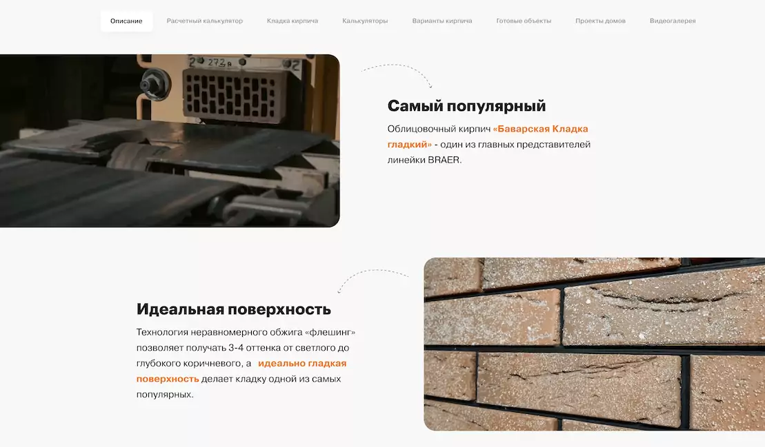
The idea was to create a website that doesn’t just sell bricks, but a dream – your very own house. What images do you conjure up when you think of a brick house? Cosiness, warmth, safety and security, comfort – perhaps family dinners on cold winter evenings. Everyone’s got their own associations, but we’ve tried to capture the general idea in the design. On the home page, we take the user through every stage of construction, from quarrying and manufacturing to the finished building – it’s as if the customer is personally involved in the construction of their house. But to achieve this result and not slip into personal preferences, you need to constantly bring the client back to their original goal – the very reason why they commissioned web design development in the first place.
Focus on usability
Effective web design adheres to the principles of good UI/UX; in particular, it must not hinder the website’s usability. If these design principles are violated, your conversions will take a hit. We’re talking about such issues as high bounce rates for animation-heavy web pages, low number of click-throughs due to an inconspicuous CTA button, clumsy navigation that makes it difficult to place an order, and so on.
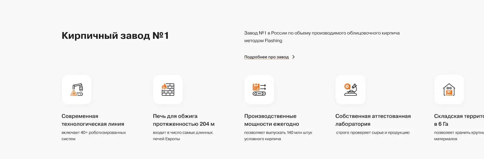
Going back to Braer, we displayed a lot of information on their home page. So to make it more readable, we divided it into separate blocks, added icons, highlighted key points of the text, and left lots of free space between elements. As a result, the page – although content-heavy – is still very convenient to explore.
UI/UX design mistakes come in all shapes and sizes – we’ve compiled the most overlooked and common ones in this article for Brodude. Be wary of these, and your design will become more convenient and clear for the user and thus serve its original purpose. This is what makes web design practical, and thus meaningful.