Fintech website design in 2026 has split between two masterworks — institutional infrastructure brands like Stripe and Plaid that treat every pixel as trust architecture, and consumer neobanks like Monzo and Nubank that treat every pixel as brand expression. These 10 sites define the ceiling of each approach.
Key takeaways 👌
Fintech design in 2026 is defined by typography commissioned as brand infrastructure — Stripe's Söhne, Wise Sans, Coinbase Sans, Klarna Title, Robinhood Phonic, Aeonik Pro at Revolut — commoditizing Figma templates is no longer competitive at the top of the category.
Trust architecture has moved above the fold. Benchmark sites lead with specific compliance disclosures, quantified outcomes, and regulatory lockups as design elements — buried legal copy is a category weakness signal in 2026.
The brands winning fintech design now commit to a single aesthetic conviction and execute it at every scale — Cash App's video-game icon system, Monzo's Hot Coral, Plaid's currency-paper woodcut portraits. The middle ground between "tech bro neon" and "heritage bank blue" is where trust dies.
TL;DR: Top 10 Best Fintech Website Designs in 2026
For payment infrastructure benchmarking: Stripe, Plaid — different aesthetics, identical discipline levels.
For global money movement: Wise — the most-awarded fintech rebrand of the decade.
For investment and trading UX: Robinhood — Porto Rocha's 2024 rebrand redefining the category's editorial direction.
For payments and P2P: Cash App — Awwwards SOTD at design.cash.app, proving brand portals can be destination design.
For crypto done seriously: Coinbase — white-space-heavy institutional aesthetic rejecting crypto-trading dark mode.
For consumer neobanks: Monzo, Nubank — UK Hot Coral and LATAM roxinho as cultural territory.
For BNPL execution: Klarna — the pre-IPO refresh influencing PayPal and the rest of the category.
For business banking: Mercury — luxury-brand aesthetic applied to startup banking.
Introduction
Fintech has the tightest design brief of any category. Buyers arrive skeptical — they've read about hacks, fraud, and startup collapses for a decade. They're being asked to move real money through your product in exchange for promises about security, speed, and cost. The window for establishing trust is measured in seconds. The design decisions on your homepage directly determine whether a visitor becomes a customer or bounces to a competitor.
The ten brands in this guide represent the current ceiling of fintech design — and they've reached that ceiling by making the investments most competitors avoid. Custom typography commissioned from the world's best foundries. In-house brand studios publishing public design systems. Real-photography commissions rather than stock-image subscriptions. Compliance disclosures designed as editorial elements rather than buried footnotes. Motion systems documented across engineering teams to maintain brand consistency at scale.
For any fintech brand commissioning a new web development project or considering a redesign in 2026, studying these ten sites closely is the fastest way to understand where the category's ceiling sits — and what specific investments separate the sites that earn category-defining status from the ones that merely keep up. The gap between benchmark fintech and median fintech has widened sharply since 2022, and that gap is measurable in both design awards and commercial outcomes.
What follows is ten profiles with specific design moves that elevated each site, the strategic context that justifies the investment, and a selection framework to identify which direction your brand can credibly own.
The Seven Design Patterns Separating Benchmark Fintech Sites from the Rest
Across the ten sites below, seven patterns recur consistently. Each appears on mediocre fintech sites in isolation — but the brands on this list combine all seven simultaneously, at a craft level that compounds rather than adding up arithmetically.
1. Commissioned typography as brand infrastructure. Stripe's Söhne (Klim Type Foundry) is now the most-copied fintech typeface in the world. Wise Sans supports 342 languages. Coinbase Sans spans 36 styles across four optical sizes. Klarna Title, Robinhood Phonic, Cash Sans, Chime Saans + Chime Serif — all are custom commissions. In 2026, running a fintech on Inter or Helvetica signals that the brand hasn't yet invested in distinction. The cost of a custom typeface commission ($50K–$250K) is one of the highest-ROI brand strategy investments in the category.
2. A single, defensible color conviction. Monzo's Hot Coral. Nubank's roxinho purple. Wise's Bright Green #9FE870. Cash App's #00D533 green. Robinhood's Robin Neon chartreuse. Each of these colors is territory the brand owns culturally — not just a palette choice, but a brand asset that appears in merchandise, ads, and user muscle memory. Generic "fintech blue" signals that the brand couldn't commit to a position.
3. Trust architecture designed above the fold. Benchmark sites show specific numbers — $118B+ moved annually (Wise), 70M+ customers (Nubank), 1 in 2 banked Americans (Plaid) — alongside regulatory lockups (FDIC via partner bank, FSCS protection, CFTC registration) presented as typographic trust modules. Compliance as editorial content is a category-defining pattern that custom interface design can elevate into a competitive advantage.
4. Live or interactive product demos in the hero. Stripe's interactive globe visualizing cross-border payments. Mercury's ungated product sandbox. Wise's fee comparison calculator. Cash App's video-game-collectible icon system. The "product is the demo" pattern — pioneered by Stripe — has become table stakes at the top of the category.
5. Real human photography, not stock imagery. Nubank's photography of real Brazilians. Chime's Marco Palmieri illustrations of diverse members. Monzo's Ola Dobrzyńska illustration commissions. Every benchmark fintech has moved past the "diverse cast of three smiling office workers" stock-photo pattern that defined fintech marketing from 2015–2020.
6. Published brand portals as trust signals. design.cash.app (Cash App). wise.design (Wise). brand.klarna.com (Klarna). oscardesign.team (Oscar, from the healthcare category). Publishing the design system publicly signals that the brand treats design as institutional infrastructure — a signal that sophisticated buyers and partners increasingly evaluate. This pattern connects directly to the fundamentals of design systems and brand trust that now define category leadership.
7. Motion and sound as category differentiators. Stripe's MiniGL shader library. Cash App's Never Sit Still motion. Coinbase's "Global Grid" motion identity with custom sound by Studio Menura. The brands competing on motion aren't adding animation for decoration — they're using motion as brand memory, the way consumer products use color. For B2B fintech specifically, motion has become the single most underinvested competitive frontier.

1. Stripe — The Payment Infrastructure Gold Standard
Website: stripe.com
Category: Payments infrastructure / developer-focused fintech
Design Aesthetic: Technical editorial polish
The hero pairs Stripe's signature skewed WebGL gradient mesh (built on an internal "MiniGL" shader library that's been reverse-engineered on GitHub) with crisp typography set in Klim Type Foundry's Söhne, adopted in the 2020 redesign. Product pages use a dense CSS Grid system layered with custom 3D device renders and inline syntax-highlighted code snippets that make the API feel tangible. The celebrated interactive WebGL globe — three stacked spheres with thousands of animated dots and arcs — visualizes cross-border payments in real time. The palette leans deep indigo with iridescent rainbow gradients; motion respects `prefers-reduced-motion` for accessibility.
Key design elements: Skewed WebGL animated gradient mesh hero; interactive 3D WebGL globe; custom 3D-rendered device mockups; live inline code blocks with syntax highlighting; CSS-Grid "background stripes" layout system; Söhne with mono companion; reduced-motion accessibility support; deep UX discipline applied across every product surface.
Best for inspiration if: You're building payments, infrastructure, or any developer-facing fintech where technical credibility and brand polish must coexist. Stripe is the template for when investment in custom craft justifies itself through category-defining status.
Recognition: Awwwards Site of the Day for stripe.dev and the Stripe BFCM Machine; Honorable Mentions for Stripe Sessions 2023 and 2024; primary brand work by Stripe Design/Brand Studio; Söhne's industry-wide fintech adoption widely credited to Stripe.
2. Wise — The Most-Awarded Fintech Rebrand of the Decade
Website: wise.com
Category: International money transfer / multi-currency account
Design Aesthetic: Bold confident global-humanist
The site is the output of the March 2023 rebrand by London agency Ragged Edge — one of the most awarded fintech rebrands of the decade. A custom Wise Sans typeface was designed to work across 342 languages, set against a confident, unapologetic primary of Bright Green #9FE870 on Forest Green #163300, with a secondary palette of Bright Orange, Yellow, cyan Blue and Pink sampled from global cultures. Wise introduced "graphic tapestries" — dense collaged textural backgrounds fused from imagery, colour and type — that scroll behind hero sections. Every colour was tested against WCAG 3.0, and 200+ tokens support parity across 146+ languages.
Key design elements: Custom Wise Sans (342-language coverage); Bright Green #9FE870 + Forest Green #163300 signature; "graphic tapestry" collaged backgrounds; refined Fast Flag logo mark; fluid money-movement motion principles; WCAG 3.0-tested palette; public design system site at wise.design.
Best for inspiration if: You're operating global consumer fintech where localization at scale is a primary design constraint. Wise's typeface commissioning and cultural-sampling palette are the template for brands serving dozens of markets without fragmenting visual identity.
Recognition: Awwwards Site of the Day for the rebrand launch; Brand New "Best Brand 2023"; Transform Awards 2023 (Best Adoption, Identity Design, Rebrand); Creative Review, Design Week, It's Nice That features; agency Ragged Edge; reported 9.8% conversion uplift post-launch.
3. Robinhood — Editorial Investment Design That Rejects Category Defaults
Website: robinhood.com
Category: Investment / trading (brokerage, crypto, retirement)
Design Aesthetic: Editorial fashion-adjacent finance
The site reflects the October 2024 rebrand by New York studio Porto Rocha, built around a custom sans-serif Robinhood Phonic (with delicate ink traps for UI) paired with warm serif Martina Plantijn for editorial headers. The color strategy deliberately abandons fintech rainbow gradients for black, white and "Robin Neon" — an electric lime-chartreuse unique to Robinhood. Hero sections use editorial close-up photography (a double-yolked egg for "returns," chains for crypto) shot in a fashion-adjacent style, replacing the previous futuristic cityscapes with technical financial-graph illustrations. SIPC disclosures and live margin-rate comparisons are designed in as trust artifacts rather than legal afterthoughts.
Key design elements: Robinhood Phonic + Martina Plantijn type pairing; "Robin Neon" electric yellow-green on black/white; editorial close-up object photography; technical graph-inspired illustration system; restored feather mark; modular scalable grid; premium dark-mode Robinhood Gold sub-brand.
Best for inspiration if: Your fintech has cultural ambition beyond commercial infrastructure. Robinhood's rebrand is the clearest case study in treating fintech marketing as editorial design rather than product marketing.
Recognition: The One Show 2025 Bronze Pencil (Brand Identity / Rebranding); The Brand Review "Brand of the Year 2024"; Porto Rocha named Studio of the Year 2024; featured on Brand New, Creative Review, It's Nice That, Transform, LogoLounge; Porto Rocha + Robinhood presented at Figma Config 2025.
Banking is necessary, banks are not.
— Bill Gates, Co-founder, Microsoft
4. Cash App — The Video-Game Aesthetic That Made Brand Portals Destination Design
Website: cash.app (brand portal at design.cash.app)
Category: Payments / P2P (Block, Inc.)
Design Aesthetic: Video-game-collectible maximalism
Cash App runs a two-site strategy — the consumer cash.app marketing site and a dedicated brand-system showcase at design.cash.app (launched Feb 2025). The visual language centres on hyper-saturated Cash App Green #00D533 against pure black, proprietary Cash Sans, and a deep library of 2D/3D icon "assets" treated like collectible game items (paracords, parachutes, locks, coins). The brand portal uses an infinite-canvas expressive hero with 3D animations, tactile video transitions, microinteractions, a custom 404 and a heavily animated loader. Typography intentionally breaks rules — headlines are offset for tension — thanks to BUCK's "Evergreen Design System" commissioned in 2023–24.
Key design elements: Two-colour core palette (#00D533 + #000); Cash Sans; 3D video-game-asset icon system; infinite-canvas expressive scroll; rich microinteractions and animated 404; offset "rule-breaking" editorial typography; BUCK Evergreen Design System.
Best for inspiration if: You're building a consumer fintech with cultural reach where brand memory matters as much as utility. Cash App's design.cash.app shows how a brand portal can become destination design rather than just documentation.
Recognition: design.cash.app won Awwwards Site of the Day via Index Studio + Jonathan Da Costa + Quentin Hocdé (7.4/10 overall); featured by Siteinspire, Creative Bloq ("Cash App's new brand guidelines make style guides fun") and Standards magazine.
5. Coinbase — The Anti-Dark-Mode Institutional Crypto Site
Website: coinbase.com
Category: Crypto exchange / Web3 platform
Design Aesthetic: Institutional-bright wayfinding
Coinbase's current identity was built on the 2022 rebrand by San Francisco studio Moniker (motion by Never Sit Still, sound by Studio Menura). It debuted the custom Coinbase Sans, a 36-style family of ~29,000 glyphs supporting 200+ Latin languages across Display/Text/Micro/Mono optical sizes. A brightened Coinbase Blue (#0052FF family) sits against generous white space — a deliberate break from dark-mode crypto-trading aesthetics — using wayfinding-signage-inspired layouts and a "Global Grid" motion identity that signals always-on markets. Later updates by designer Karri Saarinen layered a more institutional feel. Trust signals emphasise over $400B in assets on platform and Fortune-500 partner logos.
Key design elements: Coinbase Sans (36 styles, four optical sizes); Coinbase Blue primary on white (anti-dark-mode); transit-signage-inspired layouts; Moniker "Global Grid" motion identity; Instagram-story educational micro-modules; minimal ornamentation; tight typographic hierarchy.
Best for inspiration if: You're operating crypto, Web3, or any fintech in a category that has defaulted to dark-mode-techno aesthetic. Coinbase proves that rejecting the category visual grammar can be the strongest trust signal available.
Recognition: Agencies Moniker (brand) + Never Sit Still (motion); It's Nice That feature (March 2022); benchmarked across crypto UX writing (Loomery, Clay).
6. Monzo — Hot Coral as Cultural Territory
Website: monzo.com
Category: UK neobank
Design Aesthetic: Warm approachable consumer banking
The 2022 brand refresh by Ragged Edge doubled down on Monzo's signature Hot Coral — made even hotter — anchored by Deep Navy and Soft White. The typography pairing is distinctive: Oldschool Grotesk as display (chosen for "warm, analog friendliness and bold curves harking back to wood-block printing"), with Monzo Sans (a custom cut of Universal Sans by Grilli Type) for functional UI. The site foregrounds a suite of 90 custom illustrations by Ola Dobrzyńska and an "exaggerated UI" component language — oversized buttons, pots and cards — that turns product metaphor into marketing. The Monzo Business sub-brand was extended by Studio Output. Trust signals include FSCS protection copy, live customer counts and product ratings.
Key design elements: Hot Coral + Deep Navy + Soft White core; Oldschool Grotesk display + Monzo Sans UI; 90-illustration system by Ola Dobrzyńska; "exaggerated UI" oversized components; vibrant secondary palette; monzo.com/design culture hub; warm human photography direction.
Best for inspiration if: You're a consumer neobank competing against incumbents where warmth and personality differentiate. Monzo's Hot Coral commitment is the template for how color can become brand territory rather than a palette option.
Recognition: Ragged Edge (2022 refresh); Studio Output (Business sub-brand); Creative Review, It's Nice That, Under Consideration Brand New features.
7. Nubank — Roxinho as Cultural Identity
Website: nubank.com.br
Category: Latin American neobank
Design Aesthetic: Monochrome purple with Latin American editorial
Nubank owns "roxinho" — a saturated purple — as cultural brand territory in Brazil. The 2021 Pentagram-led identity (Eddie Opara and Marina Willer) introduced a softer, fluid custom wordmark and a modular layout built on bold type, generous scale and naturalistic photography of real Brazilians. Typography pairs a humanist sans with large editorial display weights, and the extended palette adds Latin-American-inspired corals, yellows and greens orbiting the core purple. Regulatory disclosures reference local BACEN/CVM authorities rather than US FDIC lockups. An interactive public brand book ships with a live color picker and grid generator.
Key design elements: Monochrome roxinho hero with oversized sans display; real-customer photography (Latin-American casting); modular broadcast content grid; interactive public brand book; geometric-shape product illustrations; iconic roxinho card as hero object; Portuguese/Spanish/English localization as first-class design.
Best for inspiration if: You're operating regional fintech with ambitions for cultural identity rather than generic global polish. Nubank demonstrates that local cultural ownership (roxinho is specifically Brazilian) can be a stronger competitive asset than international aesthetic.
Recognition: Pentagram rebrand 2021; Brand New, Creative Review, Fast Company coverage; Kantar BrandZ "Strongest Brand in Brazil" 2022; campaigns indexed in Clio/Muse by Clio.
8. Klarna — The Pre-IPO Refresh That Influenced PayPal
Website: klarna.com
Category: BNPL / shopping & payments
Design Aesthetic: Playful confident consumer
Klarna's 2024 in-house brand refresh (ahead of its 2025 IPO) kept the iconic Klarna Pink #FFA8CD but balanced it with Klarna Black #0B051D (a deep violet-black) and Klarna Off White #F9F8F5. Colophon Foundry designed two new typefaces — Klarna Title ("packed with offbeat energy") and Klarna Text — replacing 2017's Klarna Headline. The wordmark was redrawn (period dropped), and typography rules formally permit three alignments including a signature offset option that creates playful tension. The adaptive grid uses 6% margins (12% for editorial moments) with half-gutters, and a button-push logo animation drives the motion identity. The brand portal lives at brand.klarna.com and klarna.design.
Key design elements: Klarna Pink #FFA8CD + Black #0B051D + Off White #F9F8F5; Colophon's Klarna Title + Text typefaces; three-alignment grid with signature offset; button-push logo motion; 6%/12% margin flex system; oversized sentence-case headlines; public brand portal.
Best for inspiration if: You're operating BNPL or consumer fintech where cultural relevance matters as much as product clarity. Klarna's 2024 refresh is the clearest template for how a mature fintech can maintain brand equity while evolving toward institutional polish.
Recognition: In-house Klarna Design (2024); Colophon Foundry (type 2024); DDB Stockholm + Nord ID (2017 "Smoooth" era); Creative Review feature 2024; widely cited as influencing PayPal's 2024 rebrand.
Interesting fact 👀
By 2030, the global fintech market is projected to exceed $1.5 trillion in revenue, growing at a CAGR of 16.8% — more than triple current levels. Research from BCG shows that website design quality directly impacts fintech customer acquisition cost, with design-benchmark sites acquiring customers at 40–60% lower CAC than industry average.
9. Mercury — Luxury-Brand Aesthetic for Business Banking
Website: mercury.com
Category: Business banking for startups
Design Aesthetic: Luxury-goods monochrome editorial
Mercury reads more like a luxury-goods brand than a bank — a monochrome palette (near-black #1B1B1F, off-white, subtle grays) with strategic dark-mode sections that make product UI feel elevated rather than technical. The open product demo (no email gate) is the primary trust artifact: visitors can navigate a fully working sandbox of accounts, cards and payments before signup. Product screenshots are shot at large crop-ins with careful shadow rendering, treating dashboards as editorial photography. Copy speaks native-founder ("burn rate," "runway," "treasury yield") with serif-accented pull quotes and tabular figures throughout for financial legibility.
Key design elements: Ungated interactive product sandbox as hero trust device; dark-mode product screenshot sections contrasted with light editorial copy; large cropped dashboard mockups; editorial-magazine layouts on About/Journal pages; serif pull quotes within sans body; monochrome-with-single-accent restraint; tabular-figure numerals across product pages.
Best for inspiration if: You're operating in business banking, startup finance, or any B2B fintech where the buyer is design-literate and expects consumer-grade polish. Mercury's luxury positioning is the template for B2B fintech that refuses to look like enterprise software.
Recognition: Widely cited benchmark in design press (Ramotion, Shadow Digital 2026 guide, Azuro Digital's Best Fintech Websites 2026).
10. Plaid — Currency Paper Woodcut as Heritage-Meets-Developer Aesthetic
Website: plaid.com
Category: Open banking / financial data API
Design Aesthetic: Heritage banknote editorial
The 2024–2025 refresh (led in-house with motion lead Tori Cincotta) is rooted in the aesthetics of paper currency: guilloche line patterns, woodcut-etched portrait illustrations (Ben Franklin on a phone, Lincoln on a laptop) commissioned from Eastern European specialist Tatiana Trikoz, and holographic-strip-inspired photography. The typographic system balances this heritage with Heimat Mono for captions and technical labels alongside a bold geometric sans for headlines, producing an unusual "heritage-meets-developer-tool" effect. A published inclusive design system defines skin-tone selection sourced from real photography. Trust signals include "1 in 2 banked Americans" and 12,000-bank counts with named vertical customer logos.
Key design elements: Custom woodcut etched portrait illustrations; guilloche currency-line backgrounds; holographic-strip photography treatment; Heimat Mono technical captions; documented inclusive illustration library with skin-tone methodology; in-house motion system (2024–25); vibrant eclectic accent palette used sparingly.
Best for inspiration if: You're operating in infrastructure fintech where banking heritage signals trust but a purely corporate aesthetic feels dated. Plaid's woodcut-portrait system is the most unique brand direction in the category — and provably defensible against imitation.
Recognition: Case studies on Plaid's own blog ("The fabric of financial progress") and former Creative Director Chris C. Warner's portfolio; Behance features by illustrators Justina Leisyte and Tatiana Trikoz.
Investment and Fintech Patterns We've Built at Toimi
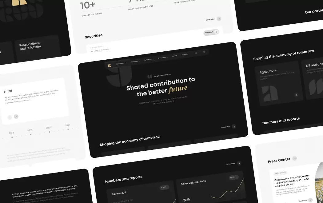
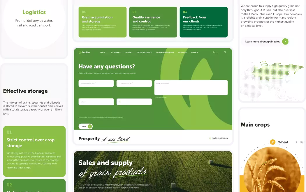
Full disclosure — Toimi designed and developed Kirillitsa, an investment company, and the site shipped with several of the exact patterns the benchmark brands above have canonized. We're including it here not as competitive positioning against Stripe or Robinhood, but as a worked example of how the principles in this guide translate into an actual investment-category build — where the weight of trust architecture is arguably higher than anywhere else in fintech, because clients aren't just moving money, they're entrusting it to be grown.
Kirillitsa — Investment-company positioning without the category's defaults. Investment fintech is where the Robinhood/Mercury playbook matters most, and where the category defaults (generic "trust blue," stock-photo advisors, buried disclosures, dark-mode trading aesthetic imported from retail brokerages) fail hardest. For Kirillitsa we took the opposite route: restrained typography as quiet conviction rather than ornament, compliance and regulated-activity copy designed into the layout as first-class typographic elements rather than footer-buried disclaimers, and an editorial rhythm closer to Mercury's luxury-brand aesthetic than to the retail-trading neon that still dominates the segment. The result is an investment-company site that reads as institutional at early scale — which is exactly where most investment fintechs lose buyers who arrived ready to trust them.
Three specific patterns from the ten brands above translated directly into the Kirillitsa build: (1) Mercury's "tabular figures everywhere financial data lives" discipline for returns, AUM, and fee disclosures so numbers align column-to-column and read as instruments rather than marketing copy; (2) Robinhood's "compliance as first-class typographic element" approach rather than legal-footer burial — every regulated claim is designed into the layout with the same weight as a heading; (3) Coinbase's white-space-led anti-dark-mode stance, because investment clients read better on calm, institutional layouts than on the dark-mode techno aesthetic that crypto-trading has trained the category to reach for. For teams operating investment platforms or any regulated fintech where every pixel carries compliance weight, the custom interface design discipline that made these patterns work at Kirillitsa scales directly to platforms with far larger AUM.
How to Choose the Right Design Direction for Your Fintech
If you're building payment infrastructure or developer-facing fintech
Your needs: Technical credibility, API-as-product demos in hero, custom typography, documented motion systems for accessibility.
Best references: Stripe, Plaid
Critical question: Does your agency have specific experience with API-documentation design, developer-first UX, and accessibility-aware motion systems? Generic web agencies will deliver beautiful sites that fail the specific rigor developer audiences expect.
If you're operating consumer neobanking or global consumer fintech
Your needs: Custom typography with multi-language coverage, cultural color territory, human photography commissioning, public design system.
Best references: Wise, Monzo, Nubank
Critical question: Is your brand prepared to commit to a specific color as cultural territory for 5+ years? Monzo's Hot Coral and Nubank's roxinho work because they've been owned long enough to become memory — not because they're novel palette choices.
If you're building investment, trading, or wealth platforms
Your needs: Editorial credibility, quantified outcome display, regulatory lockup design, premium sub-brand architecture for higher tiers.
Best references: Robinhood for the public-company benchmark — and for a seed-to-early-stage execution of the same principles, our own Kirillitsa investment-company build shows how the compliance-as-editorial-content approach scales down from billion-dollar brand infrastructure to the investment-brand briefs most teams are actually commissioning.
Critical question: Does your design system accommodate SIPC, FINRA, SEC, or equivalent local-regulator disclosures as first-class typographic elements rather than buried legal copy? Investment fintech design must treat compliance as editorial content — the brands that don't lose trust by appearing to hide it.
If you're operating BNPL or consumer payments
Your needs: Playful confident voice, commissioned typeface, cultural-relevance photography, seasonal campaign flexibility.
Best references: Klarna, Cash App
Critical question: Can your brand sustain the content velocity that Klarna and Cash App demonstrate? Playful consumer fintech design works when new campaigns, seasonal drops, and cultural moments ship continuously — it fails when the system is built but not maintained.
If you're operating crypto or Web3 fintech
Your needs: Institutional credibility that rejects techno-dark-mode defaults, commissioned typography, partnership trust architecture.
Best references: Coinbase
Critical question: Is your brand credibly institutional or still culturally Web3-native? The mismatch between those positions is where most crypto fintech design fails — trying to look institutional while still speaking crypto-Twitter.
If you're building business banking, spend management, or B2B fintech
Your needs: Consumer-grade polish applied to enterprise buyers, open product demos without email gates, editorial-magazine pages for brand storytelling.
Best references: Mercury
Critical question: Does your product quality justify luxury-aesthetic positioning? Mercury's luxury-brand treatment works because the underlying product operates at that quality bar — it fails catastrophically when the site suggests premium and the product delivers average.
Questions to Ask Before Commissioning Fintech Web Design
"What fintech-specific experience does your agency have with compliance content as design?" Generic web agencies treat SIPC, FDIC, FSCS, and regulatory lockups as legal footnotes. The best fintech agencies treat them as editorial content — the distinction matters more than any visual sensibility, because buyers in 2026 evaluate compliance presentation as a trust signal.
"Have you shipped design for investment companies or regulated financial brands at seed or early scale, not just publicly traded benchmarks?" Most fintech agencies showcase work for mature public-company brands — but the harder brief is designing investment-category trust at early stage, where the brand has no multi-decade AUM history or public track record to lean on. Agencies that have shipped investment-company work at early scale (such as Toimi's Kirillitsa engagement) understand the compound constraint of regulatory disclosure plus institutional credibility without institutional history — and that problem doesn't solve itself by hiring an agency that's only built sites for Fortune-500 clients.
"How do you handle custom typography commissioning, and can you show us previous type systems you've specified?" Custom typography is now category-defining for top-tier fintech. Agencies without foundry relationships (Klim, Colophon, Grilli Type, Lineto) or experience specifying type for multi-language support will deliver sites that look competent but lack the distinctiveness that separates benchmarks from competent work.
"Can you walk me through a fintech project with before-and-after conversion data?" Design investments in fintech should be measurable: conversion rate improvements, time-to-signup reductions, CAC changes. Agencies that can't produce this data from past projects are selling aesthetic craft without accountability to commercial outcomes — a risk premium most fintech buyers can't afford.
"What's your approach to the design-to-development handoff for motion systems and accessibility requirements?" Fintech motion systems must respect `prefers-reduced-motion`, maintain performance budgets, and remain consistent across engineering teams. Agencies without documented handoff practices will deliver motion that looks great in Figma and breaks in production, or passes accessibility checks but looks sterile.
"For our specific sub-category — payment infrastructure, consumer neobank, B2B fintech, crypto, investment — which of these ten sites would you study most closely and why?" Fintech is not monolithic. An agency that treats "fintech" as one category will produce generic outcomes. The agencies worth hiring have specific opinions about which reference sites match which sub-categories and can articulate the strategic reasoning for each match.
Want to discuss your project?
Share your vision with us, and we'll reach out soon to explore the details and bring your idea to life.
Conclusion
Fintech website design in 2026 has crystallized around a clear hierarchy. At the top sit ten to twenty brands that have committed to custom typography, cultural color ownership, human photography commissioning, and compliance-as-editorial-content — combined at a level of craft most competitors find uncomfortable. Below them sits a large middle tier of competent-but-undistinguished sites running on Figma templates, Inter/Helvetica typography, stock imagery, and generic "modern fintech" aesthetic. The gap between these tiers has widened sharply since 2022 and continues to widen.
The ten brands in this guide represent the current ceiling of what's possible across the full fintech spectrum — payment infrastructure, money transfer, investing, P2P, crypto, neobanking, BNPL, business banking, and open banking APIs. What unites them isn't aesthetic similarity. It's design conviction. Each has committed to a specific philosophy and executed across every page, every product launch, every sub-brand, every localization.
For any fintech brand commissioning design in 2026, the strategic decision isn't which of these to copy. It's which of these directions matches your brand conviction, regulatory posture, and audience expectations — and then how to execute that direction with more discipline than the competitors reaching for the same reference set. The brands on this list are the proof that the approach works. The ones that don't make lists like this are the ones that tried to compromise between positions, copy trends without commitment, or treat design as polish rather than infrastructure. In fintech specifically — and in investment fintech most of all — that compromise is no longer commercially viable.
Recommended reading 🤓
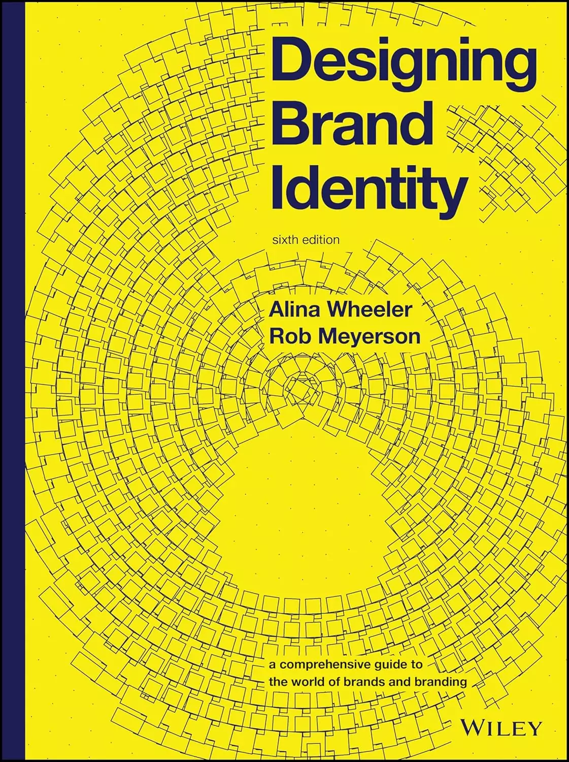
"Designing Brand Identity", Alina Wheeler
The definitive guide to building brand systems that scale across every digital and physical touchpoint — essential for understanding why Wise's typeface commissioning and Nubank's cultural color ownership produce durable commercial outcomes.
"The Brand Gap", Marty Neumeier
Neumeier's framework for the intersection of strategy and creative work applies directly to fintech, where brand conviction must translate into regulated commerce. The template for every successful rebrand on this list.
"Articulating Design Decisions", Tom Greever
Teaches how design decisions should be communicated and justified to non-designer stakeholders — critical skill for fintech teams where compliance, legal, product, and marketing all have veto power over design direction.
Fintech design is the hardest commerce brief — convince someone to move money they worked hard to earn, in under 30 seconds, without looking like every other fintech. The ten brands on this list did that by committing to design conviction most competitors would find uncomfortable.