Real estate website design in 2026 splits cleanly into two philosophies — luxury brokerages treating every pixel as brand signal, and tech portals treating every pixel as conversion infrastructure. These 10 sites represent the ceiling of each approach.
Key takeaways 👌
Real estate design in 2026 bifurcates sharply — Zillow, Redfin, and Opendoor treat the site as conversion infrastructure; Sotheby's, Compass, and Douglas Elliman treat it as brand theater. Trying to do both usually produces worse outcomes than committing to one.
Architecture-as-brand is the rising differentiator for regional and boutique brokerages — Village Properties (Spanish Revival) and Dwelling in Maine (forest green) prove that local architectural vernacular beats generic luxury templates.
Awwwards-caliber real estate design now clusters around two typologies: immersive new-development microsites (111 West 57th, MERSI) and B2B proptech SaaS (Buildout) — both are teaching the rest of the category what's now possible.
TL;DR: Top 10 Best Real Estate Website Designs in 2026
For portal/marketplace benchmarking: Zillow — the conversion-first search-as-product template.
For tech luxury brokerage execution: Compass — the 2025 WebAward winner and the reference for black-and-white-only brand systems.
For global luxury editorial: Sotheby's International Realty, Douglas Elliman — lifestyle-first IA with museum-grade restraint.
For proptech crossover innovation: Airbnb, Opendoor — category-browse discovery and single-CTA conversion at world-class levels.
For luxury new development microsites: 111 West 57th Street — Awwwards SOTD and the current ceiling for immersive development marketing.
For architecture-as-brand boutiques: Village Properties — local vernacular as competitive moat.
For Asian luxury residential: K11 ARTUS — gallery-catalog aesthetic applied to real estate.
For B2B CRE SaaS: Buildout — the proptech marketing site benchmark.
Introduction
Real estate has one of the most challenging design briefs in digital commerce. Buyers arrive with financial and emotional stakes that rival healthcare. Inventory moves faster than any other category — a listing worth studying today disappears tomorrow. Brand trust must operate across price ranges from $300K starter homes to $66M penthouses. And the category's design conventions — white backgrounds, gold logotypes, cursive serif headlines, diverse-cast-of-three stock photography — have calcified to the point where most real estate sites are nearly indistinguishable from each other.
The ten brands on this list break that pattern. They represent the ceiling of what's possible across the full real estate spectrum: enterprise portals, global luxury brokerages, tech-forward proptech, boutique architecture-led agencies, luxury new developments, and B2B SaaS. What unites them is design conviction — each has committed to a clear aesthetic and operational philosophy that distinguishes them from the category's template-driven middle.
For any real estate brand commissioning a custom website build or considering a redesign in 2026, the strategic decision isn't "what should our site look like?" It's which of these design philosophies — conversion-first, luxury-editorial, architecture-led, or immersive-development — your brand can credibly own, and whether your team has the resources to execute it at benchmark level. A generic "modern real estate website" is now a commercial disadvantage, because the brands on this list have raised the bar across every sub-category.
The guide that follows profiles each site with the specific design moves that elevated it — and the strategic context that justifies the investment. Studying them closely is the fastest way to understand where real estate design is heading and what separates the sites that win listings from the ones that merely publish them.
The Seven Design Patterns Separating Benchmark Sites from the Rest
Across the ten brands in this guide, seven patterns recur — and the ones who execute all seven simultaneously are the ones defining the category in 2026.
1. Single-purpose hero design. Zillow's entire homepage is a search bar. Opendoor's hero is one address input. Sotheby's leads with lifestyle rather than listings. The brands that win commit the hero to one decision — not four competing CTAs, not a carousel with five objectives. This discipline requires a strong understanding of custom UI design principles and the conviction to reject stakeholder requests to pack more above the fold.
2. Typography as brand infrastructure. Compass's three-font system (Tiempos / Harmonia / Pressura Mono) splits luxury, human, and data contexts into separate typographic registers. Tia and Abridge (from other categories) commission custom typefaces. In real estate specifically, typography is one of the few channels where a brokerage can establish distinctiveness against thousands of competitors using the same IDX templates — making it a serious brand strategy decision rather than a design afterthought.
3. Photography as the primary visual engine. Every benchmark real estate site commits to original, high-production photography — drone aerials, editorial lifestyle shots, architectural interiors that read like magazine features. Stock photography of diverse buyers pointing at kitchens is now a category weakness signal.
4. Split-panel information architecture. Compass, Sotheby's, and most luxury listing pages use a split-panel layout — gallery left, details right, with sticky interactive elements — because real estate buyers need to process photos and data simultaneously, not sequentially.
5. Trust stack above the fold. Opendoor shows "No showings, No repairs, No uncertainty" immediately below the hero. Avantgarde displays award badges as homepage design elements. Redfin shows MLS refresh time as a trust signal. In a category where buyers commit hundreds of thousands of dollars, trust architecture must be design, not a footer footnote.
6. Conversion UX as a discipline distinct from aesthetic design. Redfin's Hot Homes urgency badges, Zillow's saved-homes system, Compass's Collections collaboration tool — all are documented, A/B-tested conversion patterns that operate alongside brand design, not in competition with it. The best full UX engagements in real estate treat CRO as a primary deliverable, not a post-launch consideration.
7. Mobile parity as default, not adaptation. NAR data shows 76% of home buyers use mobile devices during search. Sites designed desktop-first and adapted to mobile lose to sites designed mobile-first and adapted to desktop — every brand on this list has chosen the latter approach.

1. Zillow — The Conversion-First Search-As-Product Template
Website: zillow.com
Category: Real estate marketplace / consumer portal (US)
Office/HQ:
Zillow's hero is a single large search bar — no hero video, no lifestyle photography, no distracting CTAs — treating the search input as the entire product. This brutal conversion-first decision (echoing Google's homepage philosophy) is backed by extensive A/B testing across tens of millions of sessions. Map-based search with a split half-map / half-list layout mirrors how users actually think about location, and the persistent map follows filtering without page reload. Property pages pack an unusually dense information stack — price history, Zestimate, tax records, school ratings, Walk Score, estimated mortgage — yet remain scannable due to tight typographic hierarchy and tabbed sections. The 2024–2025 AI features (natural-language search, "Listing Showcase" AI-enhanced photos) are integrated without disrupting the core UX.
Key design elements: Single dominant search bar as the entire homepage CTA; split half-map / half-list search results with persistent filtering; Zestimate price estimate as hero content on every listing page; dense information stack on PDPs with tab IA; AI-enhanced "Listing Showcase" photography; saved homes, alerts, and agent matching as a logged-in product layer; mobile app parity with Zillow Go agent-tour booking.
Best for inspiration if: Your product is a marketplace or portal where search IS the value proposition — Zillow's discipline is the template for when the search bar should own the entire hero.
Recognition: 36M+ monthly visitors; WebAward Best Real Estate Website (multiple historical wins); repeatedly cited as the UX reference for property search across the industry; Baymard Institute real-estate UX benchmark.
2. Compass — The 2025 WebAward Winner
Website: compass.com
Category: Tech-forward luxury brokerage (US, ~$6B revenue)
Office/HQ:
Compass solved the brokerage-brand problem that haunts every RE company — how to feel premium without feeling cold — through a strict black-and-white-only color rule (per the official media kit: "the Compass logo should only be reproduced in black or white"). Property photography provides all the color; the interface never competes. A three-font system — Tiempos (refined luxury serif), Harmonia (modern humanist sans), Pressura Mono (data and technology) — mirrors the brokerage's agent-as-human / data-as-infrastructure dual identity. The Collections feature is the UX centerpiece: a shared workspace where client and agent annotate, shortlist, and discuss properties together — replacing email threads with a structured collaboration surface.
Key design elements: Black/white-only color palette with photography as the only visual accent; three-font typographic system (Tiempos / Harmonia / Pressura Mono) for luxury, human, and data contexts; Collections collaborative shortlisting workspace; AI-assisted CMA and pricing tools surfaced to agents within the same design system; "Private Exclusive" listings as a conversion differentiator; Compass Concierge service as a lead-capture surface; clean split-panel listing pages with sticky "Contact Agent" rail.
Best for inspiration if: You're running a large brokerage where every agent represents the brand and visual consistency across hundreds of agent pages is the design challenge — Compass's system is the template for scale.
Recognition: WebAward Best Real Estate Website 2025 (Web Marketing Association); consistently cited in proptech design roundups; Compass Design team publishes publicly on LinkedIn and Medium with documented brand-system decisions.
3. Sotheby's International Realty — The Lifestyle-First Global Luxury Benchmark
Website: sothebysrealty.com
Category: Global luxury real estate brokerage (84 countries, 1,100+ offices)
Office/HQ:
The site solves a brutal IA challenge — representing 150,000+ listings across 84 countries without feeling like a catalog — by leading with lifestyle and destination over listing count. "Find a home that suits your lifestyle" replaces the typical "Search properties" CTA, and destination guides, local-expert profiles, and editorial "Collection" pages are surfaced at hierarchy parity with listing search. The restrained white-space-heavy layout prevents the listing inventory from overwhelming the brand; statistics ("$157 billion in sales volume," "1,100 offices") are presented as elegant typographic data points rather than infographic callouts.
Key design elements: Lifestyle-first hero ("Find a home that suits your lifestyle") vs. search-first; destination guides and local expert editorial as top-level IA; elegant data-point presentation of brand statistics (no infographics); full-screen property photography on listing detail pages; global location tabs with region-specific curated content; "Extraordinary Living" editorial magazine integrated into the main site; strict cream/white palette with photography carrying all visual weight.
Best for inspiration if: You're operating global luxury where inventory volume threatens brand exclusivity — Sotheby's demonstrates that editorial discipline can resolve the tension between scale and prestige.
Recognition: Multiple luxury real estate website rankings (Mediaboom, Grand Estate Marketing, Agent Image); brand carries 275-year Sotheby's auction house heritage as the core design trust signal; widely cited for editorial luxury-travel-magazine aesthetic applied to real estate.
Architecture is the thoughtful making of space.
— Louis Kahn, Architect
4. Douglas Elliman — The Red-and-Black Content Hub
Website: elliman.com
Category: US luxury brokerage (NY, FL, CA, TX, CO)
Office/HQ:
Douglas Elliman mixes listings with market reports, neighborhood guides, and design stories, turning the site into a genuine content hub rather than a listing portal. Bold red-and-black branding is distinctive in a sea of white/gold luxury competitors — the "Red Paper" proprietary market reports are a lead-capture and positioning device in one. New-development projects (including international) are presented as dedicated microsites within the main domain, each with full-bleed hero imagery and editorial copy.
Key design elements: Strong red/black brand identity differentiating from gold/white luxury defaults; "Red Paper" proprietary market reports as thought leadership + lead capture; content hub mixing listings, neighborhood guides, and design/lifestyle stories; new-development microsite-within-site for major projects; integrated Nest Media arm with high-production listing videos; agent profiles functioning as personal brand pages (photo, stats, specialties); Christie's International Real Estate affiliate branding as trust tier.
Best for inspiration if: You want to differentiate a US luxury brokerage from Sotheby's/Christie's gold-and-cream defaults — Elliman's red-and-black commitment is one of the few successful color rebellions in the category.
Recognition: Cited in CyberOptik's "25 Best Real Estate Websites of 2026" and Mediaboom luxury roundups; Red Paper reports are regularly covered in the press as market data sources.
5. Airbnb — The Proptech Category-Browse Pioneer
Website: airbnb.com
Category: Short-term rental marketplace (real estate crossover)
Office/HQ:
Airbnb's 2021 rebrand (Brian Chesky's post-COVID reset, with Designstudio) and ongoing refinements have produced the most usable property-search interface in any rental category. The category-based browsing (Beachfront / Trending / Cabins / Luxe / OMG / National parks) introduced in 2022 fundamentally changed how users discover properties — replacing a search bar with editorial curation that often triggers aspirational browsing even when users don't have a trip in mind. The split-map search, clean listing cards with photo-first hover interactions, and an industry-best "Airbnb Your Home" calculator flow are all widely benchmarked by real estate portal competitors.
Key design elements: Category-browsing over search-bar as primary discovery mechanism (Beachfront, OMG, Cabins); split-map / list view with persistent filter bar; photo-hover preview on listing cards (swipe without click); Airbnb Your Home calculator as interactive income estimator and lead-gen; transparent total-price display (fees shown upfront, not at checkout); accessibility-first design (largest accessibility investment in travel); Lottie-animated icons across the UI replacing static illustrations.
Best for inspiration if: Your product has a long-tail inventory where search is less useful than curation — Airbnb's category-browse pattern works for any marketplace where users don't know what they want until they see it.
Recognition: Multiple Webby Awards (Travel category); Design Milk / Fast Company Innovation by Design awards for the category-browse redesign; widely cited in real estate UX discussions as the benchmark for non-search property discovery.
6. Opendoor — The Single-CTA Conversion Machine
Website: opendoor.com
Category: iBuyer / real-estate technology
Office/HQ:
Opendoor's design is entirely built around a single conversion action — "Enter your home address to get an offer" — and every design decision on the homepage supports or leads to that moment. The hero address input is large, autocomplete-enabled, and the only CTA on the page above the fold. Trust signals are stacked immediately below: "No showings, No repairs, No uncertainty" in clear benefit headers. The sell-side funnel (address → offer in 24 hours → schedule closing) is presented as a clear three-step diagram, reducing the perceived complexity of a major financial transaction.
Key design elements: Single address input as the hero and primary CTA (nothing else above the fold); "No showings, No repairs, No uncertainty" benefit triplet as immediate trust stack; three-step sell funnel diagram reducing transaction complexity; AI-powered offer in 24 hours — presented as a product feature, not a claim; transparent fee structure comparison (Opendoor vs. traditional agent); buy + sell flows on the same domain with clear audience bifurcation; clean white / signature orange palette.
Best for inspiration if: Your product monetizes a single conversion action where every distraction reduces outcomes — Opendoor is the clearest example of what happens when a hero gets one job and executes it rigorously.
Recognition: Multiple PropTech awards; Andreessen Horowitz and other VCs have documented the UX-driven user acquisition model; frequently cited in product design discussions for the "single-CTA, zero-noise hero" pattern.
Interesting fact 👀
According to NAR's 2024 Profile of Home Buyers and Sellers, 99% of millennial and Gen Z buyers used online websites in their home search — and 51% found the home they eventually purchased online. Website design quality directly impacts which properties get seen by the 76% of buyers who use mobile devices during their search.
7. 111 West 57th Street (Steinway Tower) — The Awwwards New-Development Standard
Website: above-the-clouds.nyc
Category: Luxury new development / supertall residential (New York)
Office/HQ:
The site was awarded Awwwards Site of the Day (May 15, 2025) and Developer Award for its immersive scroll experience. Full-bleed aerial photography of Manhattan from above the cloud line anchors the hero — a literal visualization of the product's unique selling point (1,428-ft Billionaires' Row tower with residences from $7.75M to $66M). Scroll-driven parallax layers alternate between exterior architecture and interior shots, with typography that scales dramatically as layers reveal. A custom cursor, ambient audio toggling, and a floor-by-floor selector create a self-contained luxury editorial experience.
Key design elements: Scroll-driven parallax with dramatic typography scaling; full-bleed aerial-above-cloud-line photography as hero visual; custom cursor and ambient audio toggle; floor-by-floor residence selector with live sky views; cinematic looping video of the spire in cloud/sunset conditions; stark black hero with white typography matching the tower's visual identity; PDF/brochure request as the primary conversion action.
Best for inspiration if: You're marketing a luxury new-development project where the property's uniqueness justifies a dedicated microsite — 111 W 57th demonstrates that development marketing works best as a self-contained editorial experience, not a template.
Recognition: Awwwards Site of the Day — May 15, 2025 + Developer Award (technical and design parity); featured on Awwwards Real Estate category page.
8. Village Properties — Architecture-as-Brand for Boutique Brokerages
Website: villagesite.com
Category: Boutique luxury brokerage (Santa Barbara, CA)
Office/HQ:
The site is the defining example of architecture-as-brand — arched image frames and warm terracotta/cream tones reference the Spanish Revival windows of Santa Barbara homes. HousingWire cited this as a benchmark for local-architecture-inspired real estate branding. The "locally connected, Santa Barbara owned" messaging directly positions against national franchise competitors, and the visual identity itself is the trust signal — generic real estate templates cannot compete with this level of place-specificity.
Key design elements: Arched image frames mirroring Spanish Revival architecture; warm terracotta/cream palette tied to local architectural vernacular; "locally connected, Santa Barbara owned" positioning against franchise competition; full-width lifestyle photography selling the Santa Barbara dream; local neighborhood guides as editorial content; property search integrated into the local brand, not a portal-style overlay.
Best for inspiration if: You're a regional or boutique brokerage competing against national franchises — Village Properties proves that place-specific architectural identity is a defensible moat that generic luxury templates cannot replicate.
Recognition: HousingWire "Best Real Estate Website Designs for 2026" feature as a primary case study for architecture-inspired local branding.
9. K11 ARTUS — Asian Luxury Residential as Gallery Catalog
Website: artus.k11.com
Category: Luxury residential / art-hotel hybrid (Hong Kong)
Office/HQ:
The site applies the aesthetic of a gallery catalog to residential real estate — "saturated with dynamic yet calm animation" (DesignRush), with a magazine editorial vibe and a sticky burger menu that collapses into a minimalist side window. The "co-existence of nothingness and substance" brand philosophy is directly expressed through the generous whitespace and restrained palette. Property photography alternates with art-installation imagery, blurring the line between real estate and cultural collection.
Key design elements: Gallery-catalog editorial aesthetic applied to residential property; sticky burger menu collapsing into a minimalist side-panel with all key links; calm, ambient animation throughout; art-installation photography alternating with property shots; deep whitespace as "nothingness" brand expression; premium serif typography with Eastern calligraphy influences.
Best for inspiration if: You're operating Asian luxury residential or lifestyle-driven development where the property sells a cultural experience, not just space — K11 ARTUS demonstrates how brand philosophy translates into restrained design that rewards sophisticated buyers.
Recognition: DesignRush "18 Best Real Estate Website Designs 2026"; AltaStreet "23 Best" list; extensively referenced as the Asian luxury real estate design benchmark.
10. Buildout — The B2B CRE SaaS Benchmark
Website: buildout.com
Category: B2B CRE (commercial real estate) marketing software
Office/HQ:
Buildout's own marketing site is a benchmark for B2B real estate SaaS — clean dark navy + white palette, confident editorial typography, and product screenshots shown in real workflow context (not isolated floating windows). The site addresses the dual audience (brokers + brokerage firms) with a clean two-path navigation without resorting to dual homepages. Animated property-website demos loop on the homepage to show the actual output — a smart "product is the demo" pattern in a category where competitors default to feature bullet lists.
Key design elements: Dark navy + white B2B palette with orange accent; animated live demo of output property websites in the hero; dual-audience navigation (broker / brokerage) without separate homepages; product screenshot-in-context on every feature page; "See a sample OM" CTA offering instant value before a sign-up gate; integration partner logos (CoStar, LoopNet, Crexi) as trust signals; case study library organized by brokerage size.
Best for inspiration if: You're selling proptech SaaS to brokers, agents, or real estate enterprises — Buildout demonstrates that CRE software marketing can (and should) operate at the same design bar as top-tier B2B SaaS like Linear or Vercel.
Recognition: Frequently cited in CRE proptech design discussions; covered by Bisnow and CoStar as a CRE tech design reference.
Construction and Real-Estate-Industry Patterns We've Built at Toimi
The ten benchmark sites above cover the residential and commercial end of real estate, but the same design patterns transfer cleanly to the construction and industry-adjacent side of the stack — where "property" means materials, machinery, projects, and B2B service flows rather than listings. Two Toimi projects show how the benchmark patterns translate when the buyer is on the construction side of the real estate economy.
Bizon — construction-industry platform applying the Buildout + Opendoor disciplines. Bizon operates on the construction side of the real estate stack, so the marketing-site brief was closer to Buildout's B2B CRE SaaS benchmark than to a residential brokerage. We applied the same patterns: product-in-context screenshots (not floating isolated windows), dual-audience navigation (construction decision-makers vs. end clients) without splitting the site in half, and an Opendoor-style single-conversion hero where one decision dominates above the fold rather than four competing CTAs. Full approach in the Bizon case study.
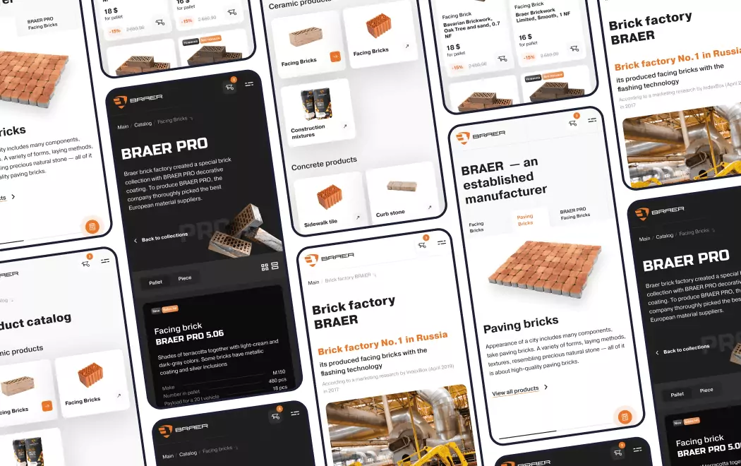
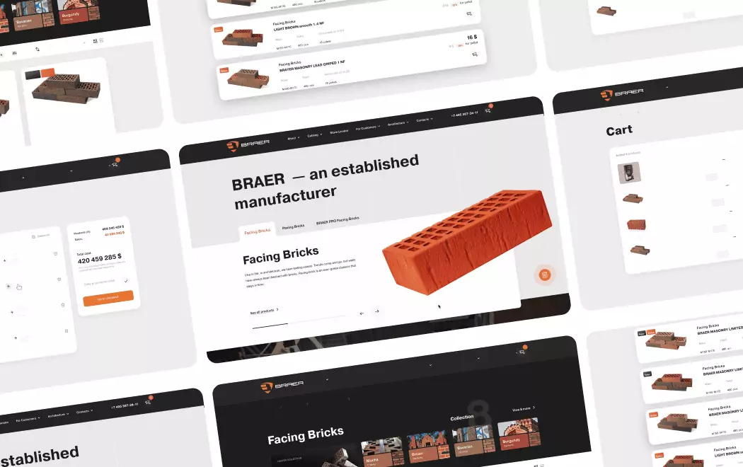
BRAER — construction material marketplace applying the Zillow portal pattern at catalog scale. Selling construction materials to professionals is architecturally similar to selling homes — massive inventory, filtering as the primary UX, mobile-first search, trust signals stacked high. For BRAER we applied the Zillow and Airbnb portal disciplines (search-first hero, persistent filtering, category-browse alongside pure search) to a materials catalog serving both B2B buyers and individual property owners. Walk through the build in the BRAER case study.
Both projects illustrate the throughline the best real-estate-industry sites share — conviction about one primary audience, rigor in conversion UX, and resisting the template-driven middle that defines most category sites. The same discipline applies when we build a custom web platform for any real-estate-industry client, whether the inventory is residential listings, commercial space, or industrial materials.
How to Choose the Right Design Direction for Your Real Estate Brand
If you're building a portal, marketplace, or high-volume listing platform
Your needs: Search-first IA, dense information architecture on PDPs, mobile-first search UX with persistent filtering.
Best references: Zillow, Airbnb
Critical question: Does your team understand conversion UX as a distinct discipline from brand design? Portal sites live and die on A/B-tested micro-interactions — hire a partner with documented CRO experience, not just aesthetic sensibility.
If you're a tech-forward brokerage serving agents at scale
Your needs: Brand system that scales across thousands of agent pages, typographic and color rules strict enough to prevent drift, agent-collaboration tools as part of the core product.
Best references: Compass
Critical question: Can your brand guidelines survive translation to 15,000+ agent bios? Tech brokerage design fails when the system is too flexible — Compass's black-white-only rule is the template for enforceable consistency at scale.
If you're in global or US luxury brokerage
Your needs: Editorial typography, museum-grade photography, destination-first IA that prioritizes lifestyle over inventory count.
Best references: Sotheby's International Realty, Douglas Elliman
Critical question: Does your content team have the editorial capability to match the design investment? Luxury sites need continuous editorial output (market reports, destination guides, collection features) — the design is only the container.
If you're a regional or boutique brokerage fighting national franchises
Your needs: Architecture-led or place-specific brand identity that generic luxury templates cannot replicate.
Best references: Village Properties
Critical question: Is your local architectural identity strong enough to anchor a brand? Village Properties' arched frames work because Santa Barbara's Spanish Revival vernacular is distinctive; brokerages in generic suburbs need to find a different design anchor.
If you're marketing a luxury new-development project
Your needs: Immersive dedicated microsite, Awwwards-caliber production values, a single conversion action (brochure request or tour booking).
Best references: 111 West 57th Street
Critical question: Does the development have a single unique selling proposition that justifies a bespoke microsite? 111 W 57th earned its Awwwards because the building's "above the clouds" USP is visually undeniable; smaller developments often don't justify the investment.
If you're operating Asian luxury residential or cultural real estate
Your needs: Gallery-catalog aesthetic, calm animation, whitespace as brand expression, photography that blurs lifestyle and property.
Best references: K11 ARTUS
Critical question: Does your brand philosophy have substance behind the minimalism? K11's "nothingness and substance" works because the physical product backs it up — imitators without the substance look empty.
If you're selling proptech SaaS or construction-industry platforms
Your needs: B2B SaaS design discipline applied to a real estate or construction audience, live product demos in the hero, dual-audience navigation.
Best references: Buildout, Bizon
Critical question: Does your agency have B2B SaaS experience beyond real estate? The best proptech and construction-platform sites borrow from Linear, Vercel, and Stripe — not from real estate template galleries.
Questions to Ask Before Commissioning Real Estate Web Design
"Can you show me three real estate sites you've built with post-launch conversion data?"
Real estate design investments should be measurable: listing views per session, agent contact conversions, saved-property rates, time-to-offer for iBuyers. Agencies that can't produce this data are selling aesthetic craft without accountability to commercial outcomes.
"How do you handle IDX integration while preserving brand aesthetic?"
For agents and regional brokerages, IDX integration is the make-or-break design challenge. The best real estate agency sites use custom IDX implementations that preserve the brand through the entire search-to-listing flow. Off-the-shelf IDX destroys most brand investments — ask specifically how the agency handles this.
"Have you built real-estate-industry sites beyond residential — construction platforms, materials marketplaces, proptech SaaS?"
Agencies that have only built residential brokerage sites struggle the moment a brief involves construction, industrial inventory, or B2B workflow. Toimi, for example, has shipped both sides — from Bizon's construction platform to BRAER's construction materials marketplace — which means the portal, SaaS, and B2B pattern toolkit all transfer. Ask for breadth, not just residential volume.
"What's your experience with mobile-first real estate UX specifically?"
Mobile isn't a secondary concern — NAR reports 76% of buyers use mobile during search. Ask for specific examples of mobile-first real estate builds and the conversion data that justifies the mobile-first approach. Agencies that default to desktop-first in 2026 are not operating at current category standards.
"For luxury brokerages specifically, what's your approach to photography and editorial content production?"
Luxury real estate design is 40% photography and editorial — the design system is mostly a frame for the content. Agencies without in-house or partner photography capabilities will deliver sites that look great in Figma but sparse once real listings populate them.
"For our specific sub-category — portal, luxury brokerage, boutique, proptech, construction-industry — which of these ten sites would you study most closely, and why?"
Real estate is not monolithic. An agency that treats "real estate" as one category will produce generic outcomes. The agencies worth hiring have specific opinions about which reference sites match which sub-categories — and can articulate why.
Want to discuss your project?
Share your vision with us, and we'll reach out soon to explore the details and bring your idea to life.

Conclusion
Real estate website design in 2026 is no longer about picking between "modern" and "luxury" templates — it's about which of the category's distinct design philosophies your brand can credibly own. Zillow and Opendoor prove that conversion-first discipline beats aesthetic polish when the product is inventory access. Compass, Sotheby's, and Douglas Elliman prove that brand discipline beats feature density when the product is trust and lifestyle. Village Properties and K11 ARTUS prove that place-specific architectural identity creates moats that generic luxury cannot breach. 111 West 57th Street proves that Awwwards-caliber immersive microsites remain the ceiling for luxury development marketing.
What unites every site on this list is conviction. Each has committed to a single design philosophy and executed it across every page, every agent profile, every listing, every mobile interaction. The brands that fail in real estate design don't fail because they picked the wrong direction — they fail because they tried to serve every audience with every design pattern simultaneously, and ended up looking like every other template-driven site in the category.
The strategic decision for any real estate brand commissioning design in 2026 isn't "which of these to copy." It's which of these directions matches your brand conviction, your operational capacity, and your buyer profile — and then how to execute that direction with more discipline than the competitors chasing the same aesthetic. The ten sites above are the current proof that the approach works. The ones that don't make lists like this are the ones that tried to compromise.
If you're scoping a real estate or construction-industry web project and want a partner that has applied these patterns on both sides of the stack — from Bizon's construction platform to BRAER's materials marketplace — that's the intersection where Toimi works. Start the conversation about a custom web build for your brand.
Recommended reading 🤓
"Selling the Invisible", Harry Beckwith
The definitive text on marketing services where buyers can't touch the product — directly applicable to real estate, where buyers evaluate trillions of dollars of inventory through screens before ever stepping inside a home.
"The Design of Everyday Things", Don Norman
Norman's framework for human-centered design is essential context for understanding why Zillow's single-search hero and Opendoor's single-CTA home convert so effectively — both reduce cognitive load at the decision-critical moment.
"Building a StoryBrand", Donald Miller
Miller's seven-part story framework is directly applicable to luxury real estate positioning — where properties compete not on features but on the lifestyle narrative the site constructs around them.
The best real estate sites aren't the prettiest — they're the ones where brand conviction and conversion mechanics don't compete for the same pixels. Most sites in the category fail because they try to be both, execute neither, and look generic doing it.