A catalogue website for a manufacturer
of building materials
Braer is a holding company that produces ceramic construction materials in line with European quality standards. It manufactures new-class brick products, combining aesthetics, innovation, and multi-generational traditions.
braer.ru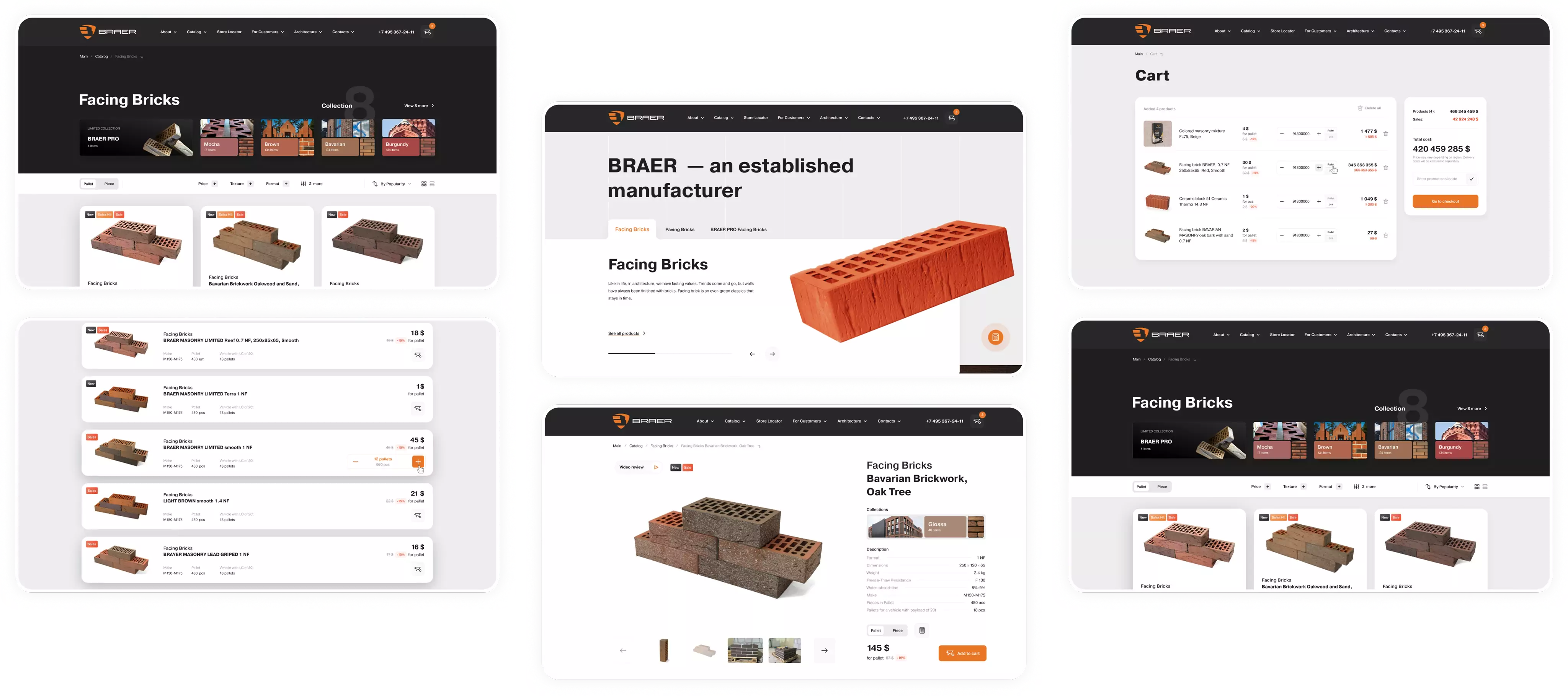
Overarching objective
To make the website more user-friendly and develop a convenient catalogue with seamless navigation and a sleek, modern design — bringing the platform closer to the standards of professional UX/UI.
Scope of works
We carried out an extensive analysis of the company and its business environment; updated the brand’s design system; developed the website’s structure, including personal accounts and a vast catalogue of products and services; and introduced tailor-made features typical for advanced Corporate Websites.

Pre-project analytics
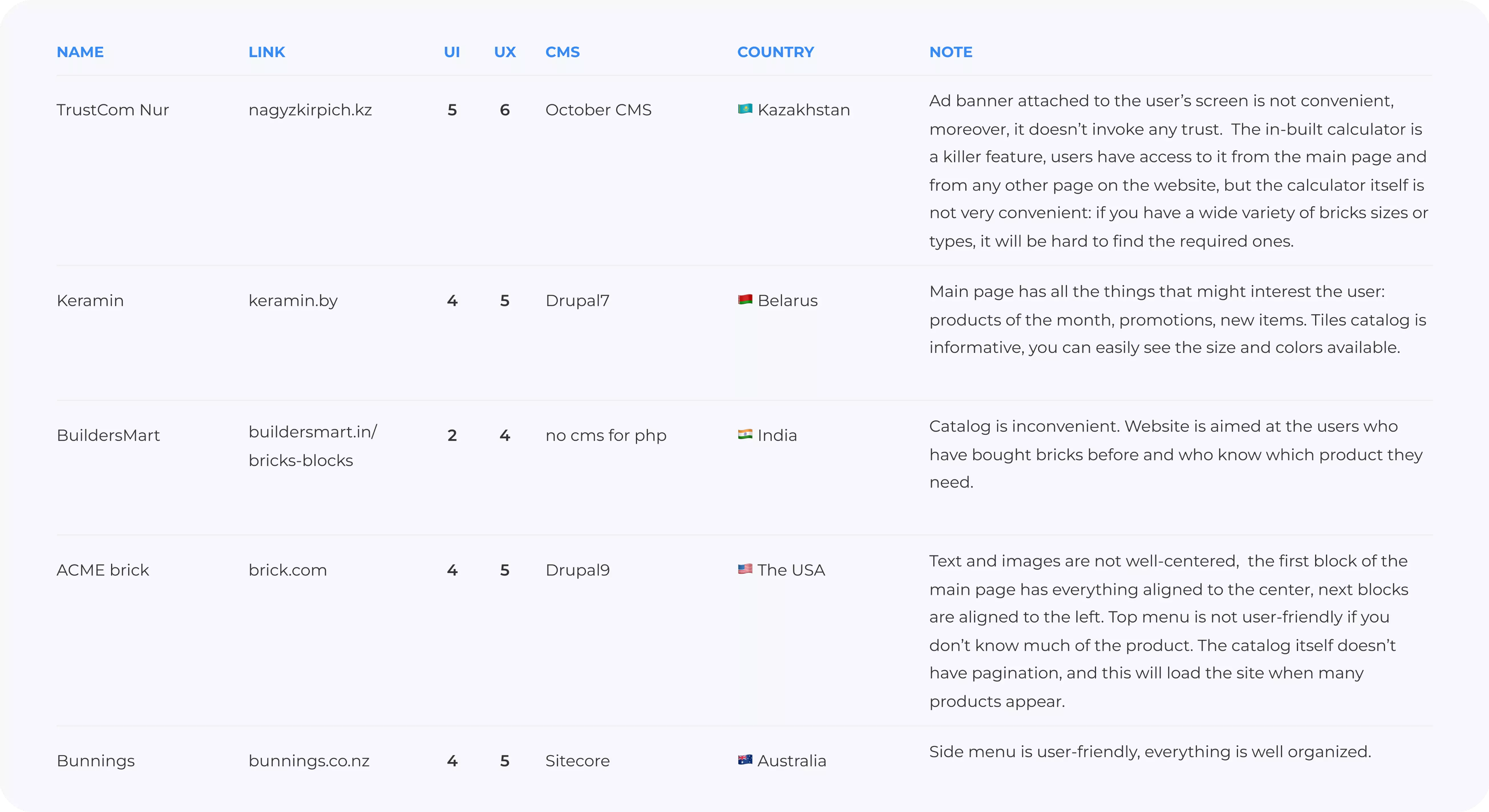
We performed a thorough pre-implementation analysis, examining over 40 competitor sites to identify their strengths and research the UI/UX aspects.
This stage mirrored the approach we apply in our UX/UI Audit, allowing us to isolate the most effective interaction patterns and use them in the prototypes.
This helped us single out the most effective solutions and use them in our prototypes. As such, our focus was to create a high-quality and user-friendly product that would satisfy all user needs and expectations.
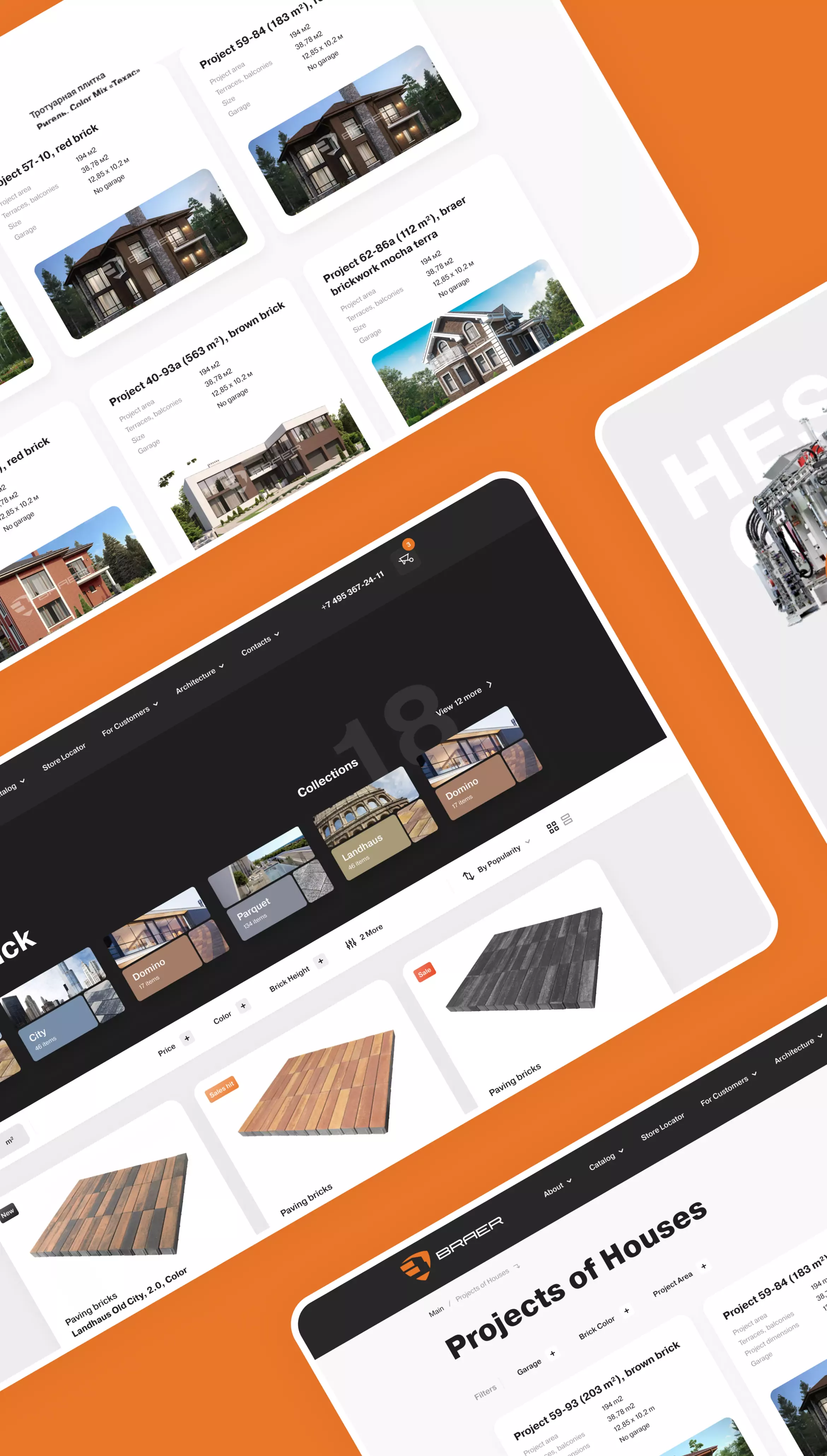
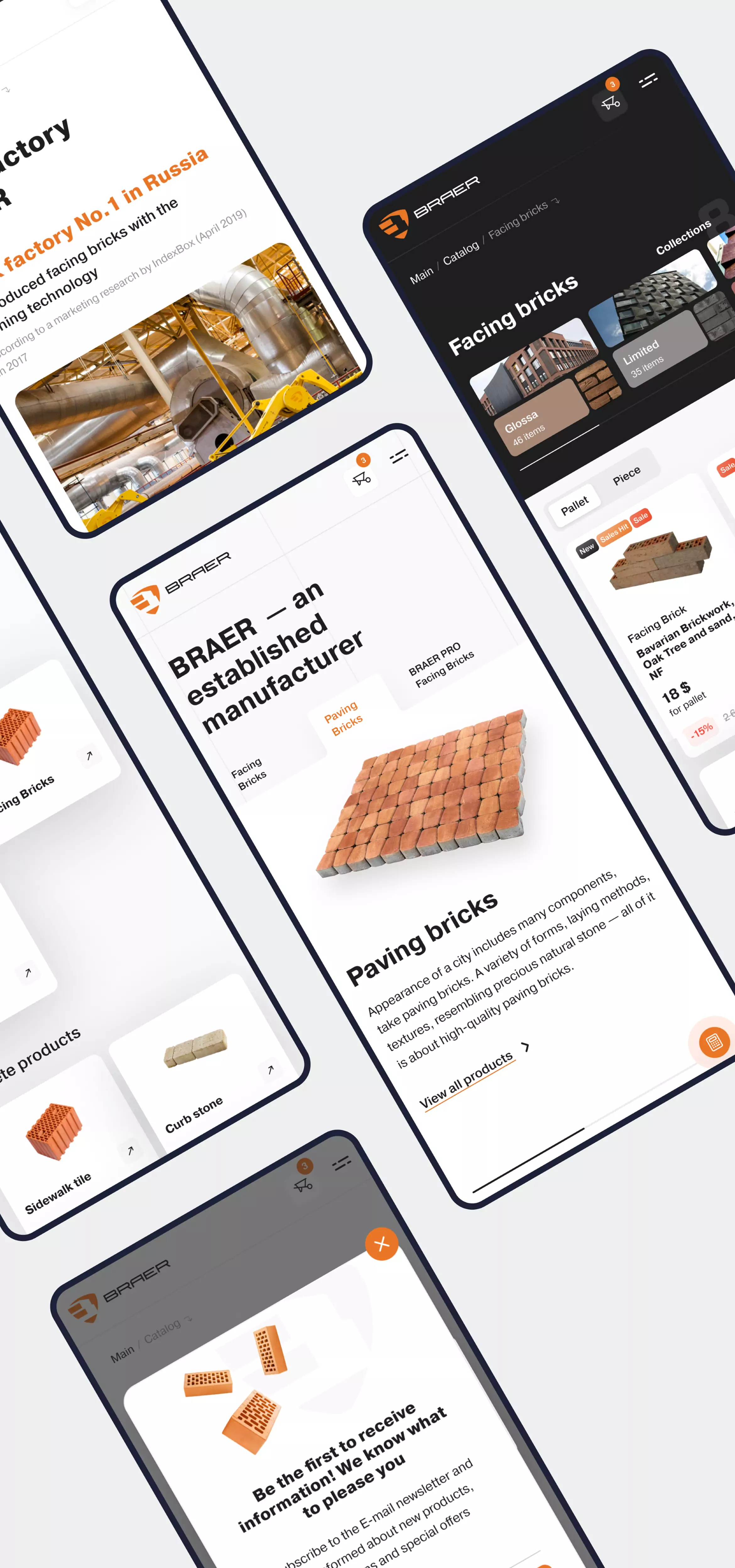
Website structure
We completely rethought the existing site structure. Every page was thoroughly reviewed and made more user-friendly and accessible — part of a broader architecture commonly found in complex Online Services Development projects.
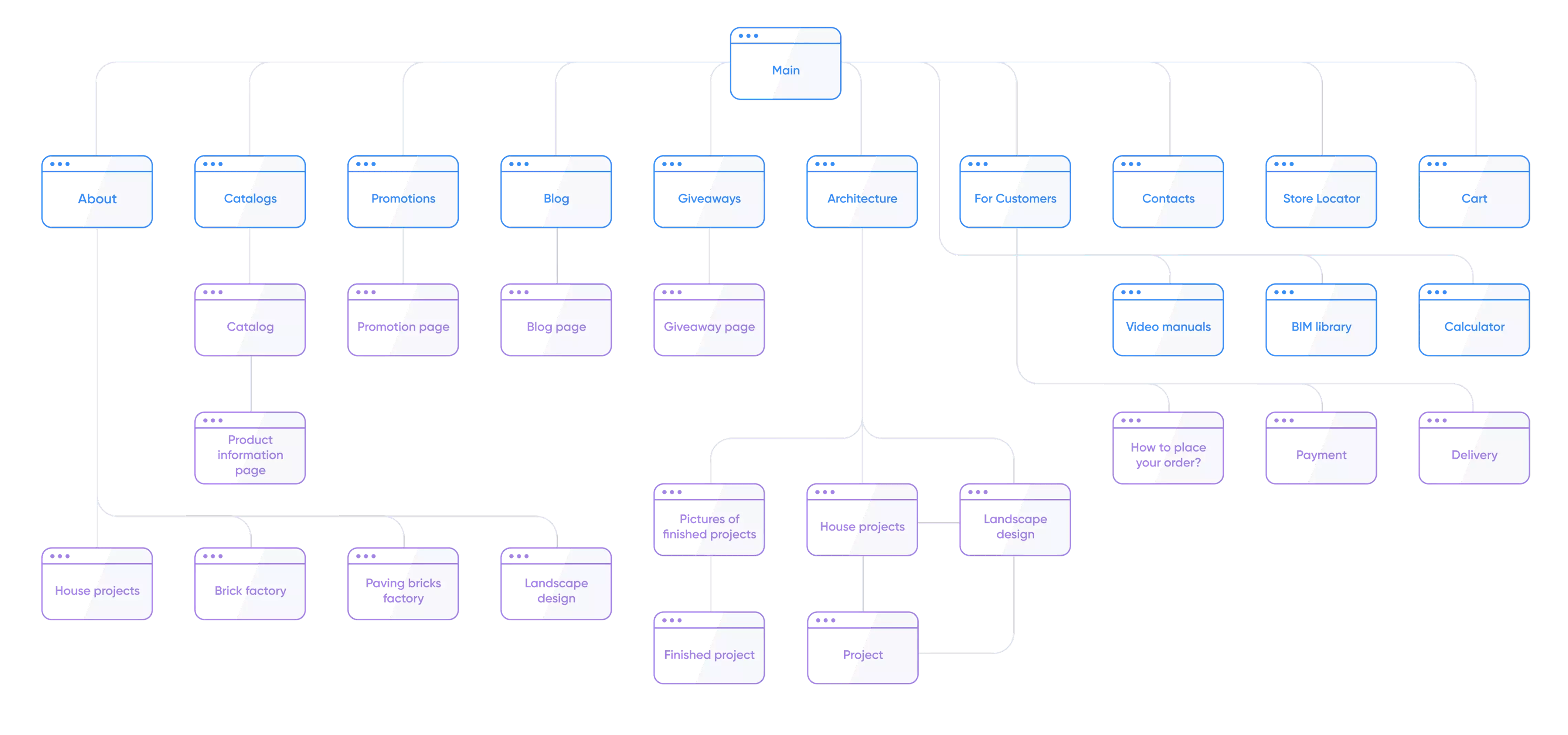
Prototyping
At the prototyping phase, we paid particular attention to the structure of the pages to make them more informative and effective.
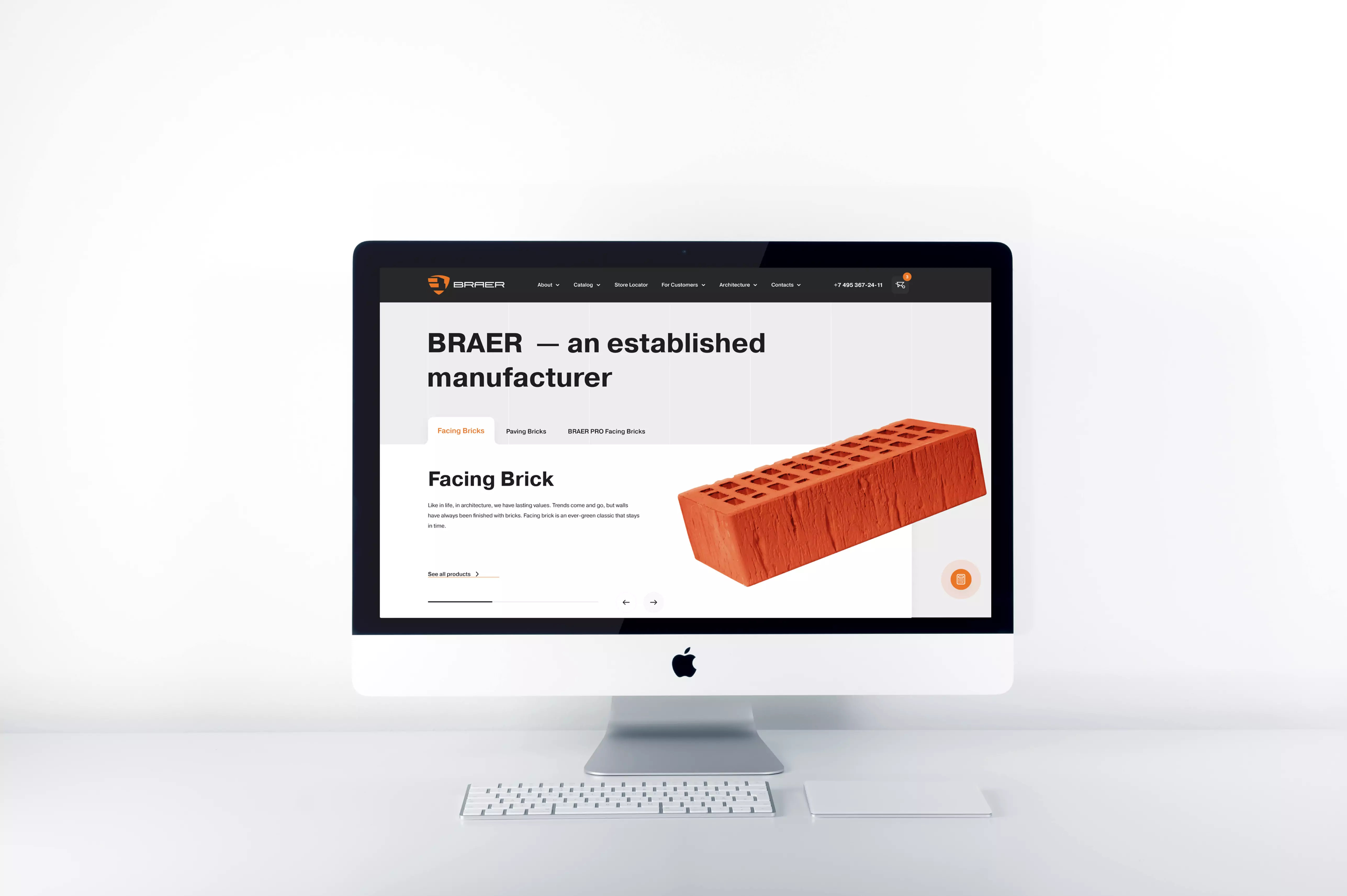
Our priority here was to simplify user interaction with the product catalogue and make the home page communicate the company’s profile at a glance.
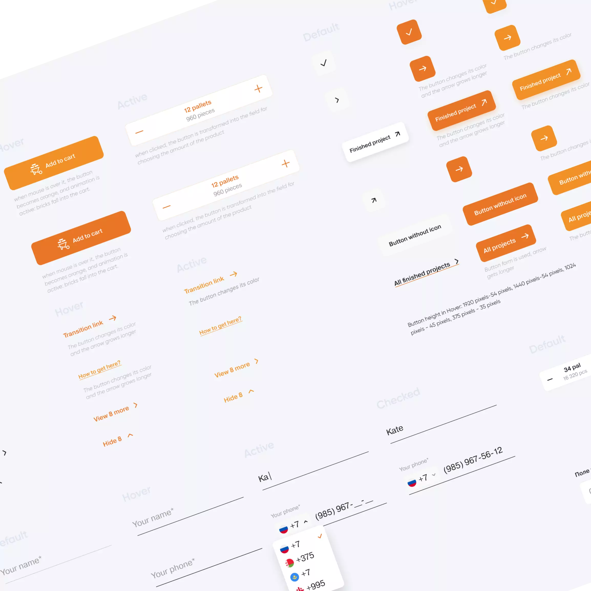
Design system
development
We fulfilled everything the client wished for in the design and developed a corporate visual style that fuses brutality, clarity, modernity, and usability.
We also created a comprehensive UI kit reflecting the harmony of all website components: grids, colours, fonts, icons, and other elements.
Choice of palette, typography,
and illustrations
The selected colour palette highlights the brand and makes it stand out from the competition.

The Pragmatica font complements the design, reflecting the new visual logic.

The client’s products are presented through minimalist vector illustrations supporting the updated visual concept.
Development of animations
We added animations to visualise the production process and highlight the company’s product strengths.
A special dark theme and custom product cards were created for the premium brick collection to underline its exclusivity.
Functionality and capabilities
Catalogue structure
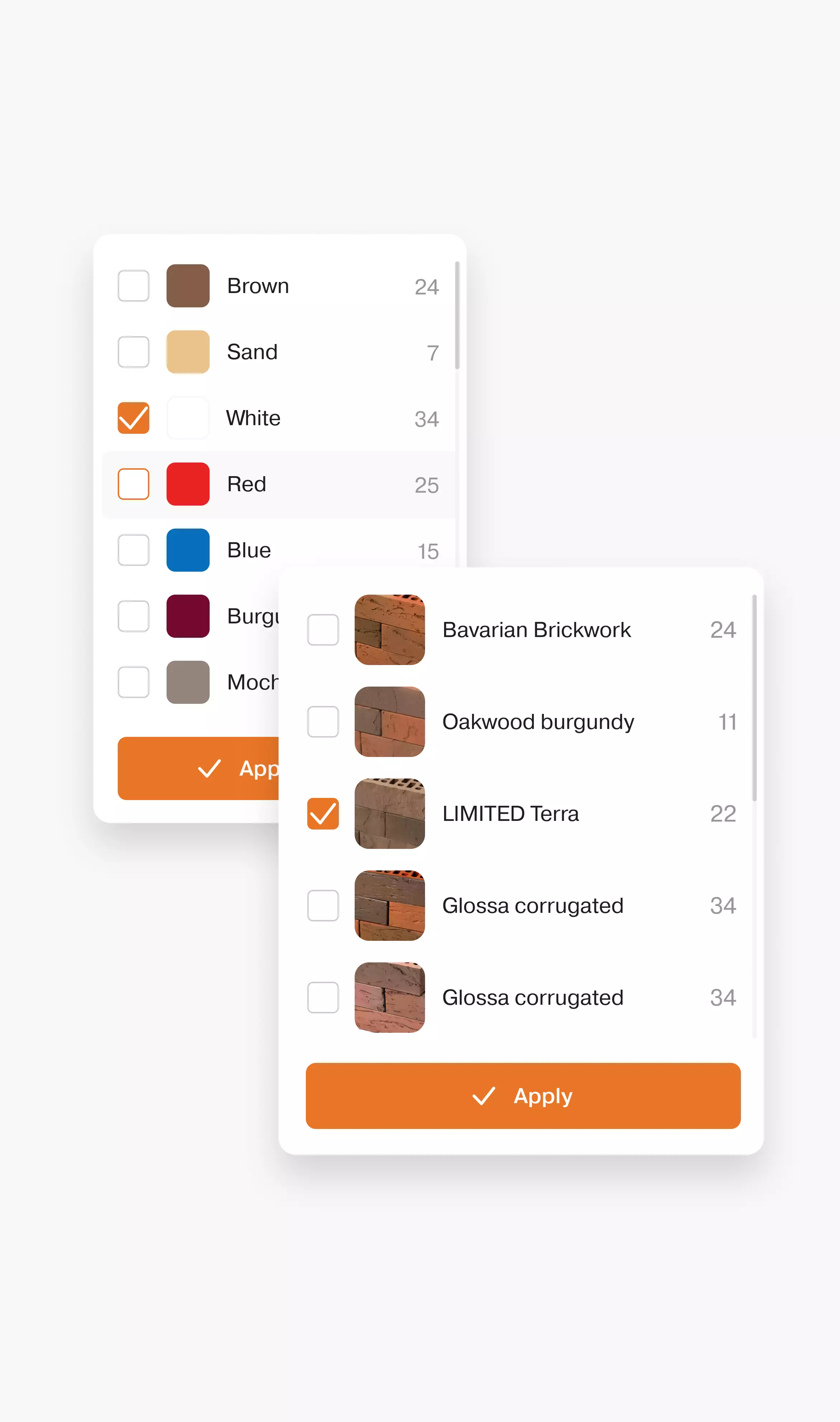
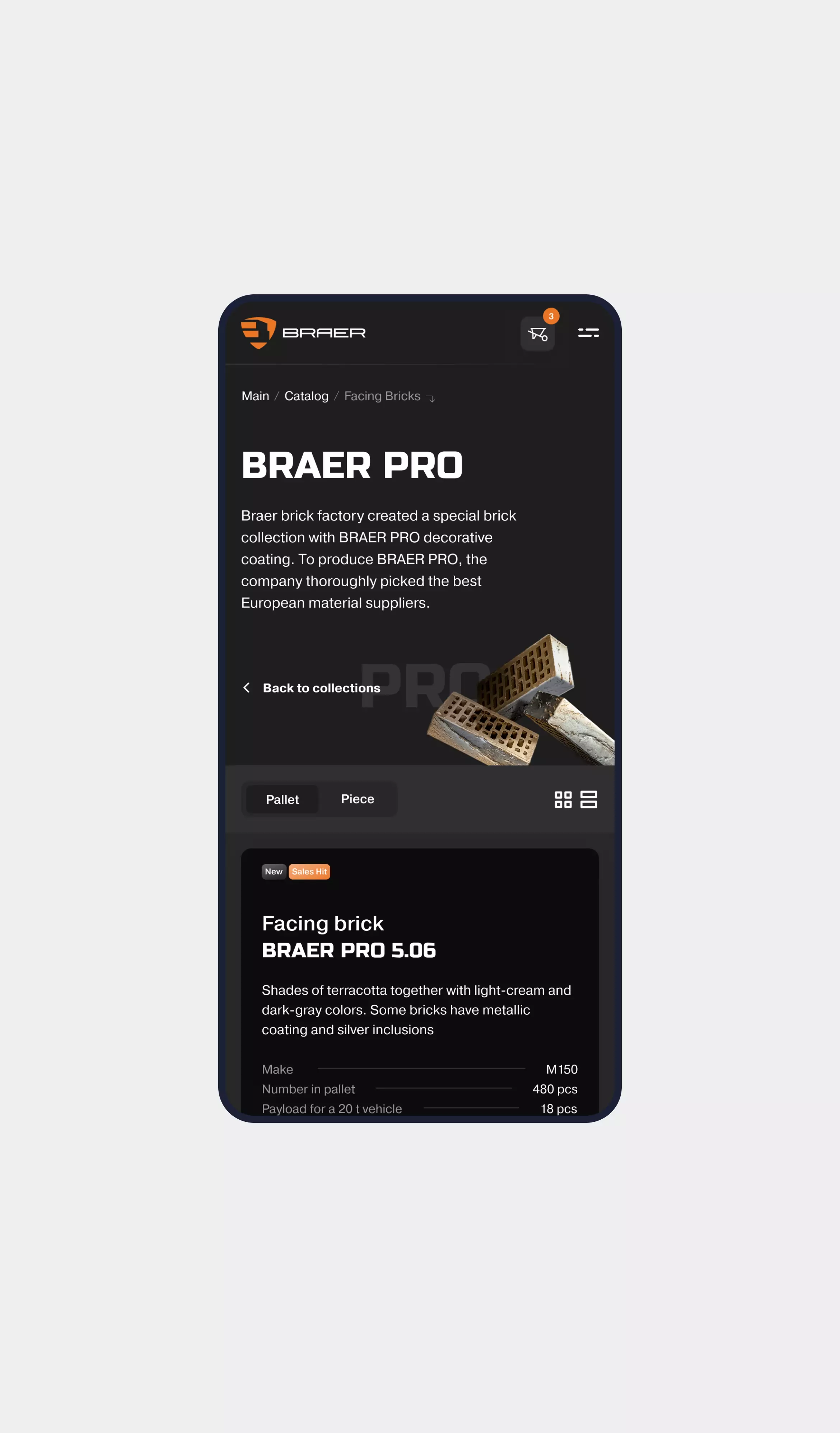
We significantly expanded the catalogue capabilities. The category page now displays collections, filters, and products in multiple formats (tile or list).
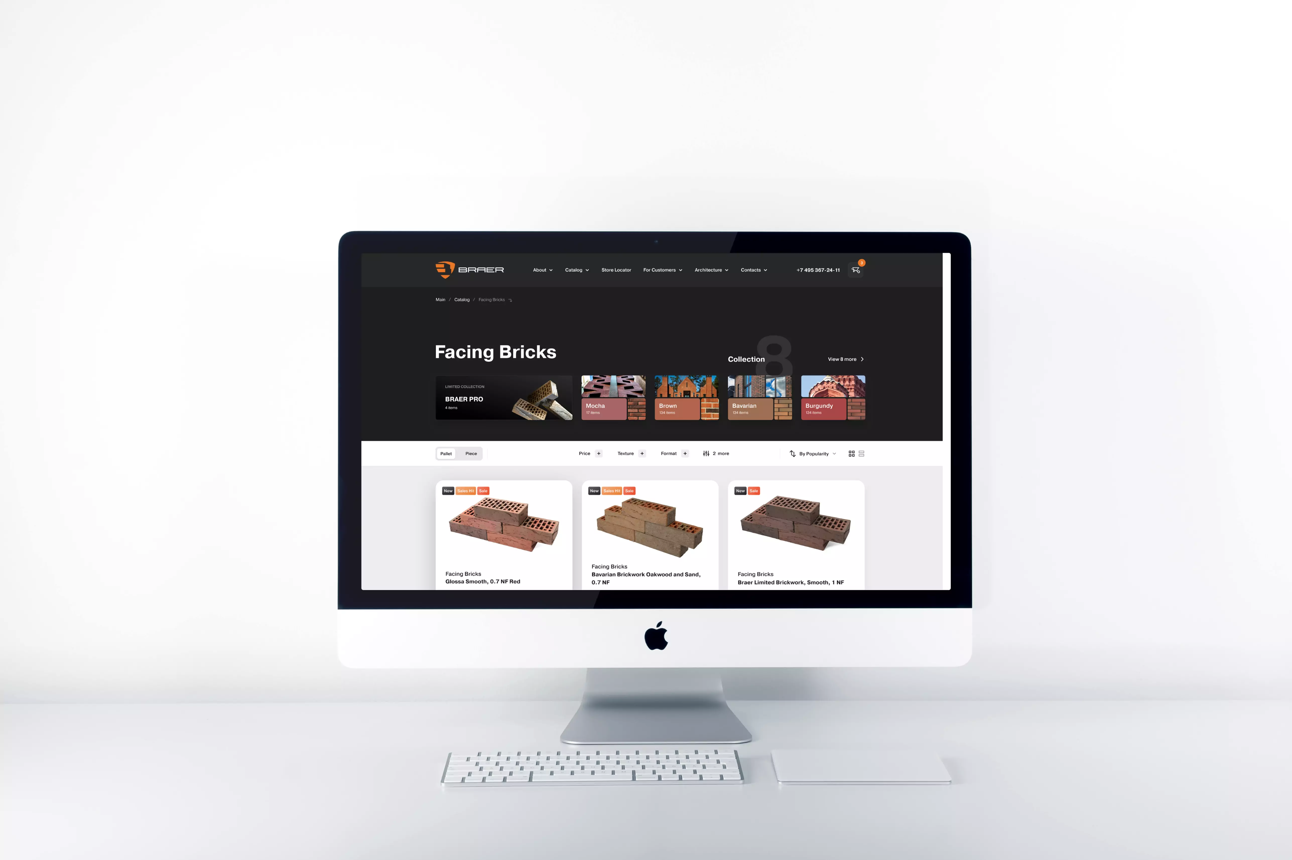
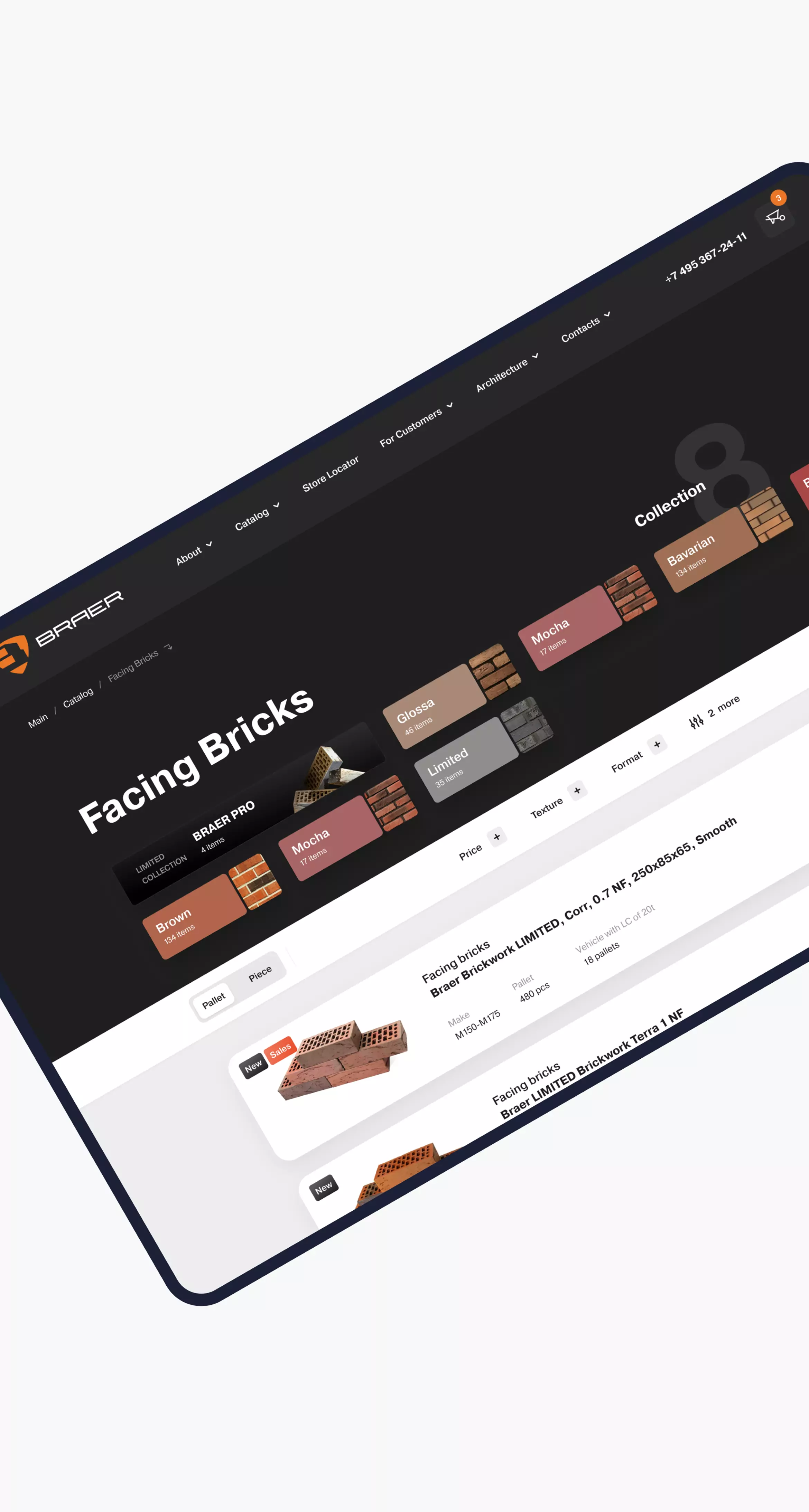
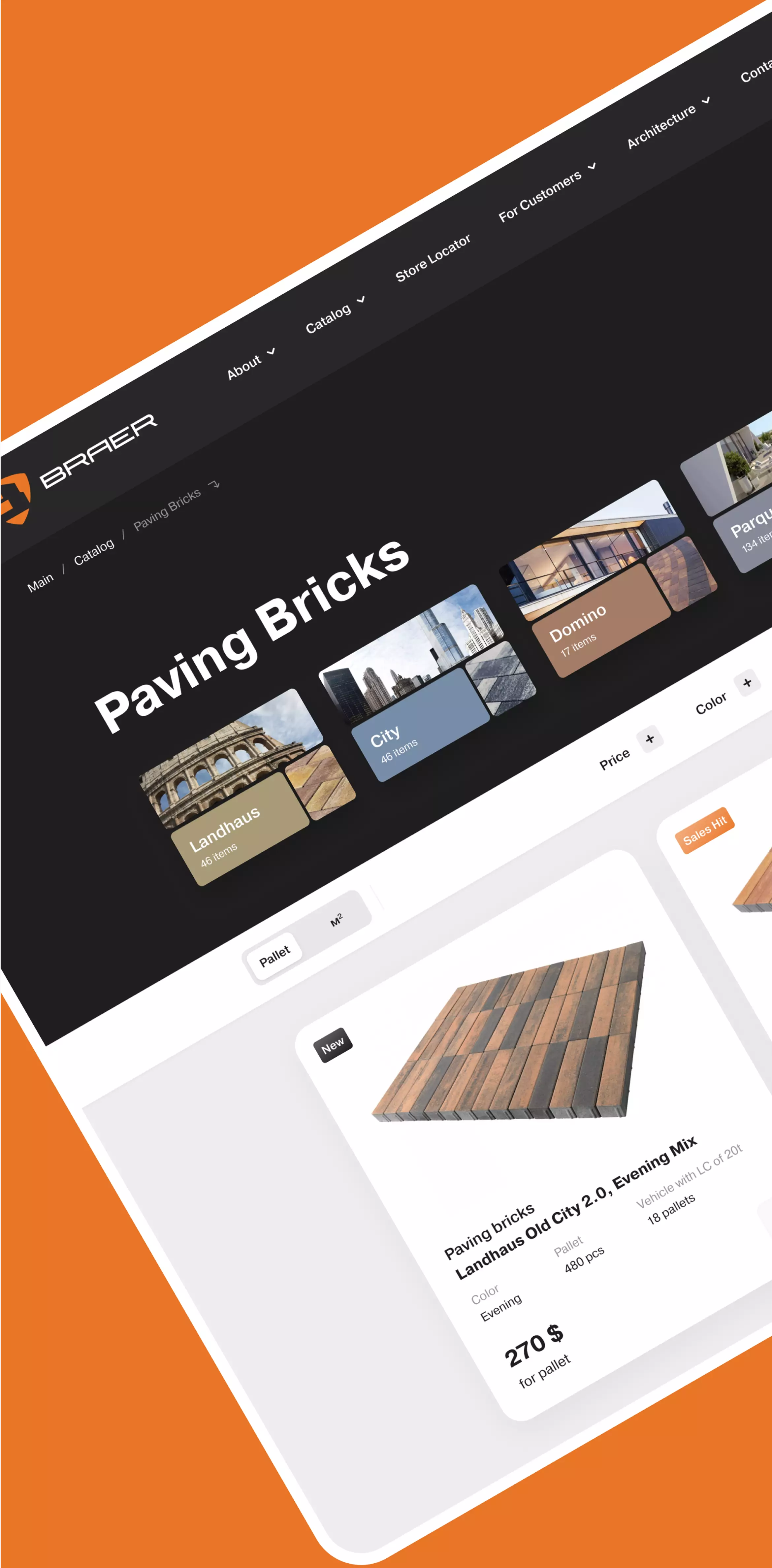
We optimised the layout and introduced custom filters to improve navigation. This allowed us to accommodate more products without sacrificing clarity or speed.
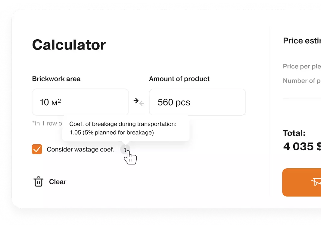
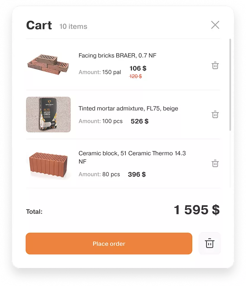
Placement of orders in pallets
We integrated ordering functionality not only in pieces, but also in pallets (m²). Such a non-standard solution required custom logic and reflects the level of development typically seen in robust Personal Account Development workflows for industrial clients.

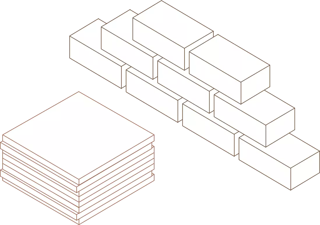
Thing
Pallet
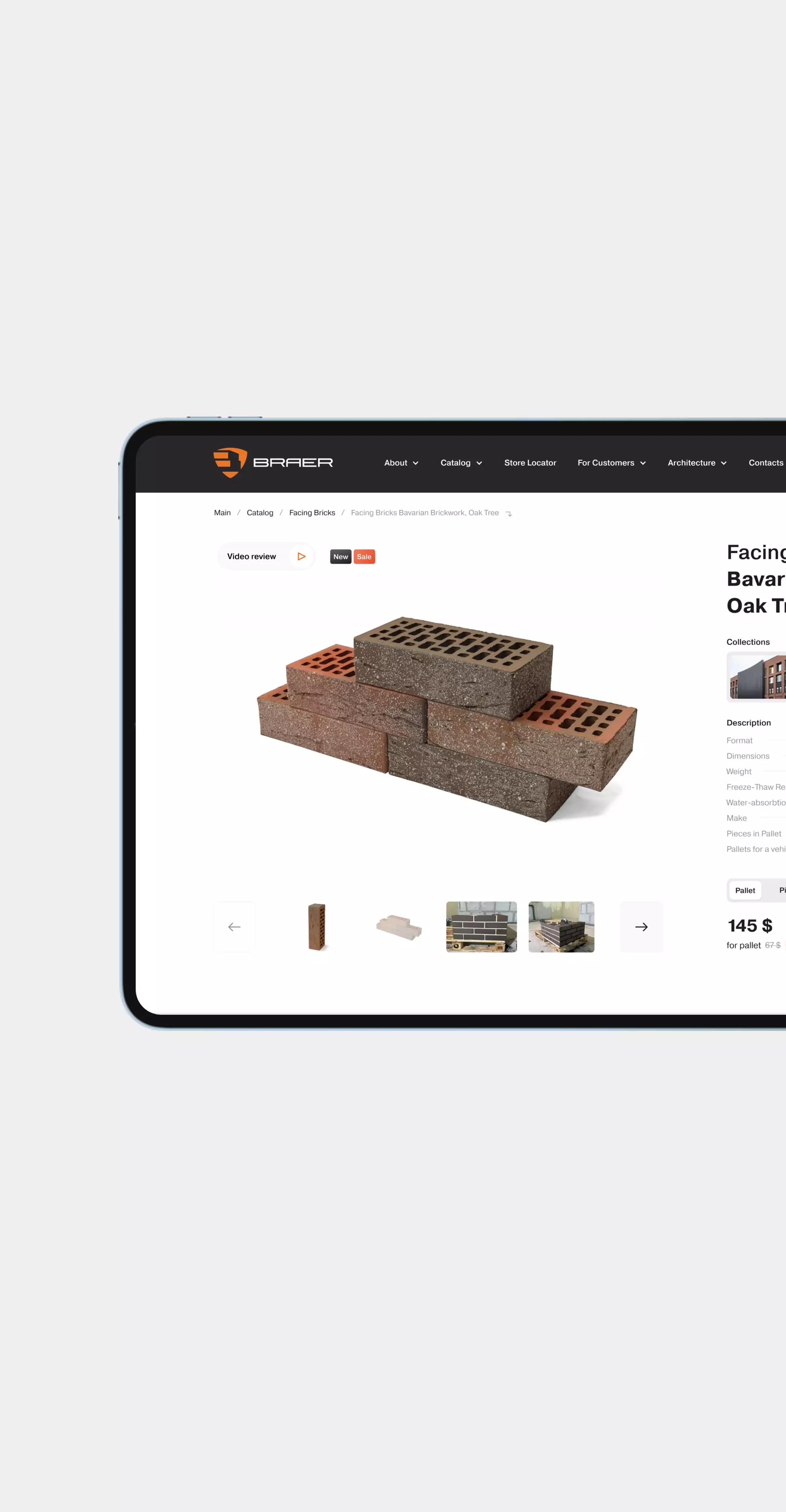
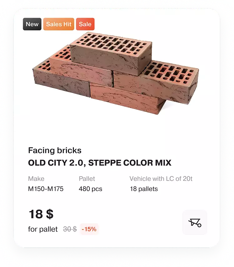
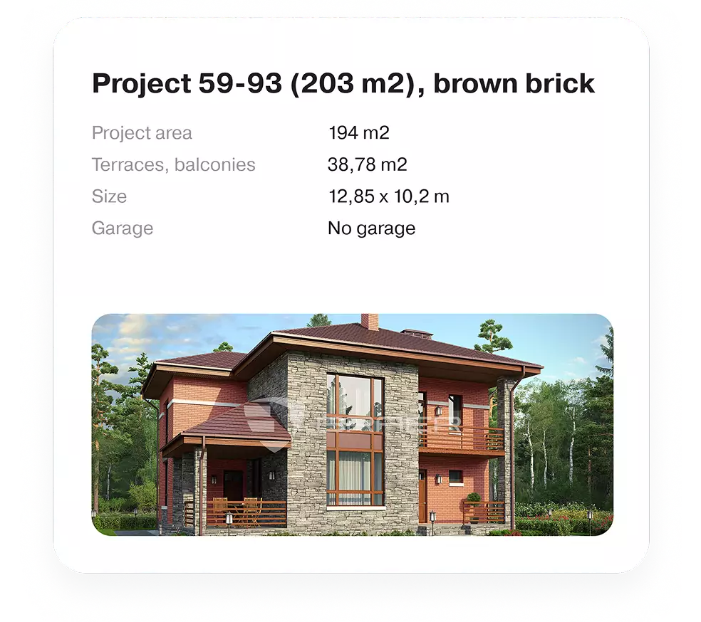
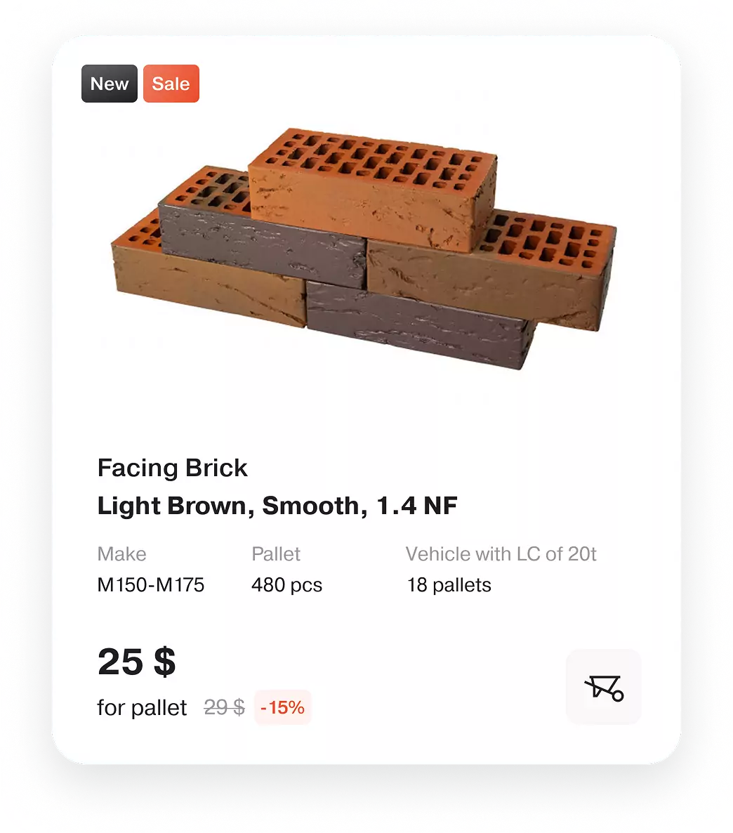
A product card
that sells
The product card was designed to work as a digital sales assistant: highlighting benefits, addressing doubts, and showing real project photos. Custom animations help users understand the material and make confident purchase decisions.
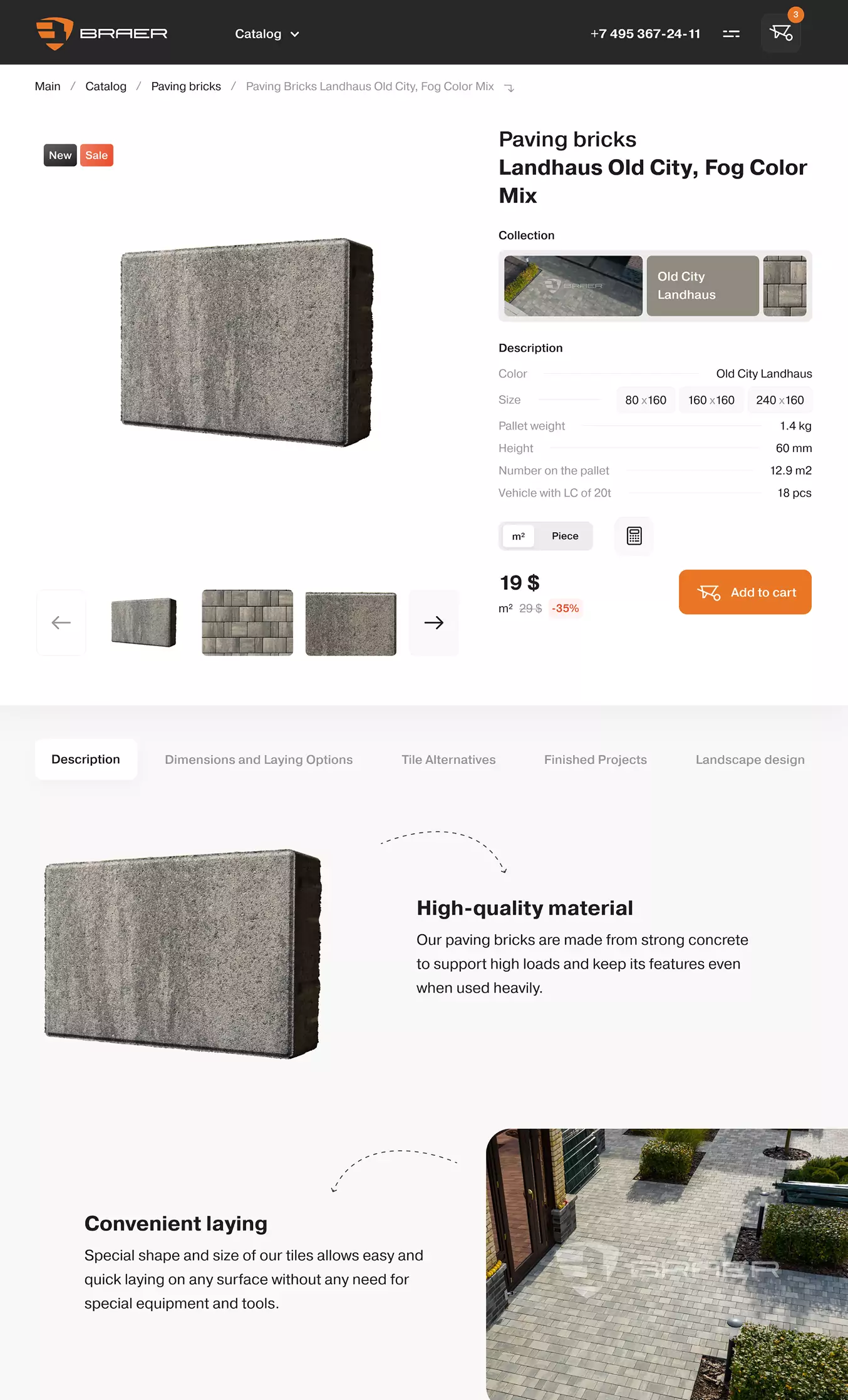
The page became a compelling and useful tool to help customers make an informed purchase decision.
Redesign
of the personal account
We optimised personal accounts, improving structure and streamlining content. All materials are now intuitively organised into sections, allowing users to find information more quickly. Orders can be placed and tracked through the personal account. For distributors, we simplified order management by removing unnecessary statuses and adding messenger chat history.
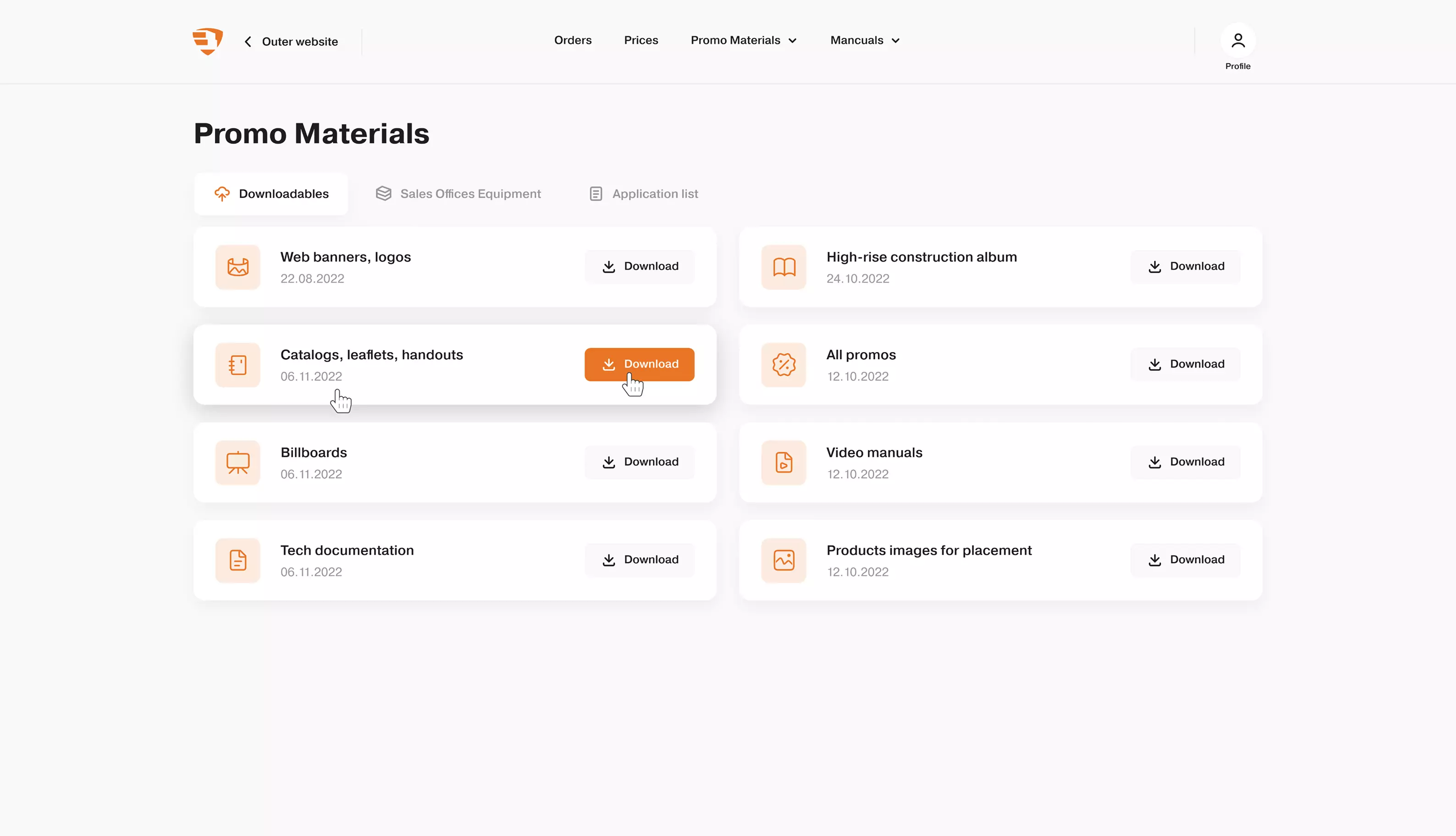
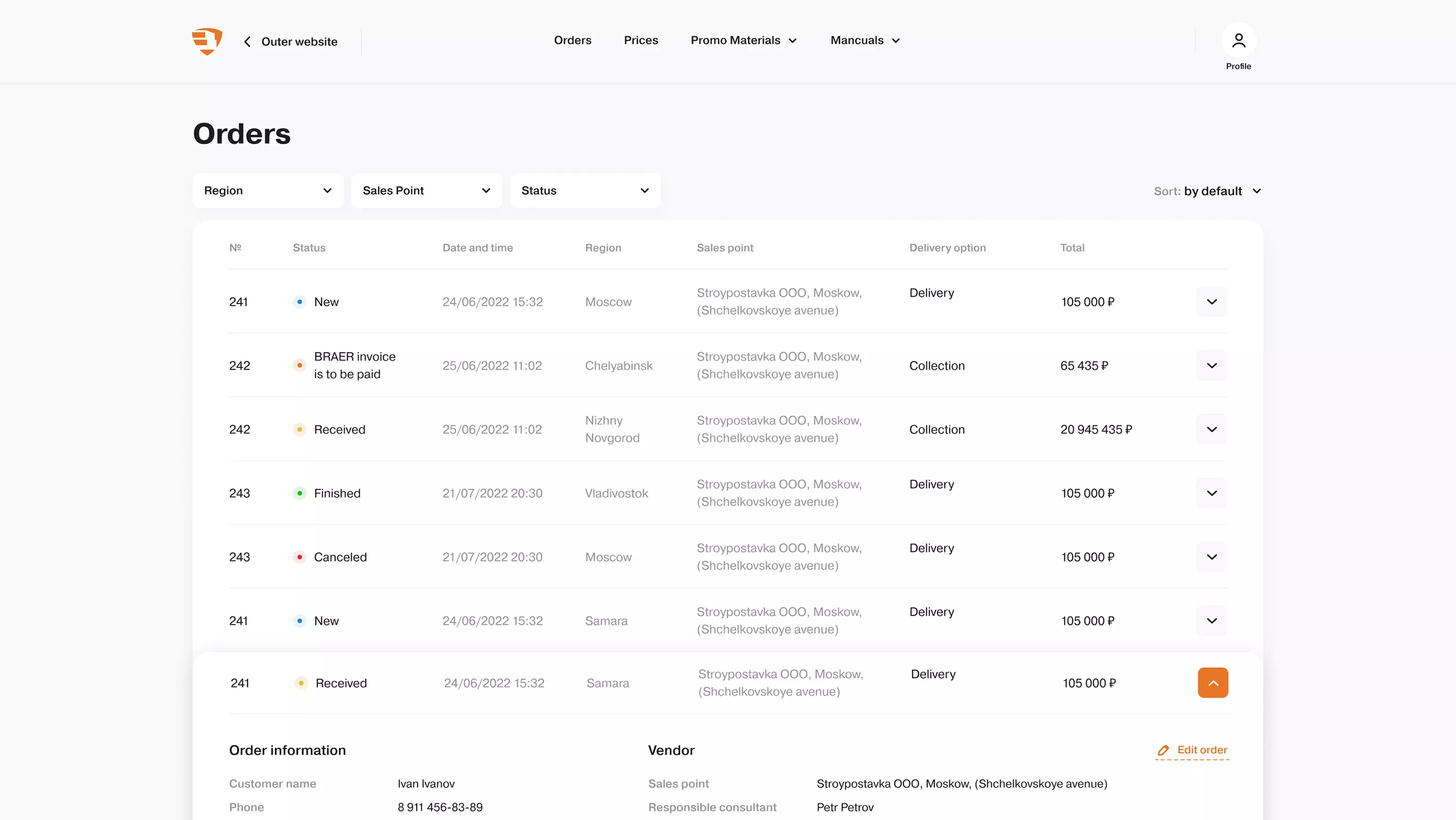
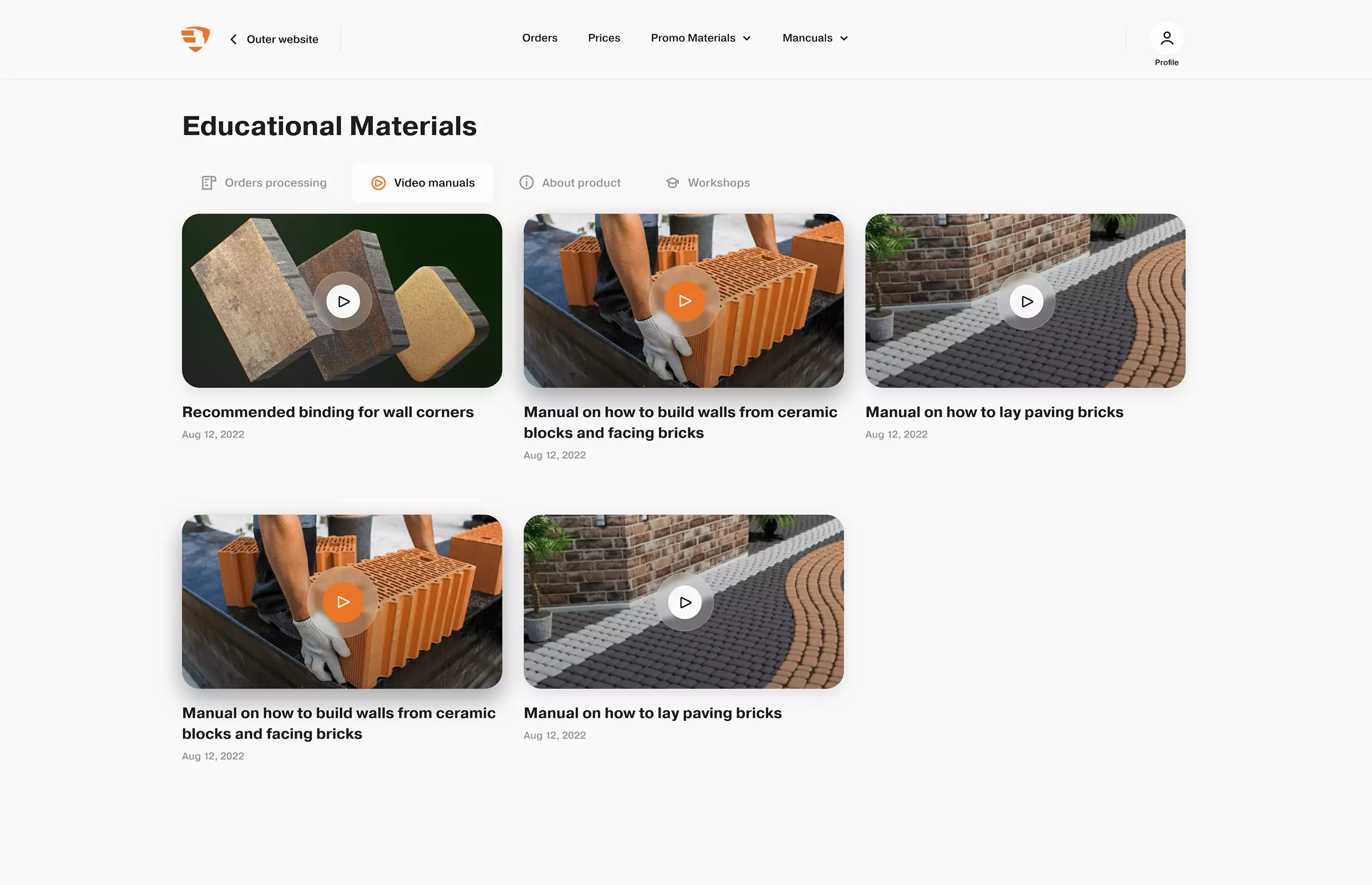
Material orders can be placed and tracked through the personal account. In addition, we simplified order management for distributors by removing redundant statuses, adding messenger chat history, and much more.
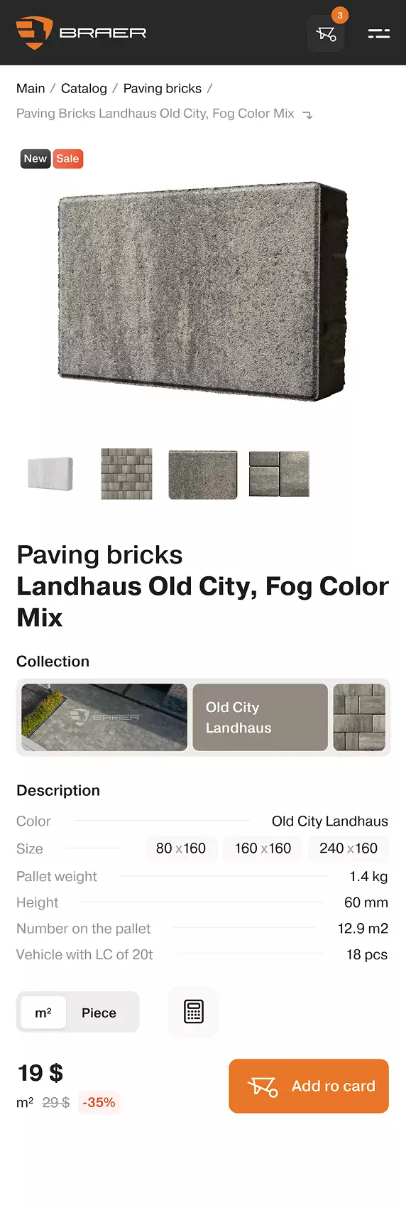
Responsive
web design
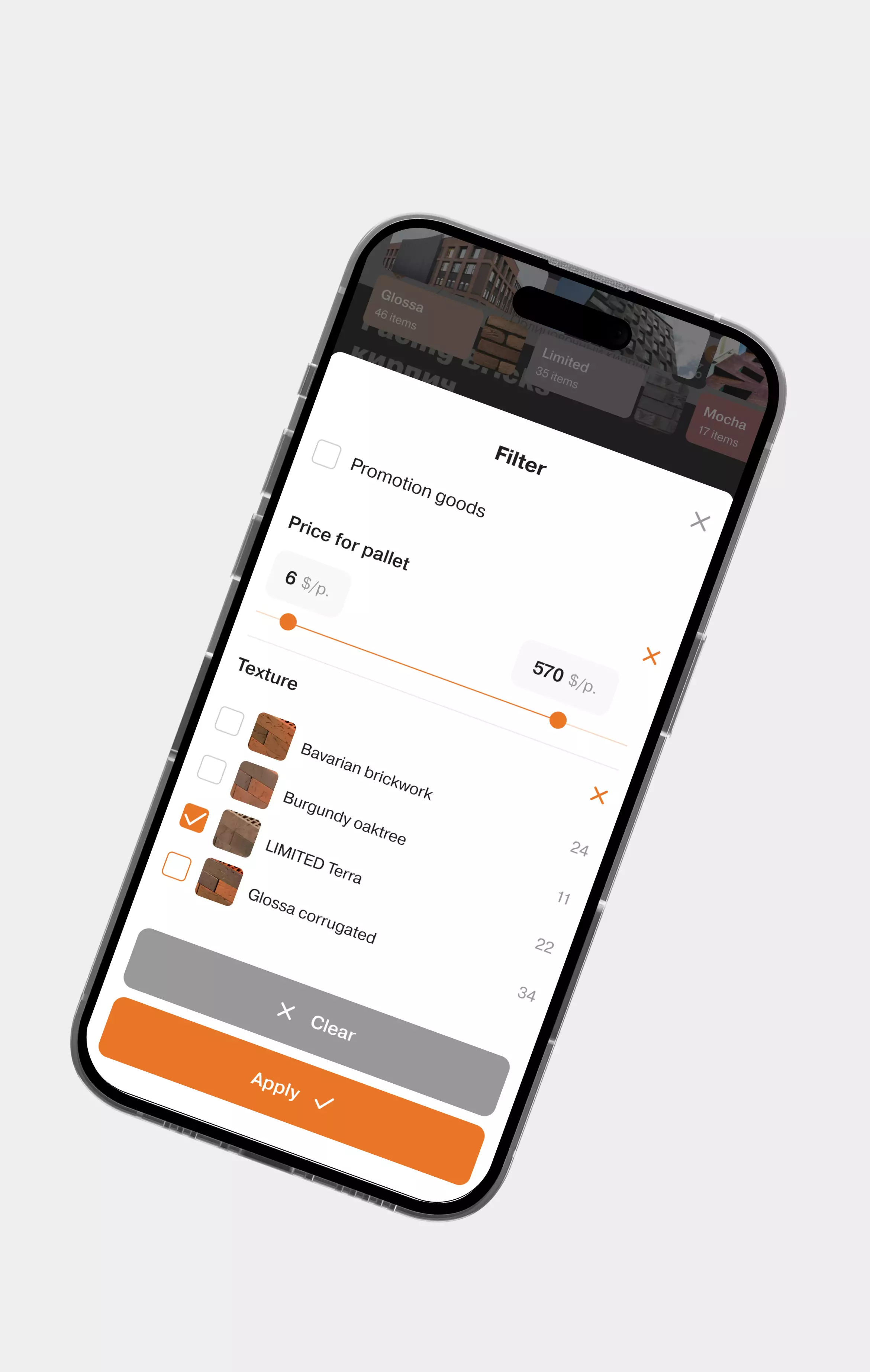
Mobile adaptation was treated as a separate product. We developed flexible layouts for different devices, designing mobile filters for one-handed use and creating UI scenarios that adapt to real-life user behaviour.
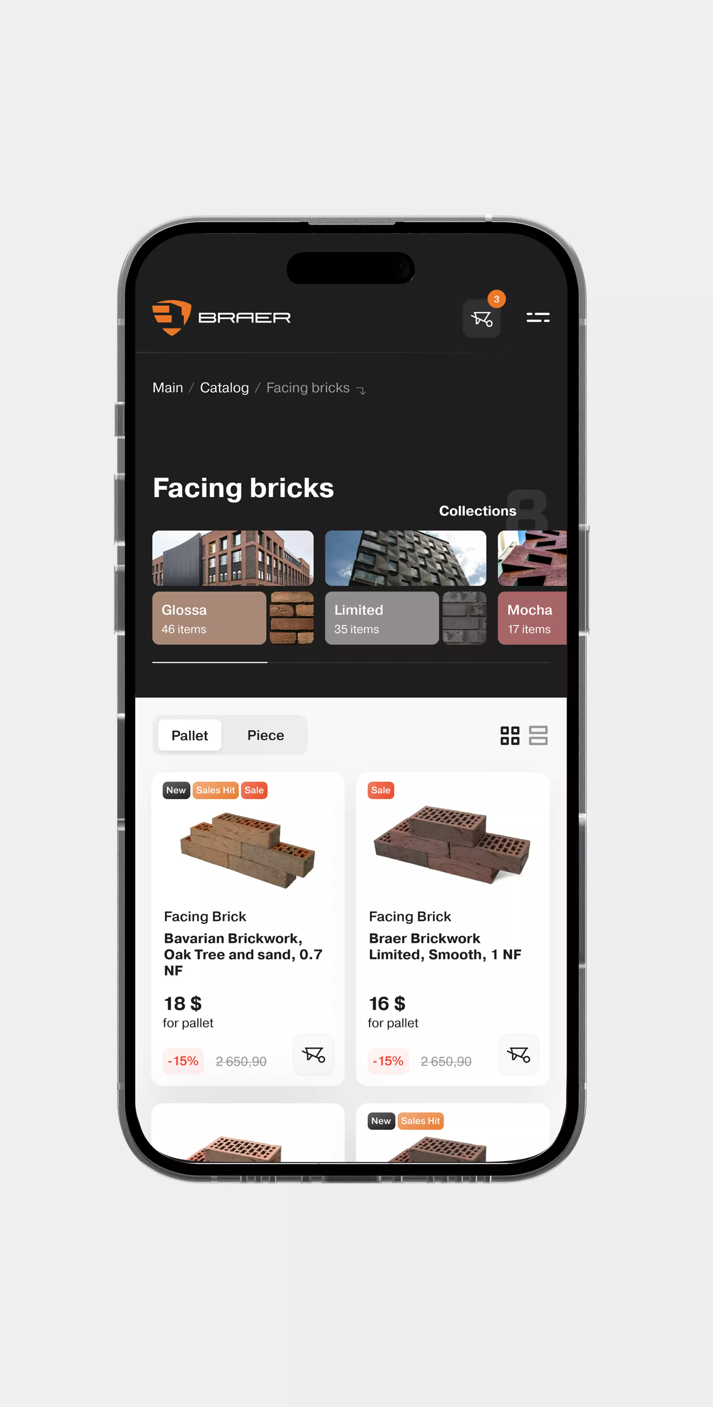
The filters on the mobile version were designed to allow seamless, one-handed use. We also considered how users interact with the website on different devices and developed flexible, intuitive UIs that are convenient to navigate in any scenario.