The best e-commerce sites of 2026 don't just convert — they turn buying into a brand experience. These 10 sites represent the ceiling of what's possible across luxury, DTC, enterprise, and immersive commerce, from Bottega Veneta's quiet restraint to KidSuper World's 3D storefront.
Key takeaways 👌
E-commerce design in 2026 has split into two dominant camps — luxury restraint (Bottega, Aesop, Patagonia) and challenger maximalism (Poppi, Glossier, Oatly) — and the middle ground is where most brands lose.
The "product is the demo" pattern now dominates every successful category: Apple's scroll-driven canvas sequences, Nike's looping athlete films, and KidSuper's walkable 3D store all prove that static product grids convert worse than interactive product moments.
Checkout is no longer where brands differentiate — it's table stakes. The real design investment now flows into homepage storytelling, PDP depth, and post-purchase experience, which is where conversion margins actually live.
TL;DR: Top 10 Best E-commerce Website Designs in 2026
For enterprise DTC benchmarking: Nike, Apple — the industry's reference standards for editorial heroes and scroll storytelling.
For luxury restraint: Bottega Veneta, Aesop — the sites that win by deliberately doing less.
For brand-led challenger DTC: Glossier, Poppi, Oatly — bold voice as the primary conversion mechanic.
For mission-driven commerce: Patagonia — editorial storytelling woven into the shopping experience.
For DTC mobile-first execution: Gymshark — Shopify Plus benchmark with UGC-heavy social proof.
For the immersive future of commerce: KidSuper World — full 3D storefront as the category's cutting edge.
Introduction
E-commerce design in 2026 has reached a point of clarity that 2020-era designers would have found impossible to predict. The dominant pattern isn't a single aesthetic — it's a deliberate split between two diverging philosophies, both winning at the top of their categories.
The first philosophy is restraint: luxury brands like Bottega Veneta, Aesop, and Patagonia have doubled down on editorial discipline, long-form product storytelling, and near-zero visual noise — treating the storefront as a gallery rather than a catalog. The second is maximalism: challenger DTC brands like Poppi, Oatly, and Glossier are winning market share through aggressive color, personality-led voice, and visual risk-taking that enterprise brands would never approve.
Enterprise and immersive brands occupy the outer edges of this spectrum. Nike and Apple have refined enterprise-scale DTC to the point where every interaction is benchmarked against their playbooks. KidSuper World takes immersive commerce to its logical conclusion with a fully navigable 3D storefront powered by Three.js — showing where category design is heading as WebGL and spatial computing mature.
The ten sites below represent the current ceiling in each of these directions. They're selected not for traffic volume or revenue scale, but for the clarity with which each executes its chosen design direction — and what any brand considering a selling-focused website build can learn from studying them.
What Separates the Top 10 from Everything Else
Seven attributes appear across every site on this list. Any one of them is achievable. Combining them at this level of execution is what separates benchmark sites from the thousands of "modern e-commerce" sites that look polished but convert poorly.
1. A single, defensible brand conviction. Every site on this list reads as if one person made every decision — even when the team behind it was fifty people. Nike's editorial athletic drama, Aesop's apothecary restraint, Poppi's technicolor joy. The conviction is visible in typography, spacing, motion, copy, and imagery simultaneously.
2. Product photography as the hero — not stock imagery. None of these sites use generic product-on-white shots or stock photography. Every image is either custom-commissioned, shot with intent, or rendered as part of an integrated visual system. The investment in original imagery is itself a design decision that signals brand seriousness.
3. Motion that serves meaning, not decoration. Where animations exist (Nike's looping athlete films, Apple's canvas sequences, KidSuper's 3D walkthrough), they serve a specific purpose — demonstrating product, establishing atmosphere, or providing interaction feedback. Motion-for-motion's-sake is absent.
4. Typography treated as a primary brand asset. Every site on this list either uses a custom typeface (Bottega Serif, Geist, Loewe's Pegasus adaptation) or has a distinctive, recognizable pairing (Aesop's Optima-inspired serif, Glossier's blackletter "G" accent). Typography is brand infrastructure, not decoration.
5. PDPs that function as editorial content. Product Detail Pages go beyond specs and images — they include process video (Bottega's artisan-at-work), provenance storytelling (Tatcha-style ingredient maps), sustainability data (Allbirds-style carbon specs), or interactive configuration (Nike By You, Apple Configurator).
6. Frictionless but branded checkout. The benchmark checkouts on this list are fast — Shop Pay, Apple Pay, Klarna — but they also preserve brand voice through microcopy, confirmation experiences, and post-purchase touchpoints. Speed without brand feels like Amazon; brand without speed loses the cart.
7. Homepage as magazine front page. Every site treats the homepage as an editorial surface that changes frequently — campaign films, seasonal drops, editorial features — rather than a static catalog index. Content velocity is built into the design system. This editorial flexibility is increasingly enabled by conversion-optimized page architecture that separates structural design from content updates.

1. Nike — The Enterprise DTC Benchmark
Website: nike.com
Category: Global sportswear / athletic DTC
Design Aesthetic: Editorial athletic drama
Nike leads with edge-to-edge editorial hero tiles that swap between full-bleed sport photography, looping MP4 product films (athletes in motion against colored backdrops), and split-banner campaign layouts — the hero routinely changes per viewport and campaign. The header is slim and sticky with calm Helvetica Neue typography, a persistent search/bag/Join pair top-right, and a tight primary nav opening into a typography-forward mega menu with featured-product tiles. Product grids use a light-grey background so cutout shoes "pop," with hover-to-reveal colorway swatches and star ratings. The Nike By You member-gated customization canvas runs live 3D-ish color swaps, and checkout is a sticky single-column flow with region auto-detection and Apple Pay/PayPal/Klarna express buttons.
Key design elements: Full-bleed editorial hero tiles with looping athlete films; split-banner dual-tile hero layouts; Helvetica Neue type system with campaign accents; hover-reveal colorway swatches on product cards; Nike By You 3D customization canvas; express checkout with region auto-detection.
Best for inspiration if: You're running enterprise DTC and need the gold standard for content velocity — Nike proves that editorial rhythm matters more than feature density.
Recognition: Benchmarked continuously by Baymard Institute (29 reviews since 2012); covered as UX/CRO case by Plerdy and DesignRush; consistently featured in Dezeen's sportswear design coverage.
2. Apple — The Scroll Storytelling Masterclass
Website: apple.com
Category: Consumer electronics / global benchmark
Design Aesthetic: Cinematic product storytelling
Apple's product pages are constructed as scroll-driven cinematic narratives where a fixed canvas element plays back pre-rendered image sequences tied to scroll position, creating the illusion of products rotating, unfolding, and reacting as you read. The AirPods Pro product page won Awwwards Site of the Month for this "one continuous movement that passes through a fixed-frame, activated on scroll." Full-bleed autoplay video loops in deep blacks merge with the page chrome. The Shop experience uses a progressive configurator (finish → storage → trade-in → carrier → AppleCare) with real-time price updates, and AR "View in your space" buttons trigger USDZ models natively in Safari/iOS.
Key design elements: Scroll-driven canvas animation sequences; sticky product-page sub-nav with "Buy" CTA and price; full-bleed autoplay video/3D hero loops with dark-mode sections; parallax storytelling blocks with sticky text that fades/crossfades; progressive configurator with live pricing; USDZ 3D models viewable in-page and in AR on iOS.
Best for inspiration if: Your product has a story that justifies a scroll-driven narrative treatment — Apple's pattern works for products worth 3–5 minutes of attention, not for low-consideration SKUs.
Recognition: Awwwards Site of the Month (AirPods Pro, Jan 2020); widely referenced in CSS-Tricks, Smashing Magazine, and Baymard as the gold standard for scroll storytelling and configurator UX.
3. Bottega Veneta — The Quiet Luxury Blueprint
Website: bottegaveneta.com
Category: Luxury fashion / leather goods
Design Aesthetic: Quiet luxury restraint
Bottega Veneta uses the digital storefront to replace the social-media presence it famously abandoned in 2021, so the site carries the full weight of brand expression. The hero is a rotating full-bleed editorial film (runway loops, atelier footage of the intrecciato weave, campaign stills) that plays muted and auto-loops without UI chrome. PDPs pair ultra-high-resolution zoomable photography with short artisan-at-work videos showing the 2-day weaving process, reinforcing craftsmanship as a design feature rather than a marketing claim. Navigation is a minimalist left-aligned mega-menu using the custom Bottega Serif with generous whitespace; checkout is distraction-free single-column with live stock and country-based tax messaging.
Key design elements: Full-bleed muted-autoplay runway and atelier video hero; custom serif (Bottega Serif) with generous whitespace; zoomable PDP imagery with artisan-process micro-videos; 360°/multi-angle product spins; shoppable editorial "Journal" content; single-column distraction-free checkout with region-aware pricing; no social share/UGC widgets — intentional quiet-luxury UX choice.
Best for inspiration if: You operate in true luxury (not "premium") and need to signal that the brand doesn't chase trends — Bottega's site proves that refusing conventional UX elements can itself be the brand statement.
Recognition: Widely cited as the benchmark luxury DTC experience after Bottega's 2021 social-media exit; referenced repeatedly in Vervaunt's Top Luxury Ecommerce list, Wallpaper*, Dezeen, and PurseBlog.
In order to be irreplaceable, one must always be different.
— Coco Chanel, Founder, Chanel
4. Aesop — The Editorial Luxury Standard
Website: aesop.com
Category: Luxury skincare / haircare / fragrance
Design Aesthetic: Editorial apothecary
Aesop.com is the digital extension of the brand's editorial and retail discipline — a monochrome system with Optima-inspired serifs, warm cream body background, and #ECD06F yellow used sparingly as accent. The hero is text-forward rather than image-dominant — long-form editorial intros sit above modest still-life product photography — and the site feels closer to a magazine than a store. Work & Co's "shoppable navigation" pattern exposes products directly inside the menu via elegant motion, so loyalists can restock in two clicks. PDPs embed consultative how-to copy and video mirroring in-store consultant training. Limited-edition releases ship with horizontal-scroll parallax-illustrated microsites — essentially dedicated art projects per launch.
Key design elements: Monochrome palette with #ECD06F yellow accent and serif/sans pairing; "shoppable navigation" with products exposed directly in the menu; editorial text-forward homepage; one-page checkout with integrated gift card, gift message, and gift wrap; horizontal-scroll parallax microsites for limited drops; infinite-scroll editorial index for The Fabulist / Athenaeum; personalized content by location and seasonal climate.
Best for inspiration if: Your brand has editorial substance and trust signals matter more than flash — Aesop demonstrates that editorial depth can convert better than visual excitement when the buyer values consideration over impulse.
Recognition: Work & Co redesign won HOW International Design Awards (top honors), Awwwards Honorable Mention, and FWA + Fast Company Innovation by Design honoree for Best Shopping Websites.
5. Gymshark — The DTC Mobile-First Benchmark
Website: gymshark.com
Category: DTC fitness apparel / activewear (Shopify Plus)
Design Aesthetic: Crisp athletic DTC
Gymshark runs a mobile-first, aggressively white UI where product hero tiles are occupied by high-contrast athlete photography — always models mid-lift or mid-run — and the homepage stacks "New Releases" rails broken out by gender, collection drops, and athlete-curated lookbooks that mimic the influencer's own wishlist. The mega menu is visually dense: multi-column, left rail for categories, right rail for thumbnail-image featured collections, and a "Shop by Sport" routing that personalizes subsequent browsing. PDPs use a sticky size-selector with "Selling Fast" urgency microcopy, a persistent sticky Add-to-Bag bar on mobile scroll, and shoppable UGC modules pulled from Instagram creators. Checkout is Shopify Plus with one-click Shop Pay, Klarna/Clearpay tiles, and an XP-based loyalty prompt showing points earned before payment.
Key design elements: Crisp white UI with athlete hero imagery; multi-column mega menu with "Shop by Sport" thumbnail routing; sticky mobile Add-to-Bag bar and "Selling Fast" urgency labels; shoppable UGC / influencer lookbook modules (Foursixty); collection pages personalized by training type; Shop Pay + Klarna/Clearpay express checkout; app-connected XP loyalty tier widget in cart and checkout.
Best for inspiration if: You're running Shopify Plus DTC with heavy Instagram/TikTok social proof — Gymshark's pattern proves that influencer-driven imagery and aggressive mobile optimization can coexist at benchmark quality.
Recognition: Featured on Ecomm.design as a benchmark Shopify store; cited by Future Commerce Insiders for omnichannel work; analyzed by XgenTech, Juphy, and Appbrew as a Shopify design case study.
6. Glossier — The Bold Brand-Led Experiment
Website: glossier.com
Category: DTC beauty (skincare, makeup, body care, fragrance)
Design Aesthetic: Gallery-style brand-first
Glossier's 2023 omnichannel replatform (Shopify + Contentful + Barkas-led design) leans into a gallery aesthetic: oversized editorial product stills on near-white backgrounds, a custom cursor that becomes a pink Glossier "G" dot on hover, and a blackletter "G" logomark used as a typographic accent against Glossier's usual clean sans-serif. The navigation dropdown exposes the full product shelf with thumbnail previews on hover, so you reach any SKU in one click without loading a category page. PDPs use layered video demos alongside UGC carousels, and the cart slides in as a right drawer showing an "Almost there, keep going" progress bar. Checkout is the standout: a single-page, three-column triptych layout (Contact / Shipping / Payment) visible simultaneously, eliminating progress bars by showing every remaining step at once.
Key design elements: Custom pink "G" cursor icon on hover states; blackletter "G" logomark paired with clean sans-serif body; gallery-style PDPs with oversized flat-lay photography; embedded video application demos on product pages; slide-out cart with "Almost there" free-shipping progress bar; three-column triptych single-page checkout; Algolia search, Contentful CMS, Attentive SMS, Afterpay.
Best for inspiration if: You have strong brand equity and are willing to prioritize distinctiveness over UX convention — Glossier's triptych checkout is polarizing but proves that bold brand choices can differentiate at the top of the category.
Recognition: Redesign covered by Creative Review (Barkas case study, 2024); long-standing design-inspiration reference on thoughtbot's design blog, SiteInspire, and Ecomm.design.
7. Patagonia — The Mission-Driven Editorial Benchmark
Website: patagonia.com
Category: Outdoor apparel / mission-driven sustainability
Design Aesthetic: Brand journalism
BASIC/DEPT's redesign treats e-commerce as brand journalism — the homepage interleaves product cards with full-bleed editorial storytelling from The Footprint Chronicles, Patagonia Action Works, and Worn Wear (Patagonia's used-gear resale marketplace), so purchase and activism sit on the same plane. A distinctive floating, contextually-aware filter action button anchors collection pages — filters collapse into a persistent pill that expands into a full panel, keeping the catalog scannable without left-rail clutter. PDPs include unusually rich metadata: Fair Trade Certified badges, repair-service CTAs, and a third-party Fit Finder quiz that asks body-type questions and returns recommended sizes with conversational microcopy. Out-of-stock items offer waitlist CTAs rather than dead-ending.
Key design elements: Editorial storytelling modules woven into shop grid; floating, contextually aware filter action button on collection pages; Fit Finder interactive sizing quiz; waitlist / notify-me flows instead of "out of stock" dead ends; Worn Wear resale integration on the same domain; rich PDP sustainability metadata (Fair Trade, repairability, traceability); Tealium + Monetate stack for A/B testing.
Best for inspiration if: Your brand has genuine values that drive purchasing behavior — Patagonia's editorial weaving proves that mission content and commerce can share the same surface without diluting either.
Recognition: BASIC/DEPT case study extensively published; widely cited in DTC/industry roundups as the benchmark for mission-driven e-commerce UX, with 25%+ mobile revenue lift post-relaunch.
Interesting fact 👀
Baymard Institute's 2024 e-commerce benchmark database reports an average cart abandonment rate of 70.19% across the industry — and finds that 82% of e-commerce sites have critical checkout usability issues. The gap between benchmark sites (like those profiled here) and average sites often represents 30%+ differences in conversion rate, with most of the gap located in homepage experience and PDP depth, not checkout mechanics.
8. Poppi — The Technicolor Maximalist
Website: drinkpoppi.com
Category: DTC beverage (prebiotic soda)
Design Aesthetic: Joyful technicolor maximalism
Poppi is the clearest expression of "joyful technicolor maximalism" in DTC — the above-the-fold randomly swaps between four flavor-specific art directions on each load (strawberry-lemon pink, cherry-limeade red, orange, grape purple), each with full-bleed poster-style layouts where the product name is scaled to fill the viewport in a rounded retro display face. As users scroll, contrasting color blocks divide sections, and the PDPs read like pop-art posters with flavor "haikus" replacing typical bullet copy. Interaction details include a sticky flavor-selector bar, animated liquid fills on add-to-cart, and a shoppable review wall. The brand's color-blocked Instagram grid (every 12 posts matching a color) is intentionally mirrored into site navigation so social-to-site continuity is near-seamless.
Key design elements: Randomized above-the-fold hero (4 flavor-based art directions); oversized retro display typography scaled to full viewport; pop-art inspired color-block section breaks; flavor "haiku" copy on PDPs (no standard bullet lists); animated liquid-fill add-to-cart interaction; UGC review wall integrated into shop flow; color-coded navigation matching Instagram grid.
Best for inspiration if: You're a consumer brand with multiple SKUs that each justify their own visual identity — Poppi's rotating-hero approach proves that variety within brand discipline can drive return visits.
Recognition: Featured on Ecomm.design, Lapa Ninja, Storefeel, and Tapcart's "DTC Brand Crush" series; Dieline and BevNet packaging awards; acquired by PepsiCo in 2025 for $1.95B — one of the largest functional-beverage exits of the decade, widely cited in industry coverage as validation of brand-led maximalist design.
9. Oatly — Copy-as-Design, Homepage-as-Newspaper
Website: oatly.com
Category: DTC food/beverage (plant-based)
Design Aesthetic: Irreverent editorial rebel
Oatly treats the website as a vertical newspaper rather than a grocery catalog — the homepage uses the brand's signature handwritten-style custom typography (coded into Storyblok CMS) and scrolls horizontally in the upper section before breaking into vertical editorial rails, a deliberate break from e-commerce convention. Copy itself is the design: oversized headlines ("Wow, no cow!", "It's like milk, but made for humans"), self-aware micro-copy in cookie banners, 404 pages, and even the privacy policy, plus the infamous fckoatly.com counter-site linked transparently from the nav. Product pages lean flat-design: black-on-cream with marker-sketch illustrations instead of glossy product shots. The global architecture is headless (Storyblok + Shopify API + Vimeo), letting Oatly spin up localized sites in 16 markets in 2 months.
Key design elements: Horizontal-scroll homepage breaking e-commerce convention; custom handwritten/marker-style typography system; copy-as-design oversized editorial headlines; hand-drawn illustrations in place of stock product photography; headless stack (Storyblok + Shopify + Vimeo); Recharge-powered subscription dashboard (188% MRR lift reported); voice-consistent microcopy in 404s, T&Cs, cookie banners; transparent link to self-critique site (fckoatly.com).
Best for inspiration if: Your brand has a strong editorial voice that shouldn't be softened by conventional e-commerce UX — Oatly proves that refusing design conventions can itself become a competitive moat.
Recognition: Featured on Ecomm.design, Colorlib's "24 Best Website Design Examples," Storyblok's public case study; referenced as a brand-voice/design benchmark across AdExchanger, Digital Marketing Institute, and copystyleguide.com.
10. KidSuper World — The Immersive Future of Commerce
Website: kidsuper.world
Category: Streetwear / fashion (immersive 3D store)
Design Aesthetic: Navigable 3D artwork
KidSuper World rejects the standard PLP entirely — users enter through a painted facade of the Brooklyn storefront and "walk" a photorealistic interior rendered in Three.js and React Three Fiber on Vercel, clicking portals into animated paintings to reveal products. Every texture began as physical acrylics and watercolors that were digitized, so the 3D world feels handcrafted rather than CGI. Interactive objects include a working jukebox (the "Winco") that plays music, a "La Casa" animated painting, and portal-style navigation between rooms. Products are revealed contextually via floating cards with add-to-cart inside the 3D scene.
Key design elements: Full WebGL/Three.js 3D scene navigation; custom R3F RenderTexture component for paintings-as-portals; hand-painted, scanned textures as UI; diegetic interactive objects (jukebox, paintings) as navigation; in-scene shopping cart drawer; custom cursor interaction; ABC Diatype Mono / Semimono typography system.
Best for inspiration if: Your brand has cult-level creative identity and the audience to justify experimental UX — KidSuper World points to where luxury and streetwear commerce are heading as spatial computing matures. Not a template for mass-market commerce, but a preview of what's possible.
Recognition: Awwwards Site of the Day (Jan 9, 2024); E-commerce Honors (Dec 2023); Developer Award; Webby People's Voice Award; FWA feature; Landing Love feature; covered by Codrops.
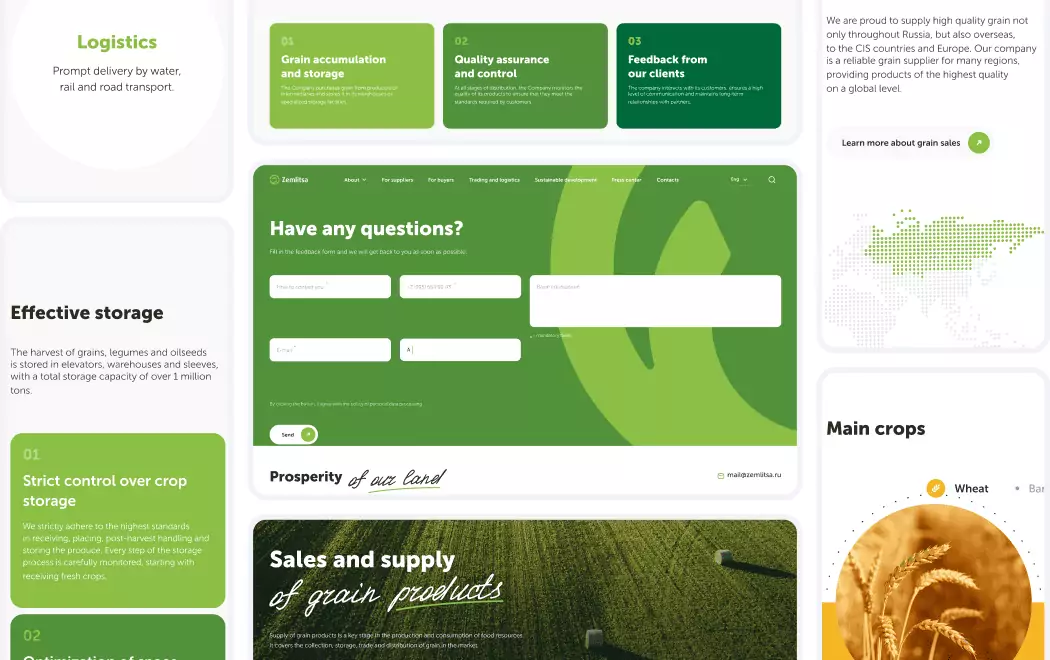
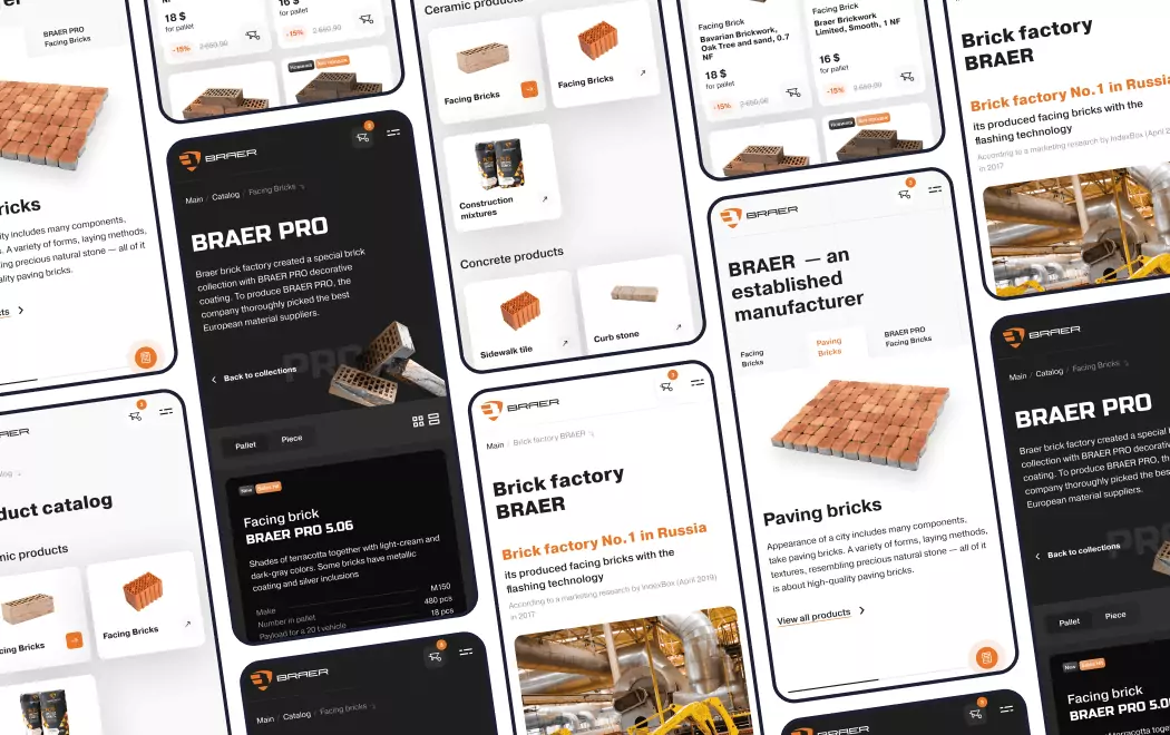
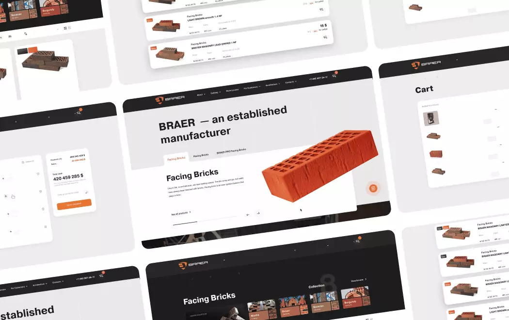
E-commerce Patterns We've Built: From Baby Food Catalogs to Construction Material Marketplaces
The ten benchmark sites above aren't abstractions for us — they're the same design conversations we have every time a client briefs us on an e-commerce project. The patterns work differently in children's products than in industrial catalogs, differently in fashion than in construction materials, differently in DTC than in B2B. Four of the stores Toimi has shipped show how these benchmark directions translate into working commerce across completely different categories, buyer profiles, and conversion pressures.
Peekaboo — children's products applying the challenger-DTC voice pattern (Poppi / Glossier). Parents scroll fast, brand recognition beats feature lists, and warmth outperforms "serious" tone. We built Peekaboo around oversized product photography, friendly microcopy, and a color system consistent across category pages so returning visitors always know where they are. The restraint is in refusing corporate polish where the audience doesn't reward it. See the approach in the Peekaboo case study.
Busy Lizzy — DTC retail applying the gallery-style brand-first pattern (Glossier / Aesop). Busy Lizzy needed editorial discipline — product photography treated as composition rather than catalog — with a checkout experience that stays branded through every step. We took cues from Aesop's "shoppable navigation" approach (products exposed directly in the menu for repeat buyers) and Glossier-style slide-out cart mechanics with progress messaging. Details in the Busy Lizzy case study.
BRAER — construction material marketplace applying the enterprise DTC pattern at catalog scale (Nike / Patagonia). Selling construction materials is the opposite of selling sneakers — the catalog is massive, the buyer is often B2B, and filtering is the primary UX. We applied the Nike mega-menu discipline (typography-forward routing, thumbnail-image featured collections) and Patagonia-style contextually-aware filter architecture to keep a large industrial catalog scannable without left-rail clutter. Walk through the system in the BRAER case study.
MTT — e-commerce platform applying the mobile-first execution pattern (Gymshark). For MTT we built the kind of mobile-first experience Gymshark has formalized at Shopify Plus scale — sticky Add-to-Bag behavior, express checkout paths, and tight content-to-conversion distance. The pattern transfers to any category where the buying decision actually happens on a phone. See the implementation in the MTT case study.
None of these projects tried to invent a new design language — each picked a specific reference pattern from the ten above that fit the brand's category, audience, and commercial model, then out-executed the typical competitor in that space. That discipline is what separates a custom e-commerce build from a templated Shopify install.
How to Choose the Right Design Direction for Your
E-commerce Brand
If you're an enterprise DTC brand with existing traffic
Your needs: Content velocity, editorial rhythm, and benchmark-grade UX that competitors are measuring against.
Critical question: Does your team have the content production capability to sustain Nike-level editorial rhythm? Enterprise DTC design isn't a one-time build — it's a continuous publishing operation. If your marketing team can't produce campaign content every 2–3 weeks, the design direction will outpace the content and the site will feel empty.
If you're in luxury or premium and trust matters more than excitement
Your needs: Restraint that signals confidence, editorial depth, and the visual discipline that luxury buyers expect.
Best references: Bottega Veneta, Aesop
Critical question: Does your brand have the editorial substance to fill a restrained design? Luxury restraint fails when there's nothing behind the minimalism. A strong brand strategy foundation is what makes minimal design read as confident rather than sparse.
If you're a DTC challenger fighting commodity categories
Your needs: Distinctive voice, bold color, memorable interactions — design that earns attention in saturated markets.
Best references: Poppi, Oatly, Glossier
Critical question: Will the brand voice survive translation into a custom UI system? Challenger brands fail when their rebellious voice gets sanitized through templated Shopify themes. The design system must be built around the voice, not the other way around.
If your brand is mission-driven and values-led
Your needs: Editorial storytelling integrated with commerce — the ability to sell without betraying the mission.
Best references: Patagonia
Critical question: Is your mission content actually good, or is it PR wearing an editorial costume? Patagonia's model works because their journalism is genuinely editorial. Brands that try to copy the pattern with weak content end up looking like they're using activism as marketing.
If you're running DTC fitness, beauty, or activewear with heavy social proof
Your needs: Mobile-first execution, UGC integration, and conversion-optimized product-to-checkout flow.
Best references: Gymshark
Critical question: Does your influencer/creator pipeline actually produce shoppable content at the volume your site can display? Gymshark's UGC modules work because they have 100+ brand-aligned creators producing monthly content. Without that pipeline, the modules look empty.
If you have a cult audience and creative ambition beyond convention
Your needs: Immersive, experimental UX that treats commerce as an art project.
Best references: KidSuper World
Critical question: Can you measure conversion in this environment? Immersive 3D commerce is spectacular but still experimental — most audiences don't know how to navigate it, and attribution tracking is harder. Suitable for brand-building; not yet reliable for primary revenue.
Questions to Ask Before Commissioning an E-commerce Site
"Show me three e-commerce builds you've launched in the last 18 months with year-over-year revenue data."
Portfolio screenshots don't prove commercial capability. Real e-commerce performance does. Agencies that can produce actual revenue data are operating at a different level than those showing only mockups. If they can't, they're optimizing for awards, not outcomes.
"Have you built e-commerce stores across multiple categories — from DTC consumer to B2B industrial?"
Agencies that have only built Shopify stores for one category rely on the patterns of that category and struggle when the brief changes. Toimi, for example, has shipped everything from children's products (Peekaboo) to construction materials (BRAER), DTC retail (Busy Lizzy), and Shopify Plus-style mobile-first (MTT) — which means the pattern toolkit transfers. Ask for cross-category breadth, not just volume.
"What's your process for balancing brand voice with conversion optimization?"
Every agency claims to do both. The honest ones have specific examples of projects where brand and conversion priorities conflicted — and can explain how they resolved the tension. "We do both" without specifics means they do neither well.
"How do you handle the design-to-development handoff for complex e-commerce features?"
Configurators, shoppable editorial modules, and custom checkout flows all live at the intersection of design and engineering. Agencies that deliver design and hand off to a separate dev shop lose quality in the gap. Ask whether they deliver end-to-end development and launch or stop at Figma.
"What's your approach to mobile-first execution, specifically for DTC?"
Over 70% of e-commerce traffic is now mobile. Agencies that design desktop-first and adapt to mobile produce sites that feel like afterthoughts on phones. Ask specifically how mobile is prioritized in their process — in research, wireframing, design, and QA. Real UX discipline makes mobile the starting point, not the final adjustment.
"For our specific category, which of these ten sites would you use as the primary reference, and why?"
Agencies with genuine e-commerce experience will have strong opinions about which reference sites match your brand positioning, category, and buyer profile. Agencies offering to combine "the best of all of them" are producing mood boards, not design direction. The ones to hire have a specific point of view about which benchmark fits your specific situation.
Want to discuss your project?
Share your vision with us, and we'll reach out soon to explore the details and bring your idea to life.
Conclusion
The ten sites above aren't a ranking of e-commerce excellence — they're a map of the directions e-commerce design has taken in 2026, and the ceiling of what's possible in each direction. Nike and Apple define enterprise benchmarks. Bottega Veneta and Aesop set the luxury standard. Glossier, Poppi, and Oatly lead the challenger DTC camp. Patagonia proves that values-led commerce can outperform conventional alternatives. Gymshark shows what Shopify Plus at peak looks like. KidSuper World points to the immersive future.
For any brand commissioning e-commerce design in the next 12 months, the strategic decision isn't which of these to copy. It's which direction matches your brand conviction — and then how to execute that direction with more discipline than the competitors chasing the same aesthetic.
The pattern across every site on this list is identical: pick one conviction, ship it everywhere, maintain it through every update. The brands that try to blend multiple directions end up with sites that feel generic at best and incoherent at worst. The brands that commit to a direction and execute it with more craft than their category competitors build the kind of commercial moats that outlast trend cycles — and produce the conversion rates that justify the design investment. The ten sites above are the current proof that the approach works. The question for any brand building an e-commerce platform in 2026 is which direction to commit to, and then how to out-craft everyone else doing the same thing.
If you're scoping an e-commerce build and want a partner that has already applied these patterns across wildly different categories — from Peekaboo's children's catalog to BRAER's construction marketplace, Busy Lizzy's gallery-style retail to MTT's mobile-first platform — that's the intersection where Toimi works. Start the conversation about a custom e-commerce project for your brand.
Recommended reading 🤓
"Decoded: The Science Behind Why We Buy", Phil Barden
The definitive text on behavioral economics applied to purchase decisions — essential context for understanding why Patagonia's editorial approach converts better than feature-dense alternatives in high-involvement categories.
"Obviously Awesome", April Dunford
April Dunford's framework for product positioning translates directly to e-commerce brand strategy — helps buyers evaluate whether an agency understands how positioning shapes every design decision.
"Paid Attention", Faris Yakob
Yakob's treatment of attention as a scarce commercial resource clarifies why Nike's editorial velocity and Poppi's color-blocked maximalism both work: they're both strategies for earning attention in overwhelmed markets.
The difference between a site that converts at 2% and one that converts at 6% isn't better checkout optimization — it's a coherent point of view executed in every pixel. The ten brands below picked a conviction and shipped it with more discipline than their competitors.