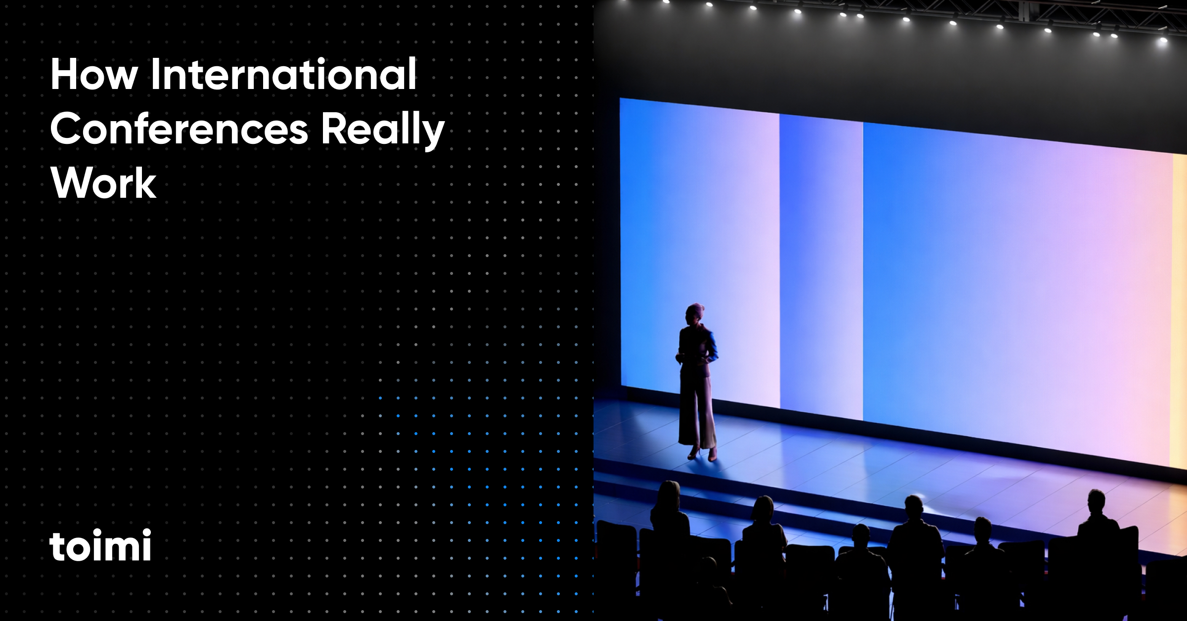
International conferences look simple on the surface — a venue, speakers, booths, and a few LinkedIn photos. In reality, they work as long conversion systems: shaped months before the event, decided through on-site trust signals, and closed in the 30–120 days after.
Key takeaways ?
Conferences are systems, not moments. Treat them as temporary markets where trust and intent compress quickly — but real conversion unfolds over 30-120 days.
Clarity drives ROI. Design everything — branding, materials, and follow-up — for cognitive constraints: less noise, clearer positioning, practical assets, and a long-tail follow-up engine that actually closes deals.
Preparation beats presence. Pre-booked meetings, clear targeting, strong messaging, and a conversion-focused event website outperform booths, visuals, and on-site improvisation.
Table of Contents
Part 1. Conferences as Systems (Not Events)
How attention, trust, and decision-making compress in physical environments
Part 2. Formats & Behavior: Offline, Online, Hybrid
Why the same logic fails across different conference formats
Part 3. Pre-Conference Preparation: Where ROI Is Actually Created
Landing pages, scheduling flows, and why preparation beats presence
Part 4. Conference Branding That Converts
Why branding is an interface — and why most conference branding fails
Part 5. Materials & The One-Page Discipline
How strong companies explain complex value fast — and convert offline attention into pipeline
Conclusion
Conferences as long-term conversion systems
Introduction:
Two conference formats. One system.
International conferences exist in two dominant formats today: offline (physical) and online (virtual or hybrid).
They look different. They behave differently. But they operate under the same underlying logic.
Both formats are systems designed to:
concentrate attention,
accelerate trust,
and move decisions closer to action.
The difference is not what they do — it’s how constraints manifest.
Offline conferences are constrained by space, movement, noise, and human energy. Online conferences are constrained by screens, distraction, time compression, and instant drop-off.
Understanding this distinction is critical. Because a strategy that works offline often fails online — and vice versa — unless the system is consciously redesigned.
Part 1 — The Conference as a System (Not a Moment)
Conferences compress three things no ad campaign can compress
International conferences are often reduced to talks, branded swag, and buffet lunches. But the real power of conferences lies in what they compress — and it’s something digital campaigns simply cannot recreate at scale.
Whether you’re planning an executive forum in Amsterdam, a tech summit in San Francisco, or a hybrid leadership event spanning time zones, the physics of attention, trust, and proximity shape the economics of real business interactions.
1.1. Attention Density — You’re not competing with the entire Internet.
At a conference, attendees are already in the experience. This creates a unique form of concentrated attention that no digital channel can replicate.
In the digital world, attention is fragmented across infinite tabs, apps, messages, and notifications. By contrast, at an in-person or hybrid event, participant focus is tethered to one concentrated moment — not the entire internet.
A wealth of information creates a poverty of attention.
— Herbert A. Simon, american multidisciplinary scholar
When business leaders walk into a session, they’re making a positional decision about where to direct attention. They are already motivated to pay attention — and they stay engaged when the event design supports it.
Engagement analytics show that event attention follows predictable peaks and recovery patterns — and that sessions built for participation sustain focus better than passive lectures, by design.
This density means far more than higher attendance numbers. It means moments of shared experience where attention converges — and brand strategy can shape that convergence into lasting memory and pipeline influence.
1.2. Trust Acceleration — Presence reduces ambiguity
Trust is the new currency in B2B relationships, and conference attendance accelerates trust faster than any digital interaction. Despite the rise of advanced online marketing channels, B2B marketers consistently say events remain one of the most valuable channels to build authentic, trust-based connections.
By 2030, Gartner predicts that 75% of B2B buyers will prefer sales experiences that prioritize human interaction over AI.
— Gartner (press release)
When two professionals meet face-to-face — or even in a thoughtfully designed hybrid session — perceptions form far more quickly than through email or ads. A buyer can read your posture, nuance, thought process, responsiveness, and clarity in real time. This isn’t subjective marketing; it directly affects how quickly credibility and intent form.
Edelman’s research into B2B trust emphasizes that audiences are increasingly skeptical of generic messaging, and they seek out interactions that signal authenticity, competence, and alignment with their own priorities.
And because attendees self-select into conference environments — they choose to be there — the baseline level of trust and engagement is already higher than for cold digital impressions or algorithmic feeds.
At events, brands don’t just broadcast. They participate — and that participation translates into credibility because it signals confidence, consistency, and real human presence.
1.3. Decision Proximity — Close to decision-makers in “evaluation mode.”
Conferences matter because they bring together people who are not just reachable — they are physically and psychologically present in a decision frame.
In traditional digital campaigns, you might reach decision-makers hundreds of times before they convert. But at a well-executed conference, you can interact with them on a compressed timeline. Decision-makers show up ready to evaluate solutions, compare alternatives, and shake hands with potential partners. These interactions are real data points that can drastically shorten sales cycles — particularly in industries with compliance needs, integration requirements, long procurement cycles, or complex ecosystems.
This proximity does more than accelerate trust — it influences internal buying committees, leverages social proof via common context, and allows multiple stakeholders to make judgment calls in the same shared environment.
1.4. Why conferences still outperform purely digital environments for high-stakes decisions
Conferences are ecosystems where attention, trust, and proximity collide — and where brands can participate in a way that turns engagement into pipeline influence.
78% of organizers said in-person conferences… are their organization’s most impactful marketing channel, and 80% said they’re a critical component of success.
— Bizzabo, benchmarking report
Digital channels excel at awareness and reach. Conferences excel at evaluation and commitment. They do not replace each other — they complement each other. But if you ignore the inherent advantages of conferences, you leave real business value on the table.
Because every physical step you design for is actually a behavioral nudge that shapes networking dynamics.
The hidden truth: conferences are designed around constraints.
Not creativity. Constraints.
Great conferences don’t fight human limits — they design around them.
Offline constraints (and how they shape outcomes)
Attention fatigue
Passive listening exhausts people quickly. Long talks, dense slides, and uninterrupted panels disengage audiences — even when the content itself is strong.
Smart offline conferences:
vary formats,
break sessions into energy cycles,
design for participation, not endurance.
Movement and distance
Walking distances directly affect:
chance meetings,
repeat interactions,
willingness to engage.
Every extra corridor reduces probability.
That’s why high-performing events design:
compact networking zones,
visible meeting points,
intuitive flow between spaces.
Noise and environment
Poor acoustics increase cognitive load. Crowded, noisy spaces shorten conversations and reduce comprehension.
Offline design success often has nothing to do with branding — and everything to do with how comfortable people feel thinking and talking.
Online constraints (and how they change strategy)
Instant drop-off
Online audiences leave without consequence.
If the value is not clear immediately, they exit.
Winning formats:
modular sessions,
clear agendas,
interaction every few minutes,
visible takeaways early.
Multitasking reality
Online attendees are never fully present. They’re answering emails, checking messages, switching tabs.
Design must assume partial attention — and still deliver value.
Platform fatigue
Long virtual days drain faster than physical ones.
Successful online conferences:
shorten total session time,
allow on-demand access,
respect cognitive limits.
The real strategic conclusion
The winning conference strategy is not:
“Make it louder.”
“Make it more creative.”
“Make it bigger.”
It is:
Design for constraints better than everyone else.
Offline or online, conferences reward teams who understand:
how attention actually behaves,
how trust actually forms,
and how decisions actually move.
Online audiences drop off aggressively unless sessions are modular and interactive
In virtual and hybrid formats, the constraint isn’t distance — it’s attention collapse.
Virtual session analytics consistently show that audiences disengage quickly unless content is:
shorter,
modular,
interactive,
and built with embedded calls to action.
This isn’t a digital shortcoming — it’s a human one. Without physical cues, immersive context, and the psychology of presence, attention decays quickly. That’s why high-performing virtual formats assume dropout and design around it rather than against it — incorporating audience interaction, segmented modules, and digital networking experiences.
So the winning strategy is not “make it louder.”
It’s “design for constraints better than everyone else.”
Decades of event psychology, attendee engagement analytics, and B2B event performance metrics tell us the same thing:
— Intelligent conferences respect human cognitive limits.
— Superior attendee experiences are engineered, not improvised.
— Design is not about spectacle, it’s about systems that work within constraints.
Conferences are not about being bigger. They are about being better designed for how people actually behave.

Part 2 — Offline, Online, Hybrid: How the System Behaves
2.0. Why formats break when teams reuse the same logic
Conferences don’t fail because of weak ideas or poor intentions.
They fail because teams misunderstand how the system behaves in different environments — and apply the same logic everywhere.
Offline, online, and hybrid conferences are not interchangeable formats. They are distinct behavioral systems with different constraints, incentives, and failure modes.
Winning teams don’t reuse assets blindly.
They redesign branding, websites, and interaction flows for each format.
2.1. Offline conferences: behavioral architecture disguised as logistics
Venue is not a location decision. It’s a behavioral decision. Most teams treat venue selection as a logistical checkbox:
capacity, cost, accessibility, and availability.
In reality, the venue is behavioral architecture — a system that quietly dictates how people move, meet, and decide.
Small design choices determine whether:
people bump into each other or avoid contact,
conversations last 30 seconds or 30 minutes,
your brand is remembered or forgotten.
What matters more than aesthetics:
- Navigation clarity
If attendees feel lost or disoriented, networking density collapses. Clear movement paths increase spontaneous meetings and repeat interactions. - Bottleneck placement
Coffee points, escalators, registration zones, and lounges either amplify interaction or create stress. Poorly designed bottlenecks repel conversation. - Conversation safety
Serious discussions don’t happen in noisy, exposed spaces. If there’s no easy way to talk privately, high-value conversations don’t escalate. - Speed from “hello” to private discussion
The shorter the path from casual greeting to focused dialogue, the higher the deal velocity.
Offline conferences succeed not because they look good —
but because they remove friction from human interaction.
2.2. The exhibitor reality
You’re not building a booth — you’re building a conversation environment. Exhibitors often think they’re designing a booth. They’re not.
They’re designing a micro-system inside a larger behavioral ecosystem.
That micro-system does one of two things:
makes it easy to start and deepen a conversation, or
causes people to bounce after 10–15 seconds.
There is no neutral outcome.
Why most booths fail
Booths fail when they optimize for:
visual noise,
excessive messaging,
decorative complexity,
passive displays.
All of this increases cognitive load.
In a crowded hall, attention is scarce.
People don’t ask “Is this booth impressive?”
They ask “Is it easy to talk to these people?”
Design principle: optimize for conversation flow, not decoration
High-performing booths share the same invisible traits:
open entry points,
clear standing zones,
minimal visual clutter,
obvious human presence,
fast qualification cues.
This is where brand clarity matters more than creativity.
A strong brand platform and brand strategy define what you say and who it’s for before any visuals exist
brand platform → brand strategy.
From there:
brand identity ensures instant recognition
brand guidelines prevent chaos across booths, slides, and materials
a clear brandbook keeps teams and vendors aligned under pressure
Logos, naming, and even rebranding only matter when this system is clear
custom logo, naming, rebranding.
Offline success is not about attracting crowds.
It’s about creating conditions for repeatable, meaningful conversations.
2.3. Online conferences: attention economics is brutal
Virtual conferences remove geography — and introduce the hardest constraint of all: competing screens.
In digital environments:
attention is optional,
exits are instant,
distraction is constant.
Participants are always doing something else.
That’s why online conferences that work assume attrition and design around it.
They don’t ask, “How do we keep people watching?”
They ask, “How do we deliver value fast — before attention disappears?”
To do that at scale, you need a structure that lets people self-navigate to what’s relevant in seconds — not minutes. The same logic applies to event ecosystems and websites: clarity is an architectural choice, which is why effective SEO website structure is less about rankings and more about reducing cognitive load.
What actually works in virtual conferences
High-performing online events follow three principles:
— Shorter, modular sessions
Long virtual sessions collapse attention.
Shorter blocks respect cognitive limits and allow people to self-select relevance.
The goal is not endurance.
It’s clarity.
— Mid-session interaction
Polls, prompts, chat questions, live feedback — these aren’t gimmicks.
They’re attention resets.
Interaction pulls people back from passive viewing into participation.
— Clear next action inside the session
If the CTA appears only at the end, it’s already lost.
Effective online sessions:
introduce the next step early,
repeat it clearly,
make it frictionless.
This is where the event website becomes critical.
Online conferences convert only when supported by a fast, focused digital system:
a clear landing pages for sessions or meetings
a credible main site for trust and depth: corporate website
and reliable infrastructure behind it: web development
For many teams, flexible platforms like WordPress enable rapid updates, localization, and content reuse across sessions WordPress development.
Virtual doesn’t fail because people don’t care.
It fails because systems aren’t designed for how attention actually behaves.
2.4. Hybrid conferences: most teams fail because they treat online as second-class
Hybrid conferences are often positioned as the best of both worlds.
In theory, they promise:
the reach of digital,
the depth of in-person,
and the flexibility modern audiences expect.
In practice, many hybrid conferences deliver something else entirely:
a divided experience where one audience matters more than the other.
And when that happens, the system breaks.
The core mistake: designing one experience and streaming it to everyone else
Most hybrid conferences are not truly hybrid.
They are offline-first events with a camera attached.
The physical audience receives:
energy,
direct interaction,
networking opportunities,
spontaneous moments.
The online audience receives:
a video feed,
limited chat access,
delayed Q&A,
and little sense of presence.
This turns online participants into watchers.
And watching is a fundamentally passive state.
Watching does not create involvement.
Watching does not create commitment.
Watching does not create trust.
Once participants feel like spectators rather than participants, disengagement becomes inevitable.
Why watching fails as a strategy
Trust and decision-making require participation, not observation.
In B2B environments, buyers don’t move forward because they “saw a presentation.”
They move forward because they:
asked a question,
tested a claim,
exchanged context,
or felt acknowledged.
When online attendees cannot influence the experience in real time, they stop investing attention.
And because digital environments allow instant exit, they disengage quietly — and early — without feedback or friction.
This is why hybrid failure often goes unnoticed until after the event, when:
engagement metrics drop,
follow-up response rates are low,
and online-generated leads fail to convert.
Why hybrid conferences break at a systems level
Hybrid conferences fail not because the idea is flawed but because the system is incomplete.
They break when:
— Online audiences receive no exclusive value
If everything valuable happens on-site, online participation becomes a downgrade. Without content or interactions designed specifically for remote attendees, there is no reason to stay engaged.
— Sessions are optimized only for the room
Speakers naturally play to the physical audience. Jokes, examples, pacing, and energy favor the room — leaving online participants feeling invisible.
— Interaction favors physical attendees
When questions, polls, or discussions prioritize microphones in the room, online attendees lose their voice. Once participation is asymmetrical, trust erodes.
— Moderation is stretched thin or absent
Hybrid environments require double facilitation. Without dedicated moderators for online participants, their questions go unanswered and their presence goes unacknowledged.
Each of these issues compounds the others.
By the time an online participant considers engaging, the system has already signaled: you’re not the priority.
The psychological impact of second-class participation
Being second-class doesn’t just reduce satisfaction — it changes behavior.
Online attendees who feel secondary:
stop asking questions,
stop networking,
stop taking notes,
and stop imagining themselves as future customers or partners.
The conference becomes content consumption, not relationship formation.
And content consumption alone rarely drives high-stakes decisions.
The real cost of hybrid failure.
The damage of a poorly executed hybrid conference is not limited to engagement metrics.
It affects:
brand perception (“they don’t really care about remote participants”),
trust (“this feels improvised or under-resourced”),
and long-term conversion (“this didn’t move the needle”).
Worse, it often undermines the entire event narrative — because hybrid is no longer an edge case. For global audiences, it is often the default.
The strategic takeaway
Hybrid conferences do not fail because they include online audiences.
They fail because they treat them as an afterthought.
A true hybrid conference does not ask:
“How do we stream this?”
It asks:
“What experience does each audience need to move forward — and how do we design both intentionally?”
Until that question is answered, hybrid conferences will continue to promise reach — and deliver frustration.
Hybrid done right: parallel systems, not mirrored ones
Successful hybrid conferences treat online as a parallel product, not a stream.
That means intentionally designing:
- Online-exclusive sessions
Content created specifically for remote roles and use cases. - Digital networking systems
Structured matchmaking and moderated discussions, not open chaos. - Dedicated moderators
Online audiences need facilitation just as much as physical rooms do. - On-demand access built into the funnel
Sessions don’t end — they become conversion and decision-support assets.
To support this, brands need:
a consistent visual and verbal system: branding
reusable assets packaged for scale: marketing kit
clear packaging of content and offers for digital consumption: packaging
When hybrid works, it doesn’t blur formats.
It respects their differences — and designs systems for each.
Part 3 — Pre-Conference Preparation as the Real ROI Engine
Most teams still judge conference success by what happens on-site. That’s backwards.
By the time the conference doors open, the outcome is already largely determined — not by the booth, not by the speakers, not by foot traffic, but by the systems built beforehand.
High-performing companies don’t treat conferences as live events.
They treat them as time-boxed conversion systems that start weeks — sometimes months — in advance.
3.1. Why preparation multiplies ROI (and improvisation destroys it)
Conferences compress attention, trust, and decision-making into a short window — but only if the right people arrive ready for the right conversations.
Without preparation:
conversations stay polite but shallow,
messaging fragments across teams,
follow-ups feel generic,
leads decay rapidly.
With preparation:
meetings start mid-funnel,
trust accelerates faster,
internal buyer alignment begins earlier.
This is why serious conference preparation looks less like “event planning” and more like product and funnel design, supported by proper web development and a clear brand system.
3.2. 90–60–30 days: how winning teams prepare
Day –90 to –60: strategy before visuals
Before designing booths, slides, or landing pages, high-performing teams lock strategy.
Key questions:
What is the single primary outcome of this conference?
Which accounts or markets are we targeting?
Who must be involved for a deal to move forward?
What conversations are we explicitly not trying to have?
This is where brand clarity becomes operational.
A defined brand platform and brand strategy ensure that every later asset speaks with one voice brand platform, brand strategy.
Without this foundation, every landing page, booth message, and follow-up email becomes generic.
Day –60 to –30: message compression and conversion design
Conferences don’t allow long explanations.
Your message must survive:
a noisy hall,
a rushed introduction,
a 15-minute meeting,
and a distracted follow-up.
That’s why teams that convert build a message ladder:
10 seconds → category + outcome
2 minutes → problem + approach
10–15 minutes → proof + differentiation
30 minutes → decision support
This ladder must be consistent across:
booth conversations,
presentations,
event landing pages,
post-event materials.
Consistency is not a visual problem — it’s a branding system problem, solved through:
clear brand identity
enforced brand guidelines
a shared brandbook for teams and vendors
3.3. The event landing page: from interest to meetings
Most conference pages fail because they try to explain everything.
A conference landing page has one job:
Turn relevance into booked meetings.
That’s it. A high-performing event landing page:
is built for one audience,
one event,
one action.
This is why dedicated landing page development consistently outperforms generic CMS pages — not because it looks better, but because it is designed around a single intent: turning relevance into commitment.
What the page must do:
clearly state who the meeting is for,
define what problem will be discussed,
provide proof that the conversation is worth time,
make scheduling effortless.
Anything else adds friction.
3.4. Scheduling flows: where intent becomes commitment
Interest without scheduling is wasted attention.
When someone says:
“Yes, let’s talk”
You have a narrow window to convert intent into a real calendar block.
Strong conference systems use:
calendar-based booking,
light qualification questions,
automated confirmations,
context capture before the meeting.
These flows should connect directly to:
the event landing page,
your CRM,
and post-event follow-up sequences.
This is why scheduling is not a “tool choice” — it’s a system design task, supported by solid web development.
3.5. Corporate website vs conference funnel: different roles
One of the most common mistakes is forcing conference traffic into a generic corporate site.
A corporate website exists to:
build trust,
explain the full offering,
support long decision cycles.
It should feel stable, credible, and comprehensive — the baseline expectation for any corporate website development process.
A conference funnel, on the other hand, must:
move fast,
reduce cognitive load,
guide toward a single next step.
Different intent → different structure → different conversion logic.
The two systems should support each other, not compete.
A corporate website only works in this setup when it’s designed to sell over time — building trust, clarifying value, and supporting long decision cycles. That’s the logic behind a selling website in 2025: not a static brochure, but a system that converts sustained attention into informed decisions.
3.6. WordPress often supports conference execution best
Conference preparation is dynamic:
agendas shift,
speakers change,
pages need updates,
localization becomes necessary.
That’s why many teams rely on flexible platforms that allow fast iteration without development bottlenecks.
For many organizations, that flexibility comes from well-structured WordPress development.
The platform itself isn’t the strategy —
but the wrong platform will slow the strategy down.
3.7. Meeting conversion systems: what happens after “yes”
Booking a meeting is not the finish line.
High-performing teams design what happens next:
pre-meeting context emails,
clear agendas,
shared assets in advance,
internal alignment on who attends and why.
This is where reusable, consistent materials matter:
When the meeting starts, alignment already exists.
3.8. Preparation protects post-event ROI
Most teams think follow-up starts after the conference.
In reality, effective follow-up is enabled before the event:
context is captured early,
meetings are pre-booked,
assets are prepared in advance,
CRM hygiene is built into the system.
Only 35 percent trust a brand message after a single exposure… rising to 97 percent after seven exposures.
— Edelman Trust Barometer (special report)
This allows post-event communication to feel relevant, personal, and timely — not generic and late. It also supports the reality of B2B buying: most conference-influenced deals close weeks or months later. Preparation turns the conference from a spike of activity into a long-term pipeline engine.
Part 4 — Conference Branding That Actually Converts (and Why Most Don’t)
Conference branding is often evaluated visually: Does it look modern? Is it impressive? Does it stand out?
Those are the wrong questions.
In conference environments, branding is not competing for admiration — it is competing for cognitive permission. Attendees are overloaded, time-poor, and selective. Every unclear message, inconsistent visual, or decorative distraction increases friction and shortens conversations.
If you confuse, you lose.
— Donald Miller, Building a StoryBrand
Branding that converts does not add more information.
It removes uncertainty.
4.1. The core misunderstanding: branding is not decoration
Most conference branding is designed as if attention were abundant.
Large slogans, abstract visuals, layered messaging, and conceptual themes assume people will stop, look, and decode. In reality, conference attendees are scanning — not reading.
When branding functions as decoration:
visitors hesitate instead of approaching,
conversations start with clarification instead of relevance,
sales teams waste the first minutes explaining basics.
Branding that converts behaves differently.
It acts as pre-qualification.
Clear branding silently answers:
Is this relevant to me?
Do these people understand my problem?
Is this worth stopping for?
When those questions are answered before a word is spoken, conversations start faster and go deeper.
This is why effective conference branding prioritizes clarity over cleverness, even when the brand itself is bold or distinctive.
4.2. Brand strategy comes before booth design (always)
Booths are downstream outputs.
Positioning is upstream.
If the brand strategy is unclear, the booth becomes a patchwork of messages:
sales wants one angle,
marketing pushes another,
leadership adds a third.
The result is noise.
A well-defined brand platform aligns internal teams around:
audience focus,
problem ownership,
value narrative,
and competitive differentiation: brand platform.
A strong brand strategy then translates that clarity into actionable direction:
When strategy is locked early, booth design becomes execution — not debate. This saves time, budget, and internal friction.
4.3. Identity at conferences: recognition beats expression
Conference environments reward familiarity.
People trust what they recognize — especially under cognitive load.
That’s why identity systems that perform well at conferences are:
simple,
consistent,
legible at distance,
resilient across formats.
A strong brand identity ensures that every touchpoint — booth panels, slides, badges, landing pages — feels like the same company, not a collection of assets.
Over-designed identities often collapse under conference conditions:
gradients disappear under lighting,
subtle typography becomes unreadable,
complex layouts confuse from afar.
Recognition tends to build trust faster than novelty.
And trust determines whether conversations progress.
4.4. Guidelines: the difference between consistency and chaos
Conferences expose weak brand governance.
Last-minute changes, local printers, external vendors, speaker decks, and partner logos all stress the system. Without enforced brand guidelines, even strong brands fragment.
Guidelines act as operational insurance:
they protect visual coherence,
reduce subjective decision-making,
and allow teams to move fast without breaking consistency.
This is why teams with recurring conference presence rely on both:
detailed brand guidelines,
and a centralized brandbook that unifies visuals, tone, and usage rules.
Consistency is not about control — it’s about maintaining trust under pressure.
4.5. Booth design as a conversion interface (not an art object)
A booth is the physical manifestation of your brand system.
It either:
lowers the barrier to conversation,
or raises it.
Booths fail when they try to say everything at once. Too much text, too many visuals, too many screens. Attendees don’t know where to look — so they don’t stop.
High-performing booths are structured around:
approachability,
message hierarchy,
and human interaction.
They make it obvious:
where to stand,
who to talk to,
what the company does.
This only works when booth design follows identity and guidelines — not creative impulse.
When designed as a conversion interface, the booth becomes a facilitator of dialogue, not a distraction.
4.6. Event assets: branding that continues the conversation
The real test of conference branding happens after the interaction.
Most assets are forgotten because they’re passive:
brochures that repeat website copy,
swag without context,
decks no one forwards.
High-performing assets are functional. They help buyers explain value internally.
Effective event assets:
summarize the conversation,
anchor key messages,
support internal decision-making.
This is where a structured marketing kit becomes essential.
For physical products or take-home items, thoughtful packaging reinforces clarity and recall.
Assets should extend the conversation — not replace it.
4.7. Naming, logos, and rebranding: only when the system demands it
Conferences act as stress tests.
If people:
misremember your name,
confuse your offer,
or associate you with the wrong category,
the issue is structural — not tactical.
Clear naming improves recall and referral, especially in noisy environments.
Sometimes conferences reveal deeper misalignment:
attention without trust,
interest without conversion.
In those cases, incremental fixes don’t work. A strategic rebranding may be required
Logos and visuals matter — but only after the system is right
4.8. Why most conference branding doesn’t convert
Most conference branding fails because it:
chases attention instead of relevance,
expression instead of recognition,
aesthetics instead of function.
It treats branding as output — not infrastructure.
And in conference environments, infrastructure determines outcomes.
Part 5 — Materials That Actually Convert (and Why Most Don’t)
Conference materials are one of the most underestimated parts of the entire conference system.
They’re often treated as an afterthought:
something to print,
something to hand out,
something to “have just in case.”
And yet, for many deals, conference materials are the only tangible artifact that survives the event and travels inside the buyer’s organization afterward.
That makes them disproportionately powerful — or disproportionately useless.
5.1. The uncomfortable truth: most conference materials are designed to be ignored
Walk any major international conference — Web Summit, Dreamforce, Hannover Messe — and you’ll see the same pattern:
thick brochures no one opens,
glossy decks no one forwards,
swag that has no connection to the conversation.
These materials fail not because they’re poorly designed, but because they’re designed for the wrong moment.
They assume:
focused reading,
linear attention,
immediate interest.
Conference reality offers none of that.
Attention is fragmented.
Time is compressed.
Memory fades quickly.
Materials that don’t acknowledge these constraints simply disappear.
5.2. What materials are actually supposed to do
High-performing companies understand a counterintuitive truth about conference materials:
They are not designed to persuade in the moment.
At conferences, persuasion happens through conversation, presence, and credibility. Materials play a different — and far more strategic — role.
Their real job is to:
stabilize memory after the event, when context begins to fade,
anchor follow-up conversations, giving sales teams a concrete reference point,
enable internal sharing, so buyers can accurately represent what they learned to colleagues who weren’t there.
In other words, materials are decision infrastructure, not marketing collateral.
This distinction is subtle — and critical.
How large enterprise brands actually use conference materials
This is why companies like IBM, SAP, and Microsoft rarely rely on traditional brochures at major conferences. If you walk their booths at events like RSA, Hannover Messe, Microsoft Ignite, or SAP Sapphire, you’ll notice a pattern:
You won’t be handed a thick catalog of offerings.
You’ll be given tools.
IBM: system clarity over feature lists
IBM’s conference materials are typically structured as:
architecture diagrams,
capability maps,
industry-specific solution overviews.
Instead of listing products, IBM materials show how components fit together — cloud, AI, security, data — in a way that enterprise buyers can later explain to IT, procurement, and leadership.
The goal isn’t persuasion.
It’s alignment.
SAP: role-specific summaries that travel internally
SAP designs many of its conference assets around job roles, not products.
A CIO, operations lead, or finance executive receives:
a short, role-specific summary,
a clear “before vs after” operational impact,
and a minimal explanation of where SAP fits into existing systems.
These assets are intentionally built to be forwarded internally without explanation — because SAP knows the real conversation happens back at the office.
Microsoft: materials as internal justification tools
Microsoft’s conference materials often resemble internal briefing documents more than marketing brochures.
They include:
simple diagrams,
comparison tables,
deployment pathways,
and quantified outcomes.
Why? Because Microsoft understands that most enterprise buyers leave conferences needing to justify interest to multiple stakeholders. Their materials are designed to support that internal narrative, not replace it.
Why “forwardability” matters more than design
A simple test separates high-performing materials from decorative ones:
Can this be forwarded internally without explanation?
If the answer is no, the material will not influence a decision.
Big companies optimize materials for forwardability:
minimal jargon,
clear structure,
obvious relevance,
and neutral tone.
This makes the material usable in:
internal emails,
slack threads,
procurement discussions,
and executive summaries.
That’s where real decisions happen.
Designing for the moment after the booth
The common thread across IBM, SAP, Microsoft, and other enterprise leaders is intentional timing.
They don’t design materials for the booth moment — when:
attention is fragmented,
conversations are rushed,
context is incomplete.
They design for the moment after:
when the buyer is back at work,
when colleagues ask “What did you learn?”,
when options are compared and evaluated.
That’s why their materials feel restrained, structured, and almost conservative.
They are not meant to excite.
They are meant to survive the decision process.
The strategic takeaway
Conference materials that convert are not:
beautiful brochures,
clever storytelling pieces,
or exhaustive product catalogs.
They are:
memory stabilizers,
conversation anchors,
and internal decision tools.
The companies that understand this don’t win conferences because they print more.
They win because they design materials for what happens after the booth — not during it.
5.3. The One-Page Discipline: Why Less Consistently Converts More
Across industries — from enterprise software to infrastructure, consulting, and platforms — the most effective conference asset remains stubbornly simple: the one-page document.
Not because buyers lack sophistication.
Not because offerings are simple.
But because complexity must be staged, not dumped.
Conferences are not environments for full explanation. They are environments for orientation.
The job of a conference asset is not to teach everything — it is to establish enough clarity that a conversation can continue elsewhere.
The one-page format excels at this because it enforces discipline.
Why one page works when everything else fails
At conferences, every asset competes against the same constraints:
limited attention,
fragmented context,
delayed decision-making.
Long documents assume conditions that do not exist:
time to read,
motivation to explore,
uninterrupted focus.
One-pagers survive because they respect reality.
A high-conversion one-pager does four things — and nothing more:
- Defines the problem in one sentence
Not a market statement. Not a vision. A concrete, recognizable problem the buyer already knows. - Shows how the system works at a glance
Not features. Not modules. A simple visual or logical flow that explains where value is created. - Provides one or two proof points
Enough to reduce perceived risk — not enough to overwhelm. - Points clearly to the next step
A meeting. A demo. A deeper briefing. Something directional.
Anything beyond that reduces forwardability.
The real value of one-pagers: internal mobility
The true test of a conference asset is not whether it impresses at the booth.
It’s whether it moves inside the buyer’s organization.
One-pagers work because they are:
easy to forward,
easy to skim,
easy to summarize verbally.
They become reference points in internal conversations:
“This is what they do.”
“This is where they fit.”
“This is why they’re relevant.”
Longer documents rarely survive that journey intact.
Evaluating the AWS example: discipline at extreme scale
AWS is one of the clearest examples of the one-page discipline executed at scale.
At re invent, AWS does not attempt to explain its platform through exhaustive materials — despite offering hundreds of services. Instead, it relies heavily on tightly scoped, one-page service briefs.
Each AWS one-pager is intentionally narrow.
It answers three questions with precision:
- Who this is for
Often defined by role (developer, architect, security lead) or use case — not by industry hype. - What problem it solves
Expressed in operational terms: latency, scalability, cost control, security, orchestration. - Why it exists alongside other services
This is critical. AWS rarely positions services as standalone heroes. One-pagers clarify how a service fits into the broader ecosystem — reducing confusion, not increasing choice anxiety.
What AWS avoids is just as important as what it includes:
no long narratives,
no emotional storytelling,
no broad positioning claims.
The documents feel almost understated.
That restraint is strategic.
Why AWS doesn’t try to “sell” on one page
AWS understands something many teams miss:
Enterprise buyers are not looking to be convinced at conferences.
They are looking to be oriented.
The one-pager’s role is to:
reduce ambiguity,
establish relevance,
and make deeper engagement feel safe.
By the time a buyer requests a deep dive, AWS has already won something more important than attention: cognitive trust.
The buyer feels they understand where this fits — even if they don’t yet understand every detail.
That’s enough to move forward.
The danger of violating the one-page discipline
Many teams attempt one-pagers — and fail — because they treat the format as a design constraint, not a strategic one.
Common mistakes include:
cramming too many messages onto one page,
trying to explain the entire offering,
using abstract language instead of operational clarity,
omitting a clear next step.
The result is a document that technically fits on one page — but still requires explanation.
At that point, the asset has already failed. If a one-pager needs verbal context to be forwarded, it will not scale.
The deeper principle: staged complexity beats full explanation
The success of the one-page discipline reflects a broader truth about conference-driven conversion:
Complex buying decisions are made through stages, not dumps.
One-pagers succeed because they:
respect the stage the buyer is in,
avoid premature detail,
and prepare the ground for the next interaction.
AWS doesn’t try to explain everything at re invent. It creates clean entry points into a vast system. That’s the model worth copying.
Strategic takeaway
The one-page discipline is not about minimalism.
It’s about respecting how decisions actually form.
If your conference materials:
can’t be forwarded without explanation,
don’t clarify where you fit,
or try to do too much too early,
They don’t reduce complexity — they amplify it. The teams that convert consistently understand this:
Less content at the right moment moves decisions further than more content at the wrong one.
And that is why, across industries, the one-page document continues to outperform everything else.
5.4. System diagrams: how big companies explain complex value fast
As offerings grow more complex — platforms instead of products, ecosystems instead of services, integrations instead of features — text stops being enough.
Paragraphs assume patience.
Slides assume linear attention.
Conferences offer neither.
This is where system diagrams outperform almost every other format.
A well-designed system diagram does not describe everything. It does something far more valuable:
It explains how value is created.
Salesforce is a textbook example. At Dreamforce, Salesforce rarely explains its platform through long descriptions. Instead, it relies on:
ecosystem maps that show how clouds connect,
layered capability models that clarify scope,
visual logic flows that explain outcomes, not features.
These diagrams reduce complexity without hiding it.
For buyers, this lowers perceived risk: “I can see how this fits.”
For internal stakeholders, it simplifies the justification: “I can explain this to my team.”
This is why system diagrams consistently outperform feature lists:
they reduce cognitive load,
they shorten explanation time,
and they survive internal forwarding.
From a branding perspective, effective diagrams only work when they are built on a clear brand platform and brand strategy — otherwise visuals become decorative instead of explanatory.
When identity, naming, and visual logic are aligned, diagrams become one of the strongest conference conversion tools.
A strong system diagram can replace ten slides — and often an entire sales conversation.
5.5. Quantified case summaries: how credibility is actually transferred
At conferences, storytelling is often overrated.
Not because stories don’t matter — but because decision-making is defensive, not emotional.
Buyers are not asking:
“Is this inspiring?” They are asking:
“Will this work for us?”
“Can I defend this internally?”
“What happens if this fails?”
That’s why quantified case summaries consistently outperform narrative-heavy case studies in conference environments.
Companies like Google Cloud and Microsoft Azure rarely rely on long success stories at events. Instead, they present:
clear before/after metrics,
realistic deployment timelines,
measurable operational impact.
No adjectives.
No hero narratives.
Just evidence.
This format allows buyers to:
compare vendors objectively,
estimate ROI with fewer assumptions,
defend recommendations in front of finance, IT, and leadership.
From a materials standpoint, these summaries are most effective when packaged as:
one-page documents,
modular slides,
or QR-linked assets connected to deeper resources.
To scale this across events and teams, companies rely on structured marketing kits rather than ad hoc files.
At conferences, proof doesn’t persuade — it removes friction.
5.6. QR-linked assets: where physical meets digital conversion
Printed materials should never be endpoints.
Their role is not to absorb attention —
but to redirect it intelligently.
The most effective QR-linked assets do not lead to:
homepages,
generic PDF libraries,
or unfocused marketing hubs.
They lead to contextual next steps, such as:
a conference-specific meeting booking page,
a role-based resource hub,
or a short follow-up sequence aligned with the conversation.
This is how companies like HubSpot and Adobe bridge physical and digital touchpoints at events — turning brief conversations into measurable, trackable journeys.
A well-designed QR flow connects:
physical assets → event landing pages
landing pages → scheduling systems
scheduling → CRM and follow-up
This only works when supported by reliable web development infrastructure, not improvised tools.
Every QR code should answer one question clearly:
“What is the smartest next step after this conversation?”
If it doesn’t, it shouldn’t exist.
5.7. Marketing kits: how large organizations stay consistent at scale
Large conferences expose a hidden operational problem: fragmentation.
Different regions.
Different partners.
Different speakers.
Different interpretations of the same message.
Without structure, materials drift — and brand clarity erodes.
This is why enterprise organizations treat marketing kits as systems, not folders.
A proper marketing kit includes:
approved core messages,
adaptable templates for different roles,
clear usage rules,
and regional or industry variations.
Companies like SAP and Accenture rely on these systems to maintain consistency across:
dozens of booths,
multiple sessions,
partner activations,
and distributed teams.
Marketing kits work only when supported by:
enforced brand guidelines
a centralized brandbook as a single source of truth
Consistency here is not a branding preference.
It’s a conversion requirement.
5.8. Physical materials and packaging: the memory multiplier
Despite digital saturation, physical materials still matter — when used intentionally.
Why?
Because they survive the event.
Items that make it back to the office:
resurface days later,
sit on desks,
reappear during internal discussions.
This is why Apple and other premium hardware brands invest heavily in packaging — even for temporary event demos.
The object becomes a memory anchor.
When packaging reinforces clarity — not gimmicks — it extends conference impact well beyond the venue: packaging.
Poorly designed physical assets are forgotten quickly.
Well-designed ones quietly keep working.
5.9. Why materials must be designed before the event — not after
The most common material mistake teams make is timing.
They design assets to support the booth —
not the pipeline.
High-performing teams start from a different question:
“What will this enable after the conference?”
That question changes everything:
which formats are chosen,
how much detail is included,
how materials are distributed,
and how follow-up is structured.
Materials stop being collateral.
They become conversion infrastructure.
This approach only works when materials, branding, and digital touchpoints are designed as one system.
Branding defines clarity under pressure.
Corporate websites and event-specific pages provide depth and credibility.
WordPress development makes that system flexible enough to adapt before, during, and after the event.
Want to discuss your project?
Share your vision with us, and we'll reach out soon to explore the details and bring your idea to life.

Final Synthesis — Conferences Are Systems, Not Events
Across preparation, branding, websites, and materials, the same pattern repeats:
Conferences don’t fail because teams lack effort.
They fail because teams lack systems.
The companies that consistently win conferences — Salesforce, AWS, Microsoft, IBM — don’t rely on:
bigger booths,
louder visuals,
or more content.
They rely on designed systems.
Systems that:
prepare the right conversations in advance,
reduce cognitive friction on-site,
and support decision-making long after the event ends.
Future Outlook: What Will Separate Winners from Noise
The future of international conferences is not about scale.
It’s about precision.
Fewer attendees — better fit
Fewer messages — higher clarity
Fewer materials — stronger function
AI will optimize matchmaking and logistics.
Platforms will improve analytics and follow-up.
But the core constraints will remain human:
limited attention,
cautious trust,
slow, collective decisions.
The teams that win won’t ask:
“How do we stand out at the conference?”
They’ll ask:
“What system are we building around it?”
And that difference will determine who converts —
and who simply shows up.
Summary
This article demonstrates that international conferences are not isolated events, branding exercises, or short-term marketing tactics. They are complex systems that compress attention, trust, and decision-making into a limited time window — and only generate ROI when every component of that system is designed intentionally.
- Part I reframes conferences as mechanisms of compression.
Their power lies in concentrating attention, accelerating trust, and bringing decision-makers into evaluation mode — both offline and online — rather than in stages, booths, or content volume. - Part II explains how this system behaves across formats.
Offline conferences are shaped by behavioral architecture and physical constraints. Online conferences operate under harsh attention economics. Hybrid conferences fail when online participation is treated as secondary instead of designed as a parallel, equally valuable experience. - Part III shows that real ROI is created before the event begins.
Clear objectives, target account planning, message compression, event-specific landing pages, and frictionless scheduling flows determine whether conference attention turns into real conversations and qualified pipeline. - Part IV dismantles common misconceptions about conference branding.
Branding that converts is not decoration or visibility — it is clarity under pressure. When strategy, identity, guidelines, booth design, and assets work as one system, conversations start faster, trust forms earlier, and follow-up becomes easier. - Part V proves that materials are not collateral — they are conversion infrastructure.
One-pagers, system diagrams, quantified case summaries, QR-linked flows, and structured marketing kits are designed for what happens after the event: internal sharing, justification, and long-tail decision-making.
Across all five parts, the same pattern emerges: conferences fail not because teams lack effort or creativity, but because they lack systems thinking.
Outcome
When conferences are designed as systems rather than moments:
Preparation aligns the right people before attention arrives
Branding reduces cognitive friction in high-density environments
Digital infrastructure converts interest into scheduled conversations
Materials stabilize memory and enable internal decision-making
Follow-up supports long-tail conversion instead of relying on luck
The outcome is not louder presence or higher foot traffic — but a predictable pipeline, stronger trust, and measurable long-term impact.
Teams that apply this approach stop asking:
“How do we stand out at the conference?”
And start asking:
“What system are we building around it — before, during, and after?”
That shift is what separates conferences that generate noise from conferences that generate results.
A conference isn’t a three-day event. It’s a conversion system with a deadline. If you treat it like a booth and some print materials, you get noise. If you treat it like a product launch — brand, website, messaging, meetings, follow-up — you get a predictable pipeline.