A design system isn't a Figma library with reusable buttons — it's the infrastructure that determines whether your product scales visually or collapses into inconsistency. This guide explains what a design system actually contains, when you need one, and how to build it without over-engineering.
Key takeaways 👌
A design system is not a component library — it's a shared language of design tokens, components, patterns, and rules that eliminates ambiguity between designers and developers.
Companies with mature design systems ship new features 30–50% faster because every interface decision doesn't start from scratch — it starts from a tested, documented foundation.
The most common mistake is building a design system too early. If you have fewer than three designers and one product, a style guide is enough — a full system adds overhead without proportional value.
Introduction
Your product has three buttons that do the same thing but look slightly different. Your mobile app uses one shade of blue, your website uses another, and your marketing emails use a third. A new designer joins the team and asks "where's the documentation?" — and the answer is a Slack thread from 2023 and a Figma file no one has updated in six months.
This is the problem a design system solves. Not by adding process, but by removing the decisions that shouldn't need to be made more than once.
A design system captures the repeatable visual and interaction patterns of your product — colors, typography, spacing, components, behavior rules — and documents them in a way that both designers and developers can use as a single source of truth. When it works, it eliminates entire categories of inconsistency, speeds up development, and frees designers to focus on problems that actually require creative thinking instead of re-solving solved problems.
When it doesn't work — or when it's built at the wrong time, for the wrong reasons — it becomes an expensive governance project that nobody uses. This guide covers how to get it right.
What a Design System Actually Contains
The term "design system" gets applied to everything from a shared Figma file to a full-stack component framework. In practice, a functional design system has four layers — each building on the one below it.
Layer 1: Design tokens
Tokens are the atomic values that define your visual language: colors, font sizes, spacing units, border radii, shadows, breakpoints, animation durations. They're not components — they're the raw materials components are built from.
Why tokens matter: when your brand blue changes from #1A73E8 to #1565C0, you update one token and every component that references it updates automatically. Without tokens, someone has to find and replace that hex value across hundreds of files — and they'll miss some.
Layer 2: Components
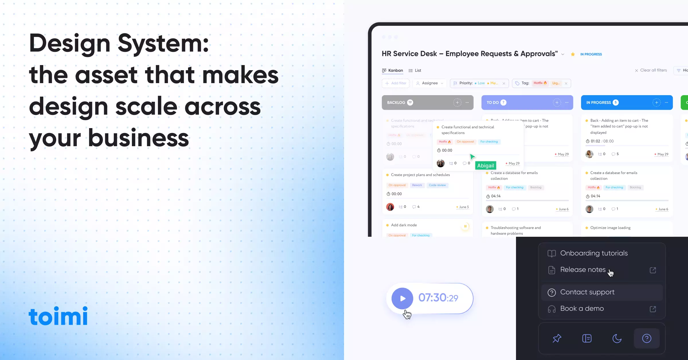
Reusable UI elements — buttons, inputs, cards, modals, navigation bars, tables — built from tokens and documented with clear usage rules. A button component isn't just a rectangle with text. It's a defined set of states (default, hover, active, disabled, loading), sizes (small, medium, large), variants (primary, secondary, ghost), and accessibility requirements (focus ring, ARIA labels, keyboard interaction).
Layer 3: Patterns
Patterns are combinations of components that solve recurring design problems: a login flow, a data table with filtering and pagination, a notification system, a checkout sequence. Patterns aren't reusable code — they're documented solutions. "When you need users to filter a large dataset, use this combination of search input + filter chips + data table + pagination."
Layer 4: Documentation and governance
The layer most teams skip — and the reason most design systems fail. Documentation covers when to use each component, when not to, how to propose changes, and who approves additions. Without governance, the system diverges within months as individual teams make local modifications that never propagate back.

Design systems encode your brand. But what happens when the brand itself evolves? Dynamic identity: adaptive branding in the digital era
Why Businesses Need a Design System
The business case for a design system isn't aesthetic — it's operational. Three measurable outcomes justify the investment.
Speed. Every new feature your team builds requires hundreds of micro-decisions: what color is this button? How much padding goes here? What happens on hover? A design system pre-answers these questions. Designers work from established patterns instead of blank canvases. Developers implement documented components instead of interpreting Figma mockups. The compound time savings across a year of product development are substantial — teams consistently report 30–50% faster feature delivery after design system adoption.
Consistency. Users don't consciously notice consistency, but they immediately notice inconsistency. A button that looks different on the settings page than the dashboard, a form that behaves differently in the mobile app than the web version, a notification style that changes between sections — each inconsistency adds a micro-friction that erodes user trust. Design systems eliminate this class of problem entirely.
Cost reduction. Without a system, design and development effort is partially wasted on re-solving solved problems. Your third designer will redesign a dropdown menu that your first designer already perfected — because there's no documentation saying it exists. Your developer will build a modal component from scratch because the one from last sprint lives in a different codebase. A design system converts this redundant effort into reusable infrastructure, reducing the marginal cost of every new feature.
A design system is a product serving products.
— Nathan Curtis, Author, Modular Web Design
When You Don't Need One (Yet)
Design systems have real overhead — building, documenting, maintaining, and governing them requires ongoing investment. That investment pays off at scale but can be premature for smaller teams.
You probably don't need a full design system if: you have fewer than three designers working on the product, you have one product not a product suite, your product is pre-product-market-fit and the interface changes fundamentally every quarter, or your team ships fewer than two features per month.
In these cases, a lightweight style guide — a single page documenting colors, typography, spacing, and key component styles — provides 80% of the consistency benefit at 10% of the maintenance cost.
You definitely need a design system if: multiple designers and developers work on the same product simultaneously, you maintain multiple products or platforms (web + mobile + internal tools) that should feel unified, new team members regularly join and need to get productive fast, your development team spends noticeable time debating visual implementation details that should be pre-decided, or your product has grown organically and accumulated visible inconsistencies across sections.
The threshold is usually around 3–5 people working on the product concurrently. Below that, direct communication handles consistency. Above that, you need a system.

How many hours did your team spend last month re-making design decisions that had already been made — and documented nowhere?
How to Build One Without Over-Engineering
The most common failure mode for design systems isn't under-building — it's over-building. Teams spend six months creating a comprehensive system before anyone uses it, then discover that half the components don't match real product needs because they were designed in isolation.
Start with an audit, not a plan
Before creating anything new, inventory what already exists. Screenshot every unique component variant across your product. You'll find 4 button styles when you thought there were 2, 6 different card layouts, and 3 incompatible approaches to form validation. The audit reveals what needs standardization — and which existing patterns are working well enough to adopt as-is.
A professional UX audit accelerates this process significantly — external reviewers catch inconsistencies that internal teams have gone blind to.
Build tokens first, components second
Define your design tokens before touching components. Colors, spacing scale (4px base unit is standard), typography scale, breakpoints, and elevation/shadow values. These decisions propagate through everything — getting them right early prevents rework later.
Build only what you need right now
Start with the 10–15 components your product uses most frequently: button, input, select, checkbox, card, modal, table, navigation, badge, alert. Build those to production quality with full documentation. Everything else gets added when a real project needs it — not because it might be needed someday.
Design and code simultaneously
A design system that exists only in Figma isn't a design system — it's a mood board. Components should be built in code at the same time they're designed, ensuring that what designers specify is technically feasible and that developers have a reference implementation from day one.
Interesting fact 👀
The Sparkbox Design Systems Survey found that the vast majority of organizations with a design system reported improved product consistency, and more than two-thirds reported faster development cycles — yet fewer than a third considered their system "mature." The gap reveals the most common problem: teams start design systems but under-invest in the documentation and governance that make them sustainable.

The Five Mistakes That Kill Design Systems
1. Building in isolation. A design system team that works separately from product teams for months will produce a system that doesn't fit real workflows. Every component should be built in the context of a real feature — then extracted into the system.
2. No governance model. Who approves new components? Who decides when to update existing ones? Who resolves conflicts when two teams need different versions of the same pattern? Without answers to these questions, the system fragments within a quarter.
3. Treating it as a one-time project. A design system is a living product. It needs a roadmap, a backlog, regular updates, and dedicated maintenance time. Teams that build a system and then move on find it outdated within six months — and adoption collapses because the system no longer matches the product.
4. Over-documenting. Documentation should answer two questions: "When do I use this?" and "How do I implement it?" Anything beyond that — design philosophy essays, historical context, theoretical justifications — gets ignored. Concise documentation gets used. Exhaustive documentation gets bookmarked and forgotten.
5. Ignoring developer experience. If developers find it easier to build components from scratch than to use the design system, they will. The system's code must be well-organized, well-documented, easy to install, and compatible with the team's existing tech stack. Designer adoption means nothing if developers don't adopt too.
Design Systems and Brand Alignment
A design system doesn't exist in a vacuum — it should encode your brand guidelines into every interface element. This is where design systems and brand identity intersect, and where many teams create unintentional disconnects.
Tokens should reference brand values, not arbitrary choices. Your primary color token shouldn't be "blue-500" — it should map to your brand's primary color. Your typography scale should use your brand typefaces at sizes that maintain the brand's visual personality. Spacing and layout density should reflect whether your brand is minimal and airy or dense and data-rich.
Component design should feel like the brand. A button in a fintech product should feel different from a button in a gaming product — even if both are technically "primary CTA buttons." Border radius, shadow depth, animation style, and micro-interactions all carry brand meaning. A design system that produces generic-looking interfaces has failed at brand integration.
Multi-brand systems need token layers. If your company operates multiple brands (or white-labels for clients), the design system should separate structural tokens (spacing, layout grid) from brand tokens (colors, typography). Components reference both layers — swap the brand tokens, and the same components produce a different-looking product without structural changes.
The teams that get this right treat visual design and design systems as parallel workstreams that inform each other — not sequential phases where brand comes first and the system comes later.
Evolving Your Design System Over Time
A design system's first version is never its best version. The real value emerges over 12–18 months as the system absorbs real-world feedback and evolves alongside the product.
Quarterly component reviews. Every quarter, audit which components are used most, which are never used, and which have been modified locally by product teams. Unused components should be deprecated. Locally modified components signal that the system's version doesn't meet real needs — investigate and update.
Versioning and migration. When components change, existing implementations need a migration path. Breaking changes without migration documentation create the same inconsistency the system was built to prevent. Semantic versioning (major.minor.patch) communicates the scope of changes: patch updates are safe to adopt automatically, minor updates add features, major updates require migration work.
Contribution model. The design system team shouldn't be the only group that can add or modify components. Establish a contribution process: product teams propose components based on real needs, the system team reviews for quality and consistency, approved contributions are documented and released. This keeps the system relevant without creating a bottleneck.
Metrics that matter. Track adoption rate (what percentage of new features use system components), coverage (what percentage of the product's interface is built from system components), and contribution rate (how many proposals come from product teams). If adoption is below 70% after 12 months, the system has a usability or relevance problem that no amount of documentation will fix.
Want to discuss your project?
Share your vision with us, and we'll reach out soon to explore the details and bring your idea to life.


Conclusion
A design system is infrastructure — not a deliverable. It doesn't launch once and get checked off a list. It lives alongside your product, evolving as the product evolves, and its value compounds over time as every new feature inherits the consistency, accessibility, and brand alignment that the system encodes.
The decision to build one comes down to a simple test: is your team spending meaningful time re-making decisions that have already been made? If three designers independently create slightly different card components in the same quarter, if developers build the same modal from scratch in separate codebases, if new team members spend their first month asking "why does this page look different from that page?" — the system has already paid for itself in prevented waste. You just haven't built it yet.
Start with tokens. Build the 15 components you use most. Document when to use each one and when not to. Establish a governance model before anyone asks for exceptions. And accept that version 1.0 will be imperfect — the goal is a foundation that improves, not a monument that ships once and decays.
Recommended reading 🤓
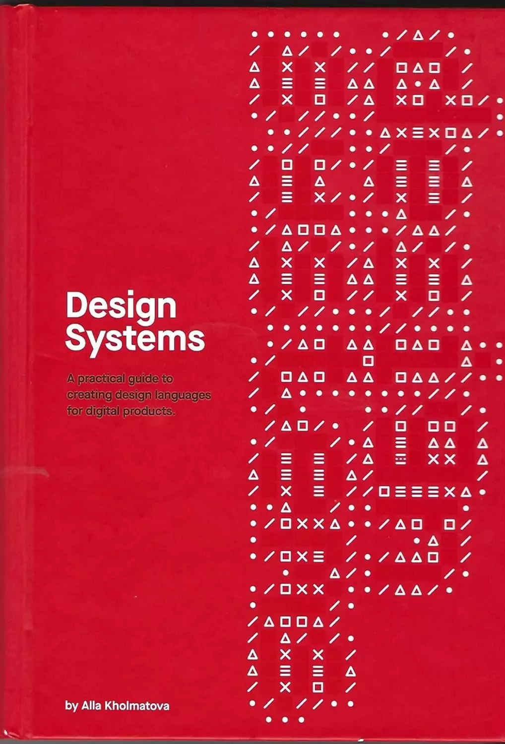
"Design Systems", Alla Kholmatova
The definitive practical guide to building and maintaining design systems — covers everything from naming conventions to governance models with real-world examples from FutureLearn and other products.
"Atomic Design", Brad Frost
Frost's methodology for breaking interfaces into atoms, molecules, organisms, templates, and pages is the conceptual foundation that most modern design systems are built on.
"Modular Web Design", Nathan Curtis
The original playbook for component-based design architecture — particularly strong on documentation standards and team workflows that make systems sustainable.
Every product team I've worked with that didn't have a design system said the same thing: "We move too fast to build one." Every team that finally built one said the same thing: "We should have done this two years ago."