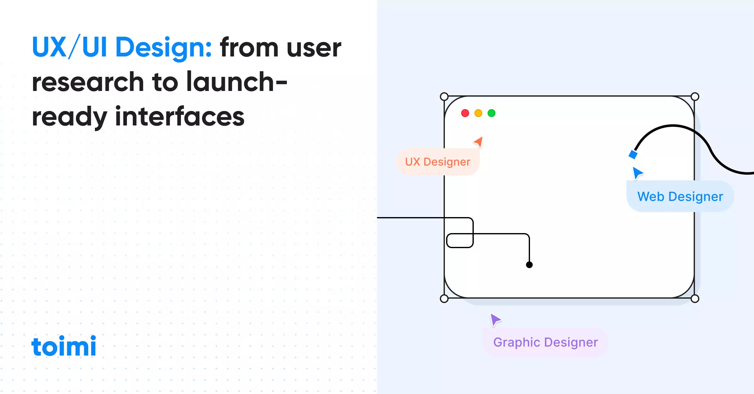
A complete UX/UI design framework — from user research to developer handoff. Process, methods, deliverables, costs, and the mistakes that turn $200K builds into $200K write-offs. Based on 150+ real projects.
Key takeaways 👌
UX ROI is measurable: every $1 invested in UX returns $100 (Forrester). Companies in McKinsey's top quartile for design outperformed the S&P 500 by 228% over ten years. The business case isn't theoretical — it's documented.
UX and UI are different disciplines with different deliverables. UX defines what the product does and why — through research, flows, and architecture. UI defines how it looks and feels — through visual systems, components, and interactions. Confusing them produces design that looks polished but doesn't work.
A 6-stage process — Research, Information Architecture, Wireframing, Visual Design, Prototyping, Handoff — reduces rework by 40–60%. Every stage skipped is a problem discovered later, when fixing it costs 10x more. The most expensive UX decision is skipping user research.
Table of Contents
PART 1. UX vs UI: What Each Actually Means
PART 2. Why Most Digital Products Fail at UX
PART 3. The 6-Stage UX/UI Design Process
PART 4. UX/UI for Different Product Types
PART 5. UX Audit: When Your Existing Product Needs Help
Introduction
Every digital product is a series of decisions. Where does the button go. What happens after the click. How does the user know it worked. What do they see when something goes wrong.
These decisions either get made deliberately — through research, testing, and iteration — or they get made accidentally, by a developer who needed to ship by Friday. The difference between the two is the difference between a product people use and a product people abandon.
UX/UI design is the discipline of making these decisions deliberately. Not decorating screens — engineering experiences. The "U" stands for user, and that's not a branding flourish. It means every decision starts with the person on the other side of the screen: what they need, what they expect, what confuses them, what makes them leave.
The problem is that most companies treat UX/UI as a visual layer — something you add after the product is built, like paint on a house. But UX decisions made after development are 10x more expensive to implement than decisions made during wireframing. And decisions made after launch — based on support tickets and declining retention — are 100x more expensive.
This guide covers the complete UX/UI design process from first research interview to developer handoff. Not theory — a working framework with specific methods, deliverables, timelines, and the mistakes that turn six-figure builds into six-figure write-offs. Whether you're building from scratch, redesigning an existing product, or trying to figure out why users keep dropping off at step three of your checkout flow — the process is the same.
PART 1. UX vs UI: What Each Actually Means
What UX Design Covers
UX design is the structural layer. It defines what the product does, how users move through it, and why each screen exists. A UX designer's job is to make the invisible architecture of a product logical, efficient, and aligned with real user behavior.
UX deliverables are functional, not visual:
- User research reports — who are the users, what do they need, what frustrates them
- User personas — behavioral archetypes based on research data, not assumptions
- Journey maps — the full path from first awareness to repeat usage, including pain points
- Information architecture — how content and features are organized and labeled
- User flows — step-by-step paths through specific tasks (sign up, make a purchase, submit a form)
- Wireframes — structural layouts showing hierarchy and functionality, without visual design
UX design answers: "Does this product make sense to the person using it?"
What UI Design Covers
UI design is the visual and interactive layer. It takes the structure defined by UX and gives it form — color, typography, spacing, animation, and interactive behavior. A UI designer's job is to make the product visually clear, consistent, and aligned with the brand.
UI deliverables are visual and systematic:
- Visual design mockups — pixel-perfect screens showing exactly what users will see
- Design system — reusable components (buttons, forms, cards, modals) with documented rules
- Style guide — colors, typography, spacing, iconography, photography direction
- Micro-interactions — hover states, loading animations, transitions, feedback patterns
- Responsive layouts — how every screen adapts from desktop to tablet to mobile
- Accessibility specifications — contrast ratios, focus states, screen reader compatibility
UI design answers: "Does this product look and feel right?"
Where They Overlap — and Where They Don't
The overlap is real but narrow. Both disciplines care about:
- Usability — can the user accomplish their goal without confusion?
- Consistency — do similar elements behave the same way everywhere?
- Accessibility — can people with disabilities use the product effectively?
But the methods are different. UX validates through user testing and analytics. UI validates through design reviews and brand alignment. UX measures task completion rates. UI measures visual consistency and design system adoption.
Aspect |
UX Design |
UI Design |
Focus |
How it works |
How it looks |
Primary tool |
Research, flows, wireframes |
Figma, design systems, mockups |
Validates through |
User testing, analytics |
Design review, brand alignment |
Key metric |
Task success rate, time on task |
Visual consistency, accessibility score |
Skill profile |
Psychology, research, logic |
Visual design, typography, color theory |
Output |
Architecture + behavior |
Visuals + interactions |
The "UX/UI designer" title suggests one person does both. In practice, this works for smaller projects. For complex products — SaaS platforms, enterprise dashboards, large e-commerce — dedicated specialists produce significantly better results. A single person rarely excels at both user psychology research and pixel-perfect visual design.
If your UX/UI design project is under $30K, a generalist works. Over $50K, consider splitting the roles.

PART 2. Why Most Digital Products Fail at UX
The 6 Most Expensive UX Mistakes
UX failures don't look like failures at launch. They look like low conversion rates three months later, or support tickets that keep growing, or users who sign up but never come back. Here are the six mistakes that create those outcomes:
1. Skipping user research. The most common and most expensive mistake. Teams assume they know what users want because they've read some reviews or because the founder "is the target user." But founder intuition is biased by expertise. The person who built the product can't experience it as a first-time user. Without research — interviews, surveys, analytics review — every design decision is a guess.
2. Designing for stakeholders, not users. The CEO wants the homepage to showcase all 12 product features. The VP of Sales wants a demo request form above the fold on every page. The product lead wants to highlight the new feature that took six months to build. None of these people are the user. When stakeholder preferences override user needs, the product becomes a compromise that serves nobody well.
3. Inconsistent interaction patterns. A dropdown in the header, a slide-out panel on the settings page, a modal for the same type of selection on the dashboard. When the same action works differently in different places, users can't build mental models. Every inconsistency creates micro-friction that compounds across the entire experience.
4. Ignoring mobile until the end. "We'll make it responsive later" is a decision to redesign the entire product later. Mobile isn't a viewport — it's a context. Users on mobile have different goals, different patience levels, and different physical constraints (thumb reach, screen glare, interruptions). Designing desktop-first and then squeezing it into 375px width produces unusable mobile experiences.
5. No usability testing before launch. Jakob Nielsen proved that testing with just 5 users reveals 85% of usability problems. Five users. Two hours. Yet most products launch without a single person outside the team trying to complete a real task. The result: problems that were obvious to anyone who wasn't the builder.
6. Optimizing for beauty over function. This deserves its own section.
The "Pretty but Useless" Trap
Dribbble and Behance are full of stunning interfaces that would fail in production. Ultra-thin text on gradient backgrounds. Navigation hidden behind creative interactions. Forms that prioritize visual minimalism over clear labels. Layouts that look perfect at 1440px and break at every other width.
The trap works like this: designers optimize for peer approval (likes, features, awards) instead of user success (task completion, conversion, retention). The portfolio gets better. The product gets worse.
Real-world examples:
Snapchat's 2018 redesign merged the friends page with the discover page, prioritizing a cleaner look over the behavioral patterns 180 million users had built over years. Result: a Change.org petition with 1.2 million signatures, a $1.3 billion market cap drop, and a partial reversal within months.
Google+, despite Google's design resources, failed because it solved a design problem (cleaner social networking) instead of a user problem (nobody needed another social network). Beautiful interface. Zero compelling reason to use it.
The antidote is simple: test with real users before committing to any design direction. If five out of five test participants can't find the primary action within ten seconds, the design fails — regardless of how many awards it might win.
When to Invest in UX (and When It's Too Late)
The cost of fixing UX problems escalates exponentially across project phases:
Phase |
Fix Cost |
Example |
Research / wireframing |
$1x |
Change a user flow in Figma — 2 hours |
Visual design |
$5x |
Redesign screens, update design system — 2 days |
Development |
$10x |
Rewrite components, change data flow — 1–2 weeks |
Post-launch |
$100x |
Hotfix, user retraining, reputation damage — months |
The right time to invest in UX is before writing a single line of code. The second-best time is now — through a UX audit that identifies the highest-impact problems in your existing product.
"Design is really an act of communication, which means having a deep understanding of the person with whom the designer is communicating."
— Don Norman, Author, The Design of Everyday Things
PART 3. The 6-Stage UX/UI Design Process
This is the operational framework. Each stage produces specific deliverables that feed the next stage. Skipping a stage doesn't save time — it creates rework later.
Stage 1: User Research & Discovery
Duration: 2–4 weeks
Budget allocation: 15–20% of total project
Research is the foundation. Everything built on assumptions instead of evidence will need to be rebuilt when reality intervenes.
Research methods (pick 3–4 based on project scope):
User interviews (8–15 participants): Semi-structured conversations about goals, behaviors, frustrations. Not "would you use feature X?" (hypothetical) but "tell me about the last time you tried to solve [problem]" (behavioral).
Analytics review: Where do users drop off? Which features have high adoption vs low adoption? What's the average session duration? Google Analytics, Mixpanel, Hotjar — the data already exists, it just needs interpretation.
Competitor UX audit: How do 5–8 competitors solve the same user problems? What patterns are standard in the category? Where is the UX white space?
Surveys (200+ responses): Quantitative validation of qualitative findings. "73% of respondents rated onboarding as difficult" is more persuasive in stakeholder meetings than "several interviewees mentioned confusion."
Contextual observation: Watch real users interact with the current product (or competitor products) in their natural environment. What workarounds do they use? Where do they hesitate?
Deliverables:
- Research report with key findings and design implications
- 3–5 user personas based on behavioral patterns (not demographics)
- Journey map showing the full user experience, including pre- and post-product touchpoints
- Jobs-to-be-done framework: functional, emotional, and social jobs the product fulfills
Stage 2: Information Architecture
Duration: 1–2 weeks
Budget allocation: 10% of total project
Information architecture (IA) defines how content and functionality are organized. Bad IA is the reason users can't find features they know exist — because the label doesn't match their mental model, or the hierarchy buries it three levels deep.
Methods:
Card sorting: Give users 30–50 content items on cards. Ask them to group and label. Shows how real users categorize information vs how the team categorizes it. Works remotely via OptimalSort or similar tools.
Tree testing: Present a text-only site structure. Ask users to find specific items. Measures whether your hierarchy works before adding visual design.
Sitemap creation: Visual map of all pages/screens and their relationships. For complex products, this includes states (empty, loading, error, success) for each screen.
Deliverables:
- Sitemap / screen map
- Navigation model (primary, secondary, contextual navigation)
- Content hierarchy and labeling conventions
- Taxonomy (if applicable — e-commerce categories, blog structure, filter systems)
Stage 3: Wireframing
Duration: 2–3 weeks
Budget allocation: 15–20% of total project
Wireframes are structural blueprints. They define what goes on each screen, in what order, at what priority level — without colors, images, or final copy. The goal is to validate structure before investing in visual design.
Fidelity levels:
Low-fidelity (sketches/boxes): Quick exploration of layout options. 15 minutes per screen. Used for internal team discussion, not client presentation.
Mid-fidelity (gray-box wireframes): Defined layout, real content hierarchy, placeholder text at correct length. 1–3 hours per screen. Used for stakeholder review and initial user testing.
High-fidelity wireframes: Detailed layouts with real copy, functional annotations, responsive behavior notes. 3–5 hours per screen. Used for development specification.
What wireframes must define:
- Content hierarchy: what the user sees first, second, third
- Call-to-action placement and priority (primary, secondary, tertiary)
- Form structure: fields, validation rules, error states
- Navigation behavior: what happens on click, scroll, hover
- Responsive strategy: what changes, what stacks, what hides on mobile
Common mistake: Going straight to high-fidelity. Low-fi → mid-fi → high-fi is faster than high-fi → revision → revision → revision. Each fidelity level filters out problems that would be expensive to fix at the next level.
Stage 4: Visual UI Design
Duration: 3–5 weeks
Budget allocation: 25–30% of total project
Now the wireframes get a visual identity. Every color, typeface, and spacing decision should trace back to the brand strategy and user research from Stage 1.
Design system first, screens second:
The most efficient approach: design the system, then use it to build screens. Not the reverse. A design system includes:
Foundations: Color tokens, typography scale, spacing grid, elevation/shadow system, border radius conventions
Components: Buttons (primary, secondary, ghost, destructive), inputs (text, select, checkbox, radio, toggle), cards, modals, tooltips, navigation elements
Patterns: Form layouts, table structures, dashboard layouts, empty states, error states, loading states
Documentation: When to use each component, accessibility requirements, responsive behavior
For a typical SaaS product, a complete design system has 40–80 components. Building screens without the system means inconsistency by screen ten.
Responsive design is not an afterthought:
Design three breakpoints minimum: desktop (1280px+), tablet (768px), mobile (375px). Don't "stack columns" — rethink the experience for each context. Mobile users have different priorities, and touch targets need minimum 44×44px.
Accessibility (WCAG 2.1 AA minimum):
- Color contrast: 4.5:1 for body text, 3:1 for large text
- Focus states: visible keyboard focus on every interactive element
- Screen reader compatibility: semantic HTML, ARIA labels, alt text
- Touch targets: minimum 44×44px with 8px spacing
Deliverable: Complete UI design in Figma — all screens, all states, all breakpoints, documented design system.
"Don't make me think. If something requires a large investment of time — or looks like it will — it's less likely to be used."
— Steve Krug, Author, Don't Make Me Think
Stage 5: Prototyping & Testing
Duration: 1–2 weeks
Budget allocation: 10–15% of total project
A prototype is a clickable simulation of the product. Users interact with it like a real product, but nothing is built yet. This is the last chance to catch problems before they become code.
Prototype scope:
Don't prototype everything. Focus on:
- Critical user flows: Onboarding, core task (the main thing the product does), checkout/conversion
- Complex interactions: Multi-step forms, drag-and-drop, data visualization, filtering
- Risky assumptions: Any design decision where the team disagreed or lacked data
Usability testing protocol:
Jakob Nielsen's research holds: 5 users find 85% of usability problems. Here's a practical testing protocol:
Recruit 5–8 participants matching your target persona. Not colleagues, not friends — real potential users.
Write 4–6 task scenarios. Not "click the blue button" but "You want to invite a team member to your project. Show me how you'd do that."
Observe without helping. When the user gets stuck, note it. Don't explain. Don't hint. The confusion IS the data.
Capture three things per session: Task success (yes/no), time on task, verbal feedback ("I expected this to be under Settings").
Debrief within 24 hours. Pattern recognition is fastest when sessions are fresh.
What testing reveals:
- Navigation labels that don't match user vocabulary
- Flows that seem logical to the builder but confuse users
- Missing information at decision points (users need X data to choose, but the screen doesn't show it)
- Expectations mismatches ("I thought clicking this would do Y, but it did Z")
Iteration after testing: Plan for 1–2 rounds of revision. Testing → fix critical issues → re-test. If round two still shows major problems, the underlying IA or flow needs rethinking, not just UI polish.
"A user interface is like a joke. If you have to explain it, it's not that good."
— Jakob Nielsen, Co-founder, Nielsen Norman Group
Stage 6: Design-to-Dev Handoff
Duration: 1 week
Budget allocation: 5–10% of total project
Handoff is where design value is either preserved or destroyed. A beautiful Figma file that developers can't implement correctly is a beautiful Figma file that was a waste of money.
What a proper handoff includes:
Figma specs: Auto-layout, proper naming conventions, organized pages (by flow, not by date created)
Design tokens: Colors, spacing, typography, and shadows exported as JSON/CSS variables — not as one-off hex values
Interaction specifications: For each interactive element — trigger, action, duration, easing. "The dropdown opens on click, slides down 200ms with ease-out, closes on click outside."
Responsive behavior notes: What scales, what reflows, what hides. For every screen, at every breakpoint.
Edge case documentation: Empty states, loading states, error states, permission states, first-use states. These account for 50–70% of all screens in a real product.
QA checklist: Visual acceptance criteria for each screen. The designer and developer agree on "done" before development starts.
Common handoff failures:
- Designer uses absolute positioning in Figma → developer can't build responsive layouts
- Colors defined as one-off hex values → impossible to maintain a consistent theme
- No documentation of states → developer invents their own empty state, error message, loading spinner
- No spacing system → every screen has slightly different padding, creating visual inconsistency
The fix: Designers must understand development constraints. Developers must participate in design reviews. The handoff is a conversation, not a file transfer.
PART 4. UX/UI for Different Product Types
The 6-stage process applies to every digital product. But the priorities, patterns, and pitfalls vary dramatically by product type.
SaaS Platforms
UX priority: Onboarding and feature discovery
Key metric: Activation rate (% of sign-ups who reach "aha moment")
SaaS products live or die by onboarding. If a user doesn't experience value within the first session, they don't come back. The median SaaS product loses 75% of users within the first week.
Critical UX patterns:
Progressive onboarding: Don't explain everything at once. Introduce features as the user needs them.
Empty states as tutorials: The first time a user sees a dashboard with zero data, that empty state IS the onboarding. Show them exactly what to do next.
Feature discovery: In-app tooltips, contextual suggestions, "did you know?" prompts — surfaced based on user behavior, not on a fixed schedule.
Reduce time-to-value: Every click between sign-up and first value-moment is a chance to lose the user. Audit ruthlessly.
E-commerce
UX priority: Checkout flow and product discovery
Key metric: Cart abandonment rate (industry average: 70%)
E-commerce UX is conversion engineering. Every element on every page either moves the user toward purchase or creates friction that stops them.
Critical UX patterns:
Search UX: Autocomplete, typo tolerance, filter facets, "no results" recovery. Users who search convert 2–3x higher than browsers.
Product pages: Image quality, size guides, reviews placement, "add to cart" visibility, trust signals (shipping, returns, security).
Checkout: Guest checkout option (forced registration kills 24% of purchases), progress indicator, minimal form fields, payment method visibility, clear error messages.
Mobile checkout: Autofill support, Apple Pay / Google Pay, thumb-friendly buttons, no horizontal scrolling in forms.
B2B Portals & Dashboards
UX priority: Complex workflow simplification
Key metric: Task completion time
B2B products handle complex data and multi-step workflows. The UX challenge is making sophisticated functionality accessible without dumbing it down.
Critical UX patterns:
Role-based views: An admin sees different controls than a viewer. Don't show features the user can't use — it creates confusion and security concerns.
Data density vs clarity: Dashboards must show enough data for decisions without overwhelming. Progressive disclosure: summary → detail → raw data.
Bulk operations: B2B users manage hundreds of records. Select all, bulk edit, batch export, saved filters — these aren't nice-to-haves, they're productivity requirements.
Workflow automation: If a user does the same 5-step sequence daily, design a one-click shortcut. Observe before automating.
Mobile Apps
UX priority: One-handed usability and platform conventions
Key metric: Session duration, retention at Day 7 / Day 30
Mobile UX follows different rules than desktop. Physical constraints (thumb reach, screen size, connection speed) override desktop conventions.
Critical UX patterns:
Thumb zone design: Primary actions in the bottom 40% of the screen. Navigation at the bottom, not the top. Hamburger menus reduce discoverability by 50% — use a bottom tab bar.
Gesture navigation: Swipe to delete, pull to refresh, swipe between tabs. Follow platform conventions — iOS and Android users expect different gestures.
Offline states: What happens when the connection drops? Graceful degradation > error screen. Queue actions and sync when connection returns.
Performance as UX: A 3-second load time on mobile causes 53% abandonment (Google data). Skeleton screens, optimistic UI updates, and lazy loading are UX tools, not just engineering optimizations.
Product Type |
UX Priority |
Key Metric |
Biggest Pitfall |
SaaS |
Onboarding, feature discovery |
Activation rate |
Showing all features at once |
E-commerce |
Checkout, product search |
Cart abandonment |
Forced registration at checkout |
B2B Portal |
Workflow simplification |
Task completion time |
Overwhelming data density |
Mobile App |
One-handed use, speed |
D7/D30 retention |
Ignoring platform conventions |
For UX/UI design projects in specific markets, local user behavior research adds another layer — cultural UX conventions vary significantly between US, European, and MENA markets.
"Good design, when it's done well, becomes invisible. It's only when it's done poorly that we notice it."
— Jared Spool, Founder, Center Centre
PART 5. UX Audit: When Your Existing Product Needs Help
Not every product needs a redesign. Sometimes the structure works, but specific friction points are killing conversion. A UX audit identifies those friction points with evidence, not opinions.
Signals You Need a UX Audit
Eight warning signs that your product has UX problems:
- Bounce rate above 60% on key pages — users arrive and leave without interacting
- Checkout/sign-up abandonment above industry average — users start the flow but don't finish
- Support tickets about "how do I...?" — if users need help with core features, the UX failed
- Feature adoption below 20% — you built it, but users can't find it or don't understand it
- Session duration declining month over month — users are spending less time, finding less value
- Mobile conversion significantly lower than desktop — your responsive design isn't working
- Users creating workarounds — exporting to Excel, using screenshots, emailing themselves links
- New user activation below 40% — people sign up but never reach the value moment
If three or more apply, an audit will almost certainly find high-impact fixes.
What a UX Audit Covers
A comprehensive UX audit evaluates the product across five dimensions:
1. Navigation & Information Architecture
- Can users find what they're looking for within 3 clicks?
- Are labels intuitive (matched to user vocabulary)?
- Is the hierarchy logical — most-used features most accessible?
- Does search work effectively (autocomplete, filters, relevant results)?
2. Forms & Input Flows
- Are form fields minimal (every unnecessary field reduces completion by 5–10%)?
- Are validation messages clear and immediate (not after submission)?
- Do error messages explain how to fix the problem (not just "invalid input")?
- Is autofill supported? Are smart defaults used?
3. Visual Hierarchy & Content
- Is the primary action obvious on every screen?
- Can users scan the page and understand the structure within 5 seconds?
- Are CTAs visually distinct from secondary elements?
- Is content written for scanning (headings, bullets, bold keywords)?
4. Mobile & Responsive
- Do touch targets meet 44×44px minimum?
- Are critical flows usable one-handed?
- Does the layout adapt meaningfully (not just stack)?
- Is performance acceptable on 3G connections?
5. Accessibility & Consistency
- Does color contrast meet WCAG 2.1 AA (4.5:1)?
- Are all interactive elements keyboard-accessible?
- Do similar elements behave consistently across the product?
- Are error, empty, and loading states designed (not default browser)?
Deliverable: Prioritized audit report — each finding rated by severity (critical / major / minor) and effort to fix (quick win / medium / large), with specific recommendations and visual examples.
Audit vs Redesign vs Rebuild
UX/UI design is Stage 3 of the web development process — it runs parallel to early development and shapes every frontend decision.
Approach |
When |
Scope |
Budget |
Timeline |
Risk |
Audit + Fix |
Product works but underperforms |
Targeted fixes to specific flows |
$8K–$20K |
3–6 weeks |
Low — incremental changes |
Structure is fine, visuals are dated |
New UI on existing architecture |
$25K–$60K |
6–12 weeks |
Medium — visual disruption |
|
Rebuild |
Architecture fundamentally broken |
New IA, new UI, new flows |
$50K–$150K+ |
12–24 weeks |
High — learning curve for existing users |
The decision matrix: if users can complete core tasks but the experience is slow/frustrating — audit. If the brand has evolved but the interface hasn't — redesign. If users need workarounds for basic tasks — rebuild.
PART 6. Measuring UX Impact
"UX is subjective" is the excuse companies use to avoid measuring it. In practice, UX impact shows up in the same metrics that finance and product teams already track — you just need to connect the dots.
UX Metrics That Matter
Behavioral metrics (measure usability directly):
Task success rate: What percentage of users complete a specific task (sign up, make a purchase, find information)? Below 78% = serious UX problem.
Time on task: How long does the task take? Compare against your benchmark and competitor benchmarks. Longer ≠ better for transactional tasks.
Error rate: How often do users make mistakes (wrong clicks, form errors, dead ends)? Each error is a design failure.
System Usability Scale (SUS): Standardized 10-question survey. Score above 68 = above average. Below 50 = serious problems. Benchmark across versions.
Business metrics (measure UX outcomes):
Conversion rate: The ultimate UX metric for commercial products. A/B test UX changes and measure conversion impact directly.
Cart/form abandonment: Where in the flow do users quit? The drop-off point IS the UX problem.
Support ticket volume: Specifically tickets about usability ("can't find," "doesn't work," "how do I"). Declining tickets after UX improvements = measurable ROI.
NPS (Net Promoter Score): How likely are users to recommend the product? NPS improvements after UX changes show perception shift.
Engagement metrics (measure value delivery):
Feature adoption: % of users who discover and use each feature. Low adoption + high value = discoverability problem (UX fix). Low adoption + low value = feature problem (product fix).
Retention curves: D1, D7, D30, D90 retention. Improving retention at D7 (after initial novelty wears off) is typically a UX win.
DAU/MAU ratio: Measures habit formation. Above 20% = healthy for most products. UX improvements that make the product easier to use daily should move this.
The Business Case for UX Investment
The data is unambiguous:
Forrester Research: Every $1 invested in UX returns $100 (100:1 ROI). The primary mechanism: reduced development rework and increased conversion.
McKinsey Design Index: Companies in the top quartile for design performance outperformed the S&P 500 by 228% over ten years. Design-led companies see 32% more revenue growth and 56% higher total returns to shareholders.
IBM: Their design thinking practice reduced development cycle time by 75% and reduced time spent in design phase by 33%. Faster shipping, fewer defects.
Amazon: A 100ms increase in page load time costs 1% in revenue. For Amazon, that's $1.6 billion. Performance IS UX.
These aren't cherry-picked studies. The pattern is consistent across industries: companies that invest in UX systematically outperform companies that treat design as decoration.
UX ROI Calculation Framework
For a mid-market digital product with $2M annual revenue:
Investment: $30K–$60K (UX audit + redesign of critical flows)
Measurable returns (conservative):
- Conversion rate improvement of 15% → $300K additional annual revenue
- Support ticket reduction of 30% → $20K–$50K saved in support costs
- Development rework reduction of 40% → $40K–$80K saved in engineering time
- Customer retention improvement of 10% → $100K–$200K in preserved revenue
Payback period: 2–4 months
Metric |
How to Measure |
Target Improvement |
Tool |
Task success rate |
Usability testing |
+15–25% |
Maze, UserTesting |
Conversion rate |
A/B testing |
+10–20% |
GA4, Optimizely |
Support tickets |
Ticket tagging |
-25–40% |
Zendesk, Intercom |
Time on task |
Session recording |
-20–30% |
Hotjar, FullStory |
SUS score |
Standardized survey |
+10–15 points |
Typeform |
Feature adoption |
Product analytics |
+15–30% |
Mixpanel, Amplitude |
Want to discuss your project?
Share your vision with us, and we'll reach out soon to explore the details and bring your idea to life.


Conclusion
UX/UI design is not a phase at the end of development. It's not a layer you add after the product works. It's the framework that determines whether the product works for the person using it — from the first research interview to the last pixel in the handoff file.
The companies that get this right don't start with Figma. They start with users. They research before they wireframe, they test before they build, and they measure after they launch. Every decision traces back to evidence, not to stakeholder preference or designer intuition.
The companies that get this wrong start with screens. They design what looks good in a portfolio, ship without testing, and then spend six months fixing problems that five users in a testing session would have caught in an hour.
The difference is not talent. It's process. The 6-stage framework in this guide exists because we've seen what happens when stages get skipped. Research gets skipped, and the product solves the wrong problem. Wireframing gets skipped, and the development team builds the wrong structure. Testing gets skipped, and users find the bugs that the team should have found first.
If your product is live and underperforming — conversion is flat, support tickets are climbing, mobile users are bouncing — the first step is a UX audit. Not a redesign. An audit. Find the specific problems, fix the highest-impact ones first, measure the results, then decide whether you need a broader redesign.
If you're building something new — start with research. Talk to eight users before opening a design tool. Map the journey before sketching the screens. Build the system before designing the pages.
The best interfaces are the ones users never think about. They just work.
Good UX is invisible. The user doesn't admire the interface — they just get things done. Every time someone says "this app is so easy to use," that's not luck. That's hundreds of design decisions made correctly, in the right order, based on research instead of guessing.