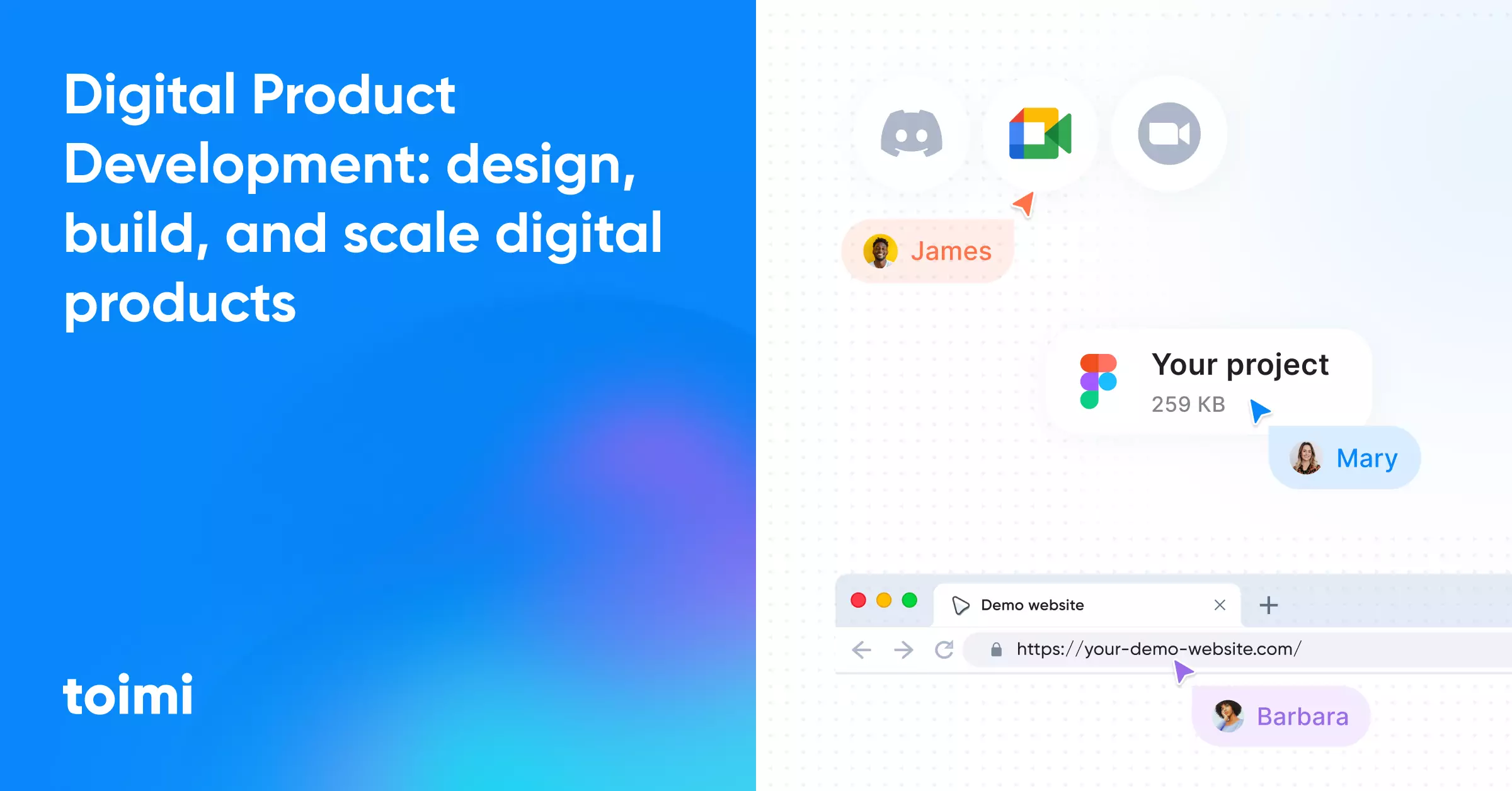
Digital products rarely break because of code. More often, they fail because of decisions made too early and too blindly. This longread shows exactly where products start to crack — and how to avoid it.
Key Takeaways 👌
A digital product is a system that delivers repeated value, not a collection of features or screens.
Confusing products with websites, platforms, or tools leads to structural mistakes early on.
Mental models shape architecture, UX, scope, and prioritization long before design or development begins.
Table of Contents
Part 1. What a digital product really is.
And why most teams misunderstand it
Part 2. Discovery as Risk Reduction
How to validate the right things before committing to build
Part 3. Product Strategy & Positioning
Turning clarity into focus, scope, and real differentiation
Part 4. UX Architecture & User Flows
How structure shapes behavior — and where UX debt begins
Part 5. UI Systems & Scalability
Why products break visually as they grow — and how to prevent it
Part 6. Technical Architecture
The product skeleton: decisions that scale — or silently limit you
Part 7. SEO, Performance & Core Web Vitals
Visibility and speed as product qualities, not afterthoughts
Part 8. Common Mistakes & False Assumptions
Where products lose time, clarity, and momentum
Part 9. Decision Frameworks
How to choose teams, stacks, and plans without ideology
Introduction
Digital products often look simple from the outside.
An interface, a set of features, a login screen, maybe a dashboard — and the assumption that everything else is just “execution.”
But that surface view hides where most products actually succeed or fail.
The real work of digital product development doesn’t start with screens, frameworks, or code.
It starts with how the product is understood internally: what problem it exists to solve, what role it plays for the business, and what assumptions guide thousands of small decisions over time.
Most product failures are not technical failures.
They are conceptual failures that compound quietly until fixing them becomes expensive, political, or impossible.
Digital product development follows the same 6-stage web development framework — with deeper emphasis on architecture and testing.
PART 1. What a Digital Product Is (vs Website, Service, Internal Tool)
At a high level, a digital product is often confused with anything that “exists online.”In practice, the distinction is not about technology, but about behavior and intent.
A website is primarily a communication layer. Its job is to inform, persuade, or convert. Even complex websites are usually page-based, content-driven, and designed around short sessions with clear entry and exit points.
A digital product is behavior-driven. It is designed around repeated use, evolving user states, and long-term interaction. Users don’t just visit it — they operate within it.
A service may be delivered digitally, but its value is often external to the interface. The product supports the service, rather than being the value itself. Think booking systems, dashboards, or portals that exist to enable something that happens elsewhere.
An internal tool can still be a digital product — but only if it is treated as one. Many internal systems fail not because internal users are “less demanding,” but because product thinking is removed under the assumption that usability matters less. In reality, internal products amplify inefficiency faster than public ones.
The key distinction is this: a digital product is designed as a system of use over time, not a surface for delivery.
When teams move from conceptual definitions to execution, the distinction between a digital product and a website becomes especially important. Treating a product as a set of pages leads to surface-level decisions, while treating it as a system forces alignment between UX, logic, and infrastructure. This difference is most visible during Web development, where architectural choices either reinforce product behavior or quietly undermine it over time.
Product Thinking vs Project Thinking
Product thinking and project thinking solve different problems, but they are often applied interchangeably — with predictable consequences.
Project thinking is based on certainty:
- fixed scope
- fixed timeline
- defined completion
It works well when the problem is already known and the solution is clearly specified.
Product thinking is based on uncertainty:
- evolving scope
- continuous feedback
- no real “end”
It assumes that important information will emerge only after users interact with the product.
When product work is managed as a project, teams optimize for delivery, not learning. Features ship, but behavior doesn’t change. Complexity accumulates, but clarity doesn’t.
This mismatch usually appears later as:
- bloated roadmaps
- UX inconsistencies
- technical shortcuts that become permanent
- internal disagreement about “what the product actually is”
Product thinking doesn’t eliminate planning. It reframes planning as hypothesis management, not task completion.
Product–Market Fit: What It Actually Means in Practice
Product–market fit is often described as a milestone.
In reality, it is a state of alignment that must be maintained.
A product has product–market fit when:
- users return without external pressure,
- value is experienced early and repeatedly,
- and retention is driven by usefulness, not inertia.
This alignment is rarely global. Most products achieve fit for:
- a specific segment,
- a specific use case,
- under specific constraints.
Problems arise when teams treat early traction as universal validation and scale prematurely. Growth amplifies both strengths and weaknesses — but weaknesses compound faster.
Product–market fit is not proven by launches or signups.
It is revealed through sustained use, behavior stability, and resistance to alternatives.
The job of the product team is to discover a product that is valuable, usable, and feasible.
— Marty Cagan, Inspired
MVP vs Prototype vs “First Release”: How to Tell the Difference
These terms are often used interchangeably, but they serve different purposes.
A prototype is a thinking tool.
It exists to explore ideas, flows, and assumptions. It may be interactive, but it is not expected to scale, persist, or perform reliably.
An MVP is a learning tool.
Its purpose is to test a critical assumption with real users under real conditions. A proper MVP minimizes scope, not clarity. It should still feel coherent, intentional, and usable.
A first release is a commitment.
It enters the product lifecycle and immediately accumulates users, expectations, and technical constraints. Treating a first release like a disposable experiment is one of the fastest ways to generate long-term debt.
The common failure mode is minimizing the wrong thing:
- cutting UX instead of features,
- shipping breadth instead of depth,
- or mistaking “unfinished” for “iterative.”
An MVP is not defined by how small it is.
It is defined by how precisely it answers the most important unanswered question.

PART 2. Discovery and Research Frameworks
Discovery is often framed as a preparatory step in the digital product development process. In practice, it plays a very different role. Discovery is not about collecting information for its own sake, nor is it a creative exercise meant to generate ideas. Its real function is risk reduction.
Every product decision is made under uncertainty. Some risks are obvious, others remain invisible until they surface as UX problems, architectural constraints, or strategic dead ends. Discovery exists to expose these risks early, when the cost of changing direction is still low. When teams skip or dilute discovery, they don’t remove uncertainty — they simply carry it forward into design and development, where it becomes harder and more expensive to resolve.
Discovery becomes especially critical when products are built as complex platforms rather than static experiences. In Online services development, early assumptions about workflows, permissions, and user behavior directly affect long-term scalability. Skipping validation at this stage often results in systems that technically work, but fail to support real usage patterns.
Discovery as Risk Reduction (not “research for research”)
Good discovery is not measured by the volume of research artifacts produced. It is measured by how many wrong assumptions are eliminated before commitment. The goal is not to prove that an idea is good, but to test whether it might be wrong.
This is why discovery often feels uncomfortable. It challenges internal beliefs, questions strategic narratives, and introduces constraints where teams would prefer flexibility. But without this pressure, product decisions tend to be driven by intuition, hierarchy, or momentum rather than evidence.
Discovery that focuses on validation instead of confirmation changes the nature of downstream work. Strategy becomes narrower, UX decisions become clearer, and technical trade-offs become easier to justify.
Product discovery is about reducing risk, not gathering requirements.
— Teresa Torres, Continuous Discovery Habits
What to validate first: problem, audience, willingness, constraints
One of the most common discovery mistakes is validating details before fundamentals.
Teams often spend time debating features, layouts, or flows while still operating on untested assumptions about the problem itself.
In practice, discovery should validate four things in sequence:
- The problem — whether it is real, recurring, and painful enough to matter.
- The audience — who experiences this problem most strongly and in what context.
- Willingness — whether users are motivated to change their behavior or adopt a new solution.
- Constraints — business, technical, legal, or organizational limits that shape what is realistic.
Reversing this order leads to polished solutions built on fragile foundations. Products may ship, but alignment between user value and business outcomes remains weak.
Practical frameworks: JTBD, competitor teardown, funnel audits
Discovery does not require complex methodologies to be effective. In fact, overly rigid frameworks often slow teams down without improving decision quality. What matters is using the right tools for the right questions.
Jobs-to-be-Done (JTBD) is useful when teams need to understand motivation rather than demographics. It helps clarify what users are trying to achieve and why existing solutions fail in specific situations.
Competitor teardowns help reveal implicit decisions rather than surface-level features. By analyzing onboarding flows, defaults, and friction points, teams can see what competitors prioritize — and what they intentionally ignore.
Funnel and UX audits are especially valuable for existing products. They highlight where users drop off, where confusion accumulates, and where effort outweighs perceived value. Often, these audits show that the core problem is not missing features, but misaligned flows or unclear priorities.
None of these frameworks are valuable on their own. Their usefulness depends on how directly they inform decisions about scope, structure, and direction.
How to Run Discovery Without Turning It Into a 40-Page PDF
Discovery fails when it becomes documentation-driven instead of decision-driven. Long reports, dense slide decks, and exhaustive research summaries rarely improve outcomes.
They often delay action and dilute insight.
Effective discovery outputs are concise and actionable. They make assumptions explicit, highlight key risks, and clearly state what has changed as a result of new information. If a discovery phase does not lead to clearer priorities, tighter scope, or better-aligned decisions, it has not done its job.
The purpose of discovery is not certainty.
It is just enough clarity to move forward deliberately, with fewer blind spots and better trade-offs.
PART 3. Product Strategy and Positioning
Product strategy sits between discovery and execution. It is the layer where research turns into decisions, and where uncertainty is narrowed into focus. Without a clear product strategy, teams tend to confuse activity with progress: features ship, designs evolve, and systems grow — but the product itself drifts.
Positioning is not a marketing exercise added at the end. It is a strategic constraint that influences what the product becomes, what it excludes, and how users interpret its value from the very first interaction.
While often treated as a separate discipline, Branding directly influences product strategy. It sets expectations, frames value, and shapes how users interpret product decisions long before they engage with individual features. Misalignment here often leads to confusion even when execution is technically sound.
Defining the Real Problem and the Real User
A common failure in digital product development is defining the problem too broadly. Statements like “users need a better experience” or “businesses need more efficiency” sound reasonable, but they are strategically useless. They describe outcomes, not problems.
A real product problem has three properties. It is specific, recurring, and rooted in context. It happens at a particular moment, to a particular type of user, under particular constraints. Removing that context turns the problem into an abstraction that can be interpreted in dozens of conflicting ways.
The same applies to defining the user. Products rarely fail because teams don’t know who their users are. They fail because they don’t know which users matter most at the start. Early strategy requires choosing a narrow user definition — not because others don’t matter, but because trying to serve everyone immediately leads to generic solutions.
Defining the real problem and the real user is an act of exclusion. It deliberately narrows the surface area of the product so that early decisions reinforce each other instead of competing.
Value Proposition and Differentiation (Without Buzzwords)
Value propositions often collapse into vague promises: faster, simpler, smarter, more efficient. These phrases are easy to agree with and impossible to design against.
A useful value proposition is not aspirational. It is operational. It explains why this product is meaningfully better in a specific situation, and what trade-offs make that possible. Differentiation rarely comes from having more features; it comes from choosing which problems to solve deeply and which ones to ignore.
In practice, strong differentiation often emerges from:
- reducing complexity where others add configuration,
- optimizing for a specific workflow instead of general flexibility,
- or accepting constraints that competitors try to avoid.
The absence of buzzwords is not a stylistic choice. It is a signal that the team understands what actually creates value and what merely describes intent.
A product’s positioning is rarely communicated through messaging alone. It is reinforced — or contradicted — by interaction patterns, defaults, and structural decisions. This is where UX/UI and Product Design becomes a strategic tool, translating abstract positioning into concrete user experience rather than decorative visuals.
Product development without a UX/UI design framework is building blind — research and testing reduce rework by 40–60%.
Prioritization Frameworks That Don’t Sabotage the Roadmap
Prioritization is where product strategy becomes visible. It is also where many strategies quietly fall apart.
Common prioritization frameworks promise objectivity through scoring, weighting, and matrices. Used carefully, they can be helpful. Used rigidly, they create the illusion of precision while masking poor assumptions. Features end up prioritized because they score well, not because they move the product forward.
Effective prioritization frameworks share one trait: they are anchored to strategy, not metrics alone. They ask how a decision supports the core problem, the chosen user, and the product’s positioning. When priorities conflict, strategy provides the tie-breaker.
Roadmaps fail when they become collections of justified features instead of expressions of strategic intent. A roadmap should make the product’s direction obvious even to someone who disagrees with it.
From Strategy to Scope: What You Build First (And Why)
Strategy only becomes real when it constrains scope. Deciding what to build first is not about sequencing tasks; it is about sequencing risk and learning.
Early scope should focus on the smallest set of capabilities that:
- prove the product’s value proposition,
- support the core user workflow,
- and expose the most dangerous assumptions.
This often means building less than feels comfortable. It also means resisting the urge to “round out” the product too early. Completeness is rarely a competitive advantage in the early stages; clarity is.
When strategy is sound, scope decisions feel uncomfortable but defensible. When strategy is weak, scope grows by accumulation, driven by requests, edge cases, and internal pressure rather than intent.
A product’s early shape tends to persist. What you build first does more than test an idea — it defines the structure future decisions must work within.
PART 4. UX Architecture and User Flows
UX architecture is where product strategy first becomes tangible. Long before colors, typography, or animations are introduced, the product already makes promises through its structure: what feels important, what feels secondary, what feels possible, and what feels hidden.
When UX architecture is weak, no amount of visual polish can compensate for it. Users don’t experience products as isolated screens — they experience them as sequences of decisions, shaped by structure, defaults, and constraints. UX architecture defines those sequences.
Information Architecture: Structure Before Screens
Information architecture is the discipline of organizing a product’s content, features, and actions into a structure that makes sense over time. It answers questions users rarely articulate directly: Where am I? What can I do here? What happens next?
Many UX problems originate not from poor interface design, but from unclear structure. When teams jump straight into screens, they often lock in decisions about hierarchy and relationships implicitly, without examining whether those relationships reflect real user mental models.
Good information architecture is not about being minimal or complex. It is about being predictable. Users should be able to infer where something lives and how it behaves based on prior interactions. When structure is consistent, learning compounds. When it isn’t, every new feature increases cognitive load.
Structure should be defined before screens because screens are expensive to change.
Architecture, when treated abstractly early on, is far easier to test, challenge, and adjust.
A bad system will beat a good person every time.
— Don Norman, The Design of Everyday Things
Core Flows vs Edge Cases
Every product has flows that define its value and flows that exist to handle exceptions. Confusing the two is one of the fastest ways to create bloated, fragile UX.
Core flows represent what most users do most of the time. They should be obvious, direct, and resilient. Edge cases represent what happens when something goes wrong, differs, or falls outside the norm. They should be handled gracefully, but never allowed to dominate the structure.
The table below highlights the practical difference:
Aspect |
Core Flows |
Edge Cases |
Frequency |
High |
Low |
Business impact |
Direct |
Indirect |
UX priority |
Primary |
Secondary |
Structural influence |
Defines architecture |
Fits into existing structure |
Common mistake |
Underdesigned |
Overdesigned |
Products often fail by over-accommodating edge cases early, cluttering navigation and decision paths before core value is clearly delivered. Handling exceptions is necessary, but elevating them to first-class UX elements too soon weakens the entire system.
Onboarding and Activation as Product Mechanics
Onboarding is often treated as a UX layer — a set of screens or tooltips that explain how the product works. In reality, onboarding is a product mechanic, not a visual one.
Its job is not to educate users exhaustively, but to move them from initial intent to first meaningful outcome as quickly and reliably as possible. Activation happens when users experience value, not when they finish a tutorial.
Strong onboarding:
- emphasizes action over explanation,
- introduces complexity only when it becomes relevant,
- and reinforces the product’s positioning through defaults and constraints.
Weak onboarding attempts to be comprehensive. It explains everything early, assumes attention is unlimited, and postpones value until users “understand the system.” Most users never reach that point.
From an architectural perspective, onboarding reveals whether the product’s core flow is actually clear. If onboarding requires heavy explanation, the structure itself is usually the problem.
UX Debt: How It Appears and How to Control It
UX debt accumulates when short-term decisions introduce long-term friction. Unlike technical debt, it is harder to quantify and easier to ignore — until it manifests as user confusion, support overhead, or declining engagement.
UX debt often appears when:
- features are added without revisiting structure,
- edge cases are promoted into primary flows,
- or design decisions are made to “just ship” without architectural alignment.
Left unchecked, UX debt compounds. Each new feature must accommodate existing inconsistencies, making future changes more expensive and risky.
Controlling UX debt does not mean avoiding shortcuts entirely. It means being explicit about them. When teams acknowledge where compromises are made and why, they can plan for correction. When compromises are implicit, they become permanent.
Good UX architecture accepts that products evolve. It creates enough structural clarity that evolution feels additive rather than corrective.
As products evolve, UX debt often accumulates invisibly. What once felt intuitive becomes fragmented, especially after multiple iterations or team changes. A structured UX/UI audit helps identify where architecture no longer matches user behavior, allowing teams to correct structural issues before they turn into systemic friction.
Not all UX problems require incremental fixes. In some cases, accumulated structural inconsistencies demand a full Redesign — not as a cosmetic refresh, but as a way to realign flows, hierarchy, and mental models with how the product is actually used today.
PART 5. UI Systems and Scalability
UI is often treated as a finishing layer — something applied after UX, logic, and architecture are already in place. In scalable digital products, the opposite is true. UI decisions shape how quickly teams can move, how safely they can evolve the product, and how consistent the experience remains as features accumulate.
Most products don’t break visually because of poor design. They break because the system underneath the interface cannot support growth. Scalability in UI is less about aesthetics and more about structure, rules, and discipline.
UI Consistency vs Flexibility: Where Products Usually Break
Consistency and flexibility are often framed as opposing forces. In reality, scalable UI systems require both — but in different places.
Consistency is what allows users to build intuition. When similar actions behave similarly across the product, cognitive effort decreases and confidence increases. Flexibility is what allows teams to address new use cases without rebuilding the interface from scratch.
Products usually break when flexibility is introduced too early or too broadly. Teams create exceptions to speed up delivery, but each exception weakens the system. Over time, the interface becomes a collection of special cases rather than a coherent whole.
The goal is not rigid consistency. It is predictable variation. Users should be able to recognize when something is intentionally different — and why.
Design Systems vs Component Libraries: What You Actually Need
Design systems and component libraries are often discussed as if they are interchangeable. They are not.
A component library is a collection of reusable UI elements. It answers the question: what can we build with?
A design system is a shared language and rule set. It answers the question: how and why things behave the way they do.
Many teams start by building components because they are tangible and immediately useful. Problems arise when components exist without shared principles. Without guidance on usage, hierarchy, and behavior, components are reused inconsistently, leading to fragmentation instead of efficiency.
What most growing products actually need is not a massive design system, but:
- a small, well-defined set of components,
- clear rules for when and how they are used,
- and shared understanding across design and development.
A design system becomes valuable only when it constrains decisions, not when it merely documents them.
Tokens, Components, Patterns: What Makes UI Scalable
Scalability in UI emerges from layering abstraction correctly.
Tokens define foundational values such as spacing, color, typography, and motion. They make global changes possible without local overrides.
Components combine tokens into reusable elements with defined behavior.
Patterns describe how components are assembled to solve recurring interface problems.
When these layers are blurred, scalability suffers. Hard-coded values creep in. Components become context-dependent. Patterns are reinvented inconsistently across teams.
A scalable UI system allows teams to:
- change appearance without breaking structure,
- add features without redesigning core elements,
- and maintain consistency without slowing delivery.
This requires resisting the temptation to optimize for one-off screens. The short-term gain rarely outweighs the long-term cost.
Governance: keeping UI from collapsing after 6 months
Most UI systems fail not at launch, but months later. Initial enthusiasm fades, new contributors join, deadlines tighten, and exceptions start to accumulate. Without governance, even well-designed systems erode quickly.
Governance does not mean bureaucracy. It means clarity around ownership, decision-making, and evolution. Teams need to know:
- who can introduce new components,
- how changes are reviewed,
- and when breaking consistency is acceptable.
The most effective governance mechanisms are lightweight but explicit. They prioritize shared understanding over rigid enforcement. When teams understand why rules exist, they are more likely to respect them — and to challenge them thoughtfully when necessary.
A scalable UI system is not a static artifact. It is a living structure that requires maintenance, communication, and occasional correction. Without that care, visual debt accumulates as quietly and destructively as technical debt.
PART 6. Technical Architecture
Technical architecture is often treated as an implementation detail — something that follows product and UX decisions. In reality, it functions as the product’s skeleton. It defines what the product can support, how easily it can evolve, and where it will start breaking under pressure.
Good architecture rarely feels impressive in the short term. It feels boring, constrained, and sometimes overly cautious. Bad architecture often feels fast and empowering — until the product grows, usage patterns shift, or new requirements appear. At that point, early shortcuts surface as hard limits.
Frontend, Backend, and Data Model: The Product Skeleton
At its core, every digital product is built on three tightly coupled layers: the frontend, the backend, and the data model. Treating these layers independently is one of the most common architectural mistakes.
The frontend defines how users interact with the system: what is visible, what is editable, and what feels responsive. The backend defines what is possible: rules, workflows, permissions, and side effects. The data model defines what exists, how it relates, and what can be trusted over time.
Problems arise when one layer is designed in isolation. A flexible UI sitting on top of a rigid data model creates friction. A powerful backend exposed through a fragile frontend leads to usability issues. A poorly designed data model locks the product into assumptions that become increasingly expensive to undo.
Strong technical architecture aligns these layers around the product’s core use cases. It assumes change will happen — and designs for it explicitly.
As products grow more modular, internal and external integrations become unavoidable. Decisions made during API development often outlive UI layers, shaping how systems communicate, scale, and remain maintainable. Poorly structured APIs tend to lock products into brittle dependencies that are difficult to untangle later.
CMS vs Headless vs Custom: Choosing Realistically
Content management is a recurring architectural decision that is often framed ideologically. In practice, it should be approached pragmatically.
A traditional CMS works well when content structure is relatively stable and editorial control is a priority. It provides speed and familiarity, but can become restrictive when products require complex interactions or non-standard flows.
A headless CMS decouples content from presentation. This increases flexibility and allows content to be reused across interfaces, but introduces operational complexity. It requires stronger discipline in modeling content and managing integrations.
A custom solution offers maximum control, but also maximum responsibility. Every feature, workflow, and edge case must be designed, built, and maintained internally. This only makes sense when the product’s requirements clearly exceed what existing tools can support.
The mistake is not choosing the “wrong” option, but choosing without understanding the cost of ownership. Architectural decisions should be evaluated not only by what they enable today, but by what they demand tomorrow.
SaaS Architecture Basics (Roles, Permissions, Multi-Tenancy)
For SaaS products, architecture decisions become especially sensitive because they affect every user simultaneously.
Roles and permissions are often underestimated early on. Many products start with a single-user mental model and retrofit access control later. This usually results in brittle permission logic that is difficult to reason about and easy to break.
Multi-tenancy introduces another layer of complexity. Whether tenants share infrastructure, databases, or environments has implications for security, performance, and scalability. There is no universally correct approach — only trade-offs that must align with the product’s scale, risk profile, and operational maturity.
The key principle is explicitness. Implicit assumptions about access, ownership, or isolation tend to surface as security issues or customer trust problems later.
Scalability, Security, Maintainability: Trade-Offs You Can’t Ignore
Scalability, security, and maintainability are often discussed as abstract goals. In practice, they are the result of concrete decisions made under constraint.
Scalability is not just about handling more users. It is about handling more features, more data, more edge cases, and more contributors without collapse. Security is not a checklist item; it is a posture shaped by architecture, defaults, and ongoing vigilance. Maintainability determines whether a product can evolve without constant rewrites or fear-driven stagnation.
Optimizing for one often means compromising another. Highly optimized systems can be difficult to maintain. Extremely flexible systems can introduce security risk. Overly defensive architectures can slow iteration.
Good technical architecture does not eliminate these trade-offs. It makes them visible, deliberate, and aligned with product strategy.
A product’s technical foundation rarely determines success on its own. But a weak foundation almost always limits how far a successful product can go.
Architecture decisions do not end at launch. Products continue to change under real-world pressure, which makes Maintenance, support and development of digital solutions a core part of technical strategy. Without structured support, even well-built systems gradually lose reliability and predictability.
PART 7. SEO, Performance, and Core Web Vitals
SEO and performance are often treated as optimization layers applied after a product is “done.” In reality, both are structural qualities that emerge from early architectural and UX decisions. For digital products — especially SaaS and complex platforms — visibility, speed, and stability are not marketing concerns alone. They directly affect usability, trust, and conversion.
Products don’t become slow or invisible because teams ignore SEO or performance outright. They become slow because these concerns are fragmented across teams, postponed until “later,” or scoped too narrowly around landing pages instead of the product as a whole.
SEO for Products (Not Just Marketing Pages)
Traditional SEO thinking is rooted in marketing websites: landing pages, blog posts, and conversion funnels. Digital products behave differently. They are stateful, dynamic, and often partially hidden behind authentication. This changes how search engines interact with them — and what actually matters.
For products, SEO is less about keyword density and more about:
- crawlable structure and predictable routing,
- semantic clarity in navigation and page hierarchy,
- and consistent internal linking between marketing, product, and content areas.
When product teams treat SEO as something “owned by marketing,” important decisions are missed. URL structure, pagination, filtering, and dynamic rendering all affect indexability long before copy is written. Retrofitting SEO into a complex product is possible, but rarely clean.
Good product SEO emerges when visibility is treated as a product requirement, not a promotional afterthought.
For digital products, SEO is not limited to traffic acquisition. It affects discoverability, trust, and how product structure is interpreted by both users and search engines. When SEO considerations are embedded early, products scale visibility without structural rework.
Core Web Vitals as UX + conversion factor
Core Web Vitals are often discussed in technical terms, but their real impact is experiential. They describe how fast a product feels, how stable it appears, and how responsive it is under real conditions.
Each metric maps directly to a user perception:
Metric |
What It Measures |
What Users Experience |
LCP (Largest Contentful Paint) |
Loading speed of main content |
"Is this usable yet?" |
INP (Interaction to Next Paint) |
Responsiveness to input |
"Does this react when I act?" |
CLS (Cumulative Layout Shift) |
Visual stability |
"Can I trust what I see?" |
Poor Core Web Vitals rarely cause immediate abandonment. Instead, they create friction that compounds subtly: reduced engagement, lower conversion rates, weaker retention, and diminished trust. Users may not articulate that a product feels slow or unstable — they simply use it less.
From a product perspective, performance is not an optimization target. It is part of the value proposition.
Performance degradation rarely comes from a single failure. It emerges gradually as features, scripts, and dependencies accumulate. Continuous Site optimization allows teams to keep performance aligned with UX expectations instead of treating speed as a one-time checklist item.
Performance Budgets and Technical Hygiene
One of the most effective ways to protect performance over time is to establish performance budgets early. A performance budget defines acceptable limits for metrics such as load time, bundle size, or request volume. It turns performance from an abstract goal into a concrete constraint.
Without budgets, performance degrades incrementally. Each individual change seems harmless, but the cumulative effect is significant. This is where technical hygiene becomes critical.
Technical hygiene includes:
- removing unused dependencies,
- controlling third-party scripts,
- avoiding unnecessary client-side computation,
- and revisiting architectural decisions as usage patterns evolve.
These practices are rarely glamorous, but they determine whether a product remains fast as it grows. Performance issues are often framed as scaling problems, when in reality they are maintenance problems left unattended.
Common reasons products become “slow” over time
Products rarely become slow because of a single mistake. They slow down through accumulation.
Common causes include:
- feature growth without architectural reassessment,
- expanding UI systems without performance consideration,
- reliance on increasingly complex client-side logic,
- and integration of external tools that add latency and instability.
Another frequent issue is misaligned incentives. Teams are rewarded for shipping features, not for preserving speed. Without explicit ownership of performance, degradation becomes an acceptable side effect of progress.
Sustainable performance requires treating speed as a shared responsibility across product, design, and engineering. When performance is considered only at the implementation level, it is already too late.
SEO, performance, and Core Web Vitals are not constraints imposed from the outside. They are reflections of how deliberately a product is designed and maintained. Products that take them seriously early tend to scale more predictably — and with fewer painful corrections later.
PART 8. Common Mistakes and False Assumptions
Most failed digital products are not the result of a single bad decision. They fail through a series of small, reasonable choices that compound over time. Each decision feels justified in the moment, especially under pressure, deadlines, or limited information. The damage becomes visible only later, when reversing course is costly or politically difficult.
What makes these mistakes dangerous is not that teams are unaware of them in theory. It’s that they are often framed as pragmatic trade-offs rather than structural risks. Over time, those trade-offs solidify into assumptions that quietly guide future decisions.
“We’ll Fix It Later” and Other Expensive Lies
“We’ll fix it later” is one of the most common phrases heard in product teams — and one of the most expensive. It is usually spoken with good intentions: to keep momentum, meet deadlines, or avoid blocking progress. The problem is not the shortcut itself, but the assumption that the shortcut will be revisited.
In practice, “later” rarely arrives. Temporary solutions become permanent simply because they work well enough. Over time, teams adapt to the workaround, and the cost of fixing it grows until it is no longer considered worth addressing.
This pattern affects UX, architecture, and product logic equally. Unclear flows remain because users learned them. Fragile systems persist because they are already deployed. Inconsistencies multiply because correcting them would require coordination across teams.
The real cost of “we’ll fix it later” is not technical debt alone. It is the gradual erosion of product clarity and confidence.
Plan to throw one away; you will, anyhow.
— Fred Brooks, The Mythical Man-Month
Building Features Before Clarity
Another common mistake is building features before the problem and user are clearly defined. Feature development feels productive. It creates visible progress, tangible output, and a sense of movement. Clarity work, by contrast, often feels slow and ambiguous.
When features lead strategy instead of following it, products accumulate surface area without coherence. Each new feature may solve a real request, but together they form a fragmented experience that is hard to explain, maintain, or scale.
This mistake is often justified as responsiveness to user feedback. In reality, feedback without context tends to reflect symptoms rather than root causes. Building directly from it without interpretation leads to reactive roadmaps rather than intentional ones.
Clarity is not a blocker to speed. It is what prevents speed from turning into noise.
Overdesigning MVPs / underdesigning growth
MVPs are frequently misunderstood. Some teams overdesign them, treating the first version as a polished, near-final product. Others underdesign them, stripping away structure and usability in the name of speed. Both approaches create long-term problems.
Overdesigned MVPs lock teams into assumptions too early. They make change emotionally and technically expensive, discouraging iteration. Underdesigned MVPs, on the other hand, test the wrong things. Poor UX, unclear structure, or missing fundamentals can invalidate otherwise useful insights.
Equally damaging is ignoring growth during MVP development. While MVPs should be narrow, they should not be short-sighted. Decisions about architecture, UX structure, and data models taken early tend to persist. Designing an MVP without considering how it might evolve often results in painful rebuilds later.
A strong MVP balances restraint with foresight. It is minimal in scope, not in thinking.
Mistakes in Handoff: Where Teams Lose Weeks
Handoffs are one of the least visible sources of inefficiency in digital product development. When responsibility shifts from strategy to design, from design to development, or from development to QA, small misunderstandings can cost weeks.
These losses usually don’t come from incompetence. They come from implicit assumptions. Strategy documents assume context that designers don’t share. Designs assume behaviors that aren’t documented. Developers fill gaps based on experience rather than intent.
Each handoff introduces interpretation. Without shared artifacts, clear decisions, and explicit constraints, interpretation multiplies. By the time issues surface, work has already been done — and rework becomes unavoidable.
Good teams don’t eliminate handoffs. They make decisions explicit enough that handoffs don’t distort intent. Clarity travels better than documentation.
PART 9. Decision Frameworks
As digital products mature, decision-making becomes harder, not easier. Early choices are often made under uncertainty but with freedom. Later choices are made with more information — and far more constraints. Teams, architecture, processes, and expectations are already in place, which means every decision carries inertia.
Decision frameworks exist to counterbalance that inertia. Not to guarantee correct outcomes, but to make trade-offs explicit and defensible. Good frameworks reduce bias, ideology, and momentum-driven choices. Bad ones create the illusion of rigor while masking weak reasoning.
How to Choose an Agency vs In-House vs Hybrid
There is no universally correct team model. Each option optimizes for different risks and introduces different constraints.
An in-house team offers continuity, deep product context, and long-term ownership. It works best when the product is central to the business and when there is enough operational maturity to support hiring, onboarding, and retention. The downside is speed and flexibility: building an effective in-house team takes time, and changing direction can be slow.
An agency model excels at focus and acceleration. Agencies are typically strongest in defined problem spaces: discovery, UX architecture, redesigns, or initial product builds. They bring external perspective and structured execution, but lack long-term context by default. Without clear ownership and integration, agency work can remain isolated rather than embedded.
A hybrid model combines internal ownership with external expertise. It often works best for growing products, where strategy and core decisions remain in-house while specialized execution is supported externally. The risk here lies in coordination. Without clear boundaries, responsibility blurs and accountability weakens.
The right choice depends less on budget and more on where the product’s complexity actually lives — in vision, execution, or scale.
How to Evaluate a Team: Signals, Red Flags, Questions to Ask
Evaluating a product team is difficult because competence often looks similar at the surface level. Most teams can show polished work, confident communication, and familiar tools. The difference emerges in how they reason about decisions.
Strong signals include the ability to explain why something was done, not just what was built. Teams that talk openly about trade-offs, constraints, and failed attempts tend to operate with higher maturity. They ask clarifying questions early and challenge assumptions respectfully.
Red flags are usually subtle. Overconfidence, rigid frameworks, or a tendency to promise certainty are common indicators. Teams that default to buzzwords instead of specifics often lack depth. Another warning sign is the absence of uncomfortable conversations — real product work inevitably involves disagreement and uncertainty.
Useful questions are those that reveal thinking, not rehearsed answers. Asking how a team handles unclear requirements, changing priorities, or conflicting feedback often provides more insight than portfolio reviews.
How to Choose a Stack Without Ideology
Technology stacks are often chosen based on preference, familiarity, or trends rather than product needs. This is rarely intentional; it happens because tools feel concrete, while constraints feel abstract.
A pragmatic stack decision starts with understanding what the product needs to do reliably, not what it might need someday. Flexibility is valuable, but only when it serves a clear purpose. Overengineering early introduces complexity without corresponding benefit.
Ideology shows up when teams defend tools instead of outcomes. Phrases like “this is the modern way” or “everyone uses this now” often mask unexamined assumptions. No stack is neutral. Every choice trades ease of change for ease of control, speed for safety, or simplicity for power.
The best stacks are not the most advanced. They are the ones that align with the team’s capabilities, the product’s lifecycle stage, and the business’s tolerance for risk.
Estimation and Planning: What Numbers Can Be Trusted
Estimation is one of the most misunderstood aspects of product development. Stakeholders often ask for certainty where none exists, and teams respond with numbers that appear precise but are fundamentally speculative.
Early estimates are best treated as ranges, not commitments. They describe the order of magnitude of effort, not a fixed outcome. As discovery, design, and architecture mature, uncertainty narrows — but it never disappears entirely.
Numbers become more trustworthy when they are tied to assumptions and constraints. An estimate without context is misleading by default. Planning works best when it is iterative, with frequent checkpoints and explicit opportunities to adjust scope rather than force delivery.
Good planning does not eliminate surprises. It creates the conditions to absorb them without destabilizing the product or the team.
Want to discuss your project?
Share your vision with us, and we'll reach out soon to explore the details and bring your idea to life.


Conclusion: Designing for What Comes After the Launch
Digital product development is not a linear path from idea to interface to release. It is an ongoing process of making decisions under uncertainty — and living with their consequences over time. Most products don’t fail because teams make obviously bad choices. They fail because early assumptions go unexamined, shortcuts are normalized, and complexity is allowed to grow faster than clarity.
What separates resilient products from fragile ones is not speed, tooling, or even talent. It is whether the product is treated as a system — one with intent, structure, and constraints — rather than a sequence of tasks to be completed. When teams invest in understanding the problem deeply, defining the user narrowly, and aligning strategy, UX, and architecture early, they create products that can evolve without collapsing under their own weight.
There is no framework that guarantees success. No methodology removes uncertainty. But deliberate product thinking reduces the cost of being wrong. It makes trade-offs visible, keeps decisions reversible for longer, and prevents local optimizations from undermining the whole.
Good digital products don’t emerge fully formed. They are shaped through disciplined choices, honest discovery, and continuous maintenance of structure — technical, experiential, and strategic. The real work is not launching something new. It is building something that still works when conditions change, teams grow, and expectations rise.
That is what it means to design, build, and scale products that actually work.
Glossary: Core Product, UX, and Development Terms
- Digital product
A software-based system designed to deliver ongoing value to users and measurable outcomes to a business over time. - Product–market fit
A state where a product consistently satisfies a real user need strongly enough to drive repeated use without artificial pressure. - MVP (Minimum Viable Product)
The smallest coherent version of a product that can test a critical assumption with real users under real conditions. - Prototype
An exploratory artifact used to test ideas, flows, or interactions. Not intended to scale or persist. - Product discovery
A structured process for identifying and reducing uncertainty around problems, users, value, and constraints before committing to build. - Product strategy
A set of decisions that define what the product focuses on, who it is for, and what it deliberately does not attempt to solve. - Positioning
How a product is framed and differentiated in the minds of users based on context, value, and trade-offs. - Information architecture (IA)
The structural organization of content, features, and actions within a product. - User flow
A sequence of steps a user takes to complete a task or achieve a goal within a product. - Onboarding
The process by which users reach their first meaningful outcome and understand how the product fits into their workflow. - Design system
A shared set of principles, rules, and components that guide UI design and implementation at scale. - Component library
A collection of reusable UI elements without broader design governance or usage rules. - UI debt
Accumulated inconsistencies and structural weaknesses in the interface that make changes harder over time. - Technical architecture
The underlying structure of frontend, backend, and data systems that support the product. - Headless CMS
A content management system that separates content storage from presentation, allowing reuse across interfaces. - Core Web Vitals
Performance metrics that measure loading speed, interactivity, and visual stability from a user’s perspective. - Performance budget
A predefined limit on performance-related metrics used to prevent gradual degradation.
Most digital products don’t fail because teams lack talent. They fail because the product was never clearly defined as a system — only as a set of tasks. When that happens, every decision becomes reactive, and complexity grows faster than value.