True Emotions
Shaping the Optimal Group IT company through facial expressions and emotions
Writing the brand story
We were to come up with branding for an IT company and define its brand platform, identifying the values and philosophy that shape its identity. To do so, we focused on:
- figuring out the company’s values and philosophy;
- establishing a strong image to define the mission and core values of the brand;
- presenting the company’s meanings and internal philosophy through the brand;
- conveying the company’s values and goals through archetypes and images.
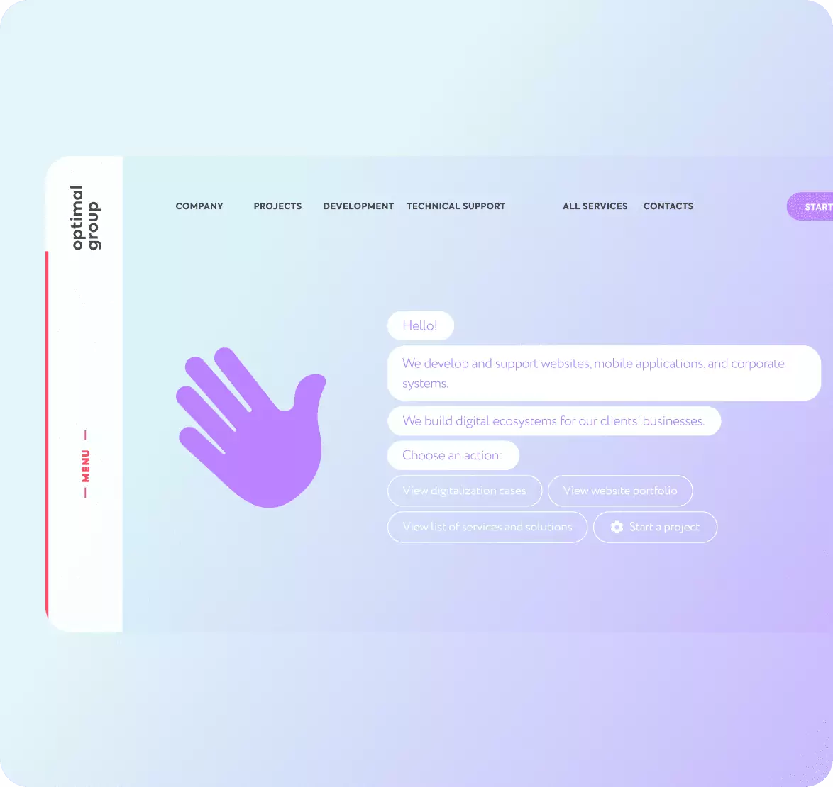
Optimal Group, the true brand
Optimal Group is a company known as a reliable digital systems developer.
TThe company is led by an extremely charismatic and funny person — its founder and CTO, Aleksandr Nefedov. His bold image and charisma virtually personified the brand, becoming a key foundation of the company’s branding and turning him into its main ambassador.
Main missions of Optimal Group:
- Positive emotions and vitality;
- Integrity and wholeness when working for the company.

Meaning of Forms and Search for Visualization
Friendly font
Axiforma, a modern font, is used for headings. Letter details curled upwards indicate that the brand is positive and friendly. The Circe font is used for the main copy — its rounded, soft letters convey openness and readability, as defined in the brand brandbook.
Brand Idea in Objects


Deliverables
We made an exceptionally vivid and dynamic brand that conveys the company’s positive attitude and aspiration for development and technological innovation. Our design reflects the company’s open, lightweight, yet decisive position, as well as its drive to create state-of-the-art solutions for clients — all brought together in a cohesive marketing kit ready for real-world use.
Optimal Group BrandbookIrina
Bogdan