Healthcare website design in 2026 faces the hardest brief in commerce — communicate clinical authority, inspire trust, serve diverse accessibility needs, and convert patients who are often making emotional decisions. These 10 sites demonstrate the best solutions across every healthcare vertical.
Key takeaways 👌
Healthcare design in 2026 has bifurcated — clinical authority brands (Mayo, Flatiron) commit to content depth and information discipline, while consumer-health brands (Oura, Headspace, Hims) lead with lifestyle editorial polish, and the best sites borrow from both camps.
Accessibility isn't a compliance checkbox — it's become a primary brand signal. The top sites on this list explicitly commit to WCAG 2.1 AA and demonstrate accessibility through design choices, not just policy pages.
The gap between healthcare sites that convert and those that don't is no longer checkout friction — it's the first-scroll trust signal stack: clinician credentials, outcome data, compliance badges, and peer-reviewed publications presented with editorial confidence.
TL;DR: Top 10 Best Healthcare Website Designs in 2026
For hospital system benchmarking: Mayo Clinic — the gold standard for content volume management and accessibility rigor.
For insurance design done right: Oscar Health — custom typography and brand system that rejects insurance design clichés entirely.
For DTC telehealth execution: Hims & Hers — the Mouthwash Studio motion system that made category the benchmark.
For consumer medtech/wearables: Oura — warm editorial palette that treats medical data as lifestyle content.
For mental health apps: Headspace — the bridge from meditation to clinical care done in a single design system.
For preventive care innovation: Neko Health — WebGL and particle systems used with clinical restraint.
For primary care consumer polish: One Medical — the gold standard for accessibility-annotated consumer design.
For B2B healthcare SaaS: Flatiron Health and Abridge — enterprise identity done by Chermayeff & Geismar and Pentagram respectively.
For femtech done without clichés: Tia — Athletics rebrand with Inferi + Basis Grotesque and a signature pink dot.
Introduction
Healthcare website design operates under constraints no other category faces at the same time. Sites must communicate clinical authority without feeling cold. They must meet strict accessibility standards (WCAG 2.1 AA minimum, often AAA for public hospital systems) without sacrificing visual expression. They must convert patients making high-stakes, often emotionally charged decisions. They must handle regulated content — FDA disclaimers, HIPAA compliance, state licensure variations — as design elements, not afterthoughts. And they must achieve all of this at scale, often across millions of pages in hospital systems or thousands of specialized providers in insurance networks.
The ten brands in this guide have solved these constraints in dramatically different ways. Enterprise hospital systems like Mayo treat content discipline as the entire design strategy. Consumer wearables like Oura reject clinical-white defaults for editorial warmth. DTC telehealth brands like Hims & Hers treat motion and access as interchangeable concepts. B2B healthcare AI brands like Abridge commission custom typefaces from Pentagram. Femtech brands like Tia explicitly reject every pink-and-pastel stereotype that defined the category's first decade.
What unites them isn't aesthetic. It's conviction. Each brand picks a position — clinical editorial, warm consumer, enterprise serious, immersive innovator — and executes with discipline most healthcare brands never approach. The ones on the outside of this list split the difference, try to appeal to everyone, and convert no one.
For any healthcare organization considering a website redesign or new brand build in 2026, the real strategic question isn't "what should our site look like?" It's "which conviction can we credibly own — and what would it take to execute at the level these ten have reached?"
What Separates the Top 10 from the Rest of Healthcare
Six patterns appear across every site on this list. Each pattern appears somewhere on mediocre healthcare sites — but the top 10 combine all six simultaneously.
1. Accessibility as a design primitive, not a compliance page. Mayo Clinic publishes a dedicated accessibility phone line in the footer. One Medical uses explicit ARIA annotations ("Clicking here takes you to the [Page] page") as a default practice. Oura and Neko Health both deliver 90+ Lighthouse accessibility scores despite heavy motion. The brands that treat WCAG compliance as an engineering constraint produce boring sites; the ones who treat accessibility as a brand value produce sites that outperform on both legal and commercial metrics.
2. Typography commissioned as brand infrastructure. Abridge commissioned "Abridge Display" from Pentagram. Talkspace commissioned "Exposure" from Koto. Tia uses "Inferi," a Garalde revival. These aren't decorative flourishes — they're defensible brand moats. Healthcare brands running on Helvetica/Inter/GT America lack the typographic distinctiveness that carries trust at the top of the category.
3. Photography of real patients and clinicians, not stock imagery. Talkspace photographs real therapists in kitchens and bedrooms. One Medical commissioned Michael O'Neal for patient portraits. Tia commissioned Maria-Ines Gul illustrations. Every site on this list treats original imagery as a brand cost of entry — stock photography of diverse smiling office workers signals "we chose the cheap option."
4. Editorial structure over marketing landing-page mechanics. Mayo's disease-condition template runs the same architecture across thousands of articles. Cleveland Clinic's Health Essentials reads like a magazine. Evvy's content hub references W.E.B. Du Bois's data portraits. Healthcare buyers increasingly expect editorial substance, not marketing copy with clinical window-dressing.
5. Data visualization as trust signal. Whoop hired "mathematical designer" Martin Oberhäuser explicitly for information design. Flatiron treats its Pipeline page as a serious data object. 23andMe turns complex genetic results into progressively-disclosed visualizations. Healthcare data is inherently dense; the brands that make it elegant win trust that brands hiding behind marketing copy never earn.
6. Compliance content as editorial content. FDA footnotes on compounded drugs (Hims, Ro), 988 crisis-resource banners (Talkspace), HIPAA modules (Cerebral, One Medical) — the top brands don't bury these in footers. They treat them as first-class design modules, signaling that they take their regulatory posture seriously. This pattern connects directly to how intuitive interface design handles disclosure: the best sites make required disclosures feel like helpful clarity, not legal noise.

1. Mayo Clinic — The Hospital System Gold Standard
Website: mayoclinic.org
Category: Nonprofit academic hospital system / consumer health education
Design Aesthetic: Editorial clinical utilitarianism
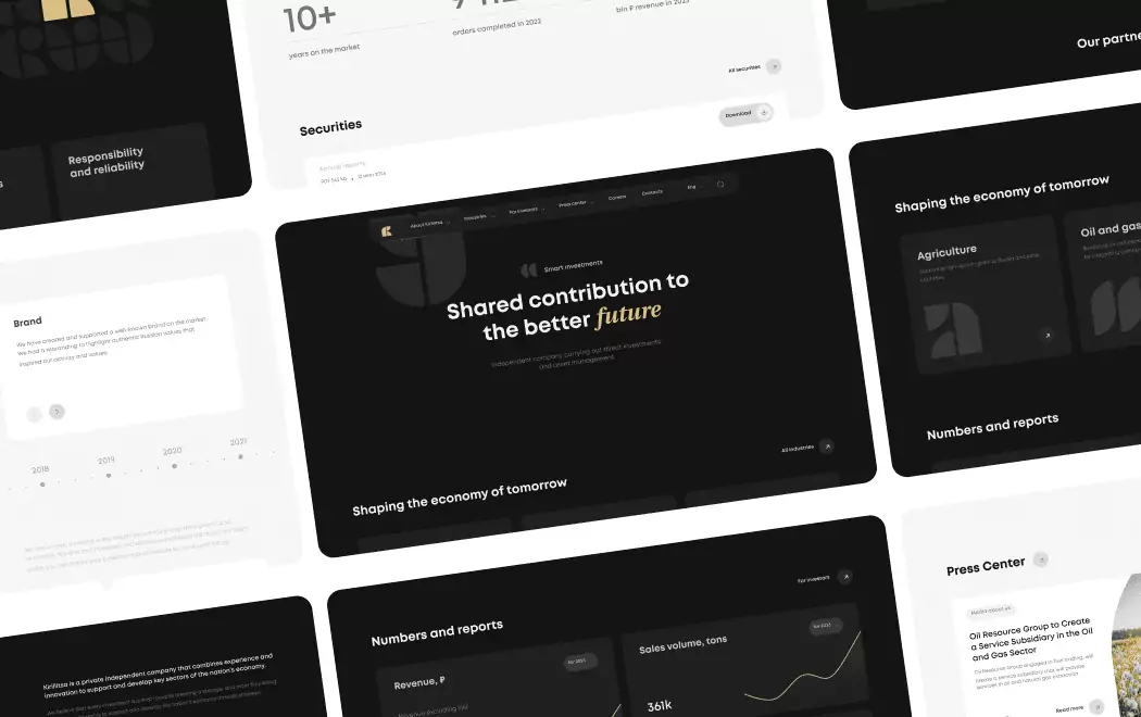
Mayo's site is a masterclass in managing sheer content volume — thousands of patient-education articles unified under a single restrained design system. The signature Mayo blue and triple-shield wordmark anchor an extremely utilitarian, information-first layout where typography does 90% of the work (clean sans for UI, serif for article H1s), with imagery deliberately restrained to preserve medical authority. Every article follows a strict template (Overview → Symptoms → Causes → Risk Factors → Complications → Prevention → When to See a Doctor), so returning users know exactly where to scan. The site publicly commits to WCAG 2.1 Level AA with a dedicated accessibility phone line.
Key design elements: Symptom Checker covering 300+ symptoms (syndicated via Epic MyChart as "Ask Mayo Clinic"); Diseases & Conditions A-Z library with standardized template across thousands of pages; Find a Doctor with multi-filter search; Clinical Trials tool; Mayo Clinic Connect moderated patient community; WCAG 2.1 AA commitment with dedicated accessibility phone line; Patient Portal with pre-visit intake and lab results.
Best for inspiration if: You're running a hospital system or large healthcare institution where content scale is the primary design challenge. Mayo's discipline is the template.
Recognition: 5× eHealthcare Leadership Awards in a single cycle; inducted into the Healthcare Internet Hall of Fame (2012); multiple-year Harris Poll EquiTrend "Health Information Website Brand of the Year"; recurring Webby Official Honoree in Health.
2. Oscar Health — The Insurance Brand That Rejects Insurance Design
Website: hioscar.com
Category: Tech-driven health insurance (ACA, Medicare Advantage, Small Group)
Design Aesthetic: Editorial clinical warmth
The 2023 in-house + Franklyn refresh is arguably the most deliberate brand system in U.S. health insurance. It pairs Heldane (Klim) — an upright, quirky serif — with Lettera (Lineto), a conversational monospaced grotesque, replacing the older clinical Avenir and giving body copy a human, almost-typewritten cadence. Brand designer Cathy Lee built a tonal color-shift palette around "Hot Blue" that can lean warmer for bad-news moments (claims, EOBs) and vivid for marketing. The custom editorial illustration system avoids the diverse-cast-of-three-people cliché entirely.
Key design elements: Heldane (serif) + Lettera (monospaced sans) typography across marketing and product; tonal "Hot Blue" palette designed to shift with emotional content; bespoke Franklyn-collaborated illustration system; plan-comparison wizard with transparent premium/deductible tables; Provider Portal subdomain reusing the same design system; multilingual content with WCAG fallbacks; public editorial design blog at oscardesign.team.
Best for inspiration if: You're in insurance, benefits, or any category where customers arrive stressed and expect to be condescended to — Oscar's tonal system proves that insurance design can sound like a human wrote it.
Recognition: Franklyn case study featured in brand-design press; Oscar's in-house team publishes live on oscardesign.team and Dribbble; widely cited as best-in-class for health insurance design in 2024–2026 trade commentary.
3. Hims & Hers — The DTC Telehealth Motion System
Website: hims.com / forhers.com
Category: Multi-specialty DTC telehealth
Design Aesthetic: Access-driven motion editorial
The 2025 site runs on a Mouthwash Studio-built motion system ("Access For All / Remove Barriers") where shapes expand, layer, and reveal to literally enact the brand promise of opening healthcare. Hero blocks use oversized Sofia-family geometric-sans lockups over editorial, naturally-lit lifestyle photography. Category color functions as spatial logic — Hers leans into buttery off-whites, warm corals, and a quasi-editorial serif; Hims flips to a desaturated slate/charcoal palette with bolder sans — so one design system bifurcates tone without duplicating architecture. The checkout is a full-height right-side drawer with a persistent step timeline, keeping users inside marketing context rather than a page swap.
Key design elements: Condition-specific landing pages with jump-to-intake CTAs in bold pill buttons; asynchronous quiz intake with progress chips and minimal per-screen cognitive load; slide-in checkout drawer preserving marketing context; headless Contentful + React stack for rapid condition-page launches; Biological Age calculator and lab modules; persistent legal/disclosure read-more drawers for FDA compounded-drug footnotes; regionalized subdomains (forhims.co.uk) with localized typography.
Best for inspiration if: You're running multi-specialty DTC healthcare and need one design system to serve multiple conditions, genders, and geographies without fragmenting the brand.
Recognition: Ad Age DTC Brand of the Year (A-List Creativity Awards, 2021); Inc. Best in Business, Health Products (2024); Fast Company coverage of the 2025 "Sick of the System" Super Bowl campaign; Mouthwash Studio's 2025 motion system widely circulated on Siteinspire, Dribbble, and Maxibestof.
Clarity is the first law of good design.
— Milton Glaser, Graphic Designer, I ♥ NY Logo Creator
4. Oura — The Wearable That Made Medical Data Feel Like Lifestyle
Website: ouraring.com
Category: Consumer medtech / smart-ring wearable
Design Aesthetic: Warm editorial health-tech
The current site was redesigned by Instrument on Next.js + Vercel (moved off WooCommerce/WordPress), layered on top of Character SF's earlier brand work. The design philosophy is explicit progressive disclosure — motion, micro-interactions, and layered information let users understand the big picture then dig deeper. The palette is a category-breaking warm cream (#F7F1E8) paired with deep ink-navy (#1D2C38), blending in-app UI screenshots, CGI product photography, and lifestyle imagery into a single editorial flow. Instrument reports the redesign delivered a 130% boost in mobile performance and a 42% increase in daily sales.
Key design elements: Progressive-disclosure content architecture across long product pages; warm cream/navy palette — deliberate rejection of medical-white defaults; layered CGI product renders + in-app UI shots + lifestyle editorial imagery; motion-driven transitions on product pages; AI-powered Oura Advisor UI integrated into marketing storytelling; long-term trend visualizations shown as hero content; jewelry-grade product photography treating the ring as both tech and accessory.
Best for inspiration if: Your product sits at the intersection of medical device and lifestyle object — Oura proves that medical credibility and editorial warmth can coexist when the design system is built for both simultaneously.
Recognition: Awwwards Honorable Mention (April 2025) and E-commerce Honors (April 2025); Drum Awards Gold in Consumer Tech; multiple Silver/Gold wins across Digital Experience categories; Instrument case study published 2025.
5. Headspace — The Mental Health Brand That Scaled Clinically
Website: headspace.com
Category: Meditation + full-stack mental healthcare
Design Aesthetic: Warm clinical approachability
The 2024 rebrand (Italic Studio with custom Aperçu-based typeface from Colophon Foundry, guidelines by Order on Standards) evolved the brand from pure meditation into a credible clinical-care platform without losing its signature orange smiley. The illustration system expanded from a single smile to a broader emotional range of round-headed characters, paired with real-person photography to signal human clinical care — a deliberate hybrid. Breath-based motion language (bounces, pulses, slow ease-outs mirroring inhale/exhale timing) carries throughout. Figma documented the light/dark-mode parity via Figma variables as a public case study.
Key design elements: Signature orange smiley + expanded expressive character illustration system; custom Aperçu-derived typeface balancing playful and clinical registers; light/dark-mode parity via Figma variables token system; breath-timed motion language throughout (bounce, pulse, ease-out); Ebb AI companion UI with conversational guardrails and crisis-escalation states; hybrid illustration (content) + photography (clinical services) system; reduced-motion + AA contrast accessibility baseline.
Best for inspiration if: Your brand is scaling from one core service into clinical or regulated services and can't lose consumer warmth in the transition — Headspace's hybrid illustration+photography system is the template.
Recognition: Webby 2025 People's Voice Winner — Best Use of AI & Machine Learning (for Ebb, 29th Annual Webby Awards); Victorian Premier's Design Award Finalist 2023; extensive 2024 rebrand coverage in It's Nice That, PRINT, Design Compass; Figma Config 2023 "Building a Design System That Breathes" case study.
6. Neko Health — Preventive Care Built on WebGL Without the Gimmick
Website: nekohealth.com
Category: Medtech / preventive-care clinic (Daniel Ek–co-founded)
Design Aesthetic: Scandinavian clinical innovation
Built by Stockholm studio 14islands on Sanity + React Three Fiber, the site uses rotoscoped video masks with particle-cloud WebGL overlays to visualize scan technology on real human bodies — a genuinely novel metaphor that replaces the tired "glowing anatomy render." Scroll-synced WebGL shaders translate the clinical scan into an almost meditative flow; typography is Scandinavian-restrained (teal #009EC9, coral #F56151, generous line-height). On launch, the site reportedly filled every available clinic slot within hours. The IA is remarkably disciplined: problem → scan → clinic → book, with no growth-hack noise.
Key design elements: Custom WebGL particle-cloud overlays tracking bodies in video (r3f-scroll-rig); art-directed photography of real members rather than stock clinical imagery; multi-language Sanity CMS with live preview; Scandinavian teal/coral palette with zero gradients; scroll-syncing between 3D meshes and DOM — WebGL without spectacle; interactive video modules explaining the scan process; graceful mobile WebGL fallback preserving the experience.
Best for inspiration if: You're launching a genuinely novel healthcare product and need the site to explain the technology visually without resorting to stock medical graphics — Neko demonstrates how WebGL can serve clinical explanation rather than replace it.
Recognition: Awwwards Honorable Mention (May 26, 2023); CSS Design Awards Site of the Day; FWA Site of the Day; Lovie Awards Gold 2023 (Health category); featured on SiteInspire; 14islands case study and Codrops feature (November 2025).
Interesting fact 👀
Research from Stanford's Persuasive Technology Lab found that 75% of users judge a company's credibility based on its website design — a multiplier in healthcare, where trust isn't just commercial but life-impacting. In the 2024 KLAS Patient Experience report, 63% of patients said they would switch providers based on digital experience alone.
7. One Medical — Primary Care with Accessibility as Default
Website: onemedical.com
Category: Membership-based primary care (Amazon-owned)
Design Aesthetic: Editorial consumer healthcare
The canonical example of B2C consumer polish applied to primary care. Moniker SF's rebrand pairs a custom GT Super serif logotype (Grilli Type) with Dinamo typography and a muted coral-red signature color; Instrument's site architecture layers Michael O'Neal photography of real patients with Charlotte Trounce hand-drawn illustrations, giving a sophisticated editorial feel that differentiates from every hospital brand. Every link carries an accessibility-annotated "Clicking here takes you to the [Page] page" pattern — explicit screen-reader labels uncommon even in marketing sites and strong ARIA practice.
Key design elements: GT Super custom serif logotype + Dinamo typography with muted coral signature; Michael O'Neal real-patient photography + Charlotte Trounce illustration system; same/next-day appointment promise elevated to primary hero message; insurance-finder widget for pre-booking network verification; location pages with hyper-templated affiliate callouts (Mass General Brigham, RUSH, Montefiore, UCSF); Mindset by One Medical mental-health sub-brand with dedicated IA; explicit screen-reader link-purpose annotations sitewide.
Best for inspiration if: Your healthcare brand operates across digital and physical experiences and needs both to reinforce a single identity — One Medical's cross-surface discipline is the reference.
Recognition: Featured on Siteinspire and The Brand Identity as a benchmark refresh; Moniker and Instrument work widely cited in design industry roundups.
8. Flatiron Health — Enterprise Oncology With Chermayeff & Geismar Heritage
Website: flatiron.com
Category: B2B oncology SaaS + real-world-evidence platform (Roche-owned)
Design Aesthetic: Editorial publishing-grade enterprise
The 2024 redesign is built around a prismatic grid reinforcing the intersection point in the Chermayeff & Geismar & Haviv wordmark/symbol. The homepage opens with a looping abstract "dynamic diamonds" video, a confident serif headline ("Reimagining the infrastructure of cancer care"), and a two-path IA that triangulates the dual pharma + provider audiences in one scroll. The palette is restrained — deep plum, ink, cream — and typography is editorial-grade, deliberately more New Yorker than healthcare SaaS. Product UI screenshots appear in workflow context with callouts rather than as isolated dashboards, and publications/clinical evidence live in a first-class Resources hub — a critical trust signal for pharma RWE buyers.
Key design elements: Looping "dynamic diamonds" hero background video referencing the prismatic grid logo; prismatic grid design system derived from wordmark geometry; dual audience navigation (Real-World Evidence / Point of Care); editorial serif + humanist sans pairing in publishing-house register; muted plum/ink/cream palette — B2B credible, not playful; first-class Publications + Resources hub surfacing peer-reviewed research; product screenshots shown in workflow context, not isolation.
Best for inspiration if: You're selling B2B healthcare to pharma, providers, or institutional buyers where evidence and editorial credibility matter more than features — Flatiron demonstrates that serious buyers respond to serious design.
Recognition: Identity by Chermayeff & Geismar & Haviv — creators of NBC, Chase, Mobil, National Geographic — the most significant design-provenance signal available; public brand guidelines at brand.flatiron.com; CB Insights AI 100 multiple years (2018–2025); Domestika case study of the identity system.
9. Abridge — Healthcare AI With a Pentagram Typeface
Website: abridge.com
Category: B2B healthcare AI / ambient clinical documentation
Design Aesthetic: Generative enterprise editorial
The 2024 Pentagram system is built around a custom display typeface ("Abridge Display") derived from the Pont du Gard aqueduct — every glyph splits into upper/lower architectural halves that recombine generatively, visually echoing the product's AI synthesis of conversation into structured notes. On the site, those letterforms morph into waveforms and super-graphics, giving marketing pages a distinctive brand voice rarely seen in healthcare SaaS (which defaults to blue gradients + stock hospital photography). The positioning line "Taken care of" anchors a calm, editorial typographic layout — sophisticated enough to land with hospital CIOs, warm enough to feel clinical.
Key design elements: Proprietary "Abridge Display" variable-architecture typeface (Pentagram, 2024); generative letterforms transforming into audio-waveform visualizations; muted non-clinical palette — off-white, deep ink, warm accents; large-scale editorial type blocks with long-form CMIO testimonial treatments; Linked-Evidence product screenshots treated as typographic artifacts; enterprise IA: Product / Platform / Research / Customers / Trust Center; named-quote press system rather than logo walls.
Best for inspiration if: You're selling healthcare AI to enterprise buyers where credibility at the CTO/CMIO level determines deals — Abridge demonstrates the visual language that earns that credibility.
Recognition: Pentagram case study published 2024; TIME 200 Best Inventions 2024; Fast Company Most Innovative Companies 2026; founder Shiv Rao named to TIME 100 Most Influential People in AI 2024; Forbes AI 50.
10. Tia — Femtech Without the Stereotypes
Website: asktia.com
Category: Femtech / hybrid women's primary-care clinic
Design Aesthetic: Editorial women's-health gravitas
Athletics' 2022 rebrand (carried through the current site) is a study in elevating consumer health without bleaching out personality. The wordmark swaps an uppercase T for lowercase, introduces a double-story 'a', and preserves the signature pink dot as a singular idiosyncrasy. Headlines use Inferi — a contemporary take on a 17th-century Garalde — paired with Basis Grotesque, delivering what Athletics called "editorial gravitas and grad-school competence." A thin, hand-drawn winding line (still and animated) recurs as a metaphor for non-linear healthcare journeys, and commissioned illustrations from Maria-Ines Gul open each service area. Brand and clinic interiors (Rockwell Group / IA Interior Architects) share the same visual language end-to-end.
Key design elements: Inferi (Garalde revival) + Basis Grotesque — unusually editorial healthcare pairing; custom wordmark with signature pink "i" dot as persistent brand anchor; animated winding-line motif representing the personal care journey; commissioned Maria-Ines Gul illustration system per service category; photography of real members celebrating real women's bodies; warm terracotta/hot-pink/cream palette tied to clinic interiors; web, app, and physical-clinic design continuity.
Best for inspiration if: You're operating in femtech, women's health, or any category where the default aesthetic (pastel pink, flower imagery, empowerment platitudes) has become the category's commercial weakness — Tia's editorial discipline is the template for what comes next.
Recognition: Athletics case study / Design Week feature (November 2022); PRINT Magazine feature on the rebrand; clinic interiors featured on Core77 Design Awards (Rockwell Group, 2020); I+S Design feature on the 2024 interior evolution.
How the Healthcare Design Brief Translates From Adjacent Regulated Industries
A note on the brief itself: Toimi's team has not yet shipped a flagship healthcare build, and we're not going to pretend otherwise — the disclosure-first approach we take in every design-system engagement applies to our own credentials too. What we do work on daily is the set of disciplines that actually separate the ten sites above from the median healthcare site: accessibility-as-primitive (not a compliance page), custom typography commissioned as infrastructure, compliance content treated as editorial content rather than legal afterthought, and information-dense product UI shown in workflow context. We've built these disciplines into regulated-adjacent work — investment fintech, enterprise SaaS, and B2B platforms where the gap between "looks credible" and "earns a six-figure contract" is measured in exactly the same trust signals Mayo, Flatiron, and Abridge deploy.
For healthcare teams evaluating agencies in 2026, the question worth asking isn't "have you built a hospital site?" but "have you built for regulated industries where accessibility, editorial-grade typography, and compliance-as-design are non-negotiable?" If the answer is yes, the portability to healthcare is real. If the answer is no — regardless of how many healthcare logos the agency shows — the build will likely default to the stock-photography, generic-blue category defaults these ten sites explicitly reject.
How to Choose the Right Design Direction for Your Healthcare Brand
If you're an academic or nonprofit hospital system
Your needs: Content-scale discipline, information architecture that serves millions, and accessibility infrastructure that meets the highest public-sector standards.
Best references: Mayo Clinic
Critical question: Does your editorial team have the capacity to produce content at Mayo's template level consistently? Hospital-system design fails when the design system is better than the content populating it. Invest in editorial infrastructure alongside visual design.
If you're in health insurance, benefits, or financial-emotional categories
Your needs: Tonal flexibility that adapts to emotional content (claims, denials, renewals), custom brand typography, and voice systems that reject the category's clichés.
Best references: Oscar Health
Critical question: Does your brand strategy foundation support a custom typographic system? Oscar's Heldane + Lettera pairing works because the brand strategy underneath is as specific as the typefaces expressing it.
If you're running DTC telehealth, wellness subscription, or consumer healthcare
Your needs: Motion-forward design system, condition-specific landing pages, and checkout/intake flows that respect patient vulnerability.
Best references: Hims & Hers, Oura
Critical question: Is your team ready to invest in custom UX design rather than off-the-shelf Shopify or WordPress themes? DTC telehealth at the level Hims achieves is not a template purchase — it's a custom design system built for scale.
If you're in mental health, wellness, or mindfulness
Your needs: Motion language that feels therapeutic, illustration systems that carry personality without feeling childish, and hybrid illustration+photography architecture for mixed services.
Best references: Headspace
Critical question: Can your brand scale from one service to clinical services without losing consumer warmth? Mental-health brands that try to "look more serious" as they expand clinically often lose the accessibility that drove initial adoption.
If you're a membership clinic, hybrid telehealth, or physical healthcare brand
Your needs: Digital-physical brand continuity, real-patient photography, and accessibility-first markup discipline.
Best references: One Medical, Tia
Critical question: Does your physical and digital experience share a visual system? One Medical's power is that a patient visiting the website and visiting the clinic experiences the same brand — not two brands stitched together.
If you're in B2B healthcare SaaS, health tech, or enterprise clinical software
Your needs: Editorial-grade typographic systems, peer-reviewed publication trust signals, and audience-segmented IA for CIOs, clinicians, and administrators.
Best references: Flatiron Health, Abridge
Critical question: Does your agency have experience building complex B2B web platforms for regulated industries? Healthcare B2B isn't the same as SaaS B2B — compliance, evidence infrastructure, and long sales cycles shape the design in ways generalist agencies miss.
If you're launching novel healthcare technology
Your needs: Visual explanation that doesn't rely on clichéd medical illustration, interactive technology demos, and brand credibility that inspires first-time users.
Best references: Neko Health
Critical question: Does your technology have a visual explanation worth building WebGL for? Novel healthcare technology design works when the interaction serves comprehension; it fails when it becomes ornamental.
Questions to Ask Before Commissioning Healthcare Web Design
"What's your accessibility testing process, and can you show us Lighthouse scores from your last three healthcare builds?" WCAG 2.1 AA is the floor for healthcare, not the ceiling. Agencies that treat accessibility as a separate specialty (rather than a default discipline) will produce sites that pass compliance checks but fail real users. Ask for evidence, not promises.
"How do you handle regulated content — FDA disclaimers, HIPAA notices, state licensure variations — as part of the design system, not as legal afterthoughts?" The best healthcare brands treat compliance content as editorial content. Agencies that haven't worked in healthcare (or in adjacent regulated industries such as fintech, insurance, or clinical SaaS) will either bury this content in footers or over-design it into alarming legalese. The right pattern is somewhere between — and the discipline is portable from any regulated vertical where disclosure is a first-class design problem.
"What's your approach to the design-to-development handoff for HIPAA-compliant infrastructure?" Healthcare web development sits at a different technical bar than e-commerce or B2B SaaS. Ask specifically about HIPAA-compliant hosting experience, patient data flow design, and integration with EHR systems (Epic, Cerner) if relevant. Agencies without this experience will design beautifully and build expensively.
"Can you show us before-and-after data from a healthcare (or regulated-industry) UX audit you've delivered?" UX improvements in trust-intensive categories should be measurable: appointment booking completion rate, provider search abandonment, accessibility compliance score, mobile conversion. Agencies that can't produce this data from past projects — in healthcare or in regulated verticals with the same discipline requirements — are selling design craft without accountability to patient or customer outcomes.
"For our specific sub-category — hospital system, DTC telehealth, B2B SaaS — which of these ten sites would you study most closely, and why?" Healthcare is not monolithic. An agency that treats "healthcare" as one category will produce generic results. The ones worth hiring have specific opinions about which reference sites match which sub-categories — and can articulate why.
Want to discuss your project?
Share your vision with us, and we'll reach out soon to explore the details and bring your idea to life.

Conclusion
The ten sites in this guide solve the hardest brief in digital design. They communicate clinical authority. They inspire emotional trust. They meet strict accessibility standards. They convert patients across diverse conditions, cultures, and access needs. They do all of this while operating under regulatory constraints that most industries never encounter — FDA disclaimers, HIPAA compliance, state licensure, international adaptation, and the ethical imperative to do no harm in the visual representation of health.
The brands that succeed at this level share one trait: conviction. Mayo commits to editorial discipline at scale. Oscar commits to brand warmth in insurance. Oura commits to editorial health-tech warmth. Neko commits to WebGL-powered clinical restraint. Flatiron and Abridge commit to enterprise editorial typography. Tia commits to femtech without the pastel stereotypes. Each refuses the middle ground — and wins because the middle ground in healthcare is where trust goes to die.
For any healthcare brand commissioning design in 2026, the strategic decision isn't aesthetic. It's about which conviction your brand can credibly own, and whether your team is prepared to execute it with the same discipline these ten have sustained over multi-year redesign cycles. The sites above represent the ceiling. The real question is which of them points toward your brand's specific direction — and then how to execute it with more craft than everyone else reaching for the same ceiling. If you're weighing those directions and want an outside read grounded in the same disciplines — accessibility as primitive, compliance as editorial, typography as infrastructure — Toimi's team offers initial strategy consultations through our custom design practice.
Recommended reading 🤓
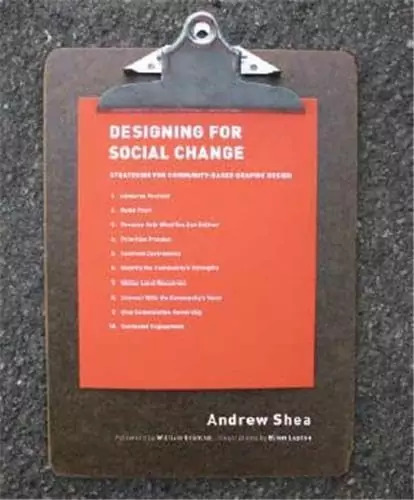
"Designing for Social Change: Strategies for Community-Based Graphic Design", Andrew Shea
Shea's framework for designing around social complexity translates directly to healthcare — where design must serve diverse audiences under emotional and clinical constraints simultaneously.
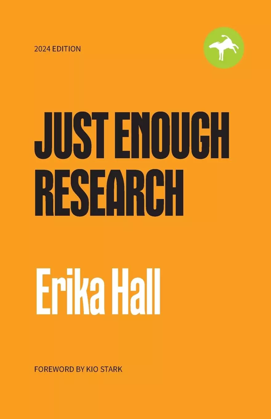
"Just Enough Research", Erika Hall
Erika Hall's methodology for rapid, rigorous user research is essential for healthcare projects, where access to patients and clinicians is limited, ethical constraints are tighter, and design decisions must be defensible beyond aesthetics.
"Form Design Patterns", Adam Silver
The definitive technical guide to designing accessible forms — non-negotiable reading for any team building intake flows, patient registration, or symptom-checker interfaces in healthcare.
Healthcare design sits at the intersection of two uncompromising demands — rigorous accessibility compliance and emotionally intelligent brand expression. The brands on this list refuse to sacrifice either. Everyone else either looks cold and clinical or warm and trust-eroding.