The best B2B SaaS websites of 2026 don't show screenshots — they show the product working, often with AI running live in the hero. These 10 sites define the new visual grammar of SaaS, from Linear's agent-native system to Anthropic's editorial counter-movement.
Key takeaways 👌
The "product is the demo" pattern has matured — live AI agent animations in the hero have replaced static screenshots, with Linear, Cursor, and Attio setting the benchmark.
SaaS design in 2026 has split into two dominant aesthetics: techno-futurist (dark mode + neon + shaders + bento grids) and editorial (cream + serif + mascots + whitespace) — both are winning, but picking one is non-negotiable.
Live product demos, WebGL shaders, and bento grids are now commodity. Distinctive voice, point of view, and restraint are the real differentiators at the top of the category.
TL;DR: Top 10 B2B SaaS Website Designs in 2026
For agent-native product showcase: Linear, Attio — live AI agents doing real work in the hero.
For WebGL and shader mastery: Stripe, Vercel — the gold standard of gradient craft.
For motion and interactivity as the product: Framer, ElevenLabs — kinetic type, cursor reveals, audio-preview on hover.
For bento-grid discipline formalized as a system: Ramp — strict grid rules as internal design language.
For editorial counter-programming: Notion, PostHog, Anthropic — the sites that win by refusing the dominant aesthetic entirely.
Introduction
The best B2B SaaS marketing sites of 2026 no longer show you screenshots — they show you the product working, often with an AI agent inside it. Linear's hero has a Codex agent picking up a real issue. Attio's hero runs the "Ask Attio" command live. ElevenLabs plays an actual voice sample when you hover a selector. The marketing site has collapsed into the product surface, and the companies winning design awards this year are the ones that rebuilt around that idea.
Alongside this shift, a tight visual grammar has cemented: dark-mode-by-default with a single electric accent, WebGL shader backgrounds, bento-grid feature sections, and kinetic variable-font headlines. A deliberate counter-movement — Anthropic, PostHog, Notion — has taken the opposite direction with cream backgrounds, serif type, and warm illustration to signal trust over techno-futurism.
This split is the real story of SaaS design in 2026. After three years of compounding convergence in the techno-futurist camp, individual sites are increasingly hard to tell apart at a glance. The editorial counter-camp is quietly winning the differentiation war by doing nearly the opposite of what everyone else is doing.
For any SaaS brand building or refreshing a website this year, the most strategic design decision is no longer which trends to adopt. The trends are commodity. The decision is which side of the aesthetic split to pick — and then how to execute that choice with more craft than the dozens of competitors making the same choice. The ten sites below demonstrate the ceiling of what's possible in each camp.
What's Actually New in B2B SaaS Design in 2026
Seven trends dominate 2026 and appear repeatedly across the sites below. Understanding them as a set is the fastest way to read the current state of the category.
1. AI-integrated product demos as hero content. Live UIs showing agents doing real work in the first five seconds. Linear's Codex agent picking up ENG-2703. Attio's "Ask Attio" executing a natural-language query. Cursor's VS Code completing its own code. This replaces the static screenshot hero that defined 2020–2023 SaaS design.
2. Bento grid layouts 2.0. Now with hover micro-interactions and scroll-reactive reshuffling. Ramp formalized the pattern with Bakken & Baeck into an internal system — consistent rounded tiles, uniform gutters, size-as-hierarchy rules applied rigorously across every feature section.
3. Dark-as-default with one neon accent. Roughly three-quarters of top design-led SaaS sites now follow this pattern: Linear-purple, Raycast-red, Mercury-lime, Cursor-cyan variations. The discipline isn't the dark mode — it's the single accent color used with restraint.
4. Shader-based WebGL backgrounds. Gone from Stripe-exclusive to commodity. Framer ships a Shaders library. Vercel offers v0 shader hero templates. The execution quality separates the top tier from the merely competent.
5. Kinetic and oversized variable typography. Headlines that swap words, stretch, and focus on scroll. Linear's hero rotating "teams" and "agents." Framer's motion-driven display type. The move from static to motion-driven typography as the primary design element.
6. Scroll-driven storytelling. Page-as-narrative built with GSAP ScrollTrigger. Ramp's scroll-driven product walkthrough. Superhuman's before/after narrative. The site isn't a collection of sections — it's a sequence that unfolds as the user scrolls.
7. One-color ownership. Brands claiming a single signature hue across the entire site. Linear owns purple. Raycast owns red-orange. Cursor owns cyan. This visual ownership has become a key brand differentiator in a category where everything else is converging.
Each of these trends is well executed somewhere in the ten sites below. What separates the best from the rest is stacking multiple trends with internal consistency — and refusing the trends that don't fit the brand's point of view. For SaaS founders commissioning a website design project in 2026, the question isn't "which trends do we include?" It's "which aesthetic camp do we commit to, and which trends do we deliberately ignore?" Teams ready to act on that answer should start with a website redesign scoped around a clear aesthetic direction — not a trend checklist.

1. Linear — The Agent-Native Product Development System
Website: linear.app
Category: Project management & developer collaboration
Design Aesthetic: Techno-futurist gold standard
Linear's 2025–2026 homepage is arguably the most-copied B2B SaaS site of the year because it executes the "product is the demo" trend more convincingly than anyone else. The hero headline uses kinetic typography that swaps "teams" and "agents" in and out of the sentence, and directly beneath it sits a pixel-perfect, real-time-feeling mock of a Linear issue (ENG-2703) in which a Codex AI agent picks up the task, leaves a comment, and opens a PR — all animating autonomously. The page is scaffolded with paper-like "FIG 0.2 / FIG 0.3" labels that give the whole thing the feel of a technical specification document rather than marketing.
Key design elements: Dark-by-default with signature purple accent; massive kinetic typography in Inter Display; live animated in-product demo as hero; bento grid feature section; technical-document typographic labels (FIG x.x); cursor-triggered micro-interactions; heavy whitespace discipline; Lighthouse accessibility score above 90.
Best for inspiration if: You're building a developer-facing or highly technical B2B SaaS where sophistication signals product quality to engineering buyers.
Recognition: Gold standard of "Linear-style" design — a named aesthetic trend in UX circles; consistently #1 in SaaS design roundups 2024–2026.
2. Stripe — The WebGL Gradient That Every SaaS Site Tried to Copy
Website: stripe.com
Category: Fintech / payments infrastructure
Design Aesthetic: Techno-futurist enterprise benchmark
Stripe's homepage remains the gold standard of enterprise SaaS design because of its skewed, flowing WebGL mesh gradient — rendered via Stripe's custom minigl canvas implementation in purple, pink, cyan, and orange — which has become the single most recognizable hero image in all of SaaS. The site treats the marketing page like a product surface: live-looking Stripe dashboards, interactive tabbed code snippets that switch languages instantly, and genuinely deep micro-interaction craft on every button and link. The discipline is in the restraint — the gradient does the heavy lifting, and everything else is exceptionally clean Söhne typography and crisp product shots.
Key design elements: Signature WebGL mesh-gradient hero (endlessly copied, never matched); Söhne family typography; live product-dashboard screenshots; interactive multi-language code snippet tabs; enterprise logo wall; benchmark-grade micro-interactions on hover and click; light mode primary with dark mode variants on nested pages.
Best for inspiration if: You're an enterprise SaaS where buyer trust and technical credibility must coexist — the Stripe model proves visual sophistication and developer credibility can be delivered in the same site.
Recognition: Called "the gold standard for enterprise SaaS design in 2026" across multiple industry analyses; Inside Marketing Design episode devoted to the design system.
3. Vercel — "The AI Cloud" Rebuilt Around Shaders
Website: vercel.com
Category: Developer platform & AI cloud infrastructure
Design Aesthetic: Dark-mode techno-futurist with monochrome system
Vercel's 2025 repositioning as "The AI Cloud" is built on top of a near-black background with shader-based animated gradients on virtually every product page, rendered using the same techniques they've now productized and ship as templates via v0. The mega-menu information architecture (AI Cloud / Core Platform / Security) is a masterclass in organizing a sprawling product line without feeling bloated, and every sub-product (v0, AI Gateway, Vercel Agent, Sandbox) gets its own distinct micro-animation and accent color while staying within the overall monochrome system.
Key design elements: Deep near-black dark mode with electric accents; Geist Sans (custom open-source typeface); shader-driven animated backgrounds; multi-tier mega-menu; distinct accent colors per sub-product within a monochrome system; animated deployment and code demos; terminal-style interface sections; bento-style feature cards.
Best for inspiration if: You have a broad product line that needs IA discipline — Vercel demonstrates how to present multiple sub-products without losing aesthetic coherence.
Recognition: Referenced as a benchmark for "developer-focused design that treats speed as an aesthetic"; near-perfect Core Web Vitals.
Design is the silent ambassador of your brand.
— Paul Rand, Graphic Designer, IBM and ABC Logo Creator
4. Framer — A Marketing Site That Is Literally a Framer Site
Website: framer.com
Category: No-code website builder / design tool
Design Aesthetic: Techno-futurist with maximum motion
Framer's homepage eats its own dog food — the entire site is essentially a live demo reel of what the tool can produce, including Framer's new Holo shader (a rainbow WebGL gradient shipped with their 2025 Shaders library). Cursor-triggered reveals, parallax transitions, kinetic typography, and live-editable product previews pile on without feeling chaotic because the underlying system is so disciplined. It is the most aggressive use of motion and interactivity on this list, yet it still loads quickly and reads cleanly on mobile.
Key design elements: Holo and other WebGL shaders natively; dark mode with neon accents; cursor-triggered reveals and parallax; kinetic typography; live-editable product previews embedded in the page; bold sans-serif display headlines; dedicated Awards and Gallery sections showcasing community work; Lighthouse accessibility above 90.
Best for inspiration if: Your product's core value is visual or design-driven — Framer's approach proves that a marketing site can itself be the product demo when the product is a design tool.
Recognition: Consistently top-cited in SaaS design roundups; SaaSFrame.io and Lapa Ninja featured examples.
5. Notion — The Warm Counter-Aesthetic That Converts
Website: notion.so
Category: All-in-one productivity / collaboration
Design Aesthetic: Editorial warm / illustration-led
Where Linear chose cold precision, Notion chose warmth. Their custom illustration style — pastel colors, playful characters, human scenes — creates an instantly recognizable brand that makes productivity software feel approachable. The site organizes content by user personas (teams, students, personal use, industries) so every visitor finds relevant information immediately. Use-case-specific landing pages are exceptionally well executed, and the approach demonstrates that warmth and polish aren't opposites — they can compound.
Key design elements: Custom illustration system (warm pastels, playful characters); persona-based navigation and landing pages; light mode primary; warm color palette; minimal but effective animations; prominent social proof from recognizable companies (Figma, Pixar, Spotify); editorial-style layout.
Best for inspiration if: You're building for a broad non-technical audience where approachability and warmth matter more than technical sophistication — Notion proves warm design can serve both prosumers and enterprise.
Recognition: Featured in virtually every SaaS design list 2024–2026; case study material across Webflow, Superside, and Azuro Digital.
6. Attio — The AI-Native CRM That Looks Like Software From 2028
Website: attio.com
Category: CRM / customer relationship management
Design Aesthetic: Techno-futurist with refined monochrome
Attio has quietly become one of the most design-forward B2B sites of 2026, rivaling Linear for the top of the category. The hero is a live product demo of the Ask Attio command executing a natural-language query and returning filtered data in real time — a textbook execution of "AI-integrated UI preview as hero." The aesthetic is disciplined monochrome black-and-white with subtle per-section pastel accents, Inter-family typography, and bento-grid feature cards with some of the most refined hover micro-interactions on the internet (slight scale, shadow shift, content reveal).
Key design elements: Live "Ask Attio" command demo in hero; monochrome black/white base with subtle pastel per-section accents; bento grid feature cards; cursor-triggered hover micro-interactions (scale + shadow + content reveal); Inter-family typography with tight tracking; light-to-dark dynamic transitions between sections; AI-first narrative integrated throughout.
Best for inspiration if: You're building AI-native SaaS where the marketing needs to convey sophistication without gimmicks — Attio sets the current benchmark for restrained, confident AI-first design.
Recognition: DesignRush website design analysis published; Pixeto.co "17 Best SaaS Website Design Examples 2026"; consistently cited alongside Linear as top CRM design reference.
Interesting fact 👀
Users form judgments about a website's aesthetic quality within 50 milliseconds of landing on it, and those first-impression reactions are durable — subsequent content rarely overrides them. For B2B SaaS, this makes homepage design one of the highest-leverage investments in the entire go-to-market stack.
7. Ramp — The Bento Grid Pioneer, Formalized
Website: ramp.com
Category: Corporate finance / expense management / fintech
Design Aesthetic: Techno-futurist with formal design system
Ramp's Webflow-built redesign with Bakken & Baeck turned bento grids from a trend into an internal design system — their "Bento box" product-graphic language now governs every feature section, with consistent rounded-corner tiles, uniform gutters, and size-as-hierarchy rules applied rigorously. The hero animates with a gradient logo and a narrative scroll-driven product walkthrough featuring counter-animated numbers, dense infographics, and real product screenshots rather than stock illustration. Per design analyses: "one of the best examples of keeping things simple enough to convert."
Key design elements: Internal "Bento box" design system with strict grid rules; animated gradient logo; scroll-driven product narrative; bold white-on-black hero; animated counting numbers and dense infographics; real product UI screenshots throughout; yellow/orange signature accent; Webflow-built for fast iteration.
Best for inspiration if: Your SaaS has multiple product lines or features that need consistent visual treatment — Ramp demonstrates how a formal grid system produces both clarity and ownership.
Recognition: Webflow customer case study published; Bakken & Baeck case study; Stan Vision 2026 SaaS design analysis; AlmCorp "47 Best SaaS Websites 2026."
8. ElevenLabs — Voice AI With an Audio-Waveform Hero
Website: elevenlabs.io
Category: AI voice synthesis / audio platform
Design Aesthetic: Techno-futurist with sensory product demo
ElevenLabs does something no other site on this list does — it makes the product audible in the hero. An animated audio waveform anchors the top of the page, and the interactive voice selector lets you hover a voice to hear it play instantly, turning a listing into a tactile preview. The rest of the site is a scroll-driven showcase of model capabilities in pitch-black with neon white/cyan accents and geometric sans type, occasionally dropping into small caps for emphasis.
Key design elements: Interactive voice-preview on hover (audio plays instantly); animated waveform hero visualization; pitch-black background with neon white/cyan accents; geometric sans-serif with small-caps accents; scroll-driven model capability showcase; developer-focused code samples alongside marketing copy.
Best for inspiration if: Your product has a core sensory capability — visual, audible, tactile — that can be demonstrated directly. ElevenLabs proves the strongest "product as demo" executions use the product's actual capability rather than representing it with a screenshot.
Recognition: GetDesign.md design system analysis; referenced in multiple 2025–2026 AI SaaS design discussions.
9. PostHog — A Hedgehog-Led Rebuttal to Sleek Minimalism
Website: posthog.com
Category: Product analytics / developer platform
Design Aesthetic: Editorial quirky / mascot-led
PostHog refuses the entire dominant aesthetic of 2026 and wins because of it. The site is developer-friendly dark UI wrapped in hand-drawn Max-the-hedgehog illustrations, with Matter SQ body type paired with a squeaky, handwritten-feel display font called Squeak. Every feature card gets its own saturated color; the illustrations appear in margins, backgrounds, loading states, and error pages. CEO James Hawkins has said publicly they "won by being weird," and the site is the most obvious expression of that — proof that personality-led design still converts at the top of the funnel.
Key design elements: Hand-drawn mascot illustrations throughout (Max the hedgehog); custom Squeak display font paired with Matter SQ body; saturated multi-color feature cards (not monochrome); dark but playful UI; long-scroll documentation-style marketing pages; overtly quirky copy and voice.
Best for inspiration if: You're entering a crowded category and differentiation from dominant aesthetics matters more than looking "serious" — PostHog is the clearest case study in winning by deliberately being different.
Recognition: Frequently cited as a counter-example to "everything looks the same" trend; GetDesign.md design system analysis; multiple developer community features.
10. Anthropic — The Editorial Counter-Programming to Dark-Mode AI
Website: anthropic.com
Category: AI platform / foundation models
Design Aesthetic: Editorial serif / literary counter-camp
In a category dominated by black backgrounds and neon cyan, Anthropic goes the other direction and reads like a well-designed literary quarterly. The palette is warm cream and off-white, the display typography is an elegant Copernicus-feel serif with generous tracking, and muted earth-tone accents replace neon entirely. Whitespace is generous, copy is dense and editorial, and the IA prioritizes research essays and safety documentation at parity with product marketing — signaling trustworthiness to enterprise buyers who are tired of techno-futurist bombast.
Key design elements: Warm cream/off-white background (no dark mode); Copernicus-style serif display typography; muted earth-tone accent palette; generous whitespace and editorial layout; research and safety content surfaced at top-level IA; no shader backgrounds, no WebGL, minimal motion; deliberate restraint as a positioning signal.
Best for inspiration if: Your brand needs to signal trust and seriousness in a category dominated by hype — Anthropic demonstrates that refusing the dominant aesthetic can be the most strategic design decision available.
Recognition: Referenced as the leading "counter-camp" to the dark-mode AI aesthetic; frequently cited alongside PostHog as proof that differentiation beats convergence.
Lessons We Applied in Our Own Work
Analysis only goes so far — the real test of a design thesis is whether you can build by it. At Toimi we ship our own SaaS product, Taskee — a task management tool we use internally and sell externally. Building its marketing site forced us to pick a side of the aesthetic split this article describes, and the decisions are worth sharing because they show which of the ten patterns above translate into a working product page and which don't.
1. Live product preview over static screenshots (Linear / Attio pattern). We replaced the conventional "here's a dashboard screenshot" hero with a live task board preview — cards moving between columns, status updating, assignees changing — that runs on load and loops in the background. Visitors see the product working within the first three seconds instead of reading about it, which is the whole point of the "product is the demo" movement.
2. Dark-mode-by-default with one signature accent (Linear / Raycast pattern). Taskee committed fully to dark mode as primary with a single accent color carried through every interactive element. Everything else — typography, charts, avatars — runs in restrained grayscale. The restraint is what lets the accent read as "the brand," not the dark mode itself.
3. Bento grid discipline for feature sections (Ramp pattern). After iterating on free-form layouts we formalized feature sections around a strict bento grid with size-as-hierarchy rules. The bigger tiles carry the capabilities most buyers ask about first; smaller tiles hold secondary features. The grid does the prioritization work so copy doesn't have to.
What we deliberately didn't apply matters equally. We avoided WebGL shaders (the Taskee buyer is an ops or PM lead, not a developer who rewards visual bombast), avoided mascot illustration (the product reads as professional-facing rather than quirky), and stayed away from oversized kinetic typography (it would have felt like showing off rather than showing the product). Every omission was a buyer-first decision — the same discipline we apply when clients commission a custom UX/UI design project.
The full breakdown of trade-offs, iterations, and measurable outcomes is in our Taskee case study.
How to Choose the Right Aesthetic for Your SaaS
If your buyers are engineers and technical decision-makers
Your needs: Technical credibility signaled through typography, restraint, and live product demos that appeal to a buyer who distrusts marketing.
Best references: Linear, Vercel
Critical question: Does your product have a demonstrable moment that can replace a static screenshot? If not, a UX/UI audit will surface why the current site isn't converting before you invest in a redesign.
If your product has a core sensory capability (visual, audio, motion)
Your needs: A hero that lets visitors experience the product directly — not via representation.
Best references: ElevenLabs, Framer
Critical question: Can the product capability run in the browser? If yes, the landing page's structure and conversion architecture should be built around that capability as the primary interaction.
If your category is crowded with identical-looking sites
Your needs: Differentiation through deliberate refusal of dominant aesthetics — editorial, illustrative, warm, quirky.
Best references: PostHog, Anthropic, Notion
Critical question: Does your brand have a point of view that justifies the counter-aesthetic? Being "different" without conviction reads as inconsistent. Commit or don't.
If your product has multiple lines or personas
Your needs: Information architecture that serves many users without fragmenting the aesthetic.
Best references: Vercel, Notion
Critical question: Can your IA absorb new products or personas without structural redesign? The best multi-line SaaS sites use modular UI/UX design systems rather than per-product page builds.
If your brand needs to signal enterprise seriousness
Your needs: Visual polish that conveys institutional credibility without feeling cold or generic.
Best references: Stripe, Attio
Critical question: Does your brand strategy support the design direction? Enterprise visual polish fails when the brand underneath isn't as sophisticated as the pixel-perfect execution.
If you're a fast-growing startup with limited design resources
Your needs: A design direction that scales with feature and team growth without constant redesign.
Critical question: Is your team capable of maintaining the design direction without the agency that built it? The best SaaS systems are defensible in-house after handoff.
Questions to Ask Before Commissioning a SaaS Website
"Show me three SaaS sites you've built in the last 18 months — and the client's Lighthouse scores before and after." Portfolio screenshots are easy. Production performance data isn't. Agencies serious about B2B SaaS design can produce real before/after metrics, not just stylized mockups. If they can't, they either don't measure or don't deliver measurable outcomes.
"How do you handle the handoff between design and development execution?" The design-to-development handoff is where most SaaS sites lose visual quality. Ask specifically: does the agency build what they design, or hand off to a separate team? Separated agencies produce sites that look different in Figma than they do in production. Integrated teams ship what they showed you.
"What's your process for maintaining the design system after launch?" Ramp's Bento system works because it's documented, governed, and extended over time. A design system without governance decays into inconsistency within six months. Ask what ongoing support looks like — not as upsell protection, but as quality protection.
"How does your team approach motion and interactivity without hurting performance?" The sites on this list score 90+ on Lighthouse despite heavy motion. Most agencies deliver the motion and sacrifice the performance. Ask for specific examples of sites that deliver both — and how the agency achieves that technically.
"Have you shipped a SaaS product of your own, and can we see it?" Agencies that have built their own SaaS product have made every trade-off this article describes from the inside — not just as critics of other people's work. Toimi, for example, built and ships Taskee using the same patterns we write about. That's the difference between analysis and experience.
"For our specific category, which of these ten aesthetic directions do you recommend, and why?" Agencies with genuine SaaS experience will have strong, specific opinions on which reference sites match your category, buyer profile, and brand positioning. Agencies offering to build "something unique that combines the best of all of them" are producing a mood board, not a design direction.
Want to discuss your project?
Share your vision with us, and we'll reach out soon to explore the details and bring your idea to life.
Conclusion
The ten sites in this guide represent the ceiling of what's possible in B2B SaaS design in 2026 — not because of budget, but because each made a single clear aesthetic decision and executed it with more discipline than its competitors.
The techno-futurist camp owns dark-mode precision, live AI demos, and shader craft. The editorial counter-camp owns warmth, personality, and trust signals. Both are winning. What's losing is the middle — sites that borrow from both directions without committing to either, producing something that looks contemporary for six months and dated for three years.
The most valuable decision any SaaS team can make before briefing an agency is the same one Linear, Anthropic, and PostHog each made: pick a side, then out-execute everyone else on that side. The trends are commodity. The craft and the commitment are not.
If you're scoping a SaaS redesign and want a partner that both writes about these patterns and ships them in its own product, that's the intersection Toimi sits at — see our Taskee case study for how we apply these principles when we build for ourselves, or start a conversation about a custom SaaS design project for your team.
Recommended reading 🤓
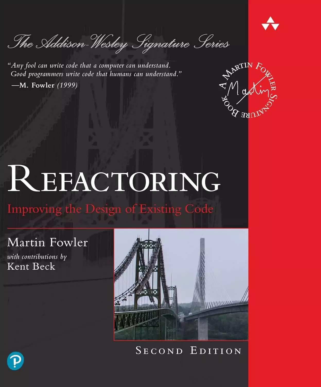
"Refactoring UI", Adam Wathan & Steve Schoger
The most practical guide to visual design for product and marketing sites — translates the principles behind sites like Linear and Stripe into decisions any team can implement.
"Designing Brand Identity", Alina Wheeler
The definitive guide to brand systems that hold up across product, marketing, and every digital touchpoint — essential for understanding why Anthropic's editorial direction works while most "warm counter-aesthetic" attempts don't.
"Atomic Design", Brad Frost
The foundation for how modern design systems — including Ramp's Bento grid — are built and scaled. Required reading for any team planning a long-lived SaaS site.
What separates these ten sites from the thousands of "modern SaaS" sites that look the same isn't budget — it's a single point of view executed with more discipline than their competitors. Pick your side of the aesthetic split, then out-craft everyone else doing the same thing.