SF SaaS companies convert 3.4x higher when they lead with outcome metrics, not feature lists. Here's how the highest-converting SaaS landing page designs in San Francisco are structured — and what they cost in 2026.
Key takeaways 👌
SaaS landing pages in SF convert 3.4x higher with outcome metrics, not feature lists. B2B buyers expect transparent pricing. Hidden costs drive 67% higher bounce rates — right when buying intent peaks.
Top SaaS pages lead with problem-first messaging in the hero. Recognizable SF logos boost conversions by 41%. One Stripe or Uber logo outweighs a dozen unknown testimonials.
62% of SaaS decision-makers in SF research on mobile. A page that won't load in 2 seconds on 4G isn't underperforming. It's invisible to your highest-intent segment.
Introduction
With over 4,000 SaaS companies headquartered in the Bay Area competing for the same decision-makers, your landing page is no longer just a website — it's your primary revenue driver.
A Series B startup in Palo Alto recently improved their landing page conversion rate by 1.2% and added $410,000 in ARR. Not bad for three weeks of optimization work. Yet most SF SaaS companies get this wrong. They build beautiful websites that win design awards but convert like garbage. The problem is consistent: they're designing for VCs, not buyers.
SaaS landing page design is the strategic practice of creating focused, single-purpose web pages that convert B2B software buyers through clear value propositions, social proof, and friction-reduced conversion paths — optimized specifically for software purchase decisions, not general brand awareness. In the SF market, that distinction matters more than anywhere else. Bay Area buyers are sophisticated, time-pressed, and metric-driven. They want quantified outcomes. Feature descriptions send them to your competitor.
This guide covers exactly how the highest-converting SaaS companies in San Francisco structure their landing pages, what they test, and where most fail.
Why Traditional Landing Page Design Fails for SF SaaS Companies
Walk through downtown SF and count the billboards for SaaS companies — Slack, Salesforce, Stripe, Airbnb. Each one sells a different outcome, not features. Your landing page should follow the same principle.
Most SaaS landing pages follow a broken formula: hero with "The leading platform for [generic industry]," a subheader listing 5–7 features, a "Start Free Trial" CTA, and a body full of integrations and security badges. Here's what actually happens: B2B software buyers scan your page for 8 seconds. They're not reading feature lists. They want to know whether this solves their specific problem — and if the answer isn't obvious in the first scroll, they leave.
SF B2B buyers aren't like buyers anywhere else. They're sophisticated, time-pressed, and skeptical of marketing claims. They want quantified outcomes rather than feature descriptions, social proof from companies they actually recognize (especially other SF and Silicon Valley brands), transparent pricing (hiding behind "contact us" kills trust), and a fast mobile experience — 62% research on mobile during commutes.
Common SF SaaS landing page mistakes: generic value props like "Streamline workflows" that communicate nothing; hidden pricing that forces prospects into a sales conversation before they're ready; too many competing CTAs that confuse the conversion path; customer logos from Ohio instead of Uber, Twitter, or Dropbox; and slow mobile loading that kills sessions on Muni WiFi.
Understanding what actually drives website conversion in competitive B2B markets reveals that the gap between a 1.8% and a 3.8% conversion rate is almost never a design problem — it's a messaging architecture problem that optimization tools alone can't fix.
What Is SaaS Landing Page Design?
SaaS landing page design is fundamentally different from traditional web design. Traditional websites focus on brand storytelling — company history, team photos, portfolio, general inquiries. SaaS landing pages focus on conversion psychology: converting visitors to trials, qualifying enterprise prospects, generating demo requests, and driving specific user actions.
Content structure reflects this difference. Traditional sites lead with "About Us" and company narrative. SaaS pages lead with buyer problems: "Your marketing team spends 23 hours per week on manual reporting. Here's how to get those hours back."
Navigation follows the same logic. High-converting SaaS landing pages use minimal navigation — Product, Pricing, Resources, Login, Demo CTA. That's it. Every additional nav item decreases conversion rates by pulling attention away from the primary action.
Trust-building differs too. Traditional websites use team photos, office locations, and company history. SaaS landing pages use customer logos (especially SF companies), usage metrics ("Processing $2.4B in transactions"), security certifications (SOC2, GDPR), and product uptime stats. CTAs shift from generic ("Contact Us," "Learn More") to outcome-focused ("See Your Savings," "Calculate ROI," "See Live Demo").
A professionally built SaaS landing page implements this conversion architecture as an integrated system — not as a visual template with outcome-focused copy pasted in, but as a page where every element (hero, social proof, pricing, CTA flow) is engineered around the specific decision-making process of a Bay Area B2B software buyer.

How to Design High-Converting SaaS Landing Pages in San Francisco
The highest-converting SaaS landing pages in SF follow a specific structure built around outcome-first messaging.
Section 1: Problem-outcome hero (above the fold). Start with the specific, measurable pain your buyer faces right now — not the industry problem.
Bad hero (actual SF company): "The modern platform for customer success teams."
Good hero (their competitor): "Stop losing $2.3M annually to preventable churn. Our customers retain 34% more revenue per account."
The good hero leads with a specific financial outcome, not a generic platform description. Hero section elements: problem headline with numbers, outcome subheader showing what they achieve, primary CTA ("See Demo" or "Get Audit" — not "Free Trial"), and a trust indicator ("Used by 2,400+ SaaS companies") with recognizable logos.
Section 2: Outcome-based social proof.

List 3–5 customer outcomes, not testimonials. B2B software buyers care about results, not opinions. Instead of "Great product, easy to use!" — John Smith, CEO, use "Reduced time to close deals from 89 to 34 days" with a company logo. Use customer logos that SF buyers recognize — Stripe, Uber, Twitter, and Square carry more weight than unknown companies from other cities.
Section 3: Problem-solution mapping. Don't list features. Map specific problems to specific outcomes: Problem: "Manual invoice approval takes 12 days." Solution: "AI approval routing." Outcome: "Approve invoices in 2.3 days average." This format helps buyers connect their pain to your solution immediately.
Section 4: Transparent pricing. 67% of SF SaaS buyers expect pricing on your landing page. Hiding behind "contact us" kills conversion. Show at least your starting price, use annual pricing (most SF companies budget annually), and include "per seat" or "per transaction" clearly.
Section 5: Risk reversal. Bay Area buyers are risk-averse. Remove friction with: 30-day free trial (not 14 days), no credit card required, cancel anytime, "Takes 5 minutes to set up."
The structural decisions that determine whether a landing page converts — information hierarchy, CTA placement, form length, social proof positioning — are the same decisions most SF SaaS companies get wrong when they brief designers without a conversion strategy.
Don't find customers for your products. Find products for your customers.
— Seth Godin, Author and marketing strategist
SaaS Landing Page CRO Best Practices for Bay Area Companies
After optimizing 200+ SaaS landing pages in the Bay Area, these are the tactics that consistently drive the highest conversion lifts.
1. Lead with outcome metrics in headlines. Instead of "The complete customer success platform," use "Reduce churn by 34% and increase expansion revenue by $2.3M annually." A Palo Alto marketing automation company changed their hero from "All-in-one marketing platform" to "Generate 47% more qualified leads without increasing ad spend." Conversion rate increased from 2.1% to 3.8%.
2. Use problem-first messaging structure. Problem: "Your sales team spends 23 hours per week on manual data entry." Agitation: "That's $127,000 in lost productivity annually." Solution: "Our AI automatically captures and updates all prospect data." Outcome: "Sales reps gain 23 hours per week for actual selling."
3. Optimize for mobile-first Bay Area usage patterns. 62% of SaaS decision-makers in SF research solutions on mobile during Caltrain and BART commutes. Hero section must load in under 2 seconds on 4G. Primary CTA must be thumb-accessible (44px minimum). Forms must use smart defaults and validation. Phone CTAs for enterprise prospects.
4. Strategic social proof from recognizable SF companies. Customer logos from Uber, Stripe, Twitter, or Square convert 41% higher than unknown companies. Tier your social proof: household names first (Apple, Google, Facebook), then SF tech darlings (Stripe, Uber, Airbnb), then industry leaders, then similar-stage companies.
5. Transparent pricing strategy. 67% of Bay Area SaaS buyers expect pricing transparency. Companies hiding behind "contact sales" see significantly higher bounce rates. Show at least starter tier pricing, use annual billing (standard in SF market), and feature the most popular plan.
6. Friction-reduced trial flow. Instead of: 14-day trial, credit card required, 6-field signup form — use: 30-day trial, no credit card, 2-field signup (email + company). Progressive profiling: collect minimal info upfront, then gather additional data during trial usage.
7. Outcome-focused CTAs. For cost-reduction tools: "See Your Savings." For efficiency tools: "Calculate Time Saved." For revenue tools: "See Revenue Impact." For complex platforms: "See Live Demo." Generic CTAs like "Get Started" consistently underperform in the SF market.
8. Real-time trust indicators. Live usage stats ("2.4M invoices processed this month"), uptime monitoring ("99.9% uptime · Monitored real-time"), security badges (SOC2, GDPR, CCPA), and recent customer wins with specific numbers.
9. Geographic relevance. Subtly reference SF and Bay Area throughout: "Join 2,400+ Bay Area companies using [Product]," "Perfect for fast-growing SF startups," "Built for Silicon Valley pace." Local specificity increases relevance perception for the exact buyer you're targeting.
10. Continuous A/B testing. The highest-performing SF SaaS companies test weekly: hero headlines and value propositions, CTA button text, color, and placement, social proof positioning and format, form length and field types, pricing presentation. Statistical significance requirement: 95% confidence with a minimum of 100 conversions per variant.
Most SF SaaS companies spend 80% of their optimization budget on driving more traffic to pages converting at 1.8%. A 1% conversion improvement on existing traffic generates more ARR than a 30% traffic increase — without spending an additional dollar on ads.
How Much Does SaaS Landing Page Design Cost in San Francisco?
Pricing for SaaS landing page design in San Francisco varies significantly based on scope, agency specialization, and company stage.
Basic landing page design ($5,000–$15,000). Single-page design and development, mobile responsive, basic contact forms, no A/B testing setup, 30-day support. Timeline: 2–4 weeks. Best for pre-seed companies validating product-market fit.
Advanced landing page design ($15,000–$30,000). Multi-section landing page, advanced animations and interactions, A/B testing setup, analytics integration, lead scoring setup, 90-day optimization support. Timeline: 6–8 weeks. Best for Series A companies scaling lead generation.
Full landing page program ($30,000–$52,000). Complete conversion optimization system, multiple page variants, advanced personalization, marketing automation integration, ongoing optimization (6+ months), dedicated account management. Timeline: 8–12 weeks initial build plus ongoing. Best for Series B+ companies with proven product-market fit.
Budget by company stage: Pre-seed $5,000–$10,000 (basic validation), Seed $10,000–$20,000 (conversion-optimized page), Series A $20,000–$35,000 (full optimization program), Series B+ $35,000–$52,000 (enterprise-grade conversion system).
Additional costs to budget: Copywriting ($3,000–$8,000 for research-driven messaging), photography and video ($2,000–$12,000 for custom product screenshots and explainer videos), technical SEO setup ($2,000–$5,000 for Core Web Vitals, structured data for SaaS product pages, and the crawlability issues that prevent trial pages from ranking), and ongoing optimization ($2,000–$8,000/month for continuous A/B testing and performance monitoring).
ROI expectations based on 200+ SF SaaS client projects: average conversion lift 23–67%, median time to ROI 2.8 months, revenue impact $340,000 additional ARR per 1% conversion improvement at Series B average.
Where SF SaaS Companies Find Landing Page Design Partners
Specialized SaaS design agencies ($18,000–$52,000). Full-service agencies focused exclusively on SaaS companies — understand conversion psychology, run A/B tests, optimize for metrics that matter. 6–12 weeks. Best for Series A–C companies with $2M+ ARR.
Freelance SaaS specialists ($5,000–$18,000). Independent contractors specializing in SaaS landing pages. Lower cost, direct control, basic A/B testing setup. 3–6 weeks. Best for Seed/Series A at $500K–$2M ARR.
General web design agencies ($8,000–$25,000). Traditional agencies working across industries. Often create beautiful designs that convert poorly because they don't understand SaaS buyer psychology. Red flags: portfolio shows mostly e-commerce or corporate sites, no SaaS-specific case studies, focus on "brand storytelling" over conversion metrics.
Questions that reveal whether an agency actually understands SaaS: "Show me 3 SaaS landing pages you've designed and their before/after conversion rates." "How do you approach messaging for our specific buyer persona?" "What A/B testing platform do you recommend and why?" "How do you handle mobile optimization for Caltrain commute traffic?"
Before briefing any landing page agency, a UX/UI audit of your current page maps exactly where visitors drop off, which elements are creating friction, and which fixes will move the conversion rate fastest — removing guesswork from the brief and preventing you from paying to rebuild the wrong things.
Interesting fact 👀
HubSpot research shows that increasing the number of landing pages significantly drives lead generation, with high-performing companies leveraging dozens of targeted pages. For SF-based SaaS businesses, where each qualified lead can represent substantial ARR, building outcome-focused landing pages by persona, use case, and competitive positioning becomes one of the highest-ROI content investments.
Common SaaS Landing Page Mistakes in San Francisco
After auditing hundreds of SF SaaS landing pages, the same conversion killers appear repeatedly.
Mistake 1: The "everything for everyone" trap. Trying to appeal to multiple buyer personas on one page. A SF cybersecurity company's hero section mentioned "IT teams, developers, and executives" in the same headline — none felt the page was specifically for them. Fix: separate landing pages for each persona, or lead with the primary buyer and address secondary audiences in body copy.
Mistake 2: Feature laundry lists instead of outcomes. "Advanced analytics, real-time reporting, customizable dashboards, API integrations, role-based permissions" tells a buyer nothing about their life after buying. Good example: "See which marketing campaigns drive the most revenue (not just clicks) with attribution tracking that connects every touchpoint to closed deals."
Mistake 3: Hiding pricing behind sales walls. No pricing information forces prospects to "contact sales" for basic plan details — producing 67% higher bounce rates in the Bay Area market where buyers expect transparency. Fix: show at least starter pricing, even if enterprise tiers are custom.
Mistake 4: Generic social proof. Using customer logos that SF buyers don't recognize. Even if you can't get Uber or Stripe, use recognizable SF startups or well-known companies in your specific industry vertical. Unknown logos from other markets don't register as credibility signals with Bay Area buyers.
Mistake 5: Mobile-hostile design. Desktop-first design that breaks on mobile — CTAs too small for thumbs, forms that don't auto-focus, slow loading on cellular connections, horizontal scrolling required. Fix: design mobile-first, then scale up to desktop. The buyer researching your product on BART during their commute is often the highest-intent visitor you'll get.
Mistake 6: Weak value propositions. "The leading platform for modern teams," "Streamline your workflow," "AI-powered solutions" — all apply to hundreds of competitors simultaneously. Good examples: "Reduce manual invoice processing from 4 hours to 12 minutes," "Identify at-risk customers 6 weeks before they churn," "Generate 2.3x more qualified leads from the same ad spend."
Mistake 7: Too many conversion goals. Multiple CTAs competing for attention above the fold — "Start Free Trial," "Book Demo," "Get Pricing," "Download Guide." One primary CTA per page section. Use progressive disclosure to guide users through the funnel.
Mistake 8: No loading speed optimization. Beautiful design that loads slowly on mobile connections. 47% of users expect a page to load in 2 seconds or less. Every additional second reduces conversion by 7%. Site speed optimization for SaaS landing pages — image optimization, JavaScript minimization, CDN configuration — is the fastest-return technical investment before any design changes, addressing the load time issue that kills sessions before a buyer sees your value proposition.

SaaS landing page speed is a conversion problem before it's a technical problem — every second of load time on 4G costs you the commuter buyer who was 30 seconds from booking a demo. This guide covers the architectural decisions that determine whether your page holds a mobile visitor's attention: Website Performance and Architecture Guide
How to Measure SaaS Landing Page Performance: SF Benchmarks and Metrics
Success metrics for SaaS landing pages go beyond basic conversion rate. Here's how the highest-performing SF SaaS companies track and optimize.
Qualified lead conversion rate — not just email signups, but leads matching your ideal customer profile with real buying intent. Calculation: (qualified demo requests + trial signups with company email) ÷ total visitors. SF SaaS benchmarks: below 2% needs immediate optimization, 2–4% is industry average, 4%+ is top quartile performance.
Trial-to-paid conversion rate — the percentage of trial users who convert to paying customers. A landing page optimized for volume might generate low-quality trials. Track trial quality, not just quantity. SF benchmarks: below 15% indicates poor trial quality or product-market fit issues, 15–25% is industry average, 25%+ is excellent.
Revenue per visitor (RPV) — total revenue generated divided by landing page visitors. Example: 10,000 visitors → 400 trials → 80 paid customers at $200/month = $16,000 MRR. RPV = $1.60 per visitor. This metric connects landing page performance directly to ARR, making the business case for optimization impossible to argue with.
Essential tracking setup. Google Analytics 4 events: `trial_signup` with user properties (company_size, industry), `demo_request` with lead source and campaign, `pricing_page_view` (indicates buying intent), `competitor_comparison_view` (high-intent signal). Heatmap analysis with Hotjar or FullStory reveals where users spend time, scroll depth, click patterns, and form friction points. A/B testing platform (Optimizely or VWO) for statistical testing — one element at a time, 95% confidence level, minimum 100 conversions per variant.
Monthly ROI report framework: Landing page investment (design and development costs amortized, A/B testing subscriptions, analytics tools, ongoing optimization hours) versus revenue generated (MRR from page-generated trials, expansion revenue, attributed referral revenue). Target ROI benchmarks for SF SaaS: Month 1 at -100% to -50% (investment recovery), Month 3 at 0–50% (break-even to early positive), Month 6 at 100%+ (strong positive ROI), Month 12 at 300%+ (excellent long-term performance).
A custom design approach built around this measurement framework — where design decisions are driven by conversion data rather than aesthetic preference — is what separates SF SaaS landing pages that hit 4%+ from those that plateau at 1.8% despite multiple redesigns.
Want to discuss your project?
Share your vision with us, and we'll reach out soon to explore the details and bring your idea to life.
Conclusion
The SF SaaS companies winning on landing page conversion didn't get there by redesigning their pages. They got there by changing what their pages are trying to do — from explaining a product to answering a buyer's most urgent question in the first scroll.
Bay Area buyers are sophisticated, time-pressed, and metric-driven. They arrive at your page with a specific problem, a limited amount of time, and a browser tab full of competitors. If your hero section doesn't answer "will this solve my specific problem" with quantified evidence in the first scroll, they're gone. Permanently — because in a market with 4,000+ SaaS companies competing for the same decision-makers, second chances don't happen.
The businesses that win in the SF SaaS market lead with outcomes, show transparent pricing, remove every trial barrier, and optimize continuously based on revenue data — not just conversion rate. A 1% improvement in conversion rate at Series B generates $340,000 in additional ARR. That's the ROI case for treating your landing page as infrastructure rather than a marketing asset.
Recommended reading 🤓
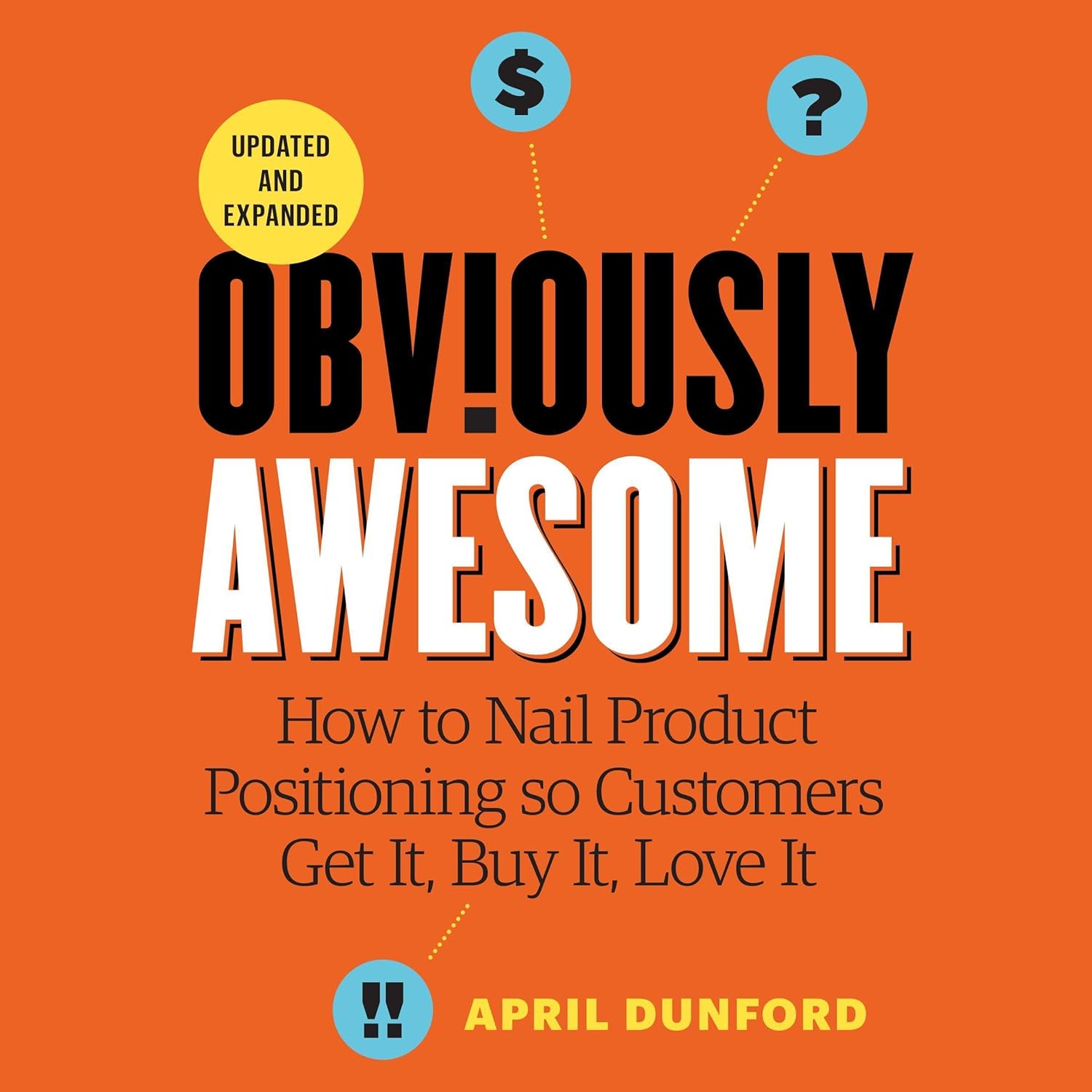
"Obviously Awesome", April Dunford
The definitive guide to positioning for B2B software companies — directly applicable to the outcome-first messaging framework that drives the highest-converting SF SaaS landing pages.
"Competing Against Luck", Clayton Christensen
Framework for understanding what "job" buyers hire your software to do — the foundation of the problem-first messaging structure that outperforms feature lists in every market, especially the sophisticated Bay Area B2B buyer.
"Influence: The Psychology of Persuasion", Robert Cialdini
The foundational text on what drives decisions — social proof, authority, scarcity — all of which map directly to the trust signals, pricing transparency, and risk reversal elements that determine whether a SF SaaS buyer books a demo or closes the tab.
The brutal truth? Most SF SaaS companies are hemorrhaging qualified leads because they're explaining features instead of selling outcomes. A Series B startup doesn't need a prettier website. It needs a page that converts at 4% instead of 1.8%.