What goes into a brand book that people actually use — and what makes most brand books a $30K PDF nobody opens. Structure, examples, templates, and the difference between a brand book and a brand strategy document.
Key takeaways 👌
A brand book is an implementation manual, not a strategy document. It answers "how do I use the brand correctly?" — not "what does the brand stand for?" Strategy belongs in the brand platform. The book is the rulebook that makes strategy executable by anyone in the company.
The most effective brand books follow a 7-section structure: Brand Overview, Logo System, Color System, Typography, Imagery, Voice & Tone, and Application Examples. Each section needs rules, not just examples — "do this, don't do this" with visual proof. Without rules, every designer interprets differently.
Brand books fail when they're too long (nobody reads 80 pages), too vague ("be bold and innovative" means nothing), or too rigid (no room for context). The sweet spot: 20–35 pages, specific rules with flexibility guidelines, and a living digital version that gets updated — not a static PDF that collects dust.
Table of Contents
PART 1. What a Brand Book Actually Is (And What It Isn't)
PART 2. The 7-Section Brand Book Structure
PART 3. Brand Book by Company Stage
PART 4. Common Brand Book Mistakes
PART 5. How to Build a Brand Book: Step by Step
PART 6. Brand Book Templates and Examples
Introduction
Every company with a brand has brand assets — a logo file, a few colors, maybe a font choice. Most companies stop there. The logo lives in a Slack thread from 2022, the colors are slightly different in every presentation, and the new marketing hire just used Papyrus in a client email because nobody told them not to.
A brand book prevents this. It's the single source of truth for how the brand looks, sounds, and behaves across every touchpoint. Not a strategy document — a rulebook. Not a creative brief — an implementation manual.
The problem is that most brand books fail at their one job. They're too long for anyone to read, too vague for anyone to follow, or too static to stay relevant. The design team creates a beautiful 80-page PDF, presents it in a meeting, and then it sits in Google Drive untouched while the sales team continues using the old logo from three versions ago.
This guide covers how to build a brand book that people actually use: the right structure, the right level of detail, the right format for your company stage, and the mistakes that turn a useful tool into an expensive decoration.
PART 1. What a Brand Book Actually Is (And What It Isn't)
Brand Book vs Brand Strategy vs Brand Guidelines
These three terms get confused constantly. Here's what each one does:
Brand strategy answers: Who are we? Who are we for? Why are we different? How do we position ourselves?
Deliverables: Positioning statement, value proposition, audience personas, competitive differentiation.
Audience: CEO, CMO, marketing leadership.
Brand book (also called brand guidelines or brand standards manual) answers: How do we use the brand correctly?
Deliverables: Logo rules, color specs, typography system, imagery direction, voice guidelines, application examples.
Audience: Designers, developers, marketers, agencies, anyone creating brand materials.
Brand identity is the collection of designed assets: the logo files, the color palette, the typefaces, the icon set. The brand book documents how to use these assets. The identity is the toolkit; the book is the instruction manual.
The critical relationship: brand strategy comes first. It defines what the brand stands for. Then the identity is designed to express that strategy. Then the brand book documents how to use the identity consistently. Strategy → Identity → Book. Skip strategy and the book documents rules for a brand that doesn't mean anything.
Who Uses a Brand Book and When
A brand book has multiple audiences, each with different needs:
In-house designers use it daily — for component specifications, color values, spacing rules. They need technical precision: hex codes, not "a warm blue."
External agencies and freelancers use it at project kickoff — to understand the visual system before creating new materials. They need context plus rules: why the brand looks this way and what they can/cannot change.
Marketing team uses it for content creation — social media, presentations, email templates. They need voice guidelines, approved templates, and image direction.
Sales team uses it (often unknowingly) through templates — pitch decks, proposals, one-pagers built on brand standards. They need pre-built templates, not a guidelines document.
New hires use it during onboarding — to understand how the company presents itself. They need the brand overview section and quick-reference examples.
If the brand book only serves designers, it's incomplete. If it tries to serve everyone in one 80-page document, nobody reads it.

PART 2. The 7-Section Brand Book Structure
Every brand book — from a 10-page startup guide to a 100-page enterprise manual — follows this structure. The depth changes; the sections don't.
Section 1: Brand Overview (1–3 pages)
This is the "why" page. Brief context so that anyone reading the book understands the brand before seeing the rules.
Include:
- Mission statement (2–3 sentences, not a paragraph)
- Brand values (3–5 behavioral values, not aspirational adjectives)
- Brand personality (how the brand would behave if it were a person)
- Target audience (one-paragraph summary, not full personas — those live in the strategy document)
Don't include: Full brand strategy, competitive analysis, market research. The brand book isn't the strategy document. Keep this section to 1–3 pages maximum.
Template text: "This brand book defines how [Company] presents itself visually and verbally. It's a guide for anyone creating materials on behalf of the brand — internal teams, agencies, and partners. For the strategic foundation behind these guidelines, see our brand strategy document."
Section 2: Logo System (3–5 pages)
The most referenced section. Logo rules get broken more than any other brand element because people don't know the rules exist.
Include:
- Primary logo — the default, full version used in most contexts
- Secondary logo — simplified version for smaller applications (social media avatars, app icons)
- Icon/mark — the symbol without the wordmark, if applicable
- Clear space — minimum empty space around the logo (usually defined as a fraction of the logo height: "1x the height of the letter 'o'")
- Minimum size — smallest acceptable reproduction size (digital: px, print: mm)
- Color variations — full color, single color (black), reversed (white on dark), grayscale
- Backgrounds — approved background colors/images the logo can sit on
- Don'ts — 6–8 visual examples of what NOT to do: don't stretch, don't rotate, don't recolor, don't add shadows, don't place on busy backgrounds, don't rearrange elements
The "Don'ts" page is the most important page in the entire brand book. It prevents 90% of logo misuse. Show it visually — side-by-side correct vs incorrect.
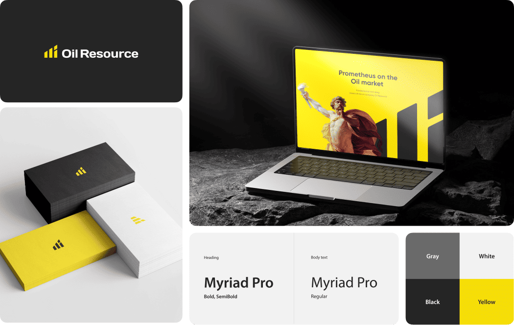
Section 3: Color System (2–3 pages)
Colors are the most commonly misapplied brand element. "Our blue" becomes five different blues across five different departments because nobody specified which blue.
Include:
- Primary palette (2–3 colors) — hex, RGB, CMYK, Pantone values for EACH color
- Secondary palette (2–3 colors) — supporting colors for variety
- Functional colors — success (green), error (red), warning (yellow), info (blue). These aren't brand colors but they appear in the product
- Color ratios — "Primary blue: 60% of any design. Secondary green: 20%. White/neutral: 20%." Without ratios, designers use colors in equal proportion and the brand loses its visual signature
- Accessibility notes — which text colors work on which backgrounds (WCAG contrast ratios)
Tip: Include a "color in context" page showing the palette applied to a real layout — a website section, a social media post, a business card. Abstract swatches don't show how colors work together in practice.
Section 4: Typography (2–3 pages)
Typography is the element that most impacts brand perception after the logo. A brand using Helvetica feels different from a brand using Playfair Display — before reading a single word.
Include:
- Primary typeface — name, weight options, where to use (headings, body, or both)
- Secondary typeface — if applicable, when to use instead of primary
- Type scale — specific sizes for H1, H2, H3, body, caption, label. Not just "use large for headings" — actual pixel/point values
- Line height and spacing — line-height ratios (1.4–1.6 for body text), letter-spacing if relevant
- Font licensing — where to download, license type (Google Fonts, Adobe Fonts, purchased license). Include the actual link. If someone can't find the font, they'll substitute
- Hierarchy examples — a sample page layout showing all type levels in context
Section 5: Imagery & Photography (2–3 pages)
The most subjective section — and therefore the one that needs the clearest rules.
Include:
- Photography style — what kind of images represent the brand? Real photography vs illustration vs 3D renders? People vs objects vs abstract? Candid vs staged?
- Mood and lighting — warm vs cool, bright vs moody, natural vs studio. Reference images are essential — show 4–6 "on brand" photos and 4–6 "not on brand" photos
- Subject guidelines — diversity, age ranges, settings, clothing style. These matter for consistency
- Icon style — line vs filled, rounded vs sharp corners, consistent stroke weight
- Illustration style — if the brand uses illustration, define the style precisely: flat vs dimensional, color palette, level of detail
The do/don't format works best here. Show two rows: top row "this is us" with 4 approved-style images, bottom row "this is not us" with 4 rejected-style images. Worth more than a page of written description.
Section 6: Voice & Tone (2–4 pages)
How the brand sounds in writing. This section is often either missing entirely or reduced to meaningless adjectives.
Include:
- Voice attributes — 3–4 characteristics with explanations. Not just "friendly" — "Friendly: we write like we're explaining something to a smart colleague, not lecturing a student. We use contractions, ask questions, and acknowledge complexity without jargon."
- We are / We are not table — the most useful format for voice guidelines. "We are direct. We are not blunt. We are expert. We are not condescending."
- Writing examples — for each voice attribute, show a before (off-brand) and after (on-brand) version of the same sentence
- Channel-specific tone — the voice stays the same, but tone adjusts. Error message tone is different from marketing email tone. Show examples for 3–4 key channels
- Word list — words to use ("build, craft, design") and words to avoid ("leverage, synergy, disrupt"). 10–15 words in each column is enough
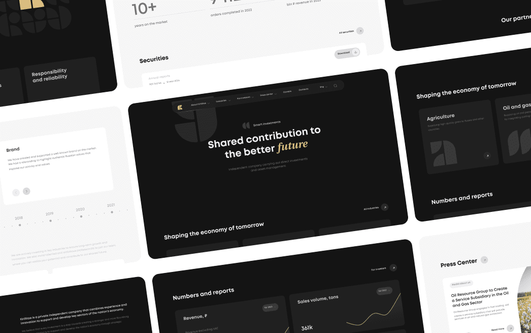
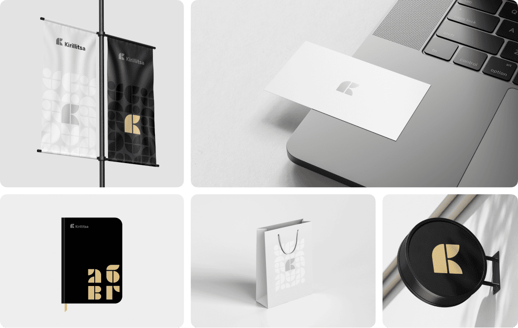
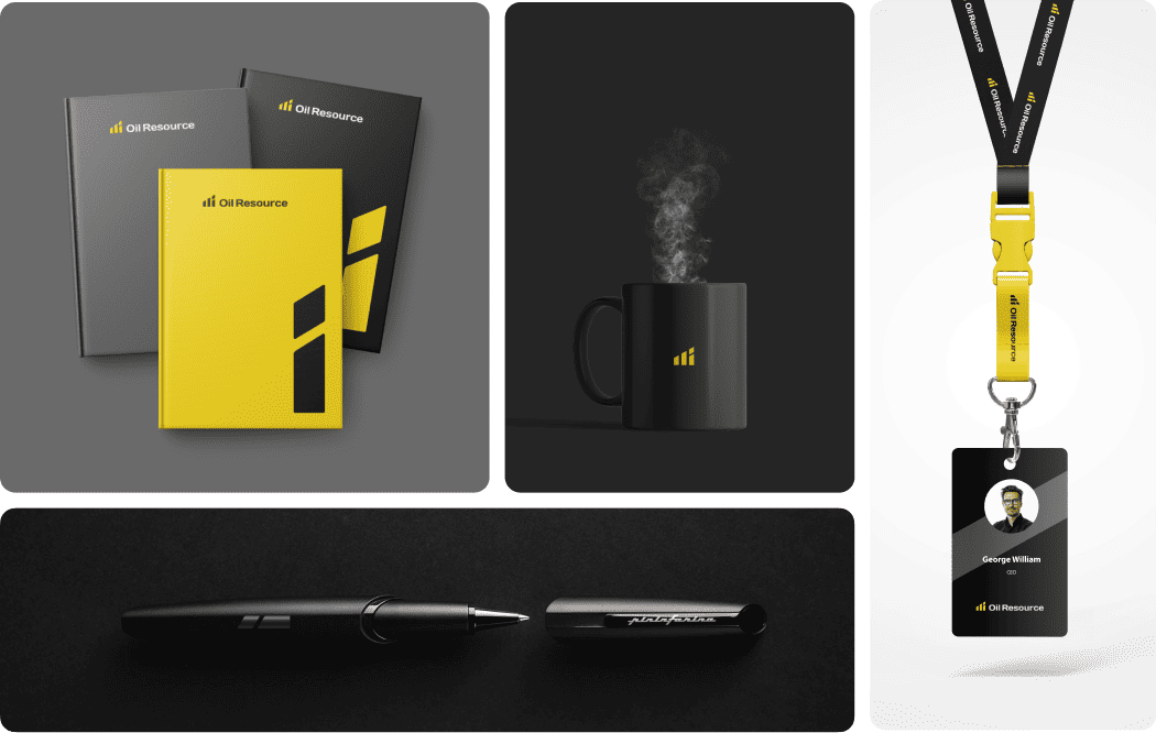
Section 7: Application Examples (3–5 pages)
Rules in isolation are abstract. Rules applied to real materials are actionable. This section shows the brand system in use.
Include:
- Business card — front and back, with specs
- Email signature — exact format, font, links
- Presentation template — title slide, content slide, closing slide
- Social media — profile image, cover image, post template for 2–3 platforms
- Website screenshot — showing how brand elements appear on the actual site
- Stationery — letterhead, envelope (if relevant)
This section serves two purposes: it shows how everything works together, and it provides ready-to-use templates that reduce the chance of off-brand materials.
A brand is a person's gut feeling about a product, service, or organization. The brand book is the manual that ensures every touchpoint creates the same gut feeling.
— Marty Neumeier, Author, The Brand Gap
PART 3. Brand Book by Company Stage
The same structure at every stage. The depth changes dramatically.
Startup: 1-Page Brand Sheet
When: Pre-seed to seed, team of 2–10, budget under $15K total for branding.
You don't need a brand book. You need a brand sheet — one page that covers the essentials:
- Logo (primary + icon) with download link
- 3 colors with hex codes
- 1 typeface with download link
- 3-sentence brand description
- "Don't do this" row (3–4 logo misuse examples)
Format: Google Doc or Notion page. Not a PDF — it needs to be editable as the brand evolves. Share the link in your team's Slack channel pinned messages.
Cost: $0 (DIY) to $500 (designer formats it). Total time: 2–4 hours.
Growing Company: 15–25 Page Brand Book
When: Seed to Series A, team of 10–50, external agencies involved, first marketing hire.
This is the sweet spot. All 7 sections, moderate depth. The brand is stable enough to document but still evolving.
Key additions vs startup:
- Full logo system (primary, secondary, icon, clear space, minimum size, don'ts)
- Color system with ratios and accessibility notes
- Typography with full hierarchy
- Voice section with we are/we aren't table
- 3–5 application examples
- Template files (pitch deck, social media, email)
Format: Figma file (designers can extract specs directly) + PDF export (for non-designers). Include a link to the asset library (Google Drive, Dropbox, or brand management platform).
Cost: $2K–$5K if designed by an agency as part of a branding project. $500–$1K if assembled in-house from existing assets.
Enterprise: Full Brand System
When: Series B+, 50+ employees, multiple products or sub-brands, international markets.
At this stage, the brand book evolves into a brand system — a living documentation platform, not a document.
Key additions vs growing company:
- Sub-brand architecture and relationship rules
- Multi-language guidelines (typography adjustments, name translations)
- Digital design system (Figma component library with auto-layout, variants, design tokens)
- Motion and animation guidelines
- Sonic branding (if applicable)
- Co-branding rules (partner logos, sponsorship lockups)
- Governance section: who approves what, escalation path for brand decisions
Format: Brand management platform (Frontify, Bynder, Brandpad) or custom documentation site. Figma design system linked from the platform. PDF exports available but not the primary format.
Cost: $10K–$30K for the documentation. $20K–$80K for the design system. Ongoing maintenance: $5K–$15K/year.
The best brand guidelines are the ones that get used. A 100-page masterpiece that nobody reads is worth less than a 10-page document that every new hire bookmarks on day one.
— Michael Bierut, Partner, Pentagram
PART 4. Common Brand Book Mistakes
The 80-Page Monument Nobody Reads
The most common failure: the brand book is so comprehensive that it's unusable. Every possible scenario is covered. Every edge case has a rule. The result is a reference document that requires a reference document to navigate.
The fix: Ruthless editing. If a section applies to fewer than 10% of use cases, move it to an appendix or remove it. The core brand book should be scannable in 15 minutes and findable (any answer within 30 seconds of searching).
Rule of thumb: If your brand book is over 35 pages, you're writing for other designers, not for the people who actually need to use the brand.
The Vague Adjective Problem
"Our brand is bold, innovative, and human-centered." This appears in approximately 10,000 brand books and means nothing in any of them.
"Bold" means different things to a copywriter (short sentences? provocative claims?), a designer (bright colors? large type? asymmetric layouts?), and a sales rep (aggressive pricing? confident pitch?).
The fix: Replace adjectives with rules. Don't say "bold" — say "We use type sizes 20% larger than the industry standard for headlines. We lead paragraphs with the conclusion, not the setup. We use one hero color per layout, never three competing colors."
The Frozen PDF Problem
A brand book created as a PDF in 2023 and never updated is outdated by 2024. New products launch, new channels emerge, the brand evolves — but the guidelines don't.
The fix: Use a living format. Figma files that designers update as the system evolves. A Notion workspace that the brand manager maintains. A dedicated platform like Frontify. The PDF can exist as an export, but it shouldn't be the source of truth.
Update cadence: Review quarterly, update as needed, major revision annually or when the brand significantly evolves.
Design is the silent ambassador of your brand. The brand book is the training manual for that ambassador — make sure it's readable.
— Paul Rand, Graphic Designer, Creator of IBM and ABC Logos
PART 5. How to Build a Brand Book: Step by Step
What You Need Before Starting
Don't build a brand book before you have:
- Finalized logo system — all variations designed, approved, and exported in all formats (SVG, PNG, EPS minimum)
- Defined color palette — with exact values (hex, RGB, CMYK, Pantone)
- Chosen and licensed typography — fonts purchased or confirmed free for commercial use
- Photography/imagery direction — at least 10–15 reference images showing the approved style
- Voice guidelines — even if rough, the voice attributes need to exist before documenting them
- Brand strategy document — positioning, values, audience. The book references this but doesn't replicate it
If any of these are missing, finish the brand identity design first. A brand book for an incomplete identity is a manual for a product that doesn't exist yet.
The Build Process
Week 1: Audit and gather
- Collect all existing brand assets in one place
- Document what's been created and what's missing
- Review how the brand is currently being used (correctly and incorrectly) — screenshots of real usage show where guidelines are most needed
Week 2: Structure and write
- Build the 7-section outline
- Write each section: rules first, then examples
- Create do/don't comparisons for logo, color, and imagery sections
- Draft voice guidelines with real before/after writing examples
Week 3: Design and assemble
- Design the brand book itself using the brand's own visual system (it should look like the brand)
- Create application example pages
- Build template files (pitch deck, social media, email signature)
- Package downloadable assets (logo files, font files, color swatches)
Week 4: Review and distribute
- Review with 3–4 people from different teams (design, marketing, sales)
- Test: give the brand book to someone who's never seen the brand and ask them to create a simple layout. Where do they get stuck? That's where the book needs more clarity
- Publish in the agreed format (Figma + PDF, Notion, brand platform)
- Announce to the company with a 5-minute walkthrough video
Tools and Formats
Tool |
Best For |
Cost |
Pros |
Cons |
Figma |
Design teams, living system |
Free–$15/user/mo |
Designers work directly in it, always up to date |
Non-designers find it intimidating |
Notion |
Internal teams, startups |
Free–$10/user/mo |
Easy to edit, searchable, collaborative |
Limited design layout options |
Frontify |
Enterprise, multi-brand |
$79+/mo |
Built for brand management, asset library |
Expensive for small teams |
Canva |
Small teams, templates |
Free–$13/user/mo |
Easy template creation, low barrier |
Limited for complex design systems |
PDF (InDesign/Figma export) |
External distribution |
One-time design cost |
Universal, print-friendly |
Static, goes out of date, not searchable |
PART 6. Brand Book Templates and Examples
What to Include at Each Budget Level
Budget |
Pages |
Sections |
Format |
What You Get |
$0–$500 |
1–5 |
Logo + colors + font + basic rules |
Google Doc / Notion |
Minimum viable brand sheet — enough for a founding team |
$500–$2K |
10–15 |
All 7 sections, light depth |
Figma + PDF |
Functional brand book for a small team with external contractors |
$2K–$5K |
15–25 |
All 7 sections, full depth |
Figma + PDF + asset package |
Professional brand book suitable for growing companies and agencies |
$5K–$15K |
25–40 |
All 7 + templates + design system basics |
Figma system + PDF + brand platform |
Comprehensive brand system for mid-market companies |
$15K+ |
40+ |
Full system + motion + multi-brand + governance |
Brand platform + Figma design system |
Enterprise brand system with ongoing maintenance |
Real-World Examples Worth Studying
Spotify — Their brand guidelines site is a benchmark for digital-first brand books. Color system with detailed usage ratios, duotone photography rules, and a "misuse" section that's better than most textbooks.
Uber — After the rebranding missteps, Uber created one of the most thorough brand systems in tech: 9 global color palettes, composition principles, motion guidelines, and detailed illustration rules.
Mailchimp — Voice and tone guidelines that set the industry standard. Instead of adjectives, they provide actual writing examples for every scenario: success messages, error messages, marketing emails, legal copy. Each has a "this, not that" example.
Slack — A brand book that's designed to be used, not admired. Clear sections, scannable layout, and a "frequently asked questions" section that addresses the actual questions people ask: "Can I use the logo on a dark background?" "What's the minimum size?"
Each of these brands solved the same problem: making guidelines that people actually follow, not just admire.
Consistency is the hallmark of great brands. Not consistency of boredom — consistency of character. The brand book is how you scale character beyond the founding team.
— Debbie Millman, Host, Design Matters
Want to discuss your project?
Share your vision with us, and we'll reach out soon to explore the details and bring your idea to life.
Conclusion
A brand book is the most misunderstood deliverable in branding. It's not a coffee table book for the CEO's shelf. It's not a design portfolio showcasing the agency's work. It's not a strategy document or a mission statement.
A brand book is a tool. Its only job is to make it easy for anyone — designer, marketer, sales rep, new hire, external agency — to use the brand correctly without asking someone for permission or clarification.
The 7-section structure works at every scale: brand overview, logo system, color system, typography, imagery, voice, and application examples. A startup can cover this in 5 pages. An enterprise needs 40+. The structure doesn't change — the depth does.
Build the book after the identity is complete, not during. Use a living format, not a frozen PDF. Include "don't do this" examples for every major element. Test it by giving it to someone who's never seen the brand and asking them to create something. Where they get stuck is where the book needs work.
The best brand books share one quality: they're short enough to read, specific enough to follow, and accessible enough to actually get used. Everything else is decoration.
I've reviewed over 50 brand books from agencies and in-house teams. The best ones are under 30 pages and answer every question a designer would ask. The worst ones are 80-page monuments to the design team's ego that nobody reads after the handoff meeting. This guide is about building the first kind.