Restaurant website design in 2026 has split between two masterworks — fine dining brands that treat restraint as the entire design brief, and fast-casual brands that treat every pixel as conversion infrastructure. These 10 sites define the ceiling of each approach across every restaurant format.
Key takeaways 👌
Restaurant design in 2026 has crystallized into two dominant aesthetics — fine dining brands (Noma, EMP) where editorial restraint carries brand weight, and fast-casual challengers (Sweetgreen, Chipotle, Nando's) where custom typography and illustration systems differentiate from commodity category defaults.
Loyalty UI has moved from footer afterthought to homepage primitive — tier visualizations, points progress bars, and Rewards Store grids are the dominant mid-page modules of 2026's fast-casual sites.
Reservation platform routing has become a design decision — Tock for pre-paid tasting menus, Resy for chef-driven independents, OpenTable for approachable full-service, SevenRooms for luxury multi-experience groups. Multi-platform routing within a single site is now a mature benchmark pattern.
TL;DR: Top 10 Best Restaurant Website Designs in 2026
For fine dining restraint: Noma, Eleven Madison Park — editorial minimalism carried by photography and seasonal palette.
For multi-location world-building: Dishoom — Awwwards-winning per-location founding myths set in different moments of Indian history.
For chef-driven group tech: Momofuku — Next.js + DatoCMS stack with multi-platform reservation routing.
For deli+cookbook+CPG ecosystems: Ottolenghi — 2024 Irving & Co rebrand with paper-cut illustrations.
For fast-casual design benchmarks: Sweetgreen — the COLLINS system that redefined the category's visual grammar.
For QSR conversion infrastructure: Chipotle, Domino's — multi-Webby-winning UX and the Pizza Tracker legacy.
For global heritage fast-casual: Nando's — PERi-ometer, hand-painted Nando's Hand typeface, cultural-color ownership.
For cocktail bar brand scaling: Death & Co — per-location palettes within a unified literary identity.
Introduction
Restaurants have one of the widest digital quality distributions in commerce. At the top, brands like Noma, Sweetgreen, and Ottolenghi invest in custom typography, commissioned illustrations, and agency-led brand systems that rival the best work in consumer tech. At the bottom, tens of thousands of restaurants run on decade-old WordPress templates with PDF menus, stock food photography, and contact forms that don't work on mobile. Between them sits an enormous middle that looks competent and produces mediocre commercial outcomes.
The ten brands in this guide represent the current ceiling of what restaurant design can deliver — across fine dining, chef-driven groups, multi-location world-building, fast-casual, QSR, and cocktail bar formats. Each has made the investment most competitors avoid: commissioned typography, dedicated photography, agency creative direction, headless technology stacks, and ongoing brand governance. The results are visible in both awards (Awwwards, Webby, James Beard) and commercial outcomes (Chipotle's 60%+ digital transaction share, Sweetgreen's 40M+ digital transactions, Dishoom's per-location cult followings).
For any restaurant brand commissioning a new website build or considering a redesign in 2026, studying these ten sites is the fastest way to understand where the category's ceiling sits — and what specific design investments separate the sites winning awards from the ones merely publishing menus.
This guide profiles each with the specific design moves that elevated it, the strategic context justifying the investment, and a selection framework to help identify which philosophy your restaurant brand can credibly own.
The Seven Design Patterns Separating Benchmark Restaurant Sites from the Rest
Across the ten sites below, seven patterns recur. Any one is achievable; combining all seven at the level these brands demonstrate is what separates category ceiling from category middle.
1. Custom typography commissioned as brand infrastructure. Sweetgreen's SweetSans + Grenette (MCKL + Colophon Foundry), Domino's Sans (WorkInProgress 2025), Nando's Hand (Marks Salimu, tilted 87° for the 1987 founding year), Ottolenghi's Riforma (2024 sharpened cut), Momofuku's Lucky Peach logomark system — commissioned typography is no longer optional at the top of the category. In a market saturated with templated restaurant sites, custom type is one of the few differentiators that can't be copied from a competitor's Webflow. This investment is a core brand strategy decision, not a design afterthought.
2. Illustration eating photography at the top of the funnel. Sweetgreen's Min Heo hand-drawn ingredient characters, Ottolenghi's Irving & Co paper-cut illustrations, Dishoom's Bombay-cinema-poster system, Nando's African-pattern library. The best 2024–2026 restaurant brands use illustration for emotional connection and save photography for conversion-critical menu moments — inverting the old "big hero food photo" playbook.
3. Reservation platform routing as a design decision. Noma uses Tock for pre-paid ticketed meals. EMP migrated from Tock to Resy in 2024. Momofuku routes multi-platform by location (OpenTable for NY/LA, SevenRooms for Vegas, DoorDash for Super Peach takeout, Goldbelly for shipping). Platform choice now signals positioning — pre-paid tasting menus signal seriousness; Resy signals chef-driven hospitality; OpenTable signals approachable full-service. A well-designed custom UI handles this multi-platform routing without fragmenting the brand.
4. World-building replacing standard IA. Dishoom's per-café founding myths, Hawksmoor's Monday Wine Club / Steak After Eight / Experiences content blocks, SingleThread's farm + inn + workshop + cinematic-dining narrative stack. The strongest 2026 restaurant sites treat each venue or sub-experience as a narrative universe — not a directory entry. Location pages have graduated from template cards to editorial chapters.
5. Loyalty UI moved to homepage primitive. Chipotle Rewards, Sweetpass+, Shack Track, MyMcDonald's Rewards, Nando's Card, Leon Club. Tier visualizations, points-to-reward progress bars, and Rewards Store grids are 2026's dominant mid-page modules. Fast-casual that hasn't elevated loyalty to a design primitive is losing margin to those that have.
6. Mobile-first ordering UX as the actual product. Across Chipotle, Domino's, Shake Shack, and Sweetgreen, the desktop site is increasingly a marketing front door while the real product UX lives in mobile ordering, app builders, and tracker patterns. The best restaurant brands treat UX architecture as a system that spans web, mobile app, and kiosk as one coherent experience.
7. Commerce + content as one native ecosystem. Ottolenghi's Shopify integration for hampers and cookbooks, Nando's packaged-goods retail cross-sell, Sweetgreen's CPG rollout, Momofuku Goods — restaurant brands now operate as restaurant + CPG + publishing + merchandise simultaneously, and their sites must natively support that breadth. For brands adding e-commerce functionality alongside reservations, the design challenge is maintaining editorial voice across transactional surfaces.

1. Noma — Defiantly Understated Editorial Restraint
Website: noma.dk
Category: Fine dining / food innovation lab (Copenhagen; LA pop-up through June 2026)
Design Aesthetic: Editorial notebook minimalism
A defiantly understated WordPress build that behaves like an editorial notebook rather than a restaurant marketing site — the hero is a muted auto-cross-fading slideshow of Ditte Isager photographs (foraged ingredients, staff hands, LA 2026 banner) with no parallax, no video, no gradient CTAs. Typography pairs a thin-weight all-lowercase serif wordmark with utilitarian sans-serif body; the chrome is near-invisible so the mossy-green/bone-white seasonal palette and food imagery carry all the expressive weight. A live Copenhagen weather/temperature readout in the header is the single signature flourish, reinforcing place and seasonality. Reservations route to Tock's pre-paid ticketing model.
Key design elements: Full-bleed editorial slideshow hero, live weather widget in header, lowercase serif wordmark, Tock ticketed reservation integration, EN/DA bilingual toggle, modular card grid linking to Noma Projects / Noma Kaffe / MAD / Omnivore, embedded dispatch-style press blog.
Best for inspiration if: You're building a fine-dining brand where restraint is the design brief. Noma proves that the highest restaurant design bar can be set not by visual sophistication but by editorial discipline — the design should never be in focus, only the food.
Recognition: Brand ecosystem (packaging, identity, 2023 art book) by Gretel NY, with David Shrigley illustration collabs; covered in It's Nice That, Creative Boom, Brand New. Redzepi's stated design philosophy: "The design should never be in focus but like a delicate, white, clean plate present the Noma creations in the best possible way."
2. Eleven Madison Park — Fine Dining Editorial Done on Squarespace
Website: elevenmadisonpark.com
Category: Fine dining / plant-based tasting menu (3-Michelin-star, Relais & Châteaux)
Design Aesthetic: Warm-neutrals editorial gallery
A disciplined Squarespace build where restraint and art direction carry the weight rather than technical showmanship. The hero is a 19-slide auto-advancing gallery of Maciek Kobielski photography — Humm tasting in the kitchen, radicchio tardivo, Magic Farms harvests, plated tonburi with pita — no video, no parallax. The warm-neutrals palette (cream, bone, soft earth green, espresso) pairs with a serif wordmark incorporating the distinctive "Leaves" mark integrated into "ELEVEN MADISON PARK." In a notable strategic shift, EMP migrated reservations from Tock to Resy in 2024. Companion microsites (Eleven Madison Home, Clemente Bar, Humm Hospitality, Wine Club) extend the identity across a luxury lifestyle stack.
Key design elements: 19-slide auto-rotating photographic hero, "Leaves" typographic mark, Resy reservation integration (migrated from Tock), Squarespace folder-pattern navigation, companion microsites ecosystem, BinWise-hosted PDF wine list, Relais & Châteaux partnership badging.
Best for inspiration if: You're operating a fine-dining brand with sub-brands or lifestyle extensions. EMP's ecosystem approach — flagship restaurant plus home goods, bar, wine club — is the template for how to build a luxury hospitality brand family without fragmenting the core identity.
Recognition: Ruth Costello served as in-house Creative Director (c. 2021–2022), launching Eleven Madison Home; now at King & Partners NY. James Beard recognition: Outstanding Restaurant 2011, Outstanding Chef 2012, Outstanding Service 2016.
3. Dishoom — Per-Location World-Building as Design Strategy
Website: dishoom.com
Category: Multi-location restaurant group (Bombay Irani-café homage; 9+ UK sites)
Design Aesthetic: Bombay-cinema-poster editorial storytelling
A world-building-first CMS-driven WordPress site where each location isn't just a page — it's a dedicated mini-world with its own founding myth set in a different moment of Indian history (1940s Bombay, Swinging Sixties, retro-futurist 1950s). Recent digital work by Forty Eight Point One replaces replicated PDF-style menus with rich illustration, animation, and typography unique per café — with character-led storytelling fronted by the sepia-tinted "From Bombay with Love" voice. The type system is deliberately loose and un-systematic (Gill Sans, Cheltenham, Clearface, Sim Hei, Berthold Akzidenz-Grotesk, and a custom mid-century/Bombay-cinema display face) — in-house designer Samuel Sutton says "out were strict guidelines and one logo version; in was multiple logos, thin papers, fast printing, original typographic inspiration and layouts inspired by their individual location stories."
Key design elements: Per-location "founding myth" storytelling pages, illustrated animated character narratives, multi-typeface identity system (Gill Sans + Cheltenham + custom cinema-poster display), newspaper/print-inspired menu layouts, Bombay art-deco + mid-century motifs, cookbook/retail CPG cross-sell, OpenTable reservation routing, responsive story-led long-scroll.
Best for inspiration if: You're operating a multi-location hospitality concept where each venue has distinct atmosphere. Dishoom demonstrates that location pages can become editorial chapters rather than directory entries — and that the additional content investment produces cult-level customer affinity.
Recognition: Awwwards Site of the Day (earlier iteration, Clubhouse Studio, 6.73 score); CSS Design Awards. Current digital work by Forty Eight Point One; print/brand identity historically by & Smith. Interior design by Macaulay Sinclair. Dishoom journal entry "Designing Dishoom" is itself a design-industry reference document.
Hospitality is present when something happens for you. It is absent when something happens to you.
— Danny Meyer, Founder, Union Square Hospitality Group; Author, Setting the Table
4. Momofuku — Chef-Driven Group Tech Done Right
Website: momofuku.com
Category: Chef-driven Asian-American restaurant group (David Chang)
Design Aesthetic: Warm-serif editorial with Lucky Peach iconography
The strongest custom web build among American chef-driven groups — a Next.js/React front end with DatoCMS headless backend serving modern srcset-optimized imagery. The iconic "Lucky Peach" logomark (Sean Elwood 2004, Asher Sarlin 2012 refresh) anchors a warm-serif / clean-sans typographic system. The restaurant directory is a filterable state-based tabbed grid (All / CA / NV / NY) with each card deep-linking to the correct reservation platform — OpenTable for NY/LA, SevenRooms for Vegas, DoorDash for Super Peach takeout, Goldbelly for national shipping — an unusually smart piece of platform-agnostic UX. A signature micro-interaction: the "Our Story" paragraph inlines small photographic thumbnails directly into the sentence flow, a print-editorial device almost never seen on restaurant sites.
Key design elements: Next.js + DatoCMS stack, Lucky Peach logomark, tabbed state-filtered restaurant directory, multi-platform reservation routing, inline photo-in-paragraph editorial device, integrated shop.momofuku.com ecommerce, rotating promo announcement bar, modern webp/avif image pipeline.
Best for inspiration if: You're operating a chef-driven restaurant group with multiple concepts across markets. Momofuku demonstrates that the technology stack itself can be a design decision — headless architecture enables content and platform flexibility that WordPress templates can't match.
Recognition: Asher Sarlin's 2012 logo refresh won UnderConsideration Brand New Best Logo (Professional) 2013. Interior design of several locations by DesignAgency Toronto. Brand held in-house under Marguerite Mariscal (former VP Brand & Design, later CEO) and Ryan Healey.
5. Ottolenghi — Deli+Cookbook+CPG with Paper-Cut Illustration System
Website: ottolenghi.co.uk
Category: Deli + restaurant group + cookbook/CPG brand (London; Yotam Ottolenghi)
Design Aesthetic: Playful hand-cut editorial with Mediterranean warmth
Following the 2024 rebrand by Irving & Co + Studio Graft, the site now blends the 20-year classic red-and-white palette with a new playful, hand-cut illustrated language — a wobbly red sun mark (created with paper cut-outs, nodding to Mediterranean origins) sits alongside painterly faces by artist Ivo Bisignano and a full visual library of cut-out ingredient illustrations (pomegranates, fish, beans). The wordmark keeps its house typeface Riforma with sharpened corners, tightened kerning, and a bolder cut. The genuinely novel UX element is the "Foodipedia" — an A-Z guide of ingredients that defines the brand and serves as a content/SEO moat translating tactile paper cut-outs into a functional digital taxonomy.
Key design elements: Foodipedia A-Z ingredient navigator, hand-cut paper illustration library, wobbly sun brand mark, Riforma wordmark (sharpened 2024 cut), painterly Bisignano face illustrations, Shopify hamper + cookbook + tableware commerce, red editorial palette, OpenTable reservations per-location, Ottolenghi Substack cross-link.
Best for inspiration if: You're operating a restaurant brand with meaningful CPG, publishing, or retail extensions. Ottolenghi's 2024 refresh is the current template for how a heritage restaurant brand can evolve into a multi-format lifestyle business without losing editorial soul.
Recognition: 2024 rebrand and website by Irving & Co (brand direction) + Studio Graft (web design and build); photography by Laura Edwards; covered in It's Nice That ("Ottolenghi introduces playful cut-outs and joyful illustrated faces"). NOPI branding + cookbook art direction by Here Design (covered in Creative Review).
6. Sweetgreen — The Fast-Casual Design Benchmark
Website: sweetgreen.com
Category: Fast-casual healthy/salad chain (~251 US locations)
Design Aesthetic: Editorial cookbook meets modern produce
Arguably the best-realized fast-casual brand system on the web. Hero combines editorial food photography with hand-drawn line-illustration ingredient characters (by Min Heo) on warm cream (~#F5F1EA) backgrounds with bursts of produce-inspired color — radish red, kale green, carrot orange, beet purple. Typography pairs the custom SweetSans (Jeremy Mickel / MCKL, inspired by Silver Lake Reservoir signage) for display with Grenette (Colophon Foundry old-style serif) for body — vintage-cookbook meets modern-editorial. The ingredient-level salad builder with live calorie + price calculation and per-ingredient dietary restriction filters is the functional star. Location-aware menus rotate 5× per year based on produce availability.
Key design elements: Ingredient-level salad builder with live calorie+price, per-ingredient dietary restriction filters, Sweetpass/Sweetpass+ subscription tier cards, location-aware seasonal menus, illustrated ingredient-character system (Min Heo), SweetSans + Grenette custom type pairing, CMS-powered collab pages (Naomi Osaka, David Chang), ADA/CCPA-compliant rebuild.
Best for inspiration if: You're building fast-casual where brand sophistication drives premium positioning. Sweetgreen is the template for how a commodity category (salads) can justify premium pricing through coherent brand design — and the template most imitators fail to reach because they commission the illustration without the typographic foundation.
Recognition: 2021 brand system by COLLINS (documented case study wearecollins.com/work/sweetgreen — custom SweetSans + Grenette, Min Heo illustration). Marketing site + CMS rebuild by Fictive Kin. Earlier identity by GrandArmy; original ordering platform/iOS by Gin Lane. Widely cited across It's Nice That and Brand New as one of the most coherent restaurant brand systems of the decade.
7. Chipotle — The Conversion-First QSR Benchmark
Website: chipotle.com
Category: Fast-casual Mexican QSR (~3,800 US restaurants; 40M+ Rewards members)
Design Aesthetic: Utilitarian earthy conversion-focused
A utilitarian, conversion-first site where the real design excellence lives in the ordering UI. Hero uses a single burrito/bowl on the signature warm cream/kraft-brown palette (Chipotle red #A81612, earthy brown #AE8F6F, olive, foil-silver) with the chunky custom "Chipotle" serif wordmark dominating. The vertical step-based builder (Protein → Rice → Beans → Salsa → Toppings → Extras) with tappable hi-res photography and "light / extra / on the side" modifiers is the category-defining pattern. Lifestyle Bowls (Whole30, Keto, Vegan, Paleo, High-Protein) surface as pre-built filters — dietary intent as a first-class navigation primitive. Research showed reorder dominates behavior, so "Reorder your last meal" is top-of-homepage — a rare example of UX shaped by actual user data.
Key design elements: Full menu customization builder with half-and-half proteins, Lifestyle Bowls as dietary filters, Chipotle Rewards tier dashboard with Rewards Store, Foodprint sustainability transparency pages, Group Order shareable links, Chipotlane pickup ETA tracker, near-native mobile bottom CTA, Apple Watch Burrito Button companion.
Best for inspiration if: You're operating QSR or fast-casual where digital ordering drives the business model. Chipotle proves that conversion-first design can absorb brand sophistication when the ordering UX is designed as the product itself — not a feature bolted onto a marketing site.
Recognition: 2017 mobile-first platform by Deloitte Digital — doubled traffic, 50% lift in mobile orders. App won Webby People's Voice 2018 Best UI in an App and Webby 2022 Best App in Food & Drink. Webby 2017 Food & Drink for Responsive Web Ordering. Current personalization via PwC + Adobe Experience Platform; packaging by JD&Co.
Interesting fact 👀
According to Toast's 2024 Restaurant Industry Report, 86% of diners check a restaurant's website before visiting for the first time, and 65% report choosing not to visit a restaurant based on a poorly designed digital presence. Among millennial and Gen Z diners, these numbers climb to 94% and 73% respectively — making the website the single highest-leverage marketing investment for most restaurants.
8. Nando's — Culturally Rooted Fast-Casual Branding
Website: nandos.co.uk
Category: Fast-casual PERi-PERi flame-grilled chicken chain (1,200+ restaurants globally)
Design Aesthetic: Heritage-heat cultural Africana
The most culturally rooted brand system in fast-casual — anchored by PERi-Red (color specialist Manie Pietersen optically matched ripe African Bird's Eye Chillies to ~#D22630 warm red), paired with charcoal black, cream, and chilli-green accents. Typography is the custom "Nando's Hand" — a hand-painted set of 350 characters originally drawn by South African sign-writer Marks Salimu and digitised, set at a signature 87-degree tilt (a nod to the 1987 founding year). The PERi-ometer is a proprietary interactive spice-level gauge (Plain...ish → Extra Hot → PERi-Flamer) that lives across the site and order flow as the brand's hero UX element. The locator has a dedicated halal restaurant filter (60+ UK halal branches), a rare but appropriate inclusion for the customer base.
Key design elements: PERi-ometer interactive spice selector, hand-painted Nando's Hand typeface tilted 87°, halal restaurant filter, Nando's Card rewards with chilli-stamp progress visual, QR-to-order in-restaurant, recipe/at-home retail cross-sell section, African-inspired textile pattern library, global corporate heritage site split from UK commerce site.
Best for inspiration if: You're operating a heritage-rooted or culturally-specific restaurant concept where cultural authenticity is a competitive moat. Nando's demonstrates that genuine cultural rooting (not appropriation) can produce brand loyalty that generic fast-casual design cannot.
Recognition: UK website, email, app by Leith (Edinburgh). Global visual identity (PERi-Red, hand-painted type, pattern library, chilli/flame/heart mnemonics) by Sunshinegun (Johannesburg). Internal Nandoca staff app by Made by Many. Covered in It's Nice That as an exemplar of culturally-rooted restaurant branding.
9. Domino's — Pizza Tracker Legacy and the 2025 Refresh
Website: dominos.com
Category: Global QSR pizza chain (21,500+ stores in 90+ markets; ~85% US digital sales)
Design Aesthetic: Hottest-flame conversion machine
Following the October 2025 rebrand (first in 13 years, by AOR WorkInProgress), the site uses an intensified "hottest flame" red (~#E31837) against blue (~#0B5EA8) — the blue tuned to evoke the hottest part of a flame when paired with the red — plus the custom Domino's Sans typeface, a condensed geometric sans with circular-dot punctuation nodding to the domino logo. The homepage alternates between product photography and the trademarked "Dommmino's" cravemark (the "mmm" stretched as a sonic/visual device, scored with a Shaboozey-voiced jingle). The real design achievement is the Pizza Tracker (Prep → Bake → Box → Quality Check → Out the Door), an industry-defining UX pattern that spawned a thousand imitators.
Key design elements: Pizza Tracker 5-stage real-time order UI, visual Pizza Builder with split halves, Easy Order one-tap reorder (saved pizza + pay + address), Domino's AnyWare cross-platform ordering (text, emoji, Alexa, CarPlay, smart TV, Ford Sync, smartwatch), tiered Rewards with points visualization, hotspot delivery + carryout filter, "Dommmino's" cravemark + audio branding.
Best for inspiration if: You're operating at QSR scale where digital ordering is the primary channel. Domino's Pizza Tracker proves that a single innovative UX pattern can define a category and produce commercial moats that survive for 15+ years — and the 2025 rebrand proves that even mature commodity brands can refresh meaningfully without losing hard-won equity.
Recognition: WorkInProgress (Boulder) current AOR; led Oct 2025 refresh with Shaboozey jingle (coverage in Marketing Dive, Adweek). UK packaging by Jones Knowles Ritchie. Previous 13-year AOR CP+B, whose Domino's AnyWare was a Shorty Awards honoree and generated 2B earned media impressions. Pizza Tracker is one of the most-referenced UX patterns in QSR case-study literature.
10. Death & Co — Cocktail Bar Brand Scaled Without Dilution
Website: deathandcompany.com
Category: Cocktail bar group / bar-tech publishing & ecommerce (NY, Denver, LA, DC)
Design Aesthetic: Speakeasy literary dark-serif
One of the few hospitality groups that has truly scaled brand design across chain-level expansion without dilution — the site's aesthetic is deliberately dark, serif-heavy, literary (a speakeasy that reads like a small press). Each location has a distinct sub-site color and texture palette (NY dark oxblood; Denver Ramble Hotel marquee; LA minimalist intimate; DC expansive patio) while sharing the overarching D&C typographic system. Menus are presented as long, itemized cocktail editorial lists — ingredient-forward, no photography, forcing users to read and imagine (appropriate for a serious cocktail canon). The separate deathandcompanymarket.com ecommerce site (bar tools, collectible mugs, Ghost Ice maker, apparel) runs its own parallel identity — one of the cleanest bar-to-DTC brand extensions in the industry.
Key design elements: Per-location sub-sites with distinct palette, ingredient-first cocktail editorial menus (no photography), Gin & Luck parent nav, Suite 6A / The Garden / DC/AM sub-experience pages, Death & Co Market ecommerce split, Ghost Ice branded hardware partnership, event inquiry forms with private-events routing.
Best for inspiration if: You're scaling a cocktail bar, wine bar, or beverage-focused hospitality brand. Death & Co is the clearest proof that sophisticated bar brands can chain nationally without losing the craft positioning that justified premium pricing in the first place.
Recognition: 2010 Tales of the Cocktail Spirited Awards — Best American Cocktail Bar and World's Best Cocktail Menu. Perennial World's 50 Best Bars. Publishing credits include Cocktail Codex (James Beard Book Awards winner). Analysis in PUNCH, Eater.
How the Restaurant Design Brief Translates From Adjacent Commerce Categories
A straight note on the brief itself: Toimi's team hasn't yet shipped a flagship restaurant or hospitality build, and we're not going to dress up adjacent work as something it isn't. What we do build — and what actually carries forward into the restaurant brief most cleanly — is the commerce-and-content ecosystem layer these ten sites depend on. The Ottolenghi-style Shopify integration alongside editorial content, the Momofuku-style multi-platform routing that keeps a brand coherent across different transactional backends, the Sweetgreen-style ingredient-level builder with live pricing, the Death & Co split between brand marketing and Market ecommerce — these are e-commerce architecture problems first, and hospitality-vocabulary problems second. Our work across DTC food/beauty (Peakaboo, Busy Lizzy) and commerce-heavy B2C (BRAER, MTT) operates on exactly that commerce-plus-editorial stack.
For restaurant teams evaluating agencies in 2026, the more useful question than "have you built a restaurant site?" is "have you built commerce experiences where a unified brand has to survive transactional surfaces — ordering flows, multi-location routing, loyalty UI, CPG cross-sell — without fragmenting?" If the answer is yes, the portability to restaurants is real. If the answer is no, the site will likely default to the PDF-menu-plus-hero-photo template these ten sites have left behind.
How to Choose the Right Design Direction for Your Restaurant
If you're operating fine dining or a Michelin-caliber tasting menu
Your needs: Editorial restraint, commissioned photography, pre-paid ticketed reservation platform, seasonal content rhythm. Best references: Noma, Eleven Madison Park. Critical question: Does your team have the editorial and photography capacity to sustain the content restraint Noma and EMP demonstrate? Fine-dining design fails when the restraint isn't backed by depth — empty minimalism reads as thin, not confident.
If you're operating a multi-location restaurant group with distinct concepts
Your needs: Per-location storytelling IA, platform-agnostic reservation routing, unified brand system that accommodates venue-specific expression. Best references: Dishoom, Momofuku. Critical question: Are your locations genuinely distinct or functionally similar? Dishoom's per-café founding myths work because each Dishoom has a different physical identity; groups with identical locations lose credibility trying to fabricate narrative distinctness.
If you're building a deli+CPG+restaurant ecosystem
Your needs: Shopify-grade ecommerce integrated with restaurant content, editorial long-form for recipes/ingredients, cookbook/retail cross-sell. Best references: Ottolenghi. Critical question: Does your restaurant operation produce enough original content (recipes, ingredient knowledge, cookbooks) to sustain an editorial ecommerce surface? Ottolenghi works because Yotam actually produces enough cookbooks and recipes to populate the Foodipedia; imitators run out of content within six months.
If you're building fast-casual where brand sophistication drives premium pricing
Your needs: Custom typography, commissioned illustration system, location-aware ordering UI, loyalty as homepage primitive. Best references: Sweetgreen, Nando's. Critical question: Is your team prepared to invest in agency-grade brand work (COLLINS-level or equivalent) rather than templated solutions? The gap between Sweetgreen and competitors isn't visible on any one page — it's the compound effect of every element being specifically commissioned.
If you're operating QSR where digital ordering is the business
Your needs: Conversion-first ordering UX, reorder-as-primary-CTA pattern, loyalty integration, mobile-first everything. Best references: Chipotle, Domino's. Critical question: Does your product actually justify the engineering investment QSR-grade ordering requires? Chipotle and Domino's spent years of engineering to produce ordering UX that looks simple — the simplicity is the result of compound investment, not a starting point.
If you're scaling a cocktail bar, wine bar, or beverage-focused concept
Your needs: Editorial dark-aesthetic, per-location sub-site flexibility within unified system, bar-to-DTC ecommerce integration. Best references: Death & Co. Critical question: Can your brand survive geographic expansion without losing craft positioning? Death & Co proves that chain scaling is possible for premium beverage brands — but only with deliberate per-location brand governance from the start.
Questions to Ask Before Commissioning Restaurant Web Design
"Show me three restaurant or adjacent-commerce builds you've launched in the last 18 months with actual reservation, ordering, or conversion data." Portfolio screenshots are easy. Conversion data that proves the site actually drives reservations, orders, or loyalty signups isn't. Agencies that can produce this data — whether from restaurants directly or from DTC and multi-location commerce projects with the same discipline requirements — are operating at a different level than those showing only polished mockups.
"What's your approach to reservation platform integration — and can you route to different platforms per location?" Multi-platform routing (Tock for ticketed tasting menus, Resy for chef-driven independents, OpenTable for approachable full-service, SevenRooms for luxury) is now a mature restaurant design pattern. Agencies without experience integrating across platforms will default to whichever one they know best — producing suboptimal matches for your actual operating reality.
"How do you handle the design-to-development handoff for mobile ordering UX specifically?" Mobile ordering is where restaurant sites live or die commercially. Agencies that design beautifully for desktop and adapt to mobile will produce sites where the actual business channel feels like an afterthought. Ask for specific mobile-first case studies — and ask to see the mobile experience before the desktop.
"For restaurant groups specifically, how do you balance a unified brand system with per-location narrative distinctness?" The best multi-location restaurants (Dishoom, Death & Co, Momofuku) let each venue tell its own story within a unified brand framework. Agencies without experience in this pattern will either force templating (losing venue character) or let each location fragment the brand entirely.
"For our specific category — fine dining, chef-driven group, fast-casual, QSR, bar — which of these ten sites would you study most closely and why?" Restaurant is not monolithic. An agency that treats "restaurants" as one category will produce generic outcomes. The agencies worth hiring have specific opinions about which reference sites match which sub-categories and can articulate strategic reasoning for each match.
Want to discuss your project?
Share your vision with us, and we'll reach out soon to explore the details and bring your idea to life.
Conclusion
Restaurant website design in 2026 has crystallized into a clear hierarchy. At the top sit 10–20 brands that have committed to commissioned typography, agency-led brand systems, original photography and illustration, and the operational rigor to sustain design quality across years of menu changes, new locations, and sub-brand launches. Below them sits a vast middle of competent-but-undifferentiated sites running on WordPress themes, Squarespace templates, stock imagery, and generic food photography. The gap between these tiers has widened sharply since 2022.
The ten brands in this guide represent the current ceiling of what restaurant design can deliver across every format — fine dining, chef-driven groups, multi-location world-building, fast-casual, QSR, and cocktail bars. What unites them isn't aesthetic similarity. Noma's editorial restraint and Nando's cultural maximalism could not look more different. What unites them is design conviction — each has committed to a specific philosophy and executed it across every page, every location, every sub-brand, every seasonal menu change.
For any restaurant brand commissioning design in 2026, the strategic decision isn't which of these to copy. It's which of these philosophies your brand can credibly own given your cuisine, operating model, and audience — and whether your team has the capacity to execute it with the discipline these ten have sustained for years. Restaurant design is compounding craft; the gap between ceiling and median will keep widening, and the brands that invest now at benchmark level are the ones that will be defining the category for the next decade. If you're weighing which direction fits and want an outside read grounded in the commerce-and-content disciplines these ten sites depend on, Toimi's team offers initial strategy consultations through our custom design practice.
Recommended reading 🤓
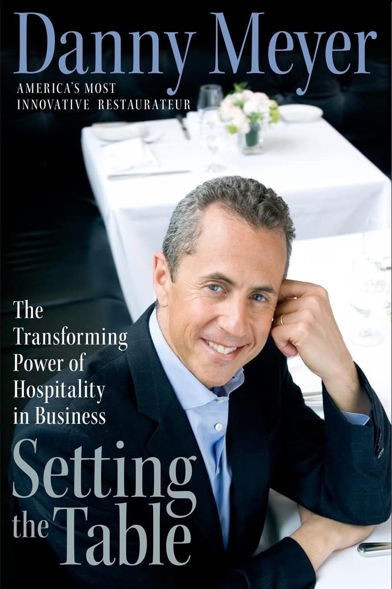
"Setting the Table", Danny Meyer
The definitive text on hospitality from the founder of Union Square Hospitality Group and Shake Shack — essential context for understanding why the best restaurant sites treat every digital interaction as an extension of in-person service.
"Kitchen Confidential", Anthony Bourdain
Bourdain's inside view of restaurant operations clarifies why so many restaurant sites fail commercially: they're built by people who don't understand the business. The best restaurant design partners internalize operator reality.
"The Food Lab", J. Kenji López-Alt
Kenji's methodical approach to cooking maps directly to design methodology — test-driven, evidence-based, willing to challenge received wisdom. Required reading for any team building for operators who think scientifically about their craft.
Restaurant sites fail more reliably than any other commerce category — because chefs hire developers for cheap templates while competitors are commissioning custom typography and hiring COLLINS. The gap between benchmark and template in restaurants is now wider than in any other vertical.