Ten companies that spent millions on rebranding and made things worse. What went wrong, what it cost them, and the specific mistakes you can avoid. Real numbers, real consequences.
Key takeaways 👌
The most expensive rebranding mistake isn't bad design — it's ignoring existing brand equity. Tropicana, Gap, and Yahoo all had strong brand recognition before their rebrands. They threw it away for something "fresh" and spent months recovering what they already had.
Rebrands fail in three predictable ways: no customer research before launch, changing too much too fast (breaking recognition), or solving a design problem instead of a business problem. Every case in this article fits one of these three patterns.
The companies that recovered fastest all did the same thing: they listened to customer backlash within days, reversed course quickly, and framed the reversal as "we heard you." Speed of response matters more than getting it right the first time.
Introduction
Rebranding is one of the highest-stakes decisions a company can make. When it works, it signals evolution — a company that's grown beyond its original identity and needs the brand to catch up. When it fails, it destroys recognition, alienates loyal customers, and burns millions in the process.
The difference between success and failure is rarely the quality of the design. It's the quality of the decisions that came before design: Was there research? Did the rebrand solve a real business problem? Did anyone ask customers what they thought before spending $200 million on a new logo?
These ten companies didn't ask. Here's what happened, what it cost them, and the specific lesson each failure teaches about what NOT to do when rebranding your business.

Before any rebrand, you need a strategy that prevents these failures. Our complete guide covers what rebranding is, when it's needed, and how to do it right — Rebranding: What It Is, When It's Needed and How to Do It
1. Tropicana — The $35 Million Packaging Disaster (2009)
What they changed: Replaced the iconic orange-with-a-straw imagery with a minimalist design featuring a glass of orange juice. Removed the distinctive visual that customers used to identify the product on shelves.
What happened: Sales dropped 20% in two months — a $35 million loss. Customers literally couldn't find the product on grocery shelves. The new packaging looked generic, indistinguishable from store brands.
Why it failed: Tropicana ignored the most basic principle of consumer packaged goods: shelf recognition. The orange-with-a-straw wasn't just a logo — it was how millions of customers identified the product in a 3-second grocery aisle scan. The redesign optimized for aesthetics in a context where recognition is everything.
The reversal: Tropicana reverted to the original packaging within two months. PepsiCo (parent company) absorbed the loss.
Lesson: Don't redesign the element that customers use to find you. Before changing any visual asset, ask: "How do people recognize us in the wild?" Then don't touch that thing.

2. Gap — The Logo That Lasted 6 Days (2010)
What they changed: Replaced the classic blue box logo — in use for 20+ years — with a new design: "Gap" in Helvetica with a small blue gradient square behind the "p."
What happened: Immediate, massive backlash on social media. Parody logos flooded Twitter. A "Make Your Own Gap Logo" website went viral. Within 6 days, Gap reverted to the original.
Why it failed: The old logo had 20 years of brand equity. Customers had an emotional connection to it — it represented their relationship with the brand. The new logo looked like a first draft from a free logo generator. No story, no meaning, no connection.
The reversal: Marka Hansen, president of Gap North America, posted: "We've heard loud and clear that you don't like the new logo." Back to the original in under a week.
Lesson: Brand equity isn't just recognition — it's emotional attachment. If your customers have a relationship with your visual identity, changing it without involving them is like redecorating someone's home without asking. They notice. They care. They're angry.
Your brand isn't what you say it is. It's what they say it is. And if they're saying your rebrand is terrible — they're right, regardless of how many design awards it might win.
— Marty Neumeier, Author, The Brand Gap
3. Yahoo — $1 Billion Acquisition, Zero Brand Strategy (2013)
What they changed: CEO Marissa Mayer launched "30 Days of Change" — revealing a different Yahoo logo variation every day for a month, then unveiling the final version on day 30. The new logo was designed over a weekend by Mayer herself.
What happened: The "30 Days" campaign generated buzz but also confusion. The final logo was widely criticized as amateurish. More importantly, the rebrand addressed none of Yahoo's actual problems: declining relevance, product confusion, and talent exodus.
Why it failed: Yahoo had a positioning problem, not a logo problem. Users weren't leaving because the logo was dated — they were leaving because Google, Facebook, and mobile apps did everything Yahoo did, better. A new logo on a sinking ship is still a sinking ship.
The cost: Yahoo was eventually sold to Verizon for $4.5 billion — a fraction of its $125 billion peak valuation. The rebrand didn't cause the decline, but it wasted leadership attention on cosmetics when the business needed surgery.
Lesson: A rebrand cannot fix a product problem. If customers are leaving because your offering is outdated, a new logo accelerates the perception of desperation. Fix the product first, then update the brand to match the improved reality.
4. RadioShack → "The Shack" — Embarrassment by Abbreviation (2009)
What they changed: Rebranded as "The Shack" to appeal to younger consumers who (supposedly) found "RadioShack" outdated. Launched a massive advertising campaign around the new nickname.
What happened: The name change was universally mocked. "The Shack" sounded like a dive bar, not a technology retailer. Existing customers were confused. New customers weren't attracted. The company filed for bankruptcy in 2015 and again in 2017.
Why it failed: RadioShack's problem wasn't its name — it was its business model. Consumer electronics had moved to Best Buy and Amazon. No name change could fix a store full of overpriced cables and phone accessories. The rebrand was a band-aid on a business model crisis.
Lesson: Rebranding to seem "cool" or "modern" without changing the underlying experience creates a gap between promise and reality. Customers notice when the new brand promises something the product doesn't deliver.

Before you rebrand, ask one question: "If we changed nothing about our visual identity but fixed our actual business problem, would customers care about the logo?" If the answer is no — you don't need a rebrand. You need a better product.
5. Kraft → Kraft Foods Group — The Logo Nobody Asked For (2009)
What they changed: Replaced the recognizable red Kraft logo with a new design featuring a lowercase "kraft" in multicolor, with a "smile" flourish and the tagline "make today delicious."
What happened: The new logo was criticized as looking like a low-budget food blog, not a $50 billion company. It lacked the authority and recognition of the original. After just six months, Kraft quietly reverted to a modified version of the classic design.
Why it failed: The redesign tried to make Kraft "friendly" and "approachable" — qualities the brand already had through 100+ years of being in every American kitchen. The new logo didn't add friendliness — it subtracted credibility.
Lesson: Heritage brands don't need to look trendy. They need to look trustworthy. A 100-year-old food company should lean into its authority, not try to look like a startup.
6. Pepsi — The $1 Million Logo That Says Nothing (2008)
What they changed: Hired Arnell Group for $1 million to redesign the Pepsi logo. The agency produced a 27-page document comparing the new logo to the Mona Lisa, the Parthenon, and the Earth's magnetic field. The actual change: the white stripe in the circle was slightly tilted to create a "smile."
What happened: The document leaked and became a legendary example of design agency absurdity. The logo change itself was so subtle most consumers didn't notice. Pepsi's market share continued to trail Coca-Cola.
Why it failed: $1 million for a barely perceptible change, justified by pseudoscientific nonsense. The rebrand didn't address Pepsi's actual challenge (competing with Coke) and became a punchline about overpriced design agencies.
Lesson: The size of the design fee doesn't correlate with the quality of the outcome. A rebrand should be judged by business impact, not by the weight of the strategy document.
Interesting fact 👀
Brand Finance's Global 500 research highlights the significant financial impact that brand decisions can have at scale. Failed or poorly executed rebranding efforts can lead to substantial value loss, particularly when they are not grounded in customer insight. This reinforces that rebranding is not just a strategic decision, but a research-driven process.
7. Mastercard → "Priceless" Identity Crisis (2006)
What they changed: Attempted to modernize by adding intersecting circles to the iconic overlapping red and yellow circles, plus dropping "Mastercard" from the logo entirely in certain applications.
What happened: Consumers and merchants didn't recognize the stripped-down symbol. At point-of-sale, confusion about which cards were accepted increased. The company eventually returned to including the name.
Why it failed: The Mastercard overlapping circles are one of the most recognized symbols in finance. But recognition requires context — when you remove the word "Mastercard" from next to the circles, the symbol alone isn't enough for real-world use cases.
Lesson: Logo simplification works when the brand is ubiquitous enough (Apple, Nike). For most companies, removing the name from the logo reduces recognition in contexts where people need to identify you quickly.
Note: Mastercard successfully dropped the name in 2019 after a multi-year transition campaign. Timing and preparation matter — the 2006 attempt was premature.
8. Uber — From Friendly to Corporate (2018)
What they changed: Replaced the recognizable "U" icon with a new wordmark and abstract geometric pattern. The new brand was described as "bits and atoms" — a concept that required explanation.
What happened: Users complained they couldn't find the app on their phone. The new icon didn't look like a transportation app — it looked like a fintech company. Driver confusion increased. Uber eventually simplified further to a basic black-and-white wordmark.
Why it failed: The CEO at the time (Travis Kalanick) reportedly designed the concept himself. The rebrand prioritized Kalanick's vision of Uber as a "technology company" rather than what users actually needed: an instantly recognizable icon that means "get a ride."
Lesson: Your brand should reflect what customers need from you, not what executives want to be. Users don't care about your "bits and atoms" philosophy. They care about finding your app when they need a ride at 2 AM.
When the CEO says "I have a vision for our new brand" and the design team has to pretend a tilted circle represents the gravitational pull of human connection and the dynamic energy of forward momentum. The strategy deck is 47 pages. The logo looks exactly the same but slightly rotated. The invoice is $1.2 million.
9. Snapchat — The Redesign That Lost $1.3 Billion (2018)
What they changed: Merged the friends page with the discover page and reorganized the entire app layout. Not a visual rebrand but a fundamental UX rebrand that changed how 180 million users interacted with the product daily.
What happened: A Change.org petition to reverse the redesign gathered 1.2 million signatures. Kylie Jenner tweeted "does anyone else not open Snapchat anymore?" — Snap's stock dropped 6% ($1.3 billion in market cap) in a single day. Daily active users declined for the first time.
Why it failed: Snapchat changed the behavioral patterns 180 million users had built over years. The redesign prioritized advertiser-friendly content placement over user habits. Users didn't want a "better" layout — they wanted the layout they'd spent years learning.
Lesson: User habits are brand equity. When your product IS the brand experience, changing the experience is a rebrand — even if you don't touch the logo. The cost of disrupting learned behavior is enormous.
10. Twitter → X — The Ongoing Experiment (2023)
What they changed: Elon Musk replaced one of the most recognized brand names and logos in technology history — the blue bird — with a black "X." The name Twitter was eliminated. The bird was gone.
What happened: Widespread confusion, parody, and criticism. Brand value dropped an estimated 80% according to multiple analysts. Advertisers pulled spending. "Twitter" remains the common name in conversation years later — the rebrand hasn't taken hold in public consciousness.
Why it failed (so far): The Twitter brand had 17 years of cultural embedding. "Tweet," "retweet," "Twitter thread" — the brand had become a verb and a cultural reference point. Replacing it with a single letter eliminated all of that accumulated meaning. The "X" doesn't carry the social, conversational associations that "Twitter" did.
Lesson: When your brand has become part of the cultural vocabulary — when people use your name as a verb — changing it is fighting against language itself. The stronger your brand's cultural embedding, the higher the cost of replacing it.
Want to discuss your project?
Share your vision with us, and we'll reach out soon to explore the details and bring your idea to life.

Conclusion
Every rebrand failure in this list shares the same DNA: someone decided to change the brand without understanding what the brand meant to the people who used it.
Tropicana didn't understand that the orange-with-a-straw was a shelf navigation tool. Gap didn't understand that 20 years of emotional attachment can't be replaced in a day. Yahoo didn't understand that a logo can't fix a product problem. Snapchat didn't understand that user habits are brand equity.
The pattern is consistent: the companies that failed treated branding as a design exercise. The companies that succeeded (or recovered) treated it as a business decision informed by customer research.
Before you rebrand, answer three questions:
What does our current brand mean to our customers? (Research, not assumption)
What business problem are we solving by rebranding? (If the answer is "the logo looks old" — that's a refresh, not a rebrand)
What are we willing to lose? (Every rebrand trades existing recognition for potential future equity)
If you can't answer all three with data, you're not ready to rebrand. You're ready to do research.
Recommended reading 🤓
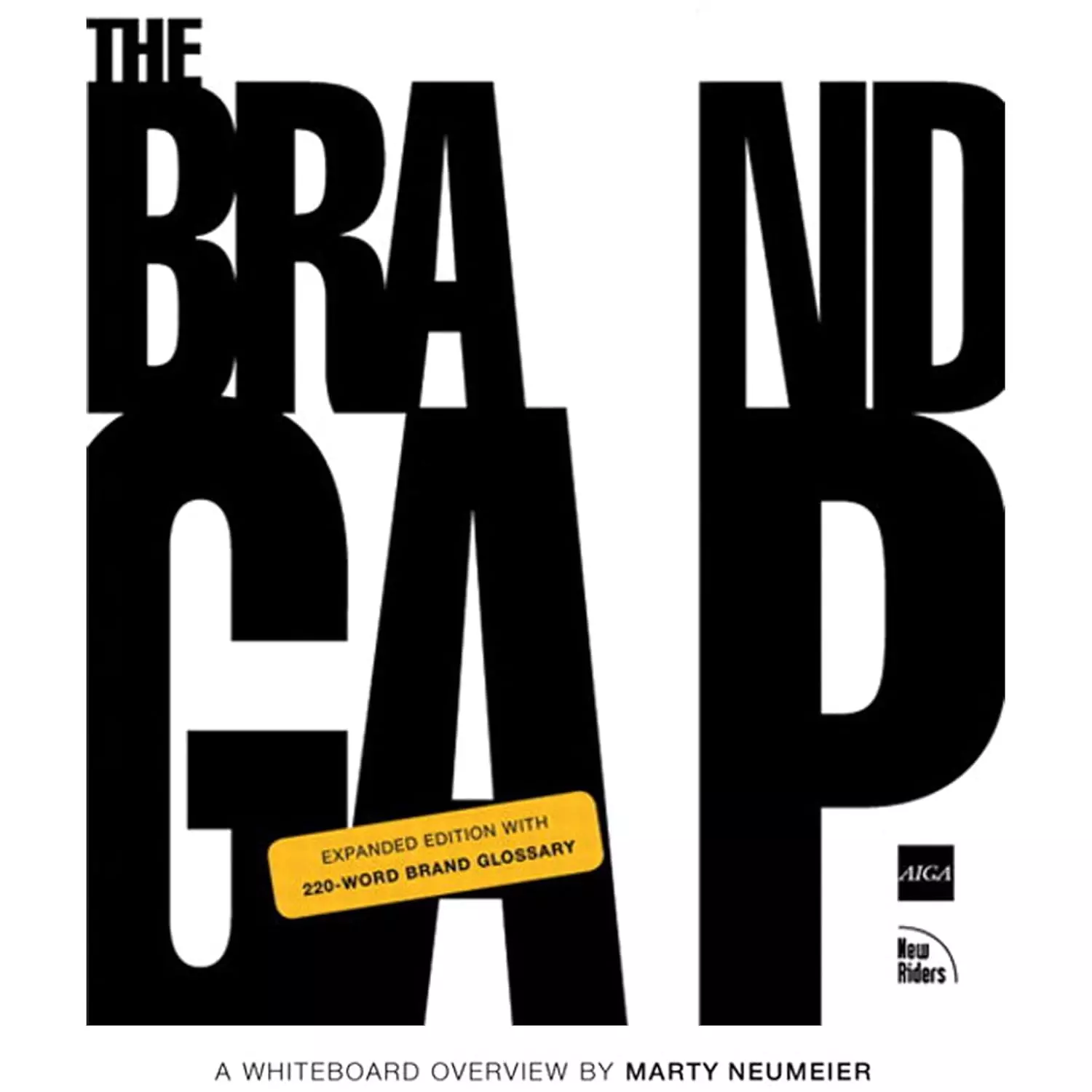
"The Brand Gap", Marty Neumeier
The foundational book on why brands fail when strategy and design aren't aligned. Every case in this article illustrates the gap Neumeier describes.
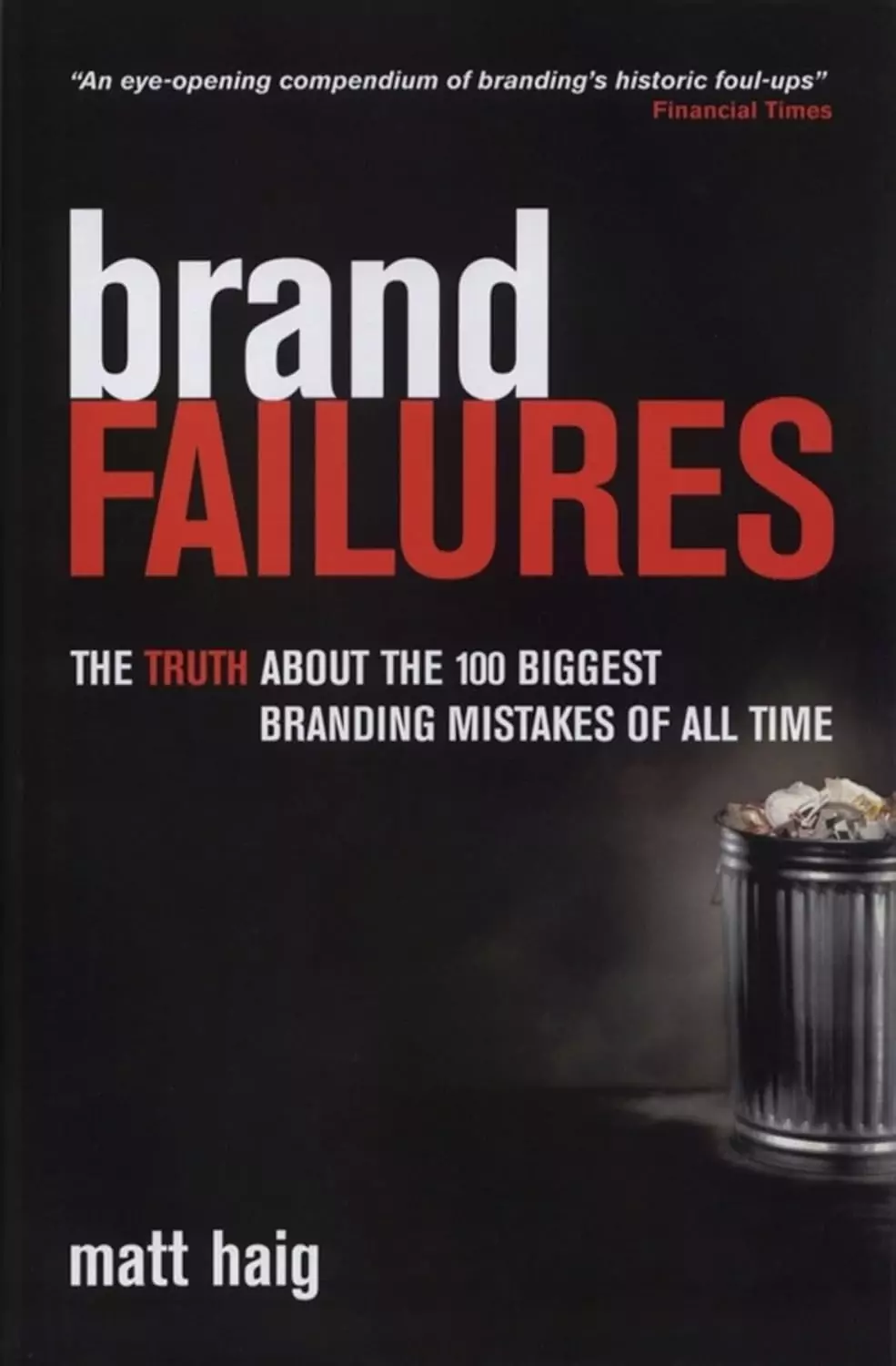
"Brand Failures", Matt Haig
200+ branding disasters analyzed — from New Coke to Google+. The most comprehensive collection of what not to do, with patterns that repeat across decades and industries.
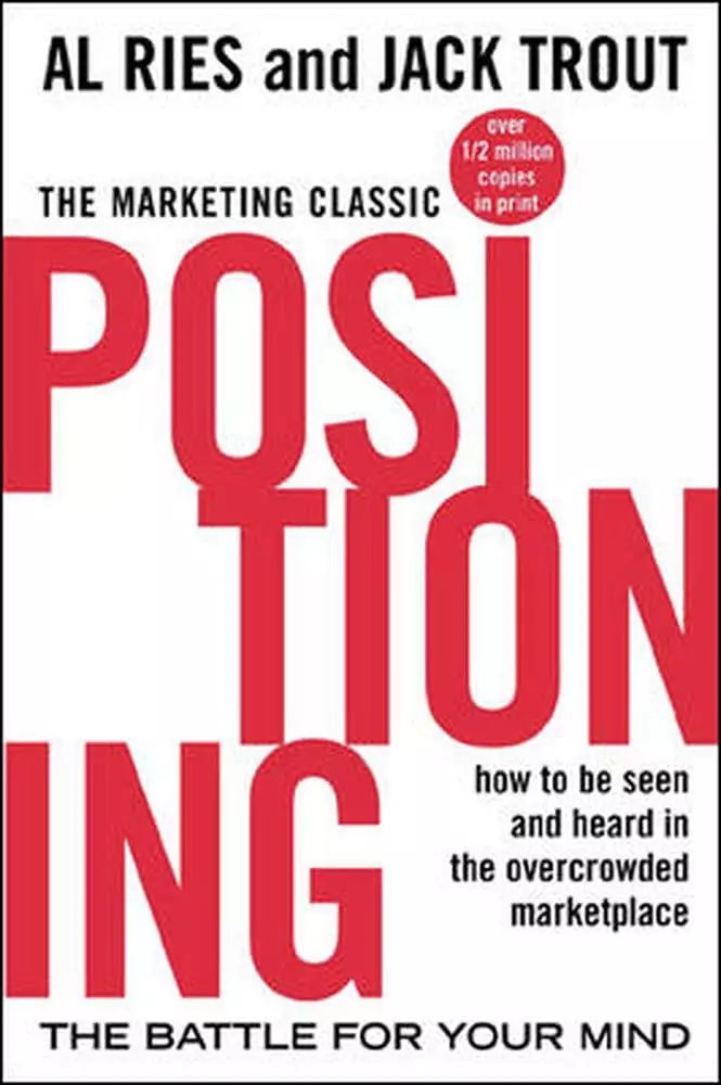
"Positioning: The Battle for Your Mind", Al Ries & Jack Trout
The original book on brand positioning. Most rebranding failures in this article stem from ignoring the principles Ries and Trout defined in 1981 — still relevant 45 years later.
Every rebrand that fails has the same root cause: someone skipped the research. They assumed they knew what customers wanted, redesigned everything based on internal preferences, and launched to silence — or outrage. The logos in this article cost a combined $1.5 billion in lost revenue.