Landing pages in 2026 are no longer "pretty one-pagers." They are fast, focused systems that guide a user toward a single decision without distractions. And it's the architecture — not effects — that decides whether the page converts.
Key Takeaways 👌
Structure beats effects: Landing pages convert thanks to the right block sequence and a predictable user journey — not animations
Clarity = conversion: Users respond to predictability. The fewer mental steps needed to understand the offer, the higher the results
Trust amplifies everything: Social proof, transparent offers, and a clear connection to the main website outperform any visual trick
Introduction
By 2026, landing pages stopped acting like "visual business cards." They evolved into tight, focused systems — fast, honest, and built around one action.
And here's the most interesting part: the more complex our tools become, the simpler the success formula turns out to be. Conversion still comes from very human things — structure, logic, rhythm, clarity, trust.
High-converting landing pages are built on clear brand strategy — consistent messaging, trust signals, and visual identity.
At Toimi, we see this daily — in small projects and in major redesigns: conversion grows where the user path is transparent, the blocks are structured honestly, and the page never forces people to "figure it out."
That's what this article is about — what actually works in 2026, and why a "proper landing page" is never built on magic.
It's built on architecture.
Why Landing Pages Matter More Than People Think
After the wave of "innovative" design, the market snapped back to simplicity.
It became obvious:
- users are tired of complex interfaces,
- nobody wants to decode vague messaging,
- decisions are made fast — almost intuitively.
A landing page is not a journey through sections.
It's a narrow corridor with a single route:
Explain the value → remove doubts → drive action.
When analyzing user flows for our article Website Design: Key Elements and Business Impact, one insight stood out: visuals may attract, but logic and rhythm convert.
This is why structure — not effects — became the main growth driver in 2026.
The First Screen: The Place Where Everything Happens
The first screen has always been decisive — not a trend, but basic attention psychology.
In a few seconds, the user must understand:
- where they are,
- why they should stay,
- what happens next.
If these answers aren't instantly clear, the page gets closed — not because the landing is "bad," but because the brain saves energy.
Which means the first screen is not about metaphors. It's a tool.
It must contain the most precise message: what you do, who it's for, and what the next step is.
We tested many variations — clarity always won.
If people understand the meaning within seconds, they stay.
If not — no animation will save it.

There is nothing harder than simplicity. The weakest landing pages are the ones trying to impress instead of guide. And the strongest? The ones that never make you think about how to use them. When the logic is honest, decisions happen instantly.
The Trust Structure: A Block You Can't Skip
Right after the first screen, high-performing landing pages almost always include a block that does one critical thing — reduces fear. Not "shows benefits," but answers the user's internal doubts:
"Does this actually work?", "Can I trust you?", "Do you understand my problem?".
People rarely leave because they're uninterested.
That's why verifiable elements work so strongly:
- real cases,
- short quotes,
- numbers,
- client logos,
- micro-stories "before → after."
We saw this even more clearly while preparing Complete website development roadmap.
Transparency itself increases trust — people understand what to expect.
Landing pages sit in the $5K–$15K tier of web development — template-based or custom depending on conversion requirements.
"Don't make me think" is not a metaphor. Every extra question a user asks themselves is a minus to conversion.
— Steve Krug, UX consultant and author of one of the most influential UX books
Landing page design follows the same UX/UI principles as full product design — research, structure, visual hierarchy, testing.
A Structure That Pulls You Down — Not Sideways
All strong landing pages share one thing: rhythm.
The page guides the user downward almost like taking them by the hand:
- meaningful block →
- proof →
- small visual pause →
- next step.
And people travel from the hero section to the CTA without resistance, fatigue, or overload.
The same principle applies to full websites: the clearer the structure, the faster trust is formed.
Why Mobile Landing Pages Became the Main Product
In 2026, mobile traffic is nearly total.
Responsiveness stopped being "part of the job" — it became the starting point.
A proper landing page is designed first for mobile, where the user has one screen and a few seconds to understand the message.
This changes everything:
- texts shorter,
- blocks simpler,
- spacing larger,
- CTAs more visible.
Mobile development is not a "light version" of desktop.
It's the version most people actually see.
Interesting fact 👀
A Nielsen Norman Group study shows: if a user doesn't understand the page's meaning within 10 seconds, the chance of conversion nearly halves.
But the opposite also holds true: when meaning is clear instantly, users spend 2–3× more time on the page — not because they're "interested," but because their brain stops working overtime.
The hero block is not about wow-effects.
It's about clarity, speed, and focus.
Landing Page SEO: The Power Is in Structure, Not Keywords
SEO for landing pages rarely works the way people expect. It's not about ranking for competitive keywords — and definitely not about stuffing long keys into short sections.
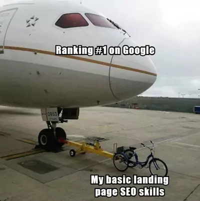
For landing pages, SEO = architecture.
It's about integrating the page into the website's larger system so it supports the core pages instead of living independently.
In 2026, the strongest landing pages rely not on keywords, but on internal connections. When a landing page links upward — to Website Development as a core service — and sideways to Landing Page Development, it stops being a standalone piece and starts strengthening the entire website.
This is not an SEO trick. It's logic and trust: search engines understand the site better, and users know where to go next.
A landing page becomes a node, not an isolated entry point.
That is its real SEO power.
Mistakes That Kill Conversion
…and unchanged in 2026.
Human perception doesn't evolve quickly.
We keep seeing the same issues:
- trying to impress instead of explaining,
- long unstructured texts,
- intimidating CTAs,
- missing trust block,
- excessive animation,
- no logical link to the main website.
All simple, all well-known, and all still costing businesses dozens of leads a day.

Explore how UX trends shape user behavior and conversion in our article UX Design Trends 2026: Enhancing User Experience.
Main Conclusion: Clarity Wins
In 2026, landing pages succeed not through technology, but through structure, sequence, and human logic.
People don't want to figure things out. They want to understand.
A landing page works when it guides a person:
meaning → trust → action.
Conclusion
In 2026, strong landing pages win not with effects,
but with honest architecture.
With how fast a person understands where they are.
With how naturally the journey flows from the first screen to action.
A great landing page is not magic.
It's structure, rhythm, and transparency — assembled into a compact yet powerful product.
Recommended Reading 🤓
"Don't Make Me Think," Steve Krug
A UX classic explaining why simplicity and predictability always win. Perfect for understanding how people actually read pages and make decisions.
"Landing Page Optimization," Tim Ash
A deep guide on landing page structure, user psychology, and trust-building. Useful for both business owners and designers/producers.
"Made to Stick," Chip & Dan Heath
On how to craft ideas that "stick." Great for structuring hero block messaging and strengthening key messages.
Over the years, we've seen hundreds of landing pages — from startups to large enterprises. And the highest-converting ones were rarely the most spectacular. They were the clearest: structure straight, path obvious, value undeniable.