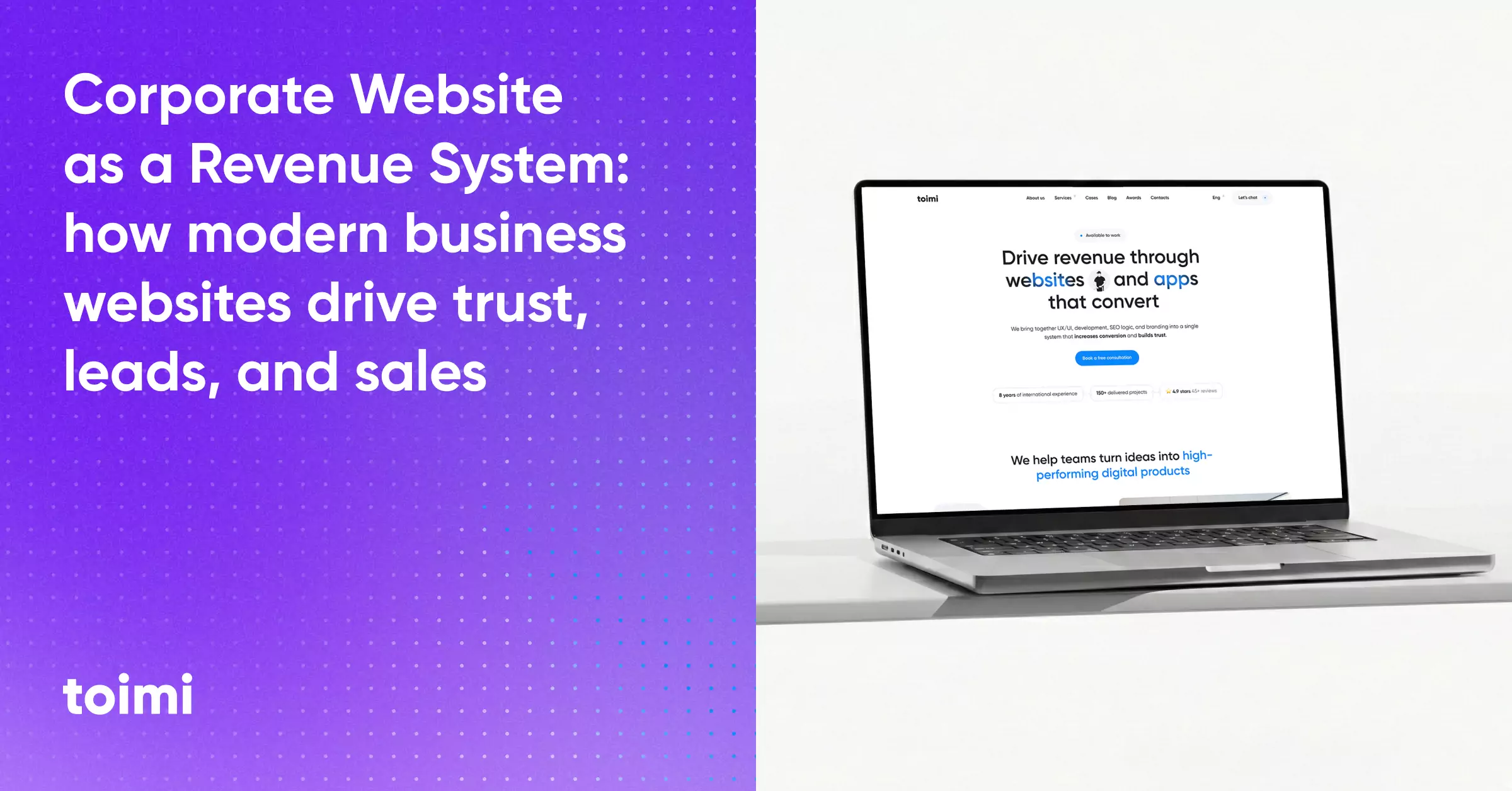
From the outside, a corporate website seems simple: a homepage, a services section, some case studies, a contact form. If everything is "there," the assumption is that the site is doing its job. In reality, most corporate websites function more like digital brochures than operational systems.
Key Takeaways 👌
A corporate website is not a brochure — it is part of the business system
Design, UX, structure, SEO, and performance all contribute to revenue indirectly — but measurably
Modern websites influence trust, qualification, and internal decision-making long before contact
Table of Contents
1. What a Corporate Website Really Is (Not a Brochure)
Why modern corporate websites function as operational systems that support real business decisions, not just static presentations.
2. Website Goals vs Business Goals
How misaligned goals turn websites into activity generators instead of tools that drive meaningful business outcomes.
3. How Corporate Websites Influence Decision-Making in B2B
How buyers actually use corporate websites to reduce risk, build trust, and navigate multi-stakeholder approval processes.
4. Information Architecture and Page Systems
How structure, hierarchy, and scalable page systems determine whether users can understand and navigate a website effortlessly.
5. Design as a Trust Mechanism
How visual and interaction design quietly signals credibility, maturity, and reliability long before users engage with content.
6. SEO-Ready Structure and Content
How corporate websites achieve visibility and relevance through clear structure, intent coverage, and decision-supportive content.
7. Performance, Security, and Scalability
Why speed, stability, and technical robustness act as trust signals and enable sustainable growth over time.
8. Redesign Triggers and Timing
How to recognize when a website needs a redesign, when it doesn't, and what happens when change is delayed too long.
9. Common Mistakes Companies Make
The recurring patterns that quietly undermine otherwise well-built corporate websites and limit their effectiveness.
10. Framework: How to Evaluate Your Current Corporate Website
A practical framework for assessing whether your website supports your business goals or works against them.
Introduction: From Presence to System
The way corporate websites are built has not kept pace with how they are used.
Buyers no longer arrive at a site looking to be convinced by slogans or visuals. They arrive with context, alternatives, and skepticism. They scan structure, language, and signals for answers to unspoken questions: this company credible? Do they understand my problem? Can I trust them with budget, reputation, or risk?
This makes the corporate website less of a presentation layer and more of a decision-support system. Its job is not to persuade aggressively, but to make the right decision feel safer, clearer, and easier to justify.
In this article, we'll break down how modern corporate websites actually work — when they work at all. We'll look at why most of them fail quietly, how structure and UX influence B2B decisions, when redesigns are necessary, and how to evaluate whether your current website supports or undermines your business goals.
We'll start by addressing the most common misconception of all: what a corporate website really is — and what it is not.
1. What a Corporate Website Really Is (Not a Brochure)
Most corporate websites fail long before design, development, or SEO decisions are made. They fail at the moment they are framed internally. When a website is treated as a brochure — a digital version of a presentation deck — every downstream decision becomes cosmetic by default. Structure, UX, content, and performance are optimized for appearance rather than function.
Corporate websites need a structured UX/UI design process — especially for complex stakeholder requirements.
Once a website is understood as an operational interface rather than a presentation layer, its implementation requirements change significantly. Corporate website development is not about assembling pages, but about translating business logic, credibility signals, and decision paths into a coherent system that can function under real evaluation pressure.
This framing error is so common that it often goes unnoticed. Teams assume the website's role is to "present the company," "explain services," or "look professional." These goals sound reasonable, but they are strategically incomplete. They describe how a website should look, not what it should do.
A brochure informs.
A corporate website participates.
A corporate website also plays a role in shaping how the business is perceived long before direct contact. Structure, tone, and clarity reinforce trust in the same way broader brand foundations do — not through slogans, but through consistency and intent across every interaction.
Understanding that difference is the foundation for everything that follows.
Why Most Corporate Websites Are Misframed From Day One
The misframing usually starts with ownership. Corporate websites are often initiated by marketing teams, approved by leadership, and executed by external vendors. In that chain, the website becomes a deliverable rather than a system. Success is measured by launch, visual quality, or alignment with brand guidelines — not by how effectively the site supports real business interactions.
Another source of misframing is timing. Websites are frequently redesigned during moments of change: rebranding, repositioning, expansion, or leadership shifts. Under pressure, teams focus on messaging and visuals because they are tangible and visible. Structural questions — how users navigate decisions, how trust is built, how intent is qualified — are postponed or skipped entirely.
The result is a site that looks updated but behaves exactly like its predecessor. Pages exist, content is polished, but the underlying logic remains static. The website communicates, but it does not operate.
Website as an Interface to the Business, Not a Marketing Asset
A modern corporate website functions as an interface between the business and external decision-makers. It translates internal complexity — services, processes, expertise, constraints — into something legible and trustworthy for people who are evaluating risk.
From a visitor's perspective, the website is often the first serious interaction with the company. Before any call, demo, or proposal, the site answers implicit questions:
Is this company credible?
Do they understand my context?
Are they experienced enough to handle complexity?
These questions are rarely answered explicitly. They are inferred through structure, clarity, language, and consistency. Navigation choices signal focus. Content hierarchy signals priorities. UX friction signals operational maturity.
When a website is treated purely as a marketing asset, it optimizes for persuasion. When it is treated as an interface, it optimizes for decision support. This shift changes everything from page structure to content depth to how success is measured.
From Static Presence to Operational System
A static website exists. An operational website works.
An operational corporate website:
- adapts to different user intents without confusion,
- supports multiple stages of decision-making,
- and remains coherent as the business grows.
This does not require complexity for its own sake. It requires intent. Pages are no longer isolated units; they are parts of a system. Content is not written once and forgotten; it is maintained as a business asset. UX decisions are not aesthetic preferences; they are behavioral signals.
When companies make this shift, the website stops being a background element and starts acting as infrastructure. It doesn't replace sales, marketing, or strategy — it connects them. And once a website plays that role, its limitations become visible quickly. Misalignment between business goals and website behavior can no longer be ignored.
That visibility is uncomfortable, but necessary. Because only after the website is understood as a system can it be designed to support what the business is actually trying to achieve.

2. Website Goals vs Business Goals
One of the most common reasons corporate websites underperform is not poor execution, but misaligned goals. Teams often agree that the website should "generate traffic" or "bring leads," but those are outcomes, not objectives. When treated as goals, they distort decision-making across UX, content, SEO, and design.
A website does not exist to maximize metrics in isolation. It exists to support how the business actually works: how it attracts demand, qualifies interest, reduces risk, and moves decisions forward. When website goals are disconnected from business goals, conversion doesn't fail loudly. It erodes quietly.
When business goals are clear, execution becomes a matter of alignment rather than guesswork. This is where web development stops being a technical task and becomes an extension of strategy — ensuring that structure, behavior, and performance reinforce the outcomes the business actually cares about.
Why "More Traffic" and "More Leads" Are Not Goals
Traffic and leads are measurements. They describe volume, not value.
"More traffic" does not specify who should arrive, why they should care, or what they should do next. In many B2B contexts, more traffic simply means more unqualified attention — people without authority, budget, or intent. Optimizing for volume alone often increases noise while masking declining relevance.
The same applies to "more leads." A lead is not a business outcome; it is an intermediate signal. Without context, lead growth can coexist with falling close rates, longer sales cycles, and increasing friction for sales teams. When a website is optimized to capture leads aggressively, it often does so at the expense of clarity and trust.
Business goals are directional. They define what kind of growth matters and under what constraints. Website goals should be derived from those priorities, not assumed as universal proxies for success.
Mapping Business Objectives to Website Behavior
A corporate website does not achieve business goals directly. It does so by shaping user behavior.
For example, if a business goal is to reduce sales cycle length, the website's role may be to provide deeper qualification content, clearer positioning, and stronger proof — even if that reduces raw lead volume. If the goal is to enter a new market, the website may need to emphasize credibility, context, and relevance over conversion speed.
This mapping requires translating abstract objectives into concrete behaviors:
- what users should understand before contacting sales,
- what uncertainty the site should reduce,
- what actions indicate meaningful intent rather than curiosity.
When this translation is missing, teams default to generic patterns: prominent CTAs, gated content, aggressive forms. These elements may increase measurable activity while actively undermining the business goal they were meant to support.
A well-aligned website makes the right actions easy and the wrong ones less likely.
How Misaligned Goals Quietly Kill Conversion
Misalignment rarely produces obvious failure. Instead, it creates friction that spreads across the system.
UX decisions start conflicting with content strategy. SEO attracts visitors the product is not positioned for. Sales teams receive leads that require requalification. Redesigns focus on aesthetics rather than outcomes. Over time, teams lose confidence in the website as a reliable channel.
The most damaging effect is erosion of trust — internally and externally. Externally, users sense inconsistency between what the site promises and what the business delivers. Internally, stakeholders stop believing the website can meaningfully support growth, treating it as a sunk cost rather than a strategic asset.
Conversion doesn't drop to zero. It stagnates. And because activity continues, the underlying problem remains unaddressed.
Aligning website goals with business goals is less about optimization and more about honesty. It forces teams to decide what the website is actually responsible for — and what it should deliberately avoid trying to do.
3. How Corporate Websites Influence Decision-Making in B2B
In B2B, corporate websites are rarely used to make final decisions.
They are used to make decisions possible.
This distinction matters. Most buying decisions in B2B involve multiple people, extended timelines, and internal justification. The website's role is not to persuade emotionally or close immediately, but to reduce uncertainty at every stage of the process. When it fails to do that, progress stalls — even if interest exists.
Supporting complex B2B decision-making requires more than clear messaging. UX/UI and Product Design plays a critical role in shaping how different stakeholders navigate information, assess risk, and build confidence independently — often without ever speaking to sales.
Understanding how buyers actually use corporate websites requires shifting perspective: from conversion mechanics to decision mechanics.
Users spend most of their time on other websites. This means that they prefer your site to work the same way as all the other sites they already know.
— Jakob Nielsen, Nielsen Norman Group
How Buyers Actually Use Corporate Websites
B2B buyers do not browse corporate websites casually. They arrive with context, intent, and often a specific internal task. Sometimes that task is exploratory. More often, it is evaluative.
A corporate website is commonly used to:
- validate that a company is legitimate and experienced,
- understand whether a solution fits a specific business context,
- gather material to share internally,
- and assess risk before committing time to direct contact.
Importantly, different visitors use the same website for different reasons. A technical stakeholder may scan architecture and capabilities. A decision-maker may focus on positioning, credibility, and proof. A procurement or legal stakeholder may look for signals of maturity, stability, and compliance.
The website must accommodate these parallel uses without fragmenting the experience.
Trust, Risk Reduction, and Internal Approval Cycles
Trust in B2B is rarely about liking a brand. It is about reducing the perceived risk of being wrong.
Every B2B purchase carries professional risk. Choosing the wrong vendor can cost budget, time, reputation, or internal credibility. Corporate websites participate in mitigating that risk by providing signals that help buyers justify their choice to others.
These signals include clarity of expertise, consistency of messaging, depth of explanation, and absence of ambiguity. Gaps, vague claims, or overly promotional language increase perceived risk — even when the underlying offering is strong.
Internal approval cycles amplify this effect. The website often becomes a reference point in conversations that happen without the vendor present. If the site cannot support those discussions — through clear explanations, structured content, and credible proof — momentum slows or dies.
UX for Multi-Stakeholder Decisions
Designing UX for B2B websites means designing for plurality, not a single user journey. Multiple stakeholders interact with the site independently, often at different times, and with different priorities.
The table below illustrates how different roles typically use a corporate website during the decision process:
Stakeholder |
Primary Question |
What They Look For on the Website |
Executive / Decision-maker |
"Is this a safe strategic choice?" |
Positioning, credibility, case studies |
Technical stakeholder |
"Will this work in our environment?" |
Architecture, integrations, depth |
Operational user |
"Will this fit our workflow?" |
UX clarity, use cases, examples |
Procurement / Legal |
"Is this a reliable vendor?" |
Company info, stability signals, clarity |
UX that prioritizes only one of these perspectives creates friction for the others. For example, a site optimized purely for executive messaging may frustrate technical evaluators. A deeply technical site without strategic framing may fail to convince decision-makers.
Effective corporate websites do not try to force everyone through the same path. They allow stakeholders to self-select depth, navigate laterally, and gather what they need without dead ends or confusion.
In this sense, UX is not about guiding users forward aggressively. It is about supporting parallel evaluation processes that converge later.
4. Information Architecture and Page Systems
Information architecture is where many corporate websites quietly succeed or fail. Not because users consciously analyze structure, but because structure determines whether meaning is easy to assemble or exhausting to reconstruct. Long before design or copy is evaluated, users encounter hierarchy: what appears first, what feels secondary, what is grouped together, and what is hidden.
As websites grow, coherence depends less on individual pages and more on site structure. Without deliberate hierarchy and relationships, even high-quality content becomes difficult to navigate — both for users and search engines.
When information architecture is weak, users feel lost even if everything they need technically exists. When it is strong, navigation feels obvious without being restrictive.
A bad system will beat a good person every time.
— Don Norman, The Design of Everyday Things
Structure Before Pages: How Users Navigate Meaning
Users do not experience websites as a collection of pages. They experience them as mental maps. Each interaction updates their understanding of what the company does, how it thinks, and whether it is relevant.
Turning abstract principles into something usable requires explicit structural decisions. Thinking deliberately about website structure helps teams avoid navigation sprawl and ensures that meaning remains clear as new pages and services are added.
Why Structure Precedes Content
Structure answers questions before words do. Navigation labels, grouping, and page hierarchy signal priorities instantly. Users infer meaning from placement: what is emphasized, what is optional, and what is foundational. If structure contradicts content, structure usually wins.
This is why designing pages in isolation is risky. A page can be well-written and visually strong, yet still feel confusing if its role in the overall system is unclear. Information architecture should define relationships first — pages then inherit meaning from those relationships.
How Users Actually Navigate Corporate Sites
Most users move laterally, not linearly. They jump between sections to validate assumptions, compare signals, and fill gaps in understanding. Rigid funnels and overly linear navigation often clash with this behavior, forcing users into paths that don't match their intent.
Good structure supports exploration without chaos. It allows users to move between overview and detail, between strategic and technical content, without losing context.
Core Pages vs Supporting Pages
Not all pages play the same role in a corporate website, even if they receive similar attention during design or development.
Core Pages: Anchors of Meaning
Core pages define the website's primary narrative. They usually include the homepage, main service pages, and key credibility pages such as case studies or company overviews. These pages carry disproportionate weight because they frame how everything else is interpreted.
Core pages should:
- establish positioning and scope,
- answer the most important user questions,
- and act as reference points for internal linking.
When core pages are vague or overloaded, supporting pages struggle to compensate.
Supporting Pages: Depth Without Noise
Supporting pages provide detail, clarification, and specialization. They serve users who need more information without overwhelming those who don't. Their job is not to repeat the core message, but to deepen it.
Problems arise when supporting pages are treated as equals to core pages. Navigation becomes crowded, hierarchy flattens, and users lose a sense of what matters most. A clear distinction between core and supporting pages keeps the system navigable as content grows.
Page Systems, Templates, and Scalability
As corporate websites evolve, scalability becomes less about adding pages and more about maintaining coherence.
Why Page Systems Matter
A page system defines how similar pages behave, not just how they look. It establishes consistent structure: what sections exist, how information is ordered, and what expectations users can carry from one page to another.
Without page systems, each new page becomes a bespoke solution. Over time, this creates inconsistency, increases maintenance cost, and weakens user trust.
Corporate websites typically fall in the $50K–$150K range — our web development cost breakdown explains what drives the price.
Templates as Behavioral Contracts
Templates are often misunderstood as design shortcuts. In reality, they are behavioral contracts. They promise users that certain types of information will appear in predictable places and follow familiar patterns.
Well-designed templates support:
- faster content creation,
- easier updates,
- and more consistent UX across teams and time.
Poorly designed templates, on the other hand, lock teams into rigid layouts that resist evolution. Scalability requires templates that are structured, not frozen.
Scaling Without Losing Clarity
The challenge is not growth itself, but unmanaged growth. As new services, markets, or offerings appear, information architecture must adapt without collapsing into sprawl.
Scalable corporate websites evolve their structure deliberately. They revisit hierarchy, retire outdated pages, and adjust page systems as the business changes. This ongoing architectural maintenance is rarely visible — but when it's absent, users feel the result immediately.
5. Design as a Trust Mechanism
In corporate websites, design is rarely neutral. Every visual decision sends a signal — intentionally or not — about how the business operates. Visitors may not consciously analyze typography, spacing, or layout consistency, but they do form judgments based on them. Those judgments often precede any rational evaluation of services or expertise.
In corporate contexts, trust rarely comes from novelty. Custom design is most effective when it reflects the company's actual maturity and focus, rather than chasing trends. When design decisions are grounded in structure and intent, they reinforce credibility instead of distracting from it.
In B2B especially, design does not need to impress. It needs reassurance. Its primary function is not expression, but credibility.
Visual Design as a Signal, Not Decoration
Visual design on a corporate website is often approached as decoration: a layer added to make the site "look professional" or "feel modern." This framing misses the point. Design works as a signaling system.
Clarity of layout signals clarity of thinking.
Restraint signals confidence.
Consistency signals operational maturity.
Conversely, overly expressive visuals, excessive animation, or stylistic experimentation often introduce doubt rather than interest. Visitors start asking unspoken questions: Is this company focused on substance or presentation? Will the same care be applied to delivery, or only to marketing?
Effective corporate design is rarely loud. It prioritizes legibility, hierarchy, and calm over novelty. It does not compete with content; it supports it.
Consistency, Clarity, and Perceived Credibility
Trust on a website is built through repetition and predictability. When similar elements behave differently across pages, users subconsciously register friction. When layouts shift without reason, confidence drops. These effects are subtle, but cumulative.
Consistency does not mean uniformity. It means that patterns are intentional and learnable. Users should not have to relearn navigation, content structure, or interaction logic as they move through the site. Each familiar element reduces cognitive load and reinforces a sense of stability.
Clarity plays a similar role. Clear headings, readable typography, and disciplined spacing help users focus on meaning rather than mechanics. When content is easy to scan and understand, it reflects positively on the organization behind it. Ambiguity, by contrast, often feels like risk.
Perceived credibility is rarely the result of a single design choice. It emerges from the absence of distractions, contradictions, and unnecessary complexity.
Common Design Choices That Reduce Trust
Many trust-eroding design choices are made with good intentions. They aim to modernize, differentiate, or impress — but end up undermining confidence instead.
Common examples include:
- overly abstract visuals that obscure meaning,
- excessive animations that slow interaction,
- inconsistent component behavior across pages,
- stock imagery that feels generic or disconnected from reality,
- and aggressive emphasis on slogans instead of substance.
Another frequent issue is prioritizing brand expression over usability. While brand is important, corporate websites exist to support understanding and decision-making. When users struggle to find information or interpret content, brand expression becomes a liability rather than an asset.
Good design does not draw attention to itself. It creates a quiet sense that the business is thoughtful, capable, and reliable. In B2B contexts, that sense of reliability often matters more than originality.
6. SEO-Ready Structure and Content
SEO for corporate websites is often misunderstood because it is approached with the wrong mental model. Many companies treat SEO as something that belongs to blogs, landing pages, or marketing campaigns. Corporate websites, by contrast, are expected to "rank naturally" through authority alone. In practice, this assumption leads to missed opportunities and structural blind spots.
A corporate website does not need to chase keywords aggressively. But it does need to be understandable to search engines in the same way it must be understandable to users. Structure, hierarchy, and clarity matter more than volume.
For corporate websites, SEO is less about visibility in isolation and more about legibility at scale. When structure and content clearly communicate scope and intent, search engines reinforce — rather than distort — how the business is understood.
SEO for Corporate Websites (Not Blogs or Landing Pages)
Corporate websites serve a different search intent than blogs or performance-driven landing pages. Visitors are rarely looking for a single answer or offer. They are evaluating a company, its scope, and its relevance to a specific problem.
This means SEO for corporate websites focuses less on individual pages and more on contextual authority. Search engines need to understand:
- what the company does at a high level,
- which problems it specializes in,
- and how different services relate to one another.
Over-optimizing corporate pages with keyword-heavy copy often backfires. It reduces clarity for users and introduces noise into what should be a confident, focused narrative. The goal is not to rank for everything, but to be clearly relevant for the right things.
When SEO aligns with positioning, pages read naturally while still covering meaningful intent.
Page Hierarchy, Internal Linking, and Intent Coverage
Structure is the backbone of SEO for corporate websites. Page hierarchy tells search engines which topics are foundational and which ones are supportive. Internal linking reinforces that hierarchy by showing how concepts connect.
A well-structured corporate site:
- uses top-level pages to define core services and expertise,
- supports them with deeper, more specific pages,
- and links between them in a way that mirrors real decision paths.
Internal links are not just technical signals. They shape how users explore the site and how authority flows across pages. When links are intentional, they guide both people and search engines toward what matters most.
Intent coverage matters more than keyword coverage. Instead of creating dozens of thin pages, strong corporate websites address key questions directly: what the company does, who it is for, how it works, and why it is credible. When those questions are answered clearly, SEO performance tends to follow.
Content That Supports Discovery and Decisions
Content on corporate websites has two jobs. First, it supports discovery by helping the right people find the site. Second, it supports decisions by helping those people understand whether the company is a good fit.
This dual role changes how content should be written. Informational depth matters, but so does restraint. Content should explain without overwhelming, clarify without overselling, and provide evidence without noise.
Effective corporate content often includes:
- clear explanations of services and processes,
- concrete examples or case references,
- language that reflects real client concerns,
- and signals of experience rather than promises.
When content is written primarily for SEO, it tends to drift into abstraction. When it is written only for internal stakeholders, it becomes insular. The balance lies in writing for informed outsiders — people who are capable of making decisions, but still need clarity to do so confidently.
An SEO-ready corporate website does not feel optimized. It feels coherent. And coherence is what allows both users and search engines to trust what they are seeing.
7. Performance, Security, and Scalability
For corporate websites, technical quality is rarely evaluated consciously — but it is felt immediately. Speed, stability, and security shape trust long before users read a single sentence of content. When these fundamentals fail, even strong positioning and design struggle to compensate.
Performance, security, and scalability are often treated as engineering concerns. In reality, they are business signals. They communicate how reliable the company is likely to be once a relationship moves beyond the website.
We see our customers as invited guests to a party, and we are the hosts. It's our job every day to make every important aspect of the customer experience a little bit better.
— Jeff Bezos, Founder of Amazon
Speed as a Trust and Conversion Factor
Speed is one of the fastest ways a corporate website communicates competence — or the lack of it. A slow site does not just frustrate users; it introduces doubt. Visitors begin questioning whether delays are accidental or symptomatic of deeper operational issues.
In B2B contexts, speed affects more than bounce rates. It influences how confidently a site can be shared internally, how seriously it is taken during evaluation, and whether it feels safe to rely on as a reference point. A site that loads inconsistently or feels sluggish subtly undermines credibility, even when the offering itself is strong.
Speed also interacts with conversion indirectly. Users who experience friction early tend to explore less deeply, skip supporting content, and disengage sooner. The loss is not always visible as a sharp drop — it often appears as stalled momentum.
Security Expectations for Corporate Sites
Security on corporate websites is rarely praised when it works — but immediately noticed when it doesn't. Missing HTTPS, outdated dependencies, broken forms, or browser warnings all signal neglect. For B2B buyers, these signals matter because they imply risk.
Corporate websites are often used as proxies for how a company treats data, systems, and responsibility. If the public-facing site feels poorly maintained, visitors may reasonably question how internal systems are handled.
Security expectations have also evolved. What was once "advanced" is now baseline. Secure connections, form protection, and predictable behavior are assumed, not admired. Falling below that baseline does not just look outdated — it looks careless.
Security is rarely noticed when it works — but instantly questioned when it doesn't. Even basic website security practices play a role in how seriously a corporate site is taken during evaluation, especially when trust and risk are already top of mind.
Why Scalability Matters Even for "Simple" Websites
Many corporate websites are described as simple: a handful of pages, limited interactivity, no user accounts. This description often leads teams to deprioritize scalability. That is a mistake.
Scalability is not only about traffic spikes or complex features. It is about change. As businesses evolve, websites accumulate new services, markets, content types, integrations, and stakeholders. Without scalable foundations, each addition increases friction.
The table below illustrates how "simple" websites tend to grow — and where problems emerge when scalability is ignored:
Initial State |
What Changes Over Time |
Result Without Scalability |
Few pages |
New services and industries |
Bloated navigation |
Static content |
Frequent updates |
Inconsistent structure |
Single audience |
Multiple stakeholders |
Conflicting priorities |
Basic tech stack |
New tools and integrations |
Fragile performance |
Performance degradation is rarely dramatic — it accumulates quietly. Continuous site optimization helps maintain speed, stability, and trust over time, preventing small technical compromises from turning into systemic friction.
Scalable websites anticipate this growth. They use flexible page systems, predictable structure, and maintainable technology choices. This does not require overengineering — it requires acknowledging that stability today does not guarantee stability tomorrow.
Performance, security, and scalability rarely drive excitement. But they quietly determine whether a corporate website can support growth instead of resisting it. When these foundations are solid, the site remains trustworthy under pressure. When they are not, every change becomes riskier than it needs to be.
8. Redesign Triggers and Timing
Redesigns are one of the most emotionally charged decisions in corporate website development. They are visible, expensive, and symbolic. Internally, they often represent "progress." Externally, they are expected to signal growth, maturity, or change. Because of this, redesigns are frequently initiated for the wrong reasons — and delayed for the wrong ones.
Part of the confusion around redesigns comes from the term itself. Teams often use redesign to describe anything from visual updates to full structural overhauls, which leads to mismatched expectations and unnecessary disruption when the scope is never clearly defined.
Not every website problem requires starting from scratch, but some structural misalignments cannot be resolved incrementally. In these cases, a redesign becomes a strategic intervention — not to refresh visuals, but to realign structure, positioning, and decision flows with how the business actually operates today.
The hardest part about redesigning a corporate website is not execution. It is timing. Redesigning too early wastes momentum. Redesigning too late compounds structural debt. In both cases, the website becomes a liability rather than an asset.
Understanding when redesign is necessary — and when it is not — requires separating surface discomfort from structural failure.
The most dangerous phrase in the language is: 'We've always done it this way.'
— Grace Hopper, computer scientist
When Redesign Is Necessary — and When It's Not
Most redesign conversations start with symptoms, not causes. Teams say the website "feels outdated," "doesn't convert," or "no longer reflects the company." These statements may be true, but they are not sufficient reasons on their own.
A redesign is necessary when the structure of the website no longer supports the structure of the business.
This usually happens when:
- the company's offerings have changed significantly,
- the target audience has shifted or expanded,
- decision-making processes have become more complex,
- or the website's information architecture no longer maps to how users think.
In these cases, incremental fixes tend to fail because the underlying logic is wrong. Updating visuals or copy only masks deeper misalignment.
By contrast, redesign is often not necessary when the discomfort is primarily aesthetic or emotional. Leadership fatigue with the current design, comparison with competitors, or the desire to "freshen things up" rarely justify the cost and risk of a full redesign. These motivations tend to prioritize novelty over clarity.
A useful diagnostic question is this:
If we changed nothing visually, could this website still support our business goals next year?
If the answer is no, redesign may be justified. If the answer is yes, the problem likely lies elsewhere.
Redesign vs Refactor vs Incremental Improvement
One of the most common strategic mistakes is treating all website changes as redesigns. In reality, there are three distinct modes of evolution, each with different risks and rewards.
A redesign replaces structure, layout, and often positioning at once. It is appropriate when the website's core assumptions are wrong. Redesigns are disruptive by nature. They reset user expectations, invalidate existing patterns, and require relearning. This disruption can be beneficial — but only when change is truly necessary.
A refactor preserves the overall structure while correcting accumulated problems. Navigation may be clarified, page systems unified, content reorganized, and technical foundations improved. From a user's perspective, the site feels more coherent without feeling unfamiliar. Refactors are often undervalued because they are less visible internally, but they frequently deliver higher ROI with lower risk.
Incremental improvement focuses on targeted fixes: improving specific pages, optimizing performance, refining copy, or strengthening internal linking. This approach works best when the website's structure is fundamentally sound, but execution has degraded over time.
The danger lies in choosing the most dramatic option by default. Redesigns are appealing because they promise a clean slate. But clean slates erase learning as well as mistakes. Refactors and incremental improvements preserve context — which is often the most valuable asset a website has.
The Hidden Cost of Redesigning Too Late
While premature redesigns are costly, delayed redesigns are often worse.
When structural issues are ignored for too long, teams adapt around them. Sales teams compensate for unclear positioning. Marketing creates workarounds. Content is added awkwardly because there is nowhere appropriate to put it. Over time, the organization internalizes the website's limitations as "just how things are."
This normalization of friction is dangerous. It makes problems less visible and harder to prioritize. By the time a redesign becomes unavoidable, the cost has multiplied — not just financially, but operationally.
Late redesigns often coincide with:
- rushed timelines driven by external pressure,
- incomplete discovery due to urgency,
- and inflated expectations about what the redesign will "fix."
In these situations, redesigns are treated as corrective surgery rather than strategic evolution. Teams expect a single project to resolve years of misalignment. The result is often disappointment: a visually new website that still struggles to support real business needs.
Another hidden cost of redesigning too late is lost trust. Externally, outdated or incoherent websites signal stagnation. Internally, they erode confidence in the website as a growth tool. Once stakeholders stop believing the website can help, it becomes harder to secure investment for meaningful improvement.
Redesign as a Strategic Decision, Not a Reaction
The most effective redesigns are not reactive. They are proactive, but not impulsive. They are grounded in evidence: user behavior, business change, and structural limitations that cannot be resolved incrementally.
A strategic redesign:
- begins with diagnosis, not aesthetics,
- defines what must change and what must remain stable,
- and aligns expectations across leadership, marketing, and delivery teams.
Crucially, it also defines what the redesign will not attempt to solve. Without this constraint, redesigns become catch-all initiatives that collapse under their own scope.
Redesign is not a reset button. It is a re-commitment to treating the website as a system — one that must evolve alongside the business it represents.
When timing is right, redesign unlocks clarity, coherence, and renewed trust. When timing is wrong, it amplifies confusion. The difference lies not in execution quality, but in whether the decision was driven by structure or by impatience.
9. Common Mistakes Companies Make
Most corporate website failures are not caused by lack of budget, talent, or intent. They are caused by familiar patterns that repeat across industries and company sizes. These mistakes are rarely obvious in isolation. They become damaging because they reinforce each other over time.
What makes them difficult to address is that each one feels reasonable when viewed locally. Together, they slowly turn the website into something that exists — but does not meaningfully work.
Designing for Themselves Instead of Users
One of the most persistent mistakes in corporate website development is designing for internal comfort rather than external clarity.
Internal Logic vs External Reality
Internally, teams are deeply familiar with their own language, structure, and priorities. This familiarity creates blind spots. Navigation labels make sense because everyone already knows what they mean. Service descriptions feel clear because they reflect how the company talks about itself internally.
For users, none of this context exists. They arrive with different mental models, different vocabulary, and different decision pressures. When a website mirrors internal structure too closely, it forces users to learn the company before they can evaluate it. Many won't bother.
Stakeholder-Driven Design Drift
Another manifestation of this problem is stakeholder-driven accumulation. Different departments request visibility, sections, or messaging that reflects their role. Without strong structural governance, the website becomes a compromise document rather than a decision-support system.
This is how sites end up trying to speak to everyone at once — and failing to speak clearly to anyone in particular.
Designing for users does not mean ignoring internal needs. It means translating them into forms that support understanding rather than exposure.
Overengineering Visuals, Underengineering Structure
Corporate websites often invest heavily in visual complexity while leaving structural questions unresolved. This imbalance is subtle but costly.
Visual Complexity as a Substitute for Clarity
Animations, custom layouts, and expressive visuals are often used to signal quality or innovation. When supported by strong structure, they can enhance perception. When used to compensate for weak architecture, they become distractions.
Users may initially be impressed, but impression does not equal comprehension. If structure is unclear, no amount of visual sophistication will help users understand what the company does, how it differs, or whether it fits their needs.
Structural Weakness Shows Under Pressure
Weak structure often remains invisible until the website grows. New services, markets, or content types expose the lack of a coherent system. Pages stop fitting. Navigation bloats. Internal linking becomes inconsistent.
At this point, teams often respond by adding more design layers instead of addressing the underlying issue. The site looks increasingly complex while becoming harder to use and maintain.
Strong corporate websites prioritize structural clarity first, then use design to reinforce it — not the other way around.
Treating the Website as a One-Time Project
Perhaps the most damaging assumption is that a corporate website is something you build, launch, and move on from.
One of the fastest ways a corporate website becomes outdated is the absence of clear ownership after launch. Maintenance, support and development of digital solutions ensures that the site evolves alongside the business instead of slowly falling out of alignment.
Most corporate websites don't break — they slowly drift out of alignment. Ongoing website maintenance is what keeps structure, performance, and content relevant as the business evolves, instead of forcing costly corrections later.
Launch as an Artificial Finish Line
Project-based thinking encourages teams to optimize for launch. Decisions are made to meet deadlines rather than long-term behavior. Content is written once. Structure is frozen. Technical shortcuts are justified as temporary.
After launch, ownership often dissolves. Updates become reactive. Improvements are postponed until the "next redesign." The website slowly drifts out of alignment with the business it represents.
Websites as Living Systems
In reality, corporate websites are living systems. They reflect ongoing changes in offerings, positioning, market context, and customer expectations. Without continuous attention, even well-built sites degrade.
This does not mean constant redesign. It means regular evaluation, maintenance, and adjustment. Small, deliberate changes preserve coherence far more effectively than large, infrequent overhauls.
Treating the website as a system rather than a project shifts responsibility from delivery to stewardship. It reframes success not as launch quality, but as sustained usefulness.
10. Framework: How to Evaluate Your Current Corporate Website
Evaluating a corporate website is difficult precisely because most problems are not obvious. Pages load. Forms work. Content exists. On the surface, everything appears functional. The real question is whether the website actively supports how the business operates today — or merely reflects how it used to operate.
This framework is designed to help teams move beyond subjective impressions and assess their website as a system. It does not aim to produce a score. It aims to surface misalignment.
Technology choices also affect how easily a website can be evaluated, maintained, and improved. In cases where flexibility and content governance matter, WordPress development remains a practical option — provided it is implemented with structure, performance, and long-term maintenance in mind.
Strategic Alignment Checklist
Strategic alignment is the most important — and most frequently ignored — evaluation layer. A website can be usable, fast, and visually polished while still failing strategically.
Key questions to ask include:
- Does the website clearly communicate what the business prioritizes today?
- Are the core offerings immediately understandable to an external audience?
- Does the site reflect current positioning, not legacy messaging?
- Is it obvious who the website is for — and who it is not for?
If these questions are difficult to answer confidently, the website is likely drifting away from the business it is meant to represent. No amount of optimization will compensate for unclear strategy.
UX and Structure Evaluation
UX problems on corporate websites are rarely about individual interactions. They are about how information is organized and how meaning unfolds as users move through the site.
Evaluation here should focus on structure before detail:
- Can users easily move between overview and depth without dead ends?
- Are core pages clearly distinguished from supporting pages?
- Does navigation reflect how users think, not how the organization is structured?
- Are page templates consistent enough to be learnable?
If users need explanation to understand where to go next, structure is likely doing too much work implicitly. Good UX reduces the need for explanation.
SEO, Performance, and Technical Signals
Technical quality often acts as a multiplier. When strategy and UX are strong, poor performance or weak SEO limits impact. When strategy and UX are weak, technical polish only hides deeper issues temporarily.
The table below summarizes common evaluation signals across technical dimensions:
Area |
Healthy Signals |
Warning Signs |
SEO structure |
Clear hierarchy, focused pages |
Thin pages, unclear intent |
Internal linking |
Logical, supportive connections |
Orphaned or redundant pages |
Performance |
Consistent load, stable layout |
Slow first load, layout shifts |
Security |
HTTPS, predictable behavior |
Browser warnings, broken forms |
Maintainability |
Easy updates, reusable templates |
One-off fixes, fragile layouts |
These signals should be interpreted together. A single issue rarely justifies major change. Patterns do.
Interpreting the Results
The purpose of this framework is not to label a website as "good" or "bad." It is to identify where effort should be applied — and where it should not.
Some sites need strategic realignment before any redesign. Others need structural refactoring rather than visual change. Some simply need ongoing maintenance and clearer ownership.
The most important outcome of evaluation is clarity: understanding what the website is currently capable of supporting, and where it is actively resisting the business.
When that clarity exists, decisions about redesign, refactor, or incremental improvement become grounded rather than reactive.
Want to discuss your project?
Share your vision with us, and we'll reach out soon to explore the details and bring your idea to life.


Conclusion: From "Company Website" to Revenue System
Most corporate websites don't fail because they lack effort. They fail because they are framed as marketing artifacts instead of operational systems. When a website is treated like a brochure, it becomes a place where information lives, not a system that moves decisions forward. It may look modern, it may contain all the "right" pages, and it may even generate activity — yet still contribute very little to trust, qualification, and revenue.
A modern corporate website is not a passive presence. It is an interface between a business and the people evaluating it. In B2B, that evaluation is rarely linear, rarely emotional, and almost never single-person. Buyers use websites to reduce risk, gather proof, compare options, and arm themselves for internal conversations. Your website doesn't just speak to prospects — it speaks to their colleagues, their managers, their procurement teams, and their skepticism.
That's why structure matters more than slogans. Information architecture and page systems determine whether users can assemble meaning quickly or have to work for it. Design becomes a trust mechanism, not decoration — a set of signals that either reinforces credibility or quietly undermines it. SEO becomes less about "ranking" and more about legibility: making your scope, focus, and relevance easy to understand for both users and search engines. Performance and security aren't technical chores; they are credibility multipliers. A slow, unstable, or sloppy site introduces doubt that no case study can fully offset.
Redesign decisions, in particular, demand discipline. Redesigning too early wastes learning and creates disruption without real benefit. Redesigning too late normalizes friction, forces workarounds, and turns the website into something teams stop trusting. The best redesigns are not reactions to aesthetics or competitor envy. They are strategic responses to structural misalignment — when the website can no longer support the business as it operates today.
If there's one practical takeaway from this entire long read, it's this: evaluate your website the way you evaluate any business system. Not by how it looks, but by what it enables. Ask whether it supports real decision-making, whether it reduces uncertainty, whether it helps the right people reach clarity, and whether it scales as your business evolves. Use the evaluation framework to locate the real bottleneck — strategy, structure, UX, SEO, performance, or maintenance — and address that layer first instead of defaulting to visual change.
Corporate websites that function as revenue systems don't rely on tricks. They are built on alignment: clear goals tied to business outcomes, architecture designed for how buyers actually behave, content that supports both discovery and justification, and technical foundations that maintain trust under real-world conditions. When those pieces work together, the website stops being a cost center and starts behaving like infrastructure — quietly doing its job every day, even when no one is actively "working on the site."
That's the difference between a corporate website that exists and one that performs.
A corporate website isn't a showcase. It's a working interface between the business and the people making decisions about it. If it doesn't reduce uncertainty, it's not doing its job.